 kage
kage
cognition.com
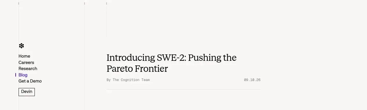
Design analysis
A sparse fixed-looking rail combines a small mark, primary links, active Blog state, and a compact Devin button while leaving the article column visually dominant.
Prompt preview
## Reference images

Study these alongside the description below: hierarchy, rhythm, spacing, colour. Build for the product you are asked about, using this design language.

- Component: https://kage-design-assets.t3.tigrisfiles.io/components/cognitions-swe-2/e9966f12-655e-494e-9580-e5330b0ddc92-1789365704-0.webp
- Full page it was cut from: https://kage-design-assets.t3.tigrisfiles.io/screenshots/cognitions-swe-2/e9966f12-655e-494e-9580-e5330b0ddc92-1789365639098-full.webp
- Component on Kage: https://kage.design/component/cognitions-swe-2-navigation

## Before you start
Ask what the user's product, audience, and brand are, then apply the principles below to create an original article navigation for that product.

Build a minimal editorial navigation for a long-form technical article. Use a narrow left rail with a small abstract brand mark at the top, vertically stacked links, a clearly indicated active section, and one compact product/action button. Keep the main article area open and uncluttered.

### Design language
- Layout: full-width shell with a narrow left navigation rail and a centered reading column; align the rail to the same top rhythm as the article title.
- Typography: compact 10–12px utility links, 16–18px wordmark/mark treatment, and a restrained button label; use a serif or high-contrast display face only if it fits the brand.
- Spacing: generous whitespace, 10–14px between links, 24–32px rail inset, and a large gap between navigation and article content.
- Colour: warm off-white background around `#f7f7f5`, near-black text `#161616`, muted text `#777777`, and a single vivid accent around `#3b19e6` for the active state.
- Borders and radius: hairline `#e4e4e0` rules; button may use a 2–4px radius or square corners depending on the brand.
- Interaction: active link remains visible while scrolling; links have a subtle colour change or underline on hover; the action button has a clear focus state.

### Never
- Never reuse logos, product names, copy, illustrations, or imagery from the reference.
- Never make the rail compete with the article headline.
- Never add dense dashboard-style navigation or generic SaaS navigation patterns.
More components

 Minimal utility navigation
kinetics.colorion.co · Navigation
Minimal utility navigation
kinetics.colorion.co · Navigation

 Global navigation bar
SHIUI · Navigation
Global navigation bar
SHIUI · Navigation

 Announcement bar and navigation
Neopress · Navigation
Announcement bar and navigation
Neopress · Navigation

 Floating site navigation
Epilude Notetaker · Navigation
Floating site navigation
Epilude Notetaker · Navigation

 Minimal product navigation
Resurf · Navigation
Minimal product navigation
Resurf · Navigation

 Announcement bar and primary navigation
DockFix 5.0 · Navigation
Announcement bar and primary navigation
DockFix 5.0 · Navigation