 kage
kage
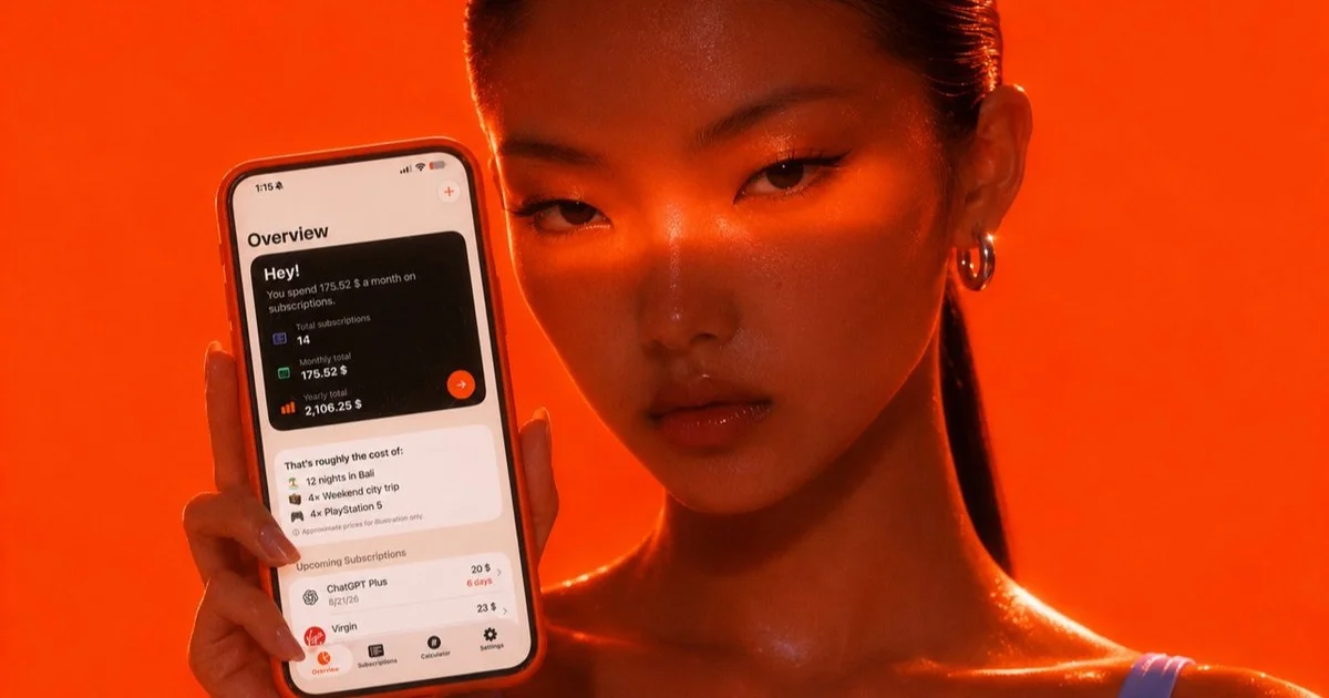
Design analysis
A 1200×630 card built from one full-bleed photograph graded into a single vermillion hue — backdrop, skin, hair and the phone's case all sit in the same #E03E0C-to-#7A1B04 range, so the only high-contrast zone is the cream app screen. The device sits in the left third at a slight tilt; inside it a near-black 'Hey!' stat card carries the monthly spend figure as the focal point, followed by a cost-comparison list and an upcoming-renewals list that add density without competing for attention. Notably there is no wordmark or headline anywhere on the card: a hard-lit, tightly cropped portrait on the right two-thirds sets an editorial fashion mood while the app UI copy states the message, with a lone pale periwinkle strap the only off-palette accent.
Prompt preview
## Reference images

Study these alongside the description below: hierarchy, rhythm, spacing, colour. Build for the product you are asked about, using this design language.

- Screenshot: https://kage-design-assets.t3.tigrisfiles.io/screenshots/subscrr/ad0b75e8-07f4-43d4-a0e0-808b928885f1-1790316147872.webp
- Design on Kage: https://kage.design/designs/subscrr-og-image

## Before you start
Ask the user what they are building, who it is for, and what brand assets they already have (product name, one dominant brand colour, typeface if any). Wait for the answers before writing code — everything below is applied to their product, with placeholder branding if assets are missing.

## Output spec
Produce one static Open Graph card at exactly **1200×630** (optionally render at 2× for sharpness). Build it as a single HTML file styled with CSS and screenshot it to PNG at 1200×630 (Playwright or Puppeteer), or author it as an SVG. Target under 1 MB. No animation — this asset appears small in social feeds.

## Page structure (canvas zones)
- **Full-bleed backdrop (100% of canvas):** a monochromatic colour field built from layered radial gradients — a hot core behind the device fading into deep shadowed corners — so the card reads as lit photography even with no photo.
- **Subject zone (right two-thirds):** if the user has lifestyle or product photography, place it here, cropped tight and colour-graded into the brand hue; otherwise leave the gradient field alone, optionally with soft diagonal light bands. This zone sets mood, not information.
- **Device zone (left third, vertically centred, tilted 2–4°):** a CSS-built phone mockup whose shell is colour-matched to the backdrop so it melts into the field, with a thin darker bezel and a cream screen inset carrying all the content. One soft directional drop shadow (lower right) separates it from the backdrop.
- **Screen content, three stacked blocks:**
  1. **Hero message card in near-black:** a short greeting headline, one sentence of spend context, then three compact stat rows (item count, monthly total, yearly total) with the monthly figure highlighted in the brand accent.
  2. **Comparison block on the cream screen:** a "that's roughly the cost of…" list translating the yearly number into three concrete equivalents, each as a small icon + text row.
  3. **Upcoming renewals list:** compact rows of name, price and days-until-renewal, plus a bottom tab bar hinting at the app's main sections.
- **Branding (optional):** the reference carries no wordmark or headline — the product UI is the message. If the user wants their name on the card, add a small wordmark no taller than 40px in the top-left in the cream colour, nothing larger.

## Design language
- **One hue owns the canvas.** Take the user's brand colour as a deep saturated base (the reference sits near `#E03E0C`), darken toward `#7A1B04` in shadows and lift toward `#FF8A50` as highlights. Backdrop, device shell and any photography must all live inside this single hue.
- **Contrast is rationed to the screen.** Reserve near-white (`#F4EFE7`) and near-black (`#141414`) exclusively for the phone screen, making the device the brightest, highest-contrast, most legible zone. At most one tiny off-palette accent elsewhere for interest.
- **Type is one grotesque family in three steps.** Greeting/headline ~30px semibold; labels ~13px at reduced opacity; values and currency figures ~18–20px semibold, with the single most important number set largest and in the accent colour. Nothing below ~12px at 1× scale.
- **Density rhythm inside the screen:** the dark hero card is dense (three tight stat rows), the comparison block is airy (generous line spacing), the renewals list is compact (tabular rows of icon + name + price + chevron). This alternation keeps a small screen scannable.
- **Shape and separation:** large radius on the device (~40px), 12–16px on screen cards, pill-shaped accent buttons. Depth comes from the gradient field and one soft shadow, never from borders.
- **Safe areas:** keep meaningful content ≥48px from every edge — some platforms crop the outer ~10% of OG images. Check legibility at 400px wide before shipping.

## Never
- Do not reuse the reference's model photography, pose, crop or lighting setup; include a person only if the user supplies one.
- Do not use real third-party brand names or logos on the mock screen (no ChatGPT, Virgin, PlayStation; no cost comparisons copied from the reference) — invent generic subscription names and equivalents.
- Do not use the Subscrr name, wordmark, tagline or any of its copy; present the finished card as the user's own product.


