 kage
kage
epilude.com

Design analysis
A compact floating navigation bar anchors the page with a wordmark, grouped menu links, and a high-contrast download button.
Prompt preview
## Reference images

Study these alongside the description below: hierarchy, rhythm, spacing, colour. Build for the product you are asked about, using this design language.

- Component: https://kage-design-assets.t3.tigrisfiles.io/components/epilude-notetaker/4c1f6c09-8367-4067-b5eb-19bb83b45625-1789365729-0.webp
- Full page it was cut from: https://kage-design-assets.t3.tigrisfiles.io/screenshots/epilude-notetaker/4c1f6c09-8367-4067-b5eb-19bb83b45625-1789365700735-full.webp
- Component on Kage: https://kage.design/component/epilude-notetaker-navigation

## Before you start
Ask what the user's product is, who it is for, and what their brand voice and visual identity are. Apply the principles below to that product rather than copying the reference.

Build a compact floating desktop navigation for a dark product website. Use a centered max-width container and a dark charcoal pill with a subtle light border and soft shadow. Align the brand mark on the left, separate navigation links with generous horizontal spacing, and place the primary download or signup action on the right in a light pill button. Use small neutral sans-serif text, muted gray link colors, and a clear hover state. Keep the bar visually lightweight and leave ample page breathing room around it. Use approximate colors: page #090909, nav #171717, border #303030, primary text #f5f5f2, muted text #9b9b98, button #f2f2ef.

Never: use logos, product names, copy, illustrations, or imagery from the reference.
More components

 Minimal utility navigation
kinetics.colorion.co · Navigation
Minimal utility navigation
kinetics.colorion.co · Navigation

 Global navigation bar
SHIUI · Navigation
Global navigation bar
SHIUI · Navigation

 Announcement bar and navigation
Neopress · Navigation
Announcement bar and navigation
Neopress · Navigation
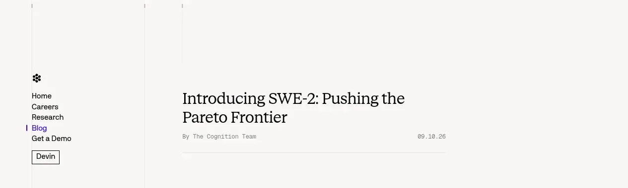
 Minimal article navigation
Cognition's SWE-2 · Navigation
Minimal article navigation
Cognition's SWE-2 · Navigation

 Minimal product navigation
Resurf · Navigation
Minimal product navigation
Resurf · Navigation

 Announcement bar and primary navigation
DockFix 5.0 · Navigation
Announcement bar and primary navigation
DockFix 5.0 · Navigation