kage
kage
epilude.com

Design analysis
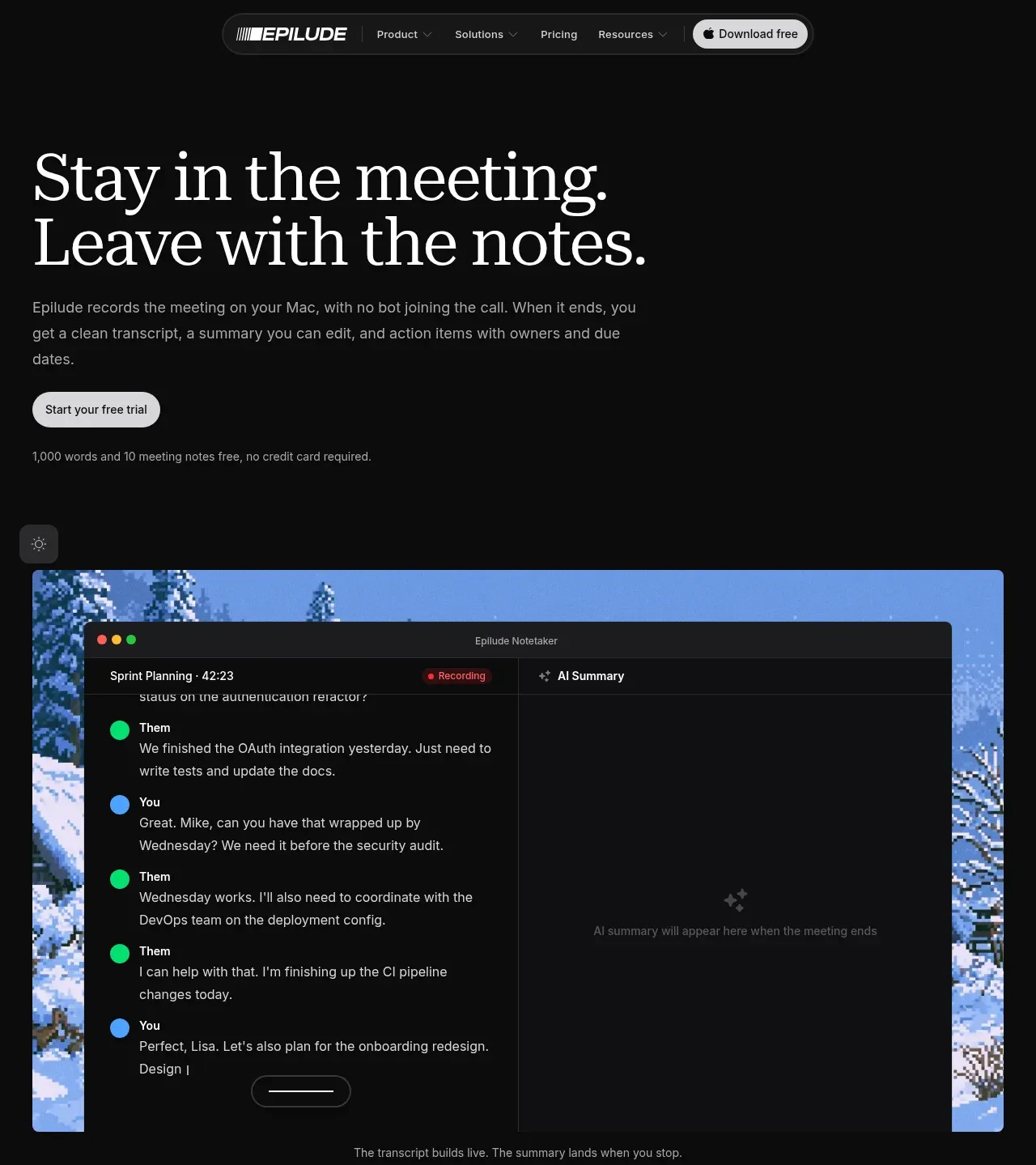
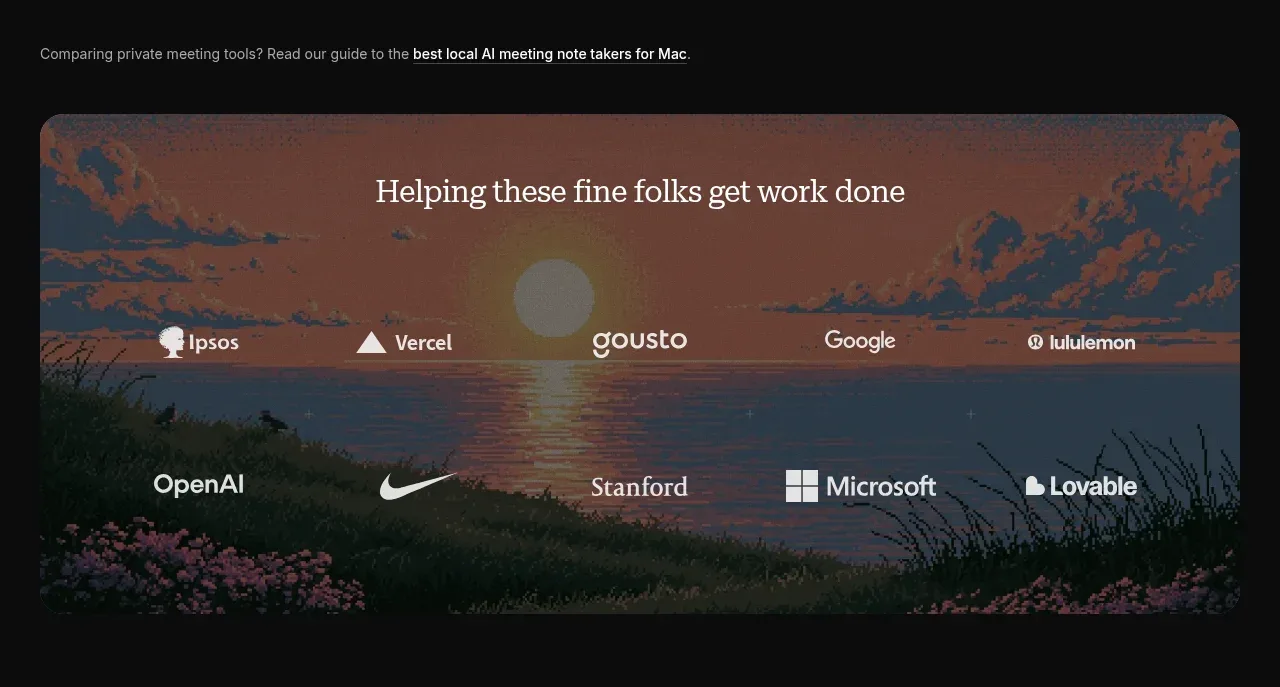
A near-black, editorial landing page pairs oversized high-contrast serif headlines with restrained sans-serif supporting text and compact pill controls. The hero establishes the product with a large transcript mockup, then the page alternates spacious left/right feature rows over atmospheric landscape imagery; a muted customer-logo panel and integration chips add proof before a darker CTA/footer block closes the page.
Prompt preview
## Reference images

Study these alongside the description below: hierarchy, rhythm, spacing, colour. Build for the product you are asked about, using this design language.

- Full page: https://kage-design-assets.t3.tigrisfiles.io/screenshots/epilude-notetaker/4c1f6c09-8367-4067-b5eb-19bb83b45625-1789365700735-full.webp
- Above the fold: https://kage-design-assets.t3.tigrisfiles.io/screenshots/epilude-notetaker/4c1f6c09-8367-4067-b5eb-19bb83b45625-1789365696938.webp
- Design on Kage: https://kage.design/designs/epilude-notetaker-landing-page

## Before you start
Ask the user what they are building, who it is for, and what brand assets they already have, including the product name, colours, fonts, logos, and imagery. Wait for their answers before proceeding. Apply the design system below to their product rather than copying the reference.

## Page structure
1. **Floating navigation** — Place a compact, centered pill-shaped nav near the top on the dark canvas, with a wordmark area, Product/Solutions/Pricing/Resources links, and a light download or primary-action pill on the right.
2. **Hero copy and CTA** — Use a very large two-line serif headline aligned to the left, followed by a narrow sans-serif explanatory paragraph, a light rounded CTA, and a small line of trial or reassurance text.
3. **Hero product demonstration** — Show a wide rounded media frame beneath the copy, using a scenic or abstract image as the backdrop and a dark desktop-app transcript/summary interface layered over it. Add a small floating utility control and a subtle caption under the frame.
4. **Comparison/resource note** — Add a quiet single-line text link beneath the hero demo, with one phrase emphasized as an underlined link.
5. **Customer proof panel** — Introduce a wide rounded image-backed panel with a centered serif heading and two rows of light customer names/logotypes over a subdued scenic background.
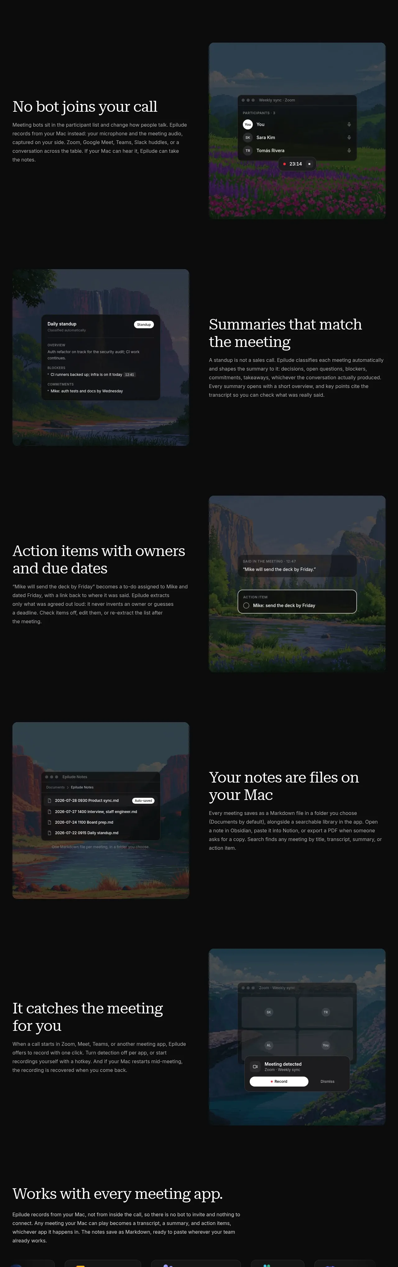
6. **Feature row: no bot** — Create a generous two-column section with the serif heading and explanatory copy on the left and a tall rounded image/mockup panel on the right showing meeting participants and a recording state.
7. **Feature row: summaries** — Reverse the layout: place a rounded product mockup/image panel on the left and the serif heading plus body copy on the right. Keep the row vertically spacious and visually quiet.
8. **Feature row: action items** — Return the text to the left and the image/mockup to the right, showing an extracted action item with an owner and due date.
9. **Feature row: local files** — Place the image/mockup on the left and text on the right, showing a local notes/file-list interface and reinforcing the user-controlled storage model.
10. **Feature row: automatic capture** — Use the text on the left and a right-side rounded mockup showing meeting detection and a record/dismiss control.
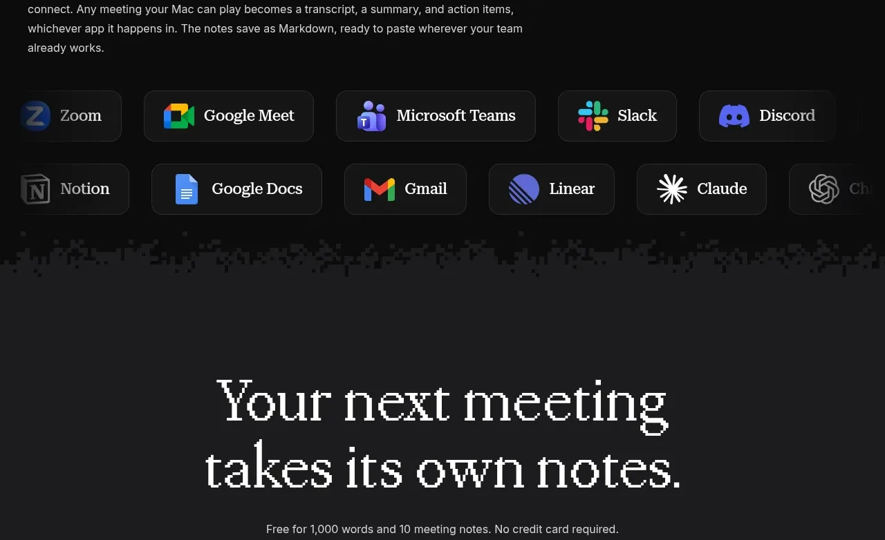
11. **Compatibility section** — Add a broad text block explaining that the product works with meeting apps, followed by two rows of dark rounded integration chips with recognizable app-color accents and labels.
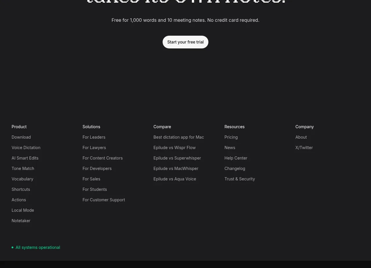
12. **Closing CTA band** — Transition to a slightly lighter charcoal panel. Center a large multi-line serif CTA, a small supporting line, and a light pill CTA with generous vertical padding.
13. **Footer navigation** — Finish with a multi-column footer of small sans-serif link groups for Product, Solutions, Compare, Resources, and Company, plus a small green operational-status indicator near the lower left.

## Design language
- Build hierarchy through contrast in scale: use oversized editorial serif headlines for statements and restrained sans-serif text for explanations, labels, navigation, and UI details.
- Keep the base canvas almost black, approximately `#090909`, with the closing/footer region lifted to charcoal around `#1b1b1d`; use white or warm-white type around `#f2f1ef` and muted gray copy around `#a5a4a3`.
- Let the rhythm change down the page: compact hero controls and copy, a large visual demo, a proof panel, then widely spaced alternating feature rows. Finish with denser integrations, a centered CTA, and a compact multi-column footer.
- Use a restrained editorial type pairing: a high-contrast or softly bracketed serif for display headlines and a clean neutral sans-serif for body text. Scale display headlines fluidly from roughly 48–72px on desktop, with body copy around 13–16px and tight, readable line lengths.
- Treat imagery as atmospheric and secondary to the interface: use darkened scenic/abstract backgrounds with cool blue, green, and warm sunset tones, then overlay near-black translucent product windows so the UI remains legible.
- Use a wide centered content container with generous horizontal margins. Alternate feature rows on a two-column grid, keeping text blocks narrow and media panels roughly half the row width.
- Keep borders subtle: use translucent gray borders around pills, cards, mock windows, and integration chips; use rounded corners around 8–14px for media and 999px for buttons/pills. Avoid heavy shadows; rely on contrast, overlays, and thin borders.
- Make primary actions light against the dark page, with dark text, compact padding, and fully rounded geometry. Keep secondary links quiet, often underlined or gray rather than buttonized.
- Use small status and accent colours sparingly: red for recording indicators, green for operational status, and muted blue/green/orange accents inherited from integration icons or scenic imagery.
- Represent product UI as believable dark desktop windows with thin dividers, small labels, compact rows, transcript bubbles, summary cards, and contextual controls. Keep interface density higher inside mockups than in the surrounding marketing layout.
- Where motion is added, keep it subtle: fade or gently translate feature mockups into view, allow media or transcript states to update softly, and preserve the calm, private, low-distraction mood.
- Make the layout responsive by stacking each alternating feature row on smaller screens, keeping the text before the image, preserving generous vertical gaps, and allowing the nav/integration chips to wrap or scroll horizontally.

## Never
- Do not use any logos, wordmarks, product names, copy, illustrations, photography, scenic assets, or icon sets from the reference.
- Do not reproduce Epilude or present the result as Epilude Notetaker.
- Do not copy the exact customer names, meeting transcripts, UI labels, brand marks, or imagery shown in the reference; invent content appropriate to the user’s product.
- Do not turn the page into a generic dashboard: preserve the editorial landing-page pacing, alternating feature storytelling, atmospheric media treatment, and restrained dark visual system.
Components from this page
All components
 Floating site navigation
Epilude Notetaker · Navigation
Floating site navigation
Epilude Notetaker · Navigation
 Meeting notes hero
Epilude Notetaker · Hero
Meeting notes hero
Epilude Notetaker · Hero
 Customer trust banner
Epilude Notetaker · Logo cloud
Customer trust banner
Epilude Notetaker · Logo cloud
 Core note-taking features
Epilude Notetaker · Feature grid
Core note-taking features
Epilude Notetaker · Feature grid
 Compatible apps strip
Epilude Notetaker · Logo cloud
Compatible apps strip
Epilude Notetaker · Logo cloud
 Final trial call to action
Epilude Notetaker · Call to action
Final trial call to action
Epilude Notetaker · Call to action
 Multi-column site footer
Epilude Notetaker · Footer
Multi-column site footer
Epilude Notetaker · Footer