 kage
kage
kinetics.colorion.co

Design analysis
A very compact black navigation bar anchors the page with a small accent brand mark, sparse center links, and a restrained right-side utility link.
Prompt preview
## Reference images

Study these alongside the description below: hierarchy, rhythm, spacing, colour. Build for the product you are asked about, using this design language.

- Component: https://kage-design-assets.t3.tigrisfiles.io/components/kinetics-colorion-co/61078688-965b-4221-9177-b73292c8438b-1789374949-0.webp
- Full page it was cut from: https://kage-design-assets.t3.tigrisfiles.io/screenshots/kinetics-colorion-co/61078688-965b-4221-9177-b73292c8438b-1789374925728-full.webp
- Component on Kage: https://kage.design/component/kinetics-colorion-navigation

## Before you start
Ask what the user's product is, who it serves, and what brand personality, logo treatment, and navigation destinations it needs. Then apply the principles below to that product rather than reproducing the reference.

Build a compact, dark-mode utility navigation bar spanning the viewport width. Use a near-black background (#0d0d0f), a 1px low-contrast bottom border (#29292c), and a small high-energy accent block in orange-red (#f04463) beside a crisp wordmark. Keep the left brand cluster aligned to a consistent page gutter of about 32px; place only a few low-emphasis links in the center and one understated utility/action on the right. Use a condensed sans-serif or mono-adjacent micro-label at 9–11px, muted gray text (#8a8a8d), and brighter off-white only for the active brand. Keep the bar around 30–36px tall with generous horizontal breathing room. Make links keyboard accessible and provide a subtle hover color shift, but avoid large buttons or visual noise.

Never: copy the reference's logo, product name, links, copy, illustrations, or imagery.
More components

 Global navigation bar
SHIUI · Navigation
Global navigation bar
SHIUI · Navigation

 Announcement bar and navigation
Neopress · Navigation
Announcement bar and navigation
Neopress · Navigation

 Floating site navigation
Epilude Notetaker · Navigation
Floating site navigation
Epilude Notetaker · Navigation
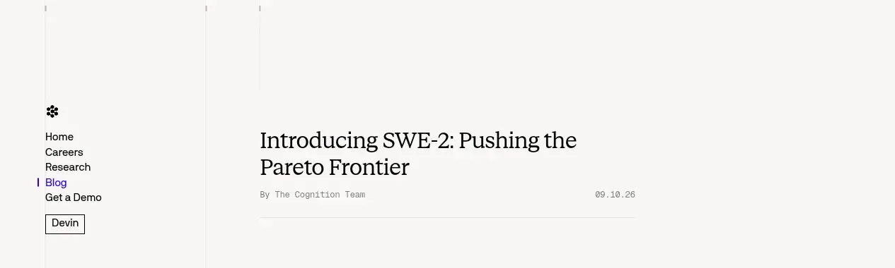
 Minimal article navigation
Cognition's SWE-2 · Navigation
Minimal article navigation
Cognition's SWE-2 · Navigation

 Minimal product navigation
Resurf · Navigation
Minimal product navigation
Resurf · Navigation

 Announcement bar and primary navigation
DockFix 5.0 · Navigation
Announcement bar and primary navigation
DockFix 5.0 · Navigation