kage
kage
kinetics.colorion.co

Design analysis
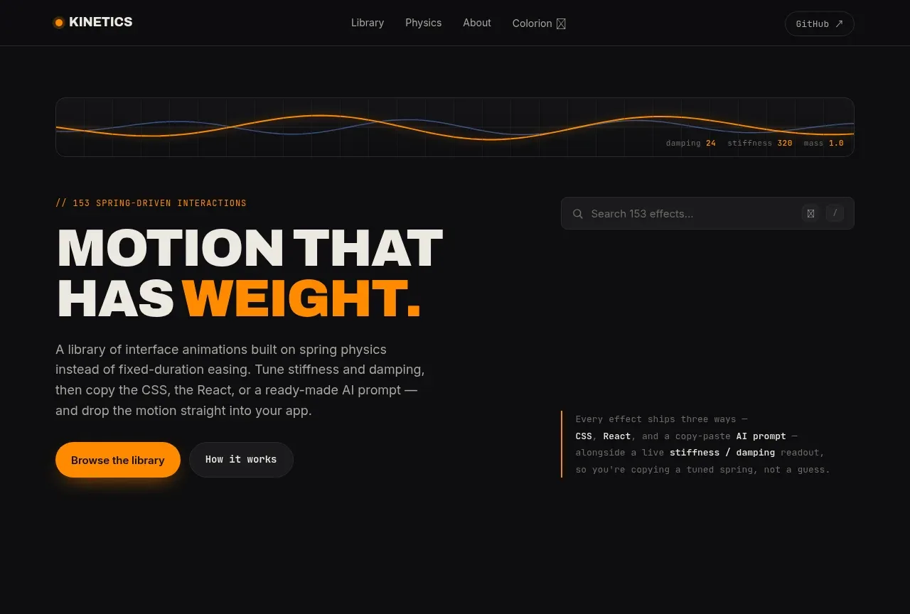
A near-black catalogue of 111 spring-driven interface effects organised as three dense demo grids — Interaction & Input, Feedback & State, Surface & Motion — each introduced by a letterspaced uppercase header with a monospace counter. The hero buys contrast through sparseness: an animated spring waveform, a huge condensed uppercase headline where one word flips to saturated orange, and a floating card previewing the CSS/React/AI-prompt handoff. Below, every card repeats one disciplined template (demo stage → monospace physics parameters → name → one-line description → View code link), so the single orange accent and the monospace meta layer carry the whole identity.
Prompt preview
## Reference images

Study these alongside the description below: hierarchy, rhythm, spacing, colour. Build for the product you are asked about, using this design language.

- Full page: https://kage-design-assets.t3.tigrisfiles.io/screenshots/kinetics-colorion-co/61078688-965b-4221-9177-b73292c8438b-1789374925728-full.webp
- Above the fold: https://kage-design-assets.t3.tigrisfiles.io/screenshots/kinetics-colorion-co/61078688-965b-4221-9177-b73292c8438b-1789374921408.webp
- Design on Kage: https://kage.design/designs/kinetics-colorion-landing-page

## Before you start

Ask the user what product they are building, who it is for, and what brand assets they already have (name, colours, typefaces, existing UI). Wait for the answers before writing any code. Everything below is a design language to apply to *their* product — not a page to recreate from the reference.

## Page structure

- **Top nav** — slim, transparent-on-black bar: left, a small accent-coloured dot/shape plus an uppercase wordmark; centre, 3–4 quiet text links (one marked as external with a tiny icon); right, one low-emphasis text button. No borders, no dropdowns.
- **Hero** — full-width animated waveform/line strip at the very top acting as a living logo for the product's core idea. Below it: a monospace kicker in the style `// 111 THING-NAME THINGS`, then a two-line display headline in uppercase condensed grotesque where the emotionally key word is set in the accent colour, then a 2–3 line muted paragraph, then two CTAs (one filled accent, one hairline outline). On wide screens, a floating "product proof" card sits right of the CTAs showing three small tab-like labels plus a mini code snippet — it previews what you get.
- **Search bar** — a full-width rounded search field directly under the hero: magnifier icon, muted placeholder with a live count ("Search 333 items…"), and a `/` keyboard-shortcut chip on the right.
- **Catalogue section 1** — uppercase letterspaced section title over a thin hairline rule, with a monospace counter (e.g. `51/55`) right-aligned. Below: a 3-column grid of demo cards.
- **Catalogue section 2** — same header treatment with its own counter, same card grid, but the card contents shift to a new category of the product.
- **Catalogue section 3** — a third header + grid; here the demo contents get more decorative/playful while the card template stays identical.
- **Slim footer** — one low dark strip of muted monospace meta links. No columns, no newsletter, no fuss.

## Design language

- **Canvas and surfaces**: page background near-black `#0a0a0a`; cards a step lighter `#151515`; separation by 1px hairline borders `#232323`, never by drop shadows. Radius is consistent and moderate (14–16px on cards, full-round on pills/buttons). Depth comes from value contrast, not blur.
- **One accent, spent carefully**: a single saturated orange `#ff5f00`. It appears only on: the logo mark, the headline's key word, the primary CTA, live/in-progress states inside demos, and small markers. Everything else is white `#f2f2f2` and muted grey `#8f8f8f`. On accent fills, use near-black text `#140a00`. If the user's brand accent is not orange, substitute theirs and keep the same scarcity rule.
- **Type system**: a geometric grotesque for display — uppercase, tight leading (~0.95), tight tracking on huge sizes (hero ~clamp(56px, 9vw, 120px)); the same family at 15–16px regular for body copy in grey. A monospace face is the second voice: section counters, parameter-style meta labels (`spring(140, 18)` syntax), code snippets, and footer meta, all at 11–13px in the muted grey. Hierarchy is built by scale jumps and colour pops, not by weight proliferation.
- **Card template**: every card is one repeated unit — a fixed-height centred demo stage on top, then a monospace parameter label, then a 15px medium-weight name in white, then a single 13px grey description line, then a bottom-right micro-link with a tiny icon ("View code" pattern: a verb + icon, right-aligned, muted until hover). Nothing else. This repetition is the page's rhythm.
- **Density rhythm down the page**: sparse and typographic at the top (hero, search), then dense and repetitive for the whole catalogue, with the three uppercase section headers acting as the only breathing points. Do not add interstitial marketing sections between grids — the catalogue *is* the pitch.
- **Section headers**: uppercase, letter-spaced (~0.2em), small (~13px), sitting on a full-width hairline, with the monospace count on the right edge. They read as dividers in a technical document.
- **Motion and interaction**: demos in cards run continuously or on hover; buttons get a fast 150ms background swap; the accent CTA can invert to white or brighten on hover; micro-links underline or brighten on hover. Motion should feel springy/weighted (ease-out overshoot), matching the product's subject — use it even if the product is not an animation library, just more subtly.
- **Empty/hover states**: search and shortcuts imply keyboard-first use; keep focus rings visible in the accent colour.

## Never

- No logos, wordmarks, product names, effect names, or copy from the reference ("Kinetics", "MOTION THAT HAS WEIGHT.", "View code" verbatim, etc.).
- No illustrations, photography, or icon sets taken from the reference — icons stay generic and hairline.
- Never present the result as the reference product; the structure and design language transfer, the content and brand come from the user's answers.
Components from this page
All components
 Minimal utility navigation
kinetics.colorion.co · Navigation
Minimal utility navigation
kinetics.colorion.co · Navigation
 Motion-focused hero introduction
kinetics.colorion.co · Hero
Motion-focused hero introduction
kinetics.colorion.co · Hero
 Interaction and input pattern library
kinetics.colorion.co · Feature grid
Interaction and input pattern library
kinetics.colorion.co · Feature grid
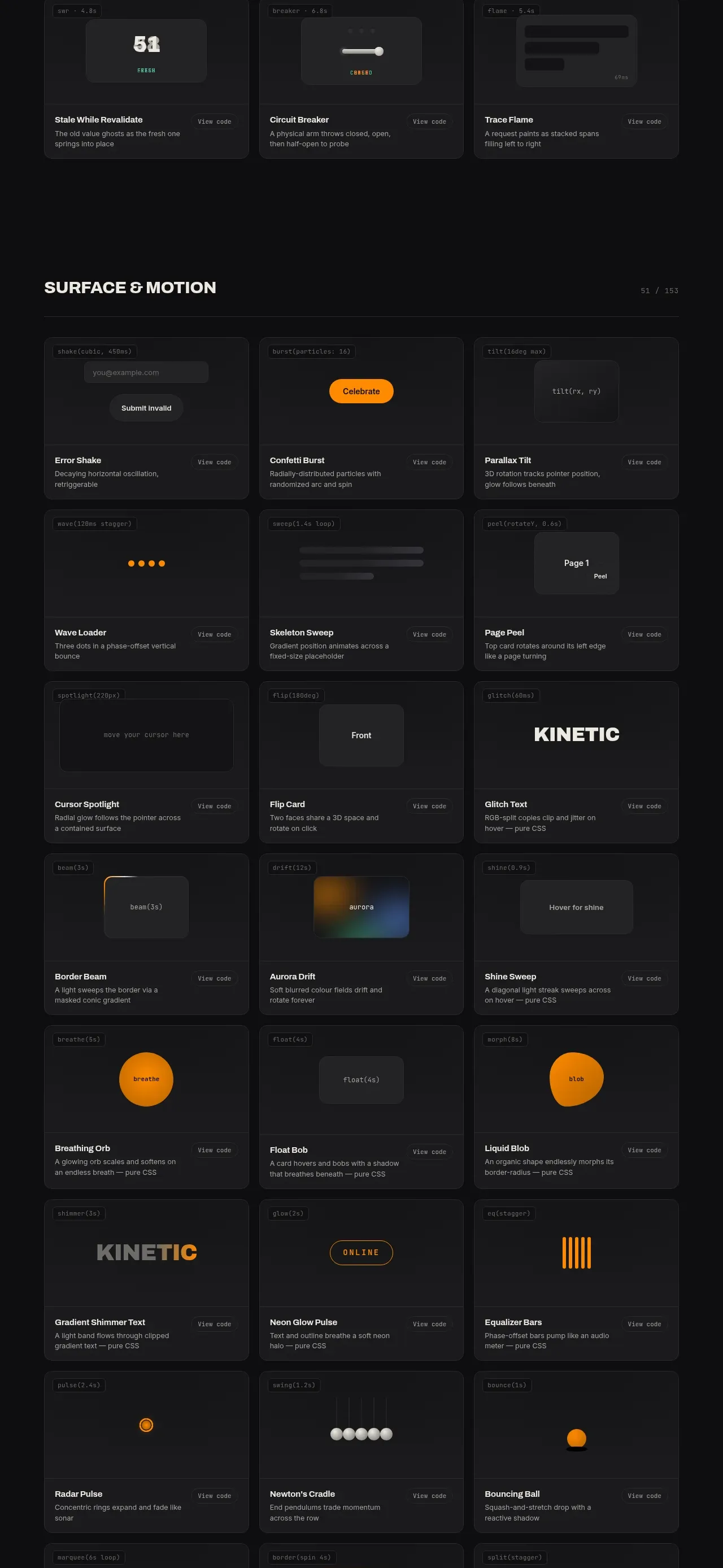 Feedback and state pattern library
kinetics.colorion.co · Feature grid
Feedback and state pattern library
kinetics.colorion.co · Feature grid
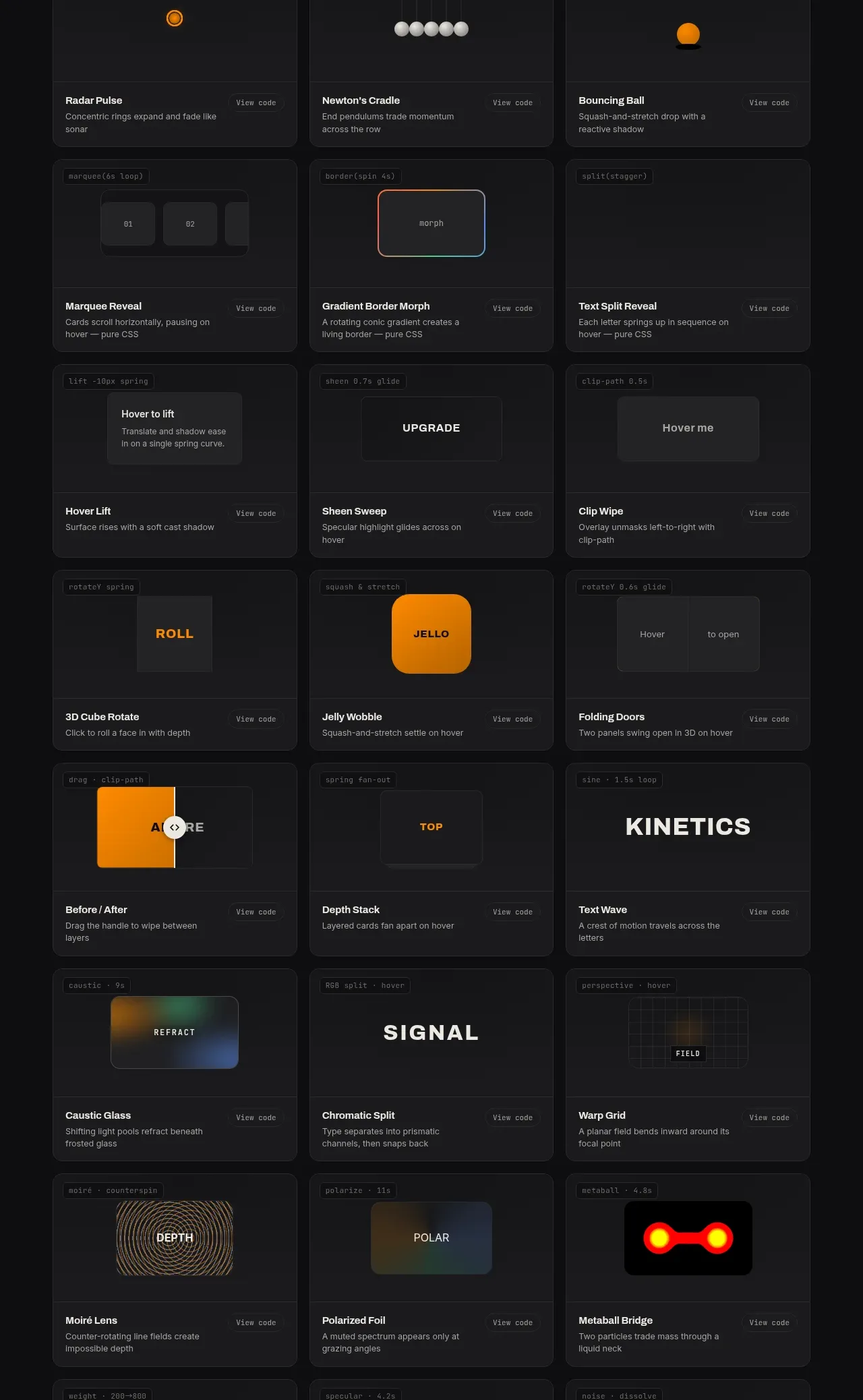 Surface and motion pattern library
kinetics.colorion.co · Feature grid
Surface and motion pattern library
kinetics.colorion.co · Feature grid