kage
kage
naise.ai

Design analysis
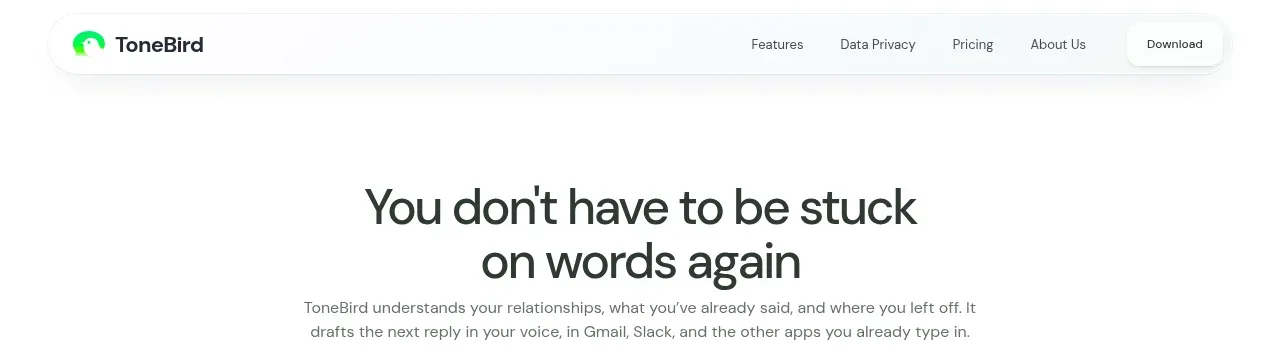
A compact white navigation bar establishes the brand, keeps the main product links centered, and ends with a low-friction login plus bright primary action.
Prompt preview
## Reference images

Study these alongside the description below: hierarchy, rhythm, spacing, colour. Build for the product you are asked about, using this design language.

- Component: https://kage-design-assets.t3.tigrisfiles.io/components/naise-ai/7a5a1374-ad41-4c97-8974-81f691da0cb9-1790229776-0.webp
- Full page it was cut from: https://kage-design-assets.t3.tigrisfiles.io/screenshots/naise-ai/7a5a1374-ad41-4c97-8974-81f691da0cb9-1790229706709-full.webp
- Component on Kage: https://kage.design/component/naise-navigation

## Before you start
Ask what the user's product and brand are, then apply these principles to that product rather than reproducing this reference.

Build a compact SaaS navigation bar with a left-aligned wordmark, a centered or balanced row of 5–7 product links, and right-aligned secondary and primary actions. Use a white background, dark near-black text around #10242d, a subtle bottom border #edf0ee, 16–18px horizontal padding, and a 44–48px height. Use a clean grotesk sans-serif, 12–14px nav text, restrained chevrons for dropdowns, and a lime primary pill around #c9ff00 with dark text and a soft glow. Keep the layout max-width aligned with the page content and make it responsive by collapsing links into a menu on narrow screens. Make hover and focus states obvious but quiet.

Never: use logos, product names, copy, illustrations, or imagery from the reference.