kage
kage
naise.ai

Design analysis
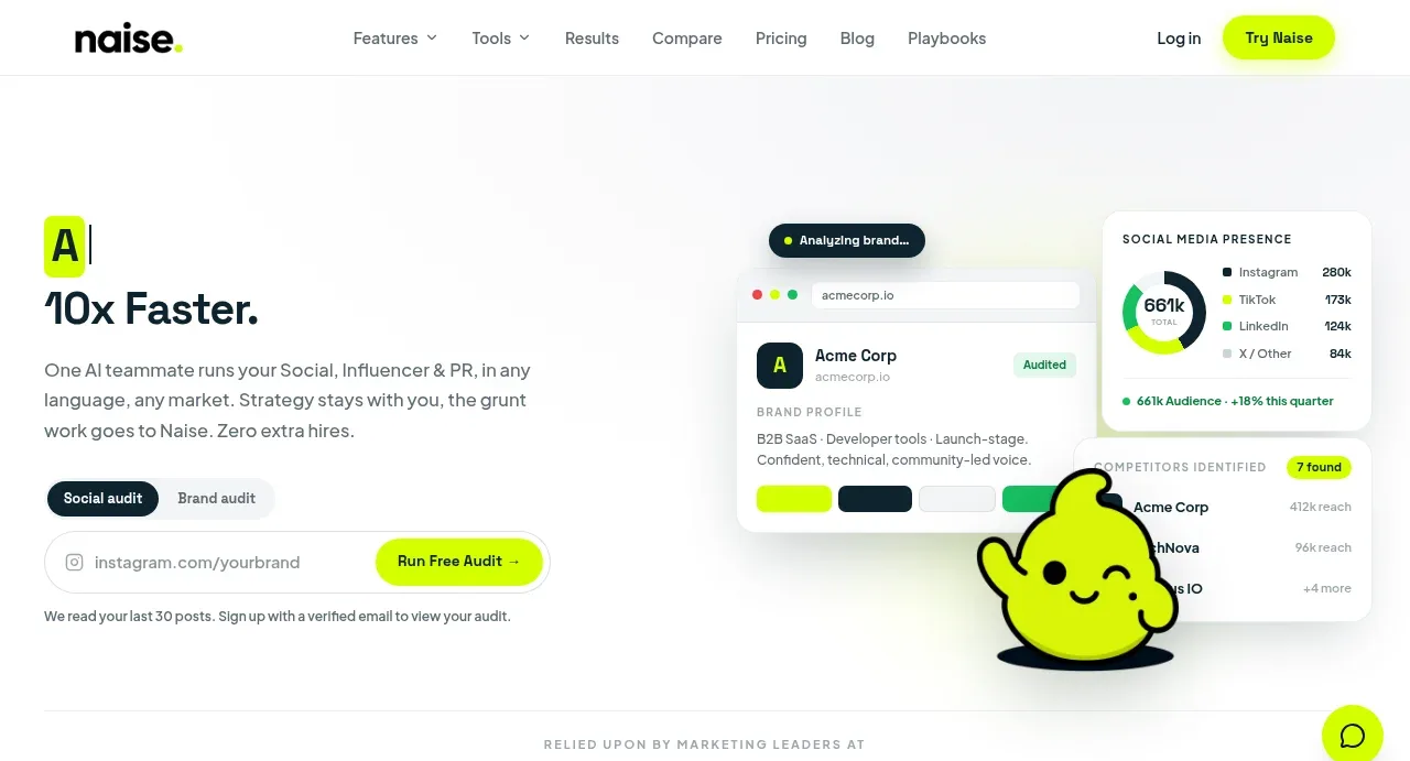
A long-form marketing page uses a restrained white and pale-gray foundation with dark navy typography and a high-contrast lime accent for actions, status marks, and illustrated mascot moments. The hero pairs compact navigation and a split audit form with layered product mockups, then the page shifts into alternating proof sections: logos, video, role-based feature content, agent modules, metric cards, testimonial, comparison table, pricing, FAQ, and a dark closing CTA. Rounded white panels, faint borders, soft shadows, and generous vertical spacing keep dense product evidence legible while the rhythm becomes more tabular and conversion-focused lower down.
Prompt preview
## Reference images

Study these alongside the description below: hierarchy, rhythm, spacing, colour. Build for the product you are asked about, using this design language.

- Full page: https://kage-design-assets.t3.tigrisfiles.io/screenshots/naise-ai/7a5a1374-ad41-4c97-8974-81f691da0cb9-1790229706709-full.webp
- Above the fold: https://kage-design-assets.t3.tigrisfiles.io/screenshots/naise-ai/7a5a1374-ad41-4c97-8974-81f691da0cb9-1790229685299.webp
- Design on Kage: https://kage.design/designs/naise-landing-page

## Before you start
Ask the user what they are building, who it is for, and what brand assets they already have, including the product name, logo, colours, typography, imagery, and existing UI screenshots. Wait for their answers before designing. Apply the system below to their product, not to the reference brand.

## Page structure
1. **Sticky navigation** — Place a compact logo area on the left, evenly spaced product and resource links in the centre, and a text login link plus bright primary CTA on the right; use a thin bottom divider and a white background.
2. **Hero audit section** — Use a two-column layout: a left column with a small lime-highlighted label, large concise headline, supporting paragraph, segmented mode selector, URL/input field, bright action button, and privacy note; use the right column for layered, softly shadowed product dashboards and a friendly abstract product visual.
3. **Customer logo strip** — Add a thin bordered band beneath the hero with a small uppercase eyebrow and a horizontal row of varied customer logos in muted monochrome treatment.
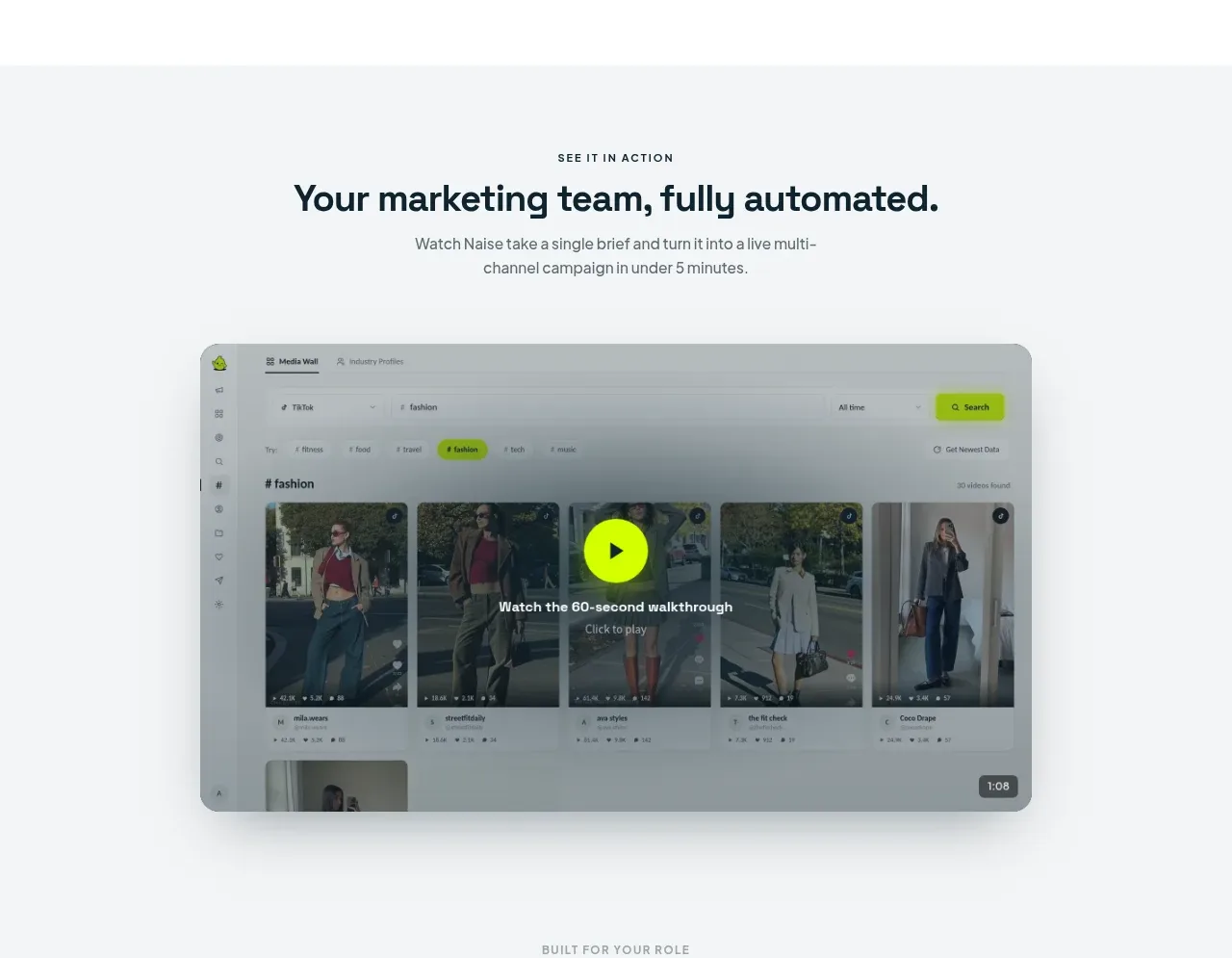
4. **Product walkthrough section** — Switch to a pale-gray background, centre an eyebrow, headline, and short explanatory paragraph, then show a large rounded video/product frame with a darkened overlay, central lime play button, and timestamp.
5. **Role-based use-case section** — Keep the pale-gray background and add pill tabs for audience roles. Below, use a large rounded white card with explanatory copy, checklist bullets, CTA, and a supporting analytics screenshot; change the card content when a tab is selected.
6. **Core agents section** — Return to white. Centre the heading and description, then split the content into a narrow left navigation list of agent categories and a large light-gray feature panel on the right. Include an agent status label, descriptive copy, a large calendar/content screenshot, checklist benefits, smaller related-tool cards, and a closing CTA.
7. **Expanding platform strip** — Add a compact rounded horizontal callout listing forthcoming capabilities as small pill tags with lime indicator dots.
8. **Results and metrics section** — Use pale gray again with a centred heading and supporting text. Follow with four equal white metric cards, each topped by a thin lime rule, then a wide analytics dashboard composition combining a large chart with smaller report/table panels.
9. **Testimonial section** — Return to white and centre an eyebrow and heading. Place one wide, softly bordered testimonial card with the customer identity in a narrow column, quotation in the main column, lime quotation mark, and small carousel controls beneath.
10. **Cost comparison section** — Use pale gray with a centred heading and explanatory text. Present a wide comparison table contrasting conventional options with the product, visually emphasizing the final product column using dark navy, lime checks, and a pale-lime savings row; add a dark rounded CTA beneath.
11. **Pricing section** — Return to white. Centre the pricing heading and supporting line, then add a monthly/yearly toggle, an early-access status pill, and three pricing cards. Make the middle card dark navy with lime CTA and a “popular” marker; keep the outer cards white with subtle borders and consistent feature checklists.
12. **FAQ section** — Use pale gray with a centred heading and support link. Stack wide white accordion rows with generous padding, bold questions, and lime circular expand controls; show one answer expanded and leave the others collapsed.
13. **Final CTA banner** — Use a deep navy full-width block with a soft green radial glow. Centre a small product illustration or abstract mark, eyebrow, large two-line headline, supporting text, primary lime CTA, secondary outlined CTA, and a small trial disclaimer.
14. **Footer** — Finish on white with a multi-column layout: product description and contact on the left, then product, company, and resources link groups. Add a bottom copyright line and muted social icons separated by generous whitespace.

## Design language
- Build hierarchy with short uppercase eyebrow labels, bold dark headings, compact supporting copy, and one dominant CTA per section; use a clear type scale from tiny 10–11px labels through 14–16px body text to 32–48px section headlines.
- Use a calm, evidence-led rhythm: spacious white hero and trust areas, denser pale-gray product demonstration panels, then increasingly structured metrics, comparison, pricing, and FAQ blocks toward the bottom.
- Use a near-white foundation around `#ffffff` with pale gray section fills around `#f4f6f7`, dark navy text and panels around `#0d2833`, and electric lime for action states around `#c8ff00` or `#d4ff00`. Keep secondary text around `#667277`.
- Pair a clean geometric sans-serif for all text. Use semibold or bold weights for headings and prices, regular weight for explanatory copy, tight line-height on large headlines, and slightly expanded tracking for uppercase eyebrows.
- Treat panels as soft, rounded surfaces with approximately 16–24px radius, 1px low-contrast borders, and restrained diffuse shadows. Avoid heavy outlines and avoid stacking excessive decoration around screenshots.
- Use lime sparingly as a functional signal: primary buttons, active tabs, status pills, checklist marks, top rules on metric cards, and small highlights. Do not use it as a large body background except for focused controls.
- Present product UI screenshots inside large rounded frames with realistic white surfaces, subtle blur or shadow, and enough surrounding whitespace to make them feel like evidence rather than decoration. Compose dashboards in asymmetrical but balanced layouts.
- Keep navigation and controls compact. Use pill toggles, rounded buttons, segmented tabs, circular expand/play controls, and simple line icons; hover states should gently increase contrast or shadow rather than introduce complex motion.
- Let interaction be understated: smooth accordion expansion, tab-content replacement, carousel slide changes, and a restrained play-button hover scale. Preserve clear focus states and accessible contrast, especially for lime buttons.
- On smaller screens, collapse navigation, stack hero copy above visual evidence, make tabs horizontally scrollable, stack dashboard panels and pricing cards, and retain the same white/gray/navy/lime hierarchy.

## Never
- Do not copy any reference logos, wordmarks, product names, taglines, mascot, illustrations, screenshots, customer marks, testimonial copy, pricing copy, or icon set.
- Do not present the result as Naise AI or imply an affiliation with the reference product.
- Do not reproduce the exact marketing claims, customer identities, UI content, or numerical metrics; create original content and product evidence for the user’s product.
- Do not turn every section into a floating card or overuse lime; preserve the changing density and alternating background rhythm.
Components from this page
All components
 Minimal product navigation
Naise AI · Navigation
Minimal product navigation
Naise AI · Navigation
 AI marketing audit hero
Naise AI · Hero
AI marketing audit hero
Naise AI · Hero
 Marketing leader logo strip
Naise AI · Logo cloud
Marketing leader logo strip
Naise AI · Logo cloud
 Product walkthrough preview
Naise AI · Gallery
Product walkthrough preview
Naise AI · Gallery
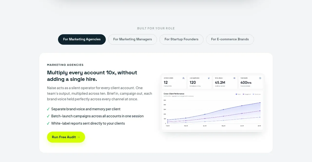 Role-based marketing workflow
Naise AI · Feature grid
Role-based marketing workflow
Naise AI · Feature grid
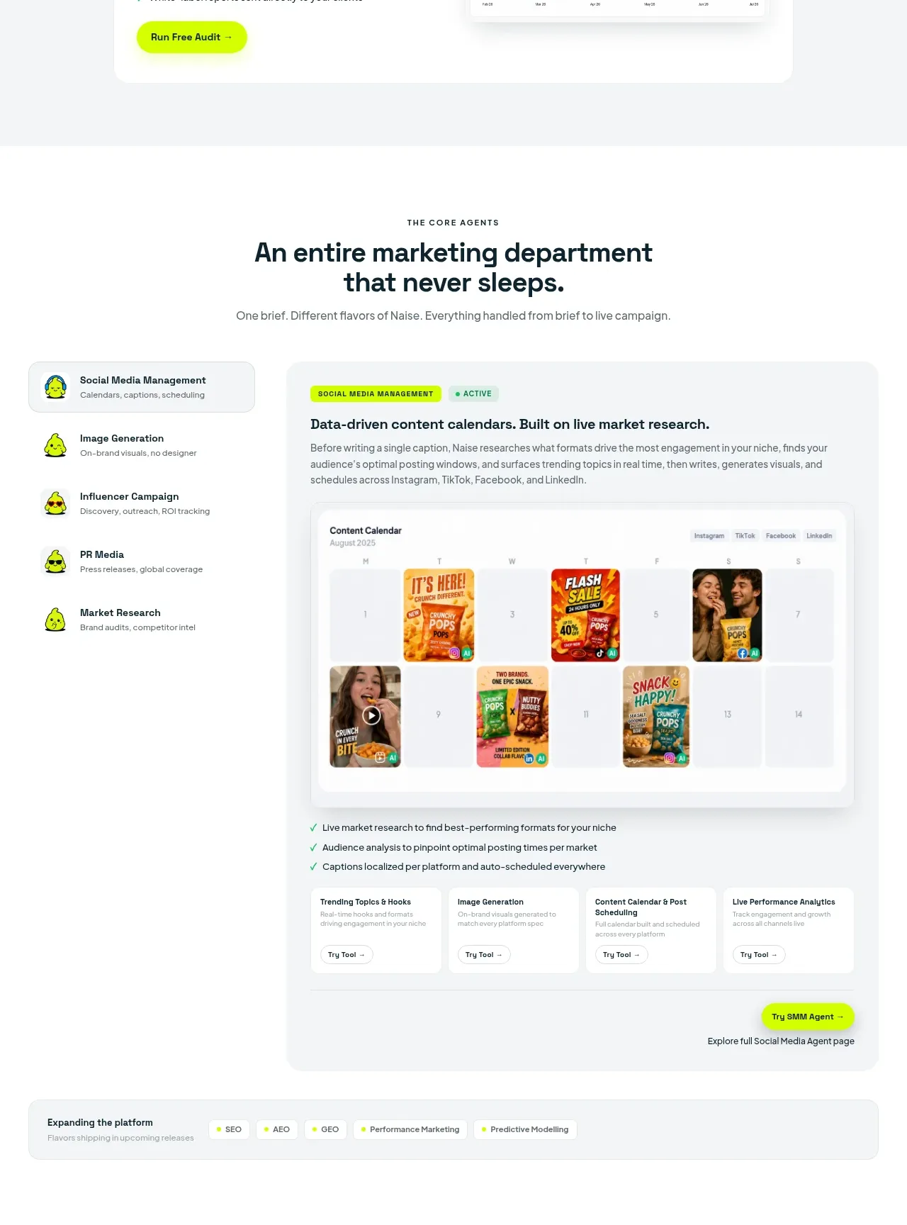 Core agent capabilities
Naise AI · Feature grid
Core agent capabilities
Naise AI · Feature grid
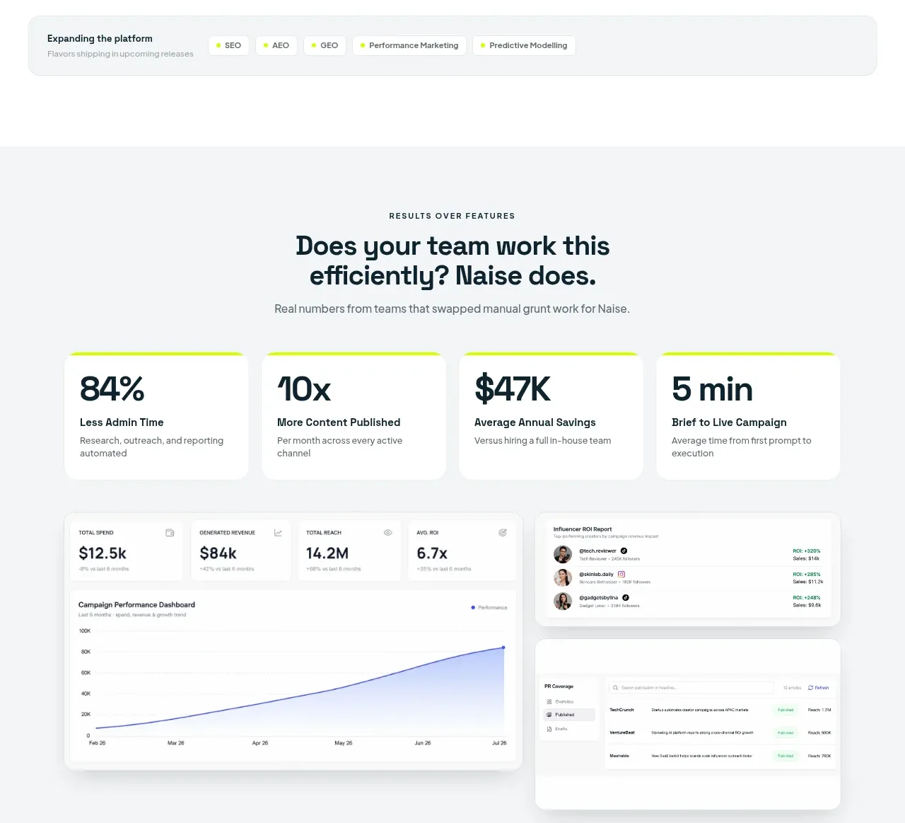 Outcome metrics
Naise AI · Stats
Outcome metrics
Naise AI · Stats
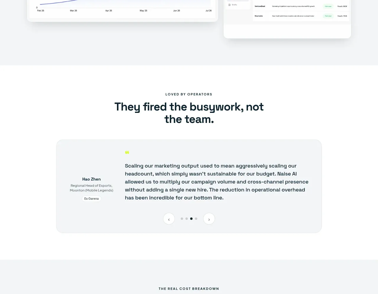 Operator testimonial carousel
Naise AI · Testimonials
Operator testimonial carousel
Naise AI · Testimonials
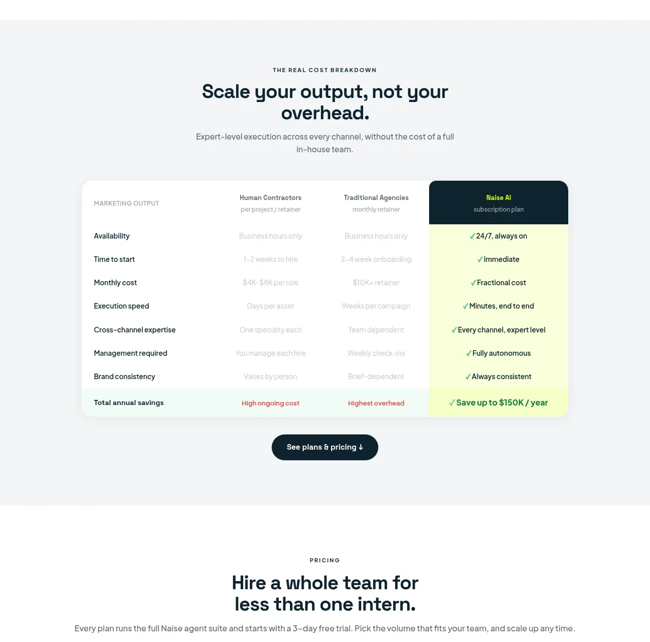 Cost comparison breakdown
Naise AI · Table
Cost comparison breakdown
Naise AI · Table
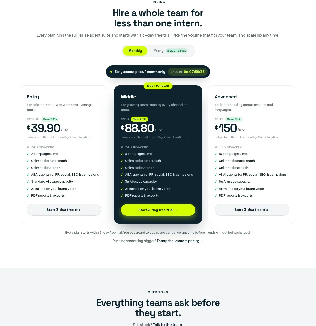 Three-tier pricing plans
Naise AI · Pricing table
Three-tier pricing plans
Naise AI · Pricing table
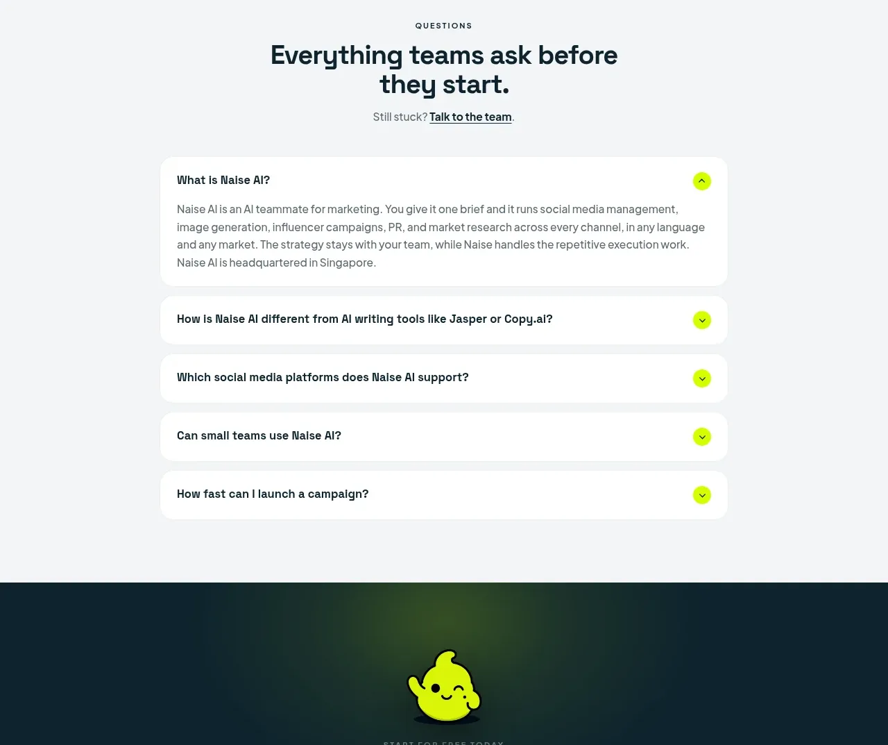 Frequently asked questions
Naise AI · FAQ
Frequently asked questions
Naise AI · FAQ
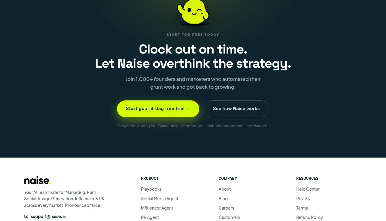 Dark conversion call to action
Naise AI · Call to action
Dark conversion call to action
Naise AI · Call to action