 kage
kage
neopress.ai

Design analysis
A compact announcement strip sits above a minimal navigation with a wordmark, small text links, locale control, and two contrasting actions.
Prompt preview
## Reference images

Study these alongside the description below: hierarchy, rhythm, spacing, colour. Build for the product you are asked about, using this design language.

- Component: https://kage-design-assets.t3.tigrisfiles.io/components/neopress/126c1916-850c-4473-b9b4-49923d5d31e2-1789365752-0.webp
- Full page it was cut from: https://kage-design-assets.t3.tigrisfiles.io/screenshots/neopress/126c1916-850c-4473-b9b4-49923d5d31e2-1789365678746-full.webp
- Component on Kage: https://kage.design/component/neopress-navigation

## Before you start
Ask what the user's product is, who it serves, and what their brand voice and visual identity are. Then apply the principles below to create an original responsive header for that product.

### Design language
- Use a two-row structure: a very thin, high-contrast announcement bar above a calm navigation row.
- Keep the navigation horizontally aligned on a centered max-width container with generous side padding; collapse links into a menu on narrow screens.
- Establish hierarchy with a small sans-serif utility style for the announcement and links, a compact brand lockup, and one dark filled primary action beside a quiet outlined secondary action.
- Use an off-white/white background (`#fbfaf7`), near-black text (`#171717`), a warm coral or orange announcement accent (`#ef5b3f`), subtle borders (`#dedbd4`), and small 2–4px corner radii.
- Keep the bar height restrained and use 12–14px navigation type with slightly increased letter spacing for utility labels.
- Make the primary and secondary actions keyboard accessible and provide visible hover/focus states; keep the announcement dismissible if appropriate.

### Never
- Never reuse logos, product names, copy, illustrations, or imagery from the reference.
- Never make the header crowded, dependent on hover, or inaccessible on mobile.
More components

 Minimal utility navigation
kinetics.colorion.co · Navigation
Minimal utility navigation
kinetics.colorion.co · Navigation

 Global navigation bar
SHIUI · Navigation
Global navigation bar
SHIUI · Navigation

 Floating site navigation
Epilude Notetaker · Navigation
Floating site navigation
Epilude Notetaker · Navigation
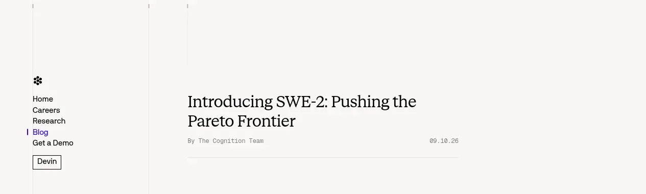
 Minimal article navigation
Cognition's SWE-2 · Navigation
Minimal article navigation
Cognition's SWE-2 · Navigation

 Minimal product navigation
Resurf · Navigation
Minimal product navigation
Resurf · Navigation

 Announcement bar and primary navigation
DockFix 5.0 · Navigation
Announcement bar and primary navigation
DockFix 5.0 · Navigation