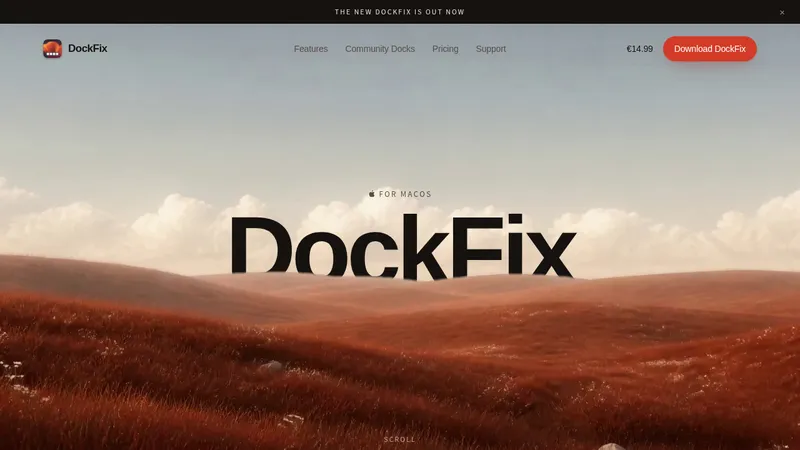
kage
kage
neopress.ai

Design analysis
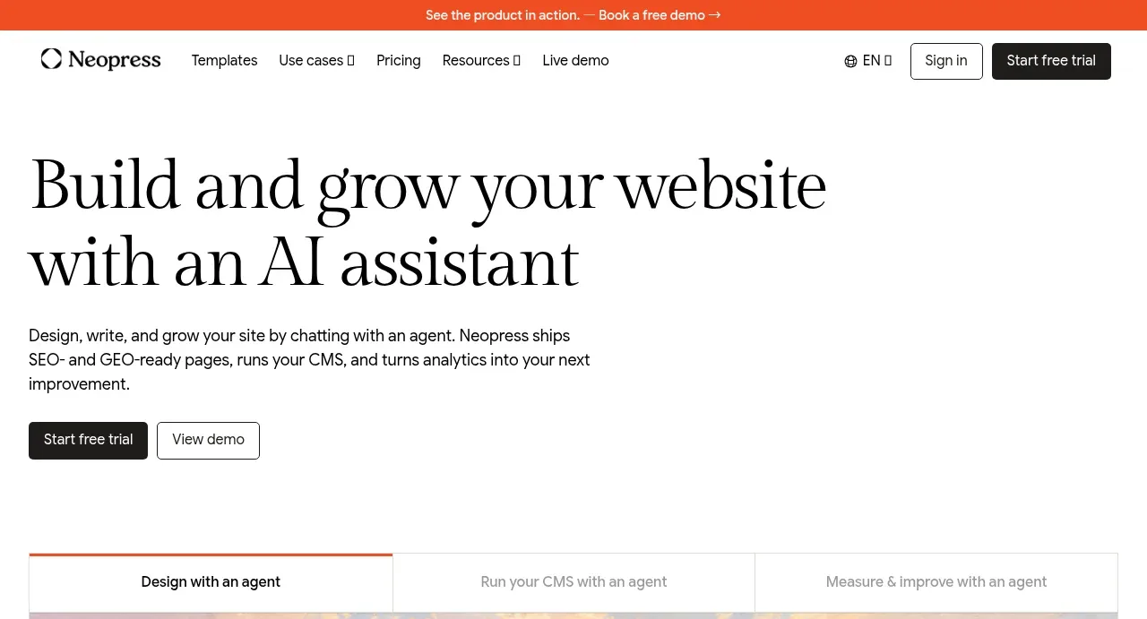
A long-form editorial landing page uses oversized high-contrast serif headlines with restrained sans-serif body copy and generous white space. The hero establishes the product through a large browser mockup, then the page alternates between template galleries, service cards, founder-led editorial content, product workflows, SEO explanations, tool grids, and pricing; soft beige sections and pastel image backdrops create rhythm without adding saturated brand colour. Thin gray borders, mostly square cards, minimal shadows, and black CTA buttons keep the interface precise while the increasingly information-dense lower sections communicate product depth.
Prompt preview
## Reference images

Study these alongside the description below: hierarchy, rhythm, spacing, colour. Build for the product you are asked about, using this design language.

- Full page: https://kage-design-assets.t3.tigrisfiles.io/screenshots/neopress/126c1916-850c-4473-b9b4-49923d5d31e2-1789365678746-full.webp
- Above the fold: https://kage-design-assets.t3.tigrisfiles.io/screenshots/neopress/126c1916-850c-4473-b9b4-49923d5d31e2-1789365672325.webp
- Design on Kage: https://kage.design/designs/neopress-landing-page

## Before you start
Ask the user what they are building, who it is for, and what brand assets they already have (name, colours, type choices, logos, imagery, and existing UI). Wait for their answers before designing. Apply the reference's structure and design language to their product, not to Neopress, and use their content and assets.

## Page structure
1. **Announcement strip and navigation:** Start with a very thin warm-orange announcement bar, followed by a compact white navigation row with a small brand mark, text links, language/utility controls, an outlined secondary action, and a dark primary CTA.
2. **Hero:** Use a spacious white hero with a large left-aligned editorial serif headline, a concise sans-serif paragraph, and two compact CTAs. Keep the copy block narrow and let the lower half introduce a wide product/browser demonstration.
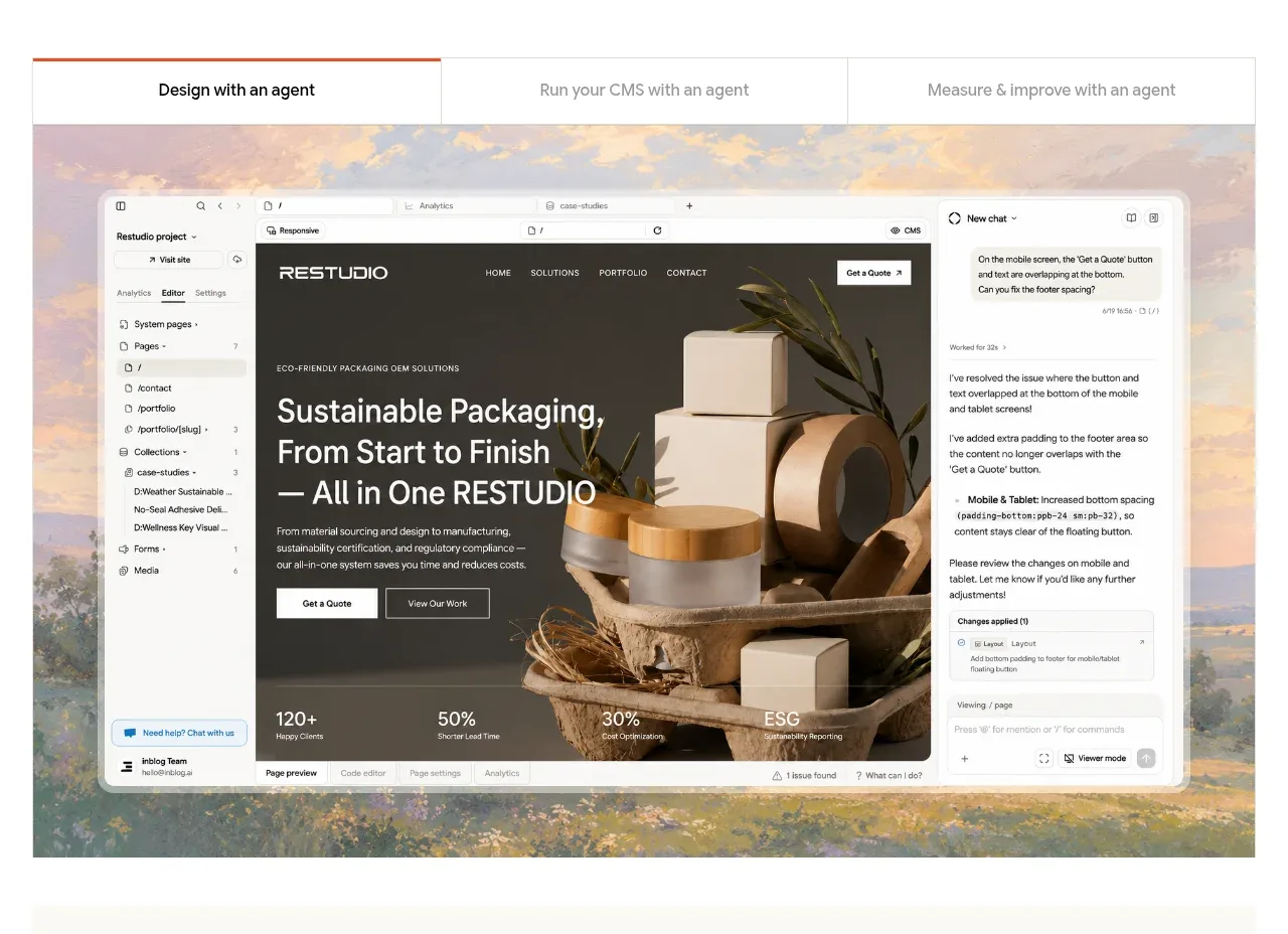
3. **Workflow tabs and product demo:** Place three thin bordered tabs above a large framed product screenshot. Give the active tab a subtle orange top accent and use a soft pastel/photographic background behind the interface mockup.
4. **Backing/credibility band:** Add a quiet off-white horizontal band with centered, low-contrast backing or customer marks; keep this section short and visually calm.
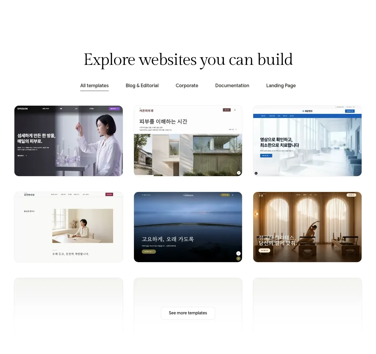
5. **Template gallery:** Introduce a centered serif heading, a small category tab row, and a six-item two-row gallery of website thumbnails. Finish with a centered text link or button for more templates and generous vertical breathing room.
6. **Services CTA section:** On a pale cream background, center a serif heading and short supporting line, then show two equal bordered cards for adjacent services. Each card has a small orange line icon, bold title, compact description, and a text CTA with arrow.
7. **Editorial product explanation:** Set a large white content panel inside a warm off-white section. Use a small uppercase/orange eyebrow, paragraphs, and three narrow comparison columns explaining the product, website essentials, and AI workflow essentials. Include a simple process diagram, supporting copy, and a founder-style signoff to make the explanation feel like an editorial letter.
8. **Agents overview:** Add a centered serif heading introducing the core agents. Present four numbered feature rows in alternating layouts: a large product screenshot or UI composition on one side and a compact numbered title/description on the other. Alternate image alignment down the page to create a zig-zag rhythm.
9. **Migration CTA:** Use a short centered cream band with a two-line serif heading, the first line in a lighter gray treatment, one explanatory sentence, and a single dark CTA.
10. **Advanced SEO/GEO section:** Return to a white, left-aligned editorial section with a large serif heading and several short paragraphs. Highlight links and key phrases with muted orange underlines or text accents, then introduce three compact metric/diagram columns.
11. **Technical capability rows:** Continue with alternating wide screenshot-and-copy rows for core capabilities such as performance reports, server rendering/code output, and custom domain connection. Use soft pastel image backdrops and alternate which side contains the explanatory text.
12. **Built-in SEO tools section:** On a pale cream background, center a multi-line serif heading and short intro. Follow with a large bordered feature panel, two-column code/example cards, and a dense matrix of smaller SEO capability cells below. Maintain thin dividers and restrained typography rather than decorative cards.
13. **Pricing:** Finish with a centered serif heading about scalable pricing, a short subheading, and two tall bordered pricing cards in a two-column layout. Show plan name, description, large price, billing note, full-width black CTA, and dense grouped checklists with small uppercase category labels.

## Design language
- Build hierarchy through contrast between large editorial serif headlines and compact neutral sans-serif UI text; use a high-contrast display serif around 48–64px for major headings, 28–40px for section headings, and 12–15px for body copy.
- Keep the overall canvas mostly white, with long calm intervals between sections. Change rhythm gradually: spacious and image-led above the fold, gallery/card-based in the middle, then denser explanatory grids, code examples, capability matrices, and pricing below.
- Use a restrained palette: white `#FFFFFF`, ink black `#171716`, cool light gray `#E7E6E1`, warm cream `#F7F6F1`, and a muted coral-orange accent around `#C66C4A`. Pastel peach, sage, blue, and pink may appear only as low-contrast screenshot/image backdrops.
- Pair a refined serif for headlines with a clean sans-serif for navigation, labels, body copy, prices, and technical details. Use uppercase micro-labels with increased tracking for eyebrows and feature categories.
- Prefer thin `1px` gray borders, square or very lightly rounded corners, and almost no shadow. Let whitespace and alignment provide depth; reserve solid black fills for primary buttons and selected controls.
- Keep buttons compact and rectangular with modest radius, short labels, and strong black/white contrast. Use orange sparingly for active rules, eyebrows, underlined links, and small utility accents.
- Use a centered max-width grid for headings and galleries, then break the grid with wide browser mockups and alternating image/text rows. Maintain consistent margins while allowing feature media to extend toward the viewport edge.
- Treat product screenshots as editorial evidence: frame them cleanly, place them over soft painterly or pastel backgrounds, and avoid excessive chrome around the mockups.
- Make interactions quiet and functional: tab selection changes the demonstration while preserving layout, gallery categories filter or switch thumbnails, and CTAs use subtle hover darkening or border changes. Avoid flashy motion; use gentle fade/slide transitions for content changes.
- Preserve the lower-page density. Technical sections should support two-column examples, compact metadata, checklists, code snippets, and small feature cells without losing the generous outer margins.

## Never
- Do not copy Neopress logos, wordmarks, product names, screenshots, exact copy, founder signature, illustrations, photography, or icon sets.
- Do not present the result as Neopress or imply affiliation with the reference.
- Do not reuse the reference's template thumbnails or branded UI; create original product demonstrations and content for the user's product.
- Do not replace the editorial hierarchy with a generic SaaS hero, loud gradients, excessive rounded cards, heavy shadows, or a saturated multi-colour palette.
Components from this page
All components
 Announcement bar and navigation
Neopress · Navigation
Announcement bar and navigation
Neopress · Navigation
 AI website builder hero
Neopress · Hero
AI website builder hero
Neopress · Hero
 Interactive product preview
Neopress · Feature grid
Interactive product preview
Neopress · Feature grid
 Backed-by credibility strip
Neopress · Logo cloud
Backed-by credibility strip
Neopress · Logo cloud
 Template gallery
Neopress · Gallery
Template gallery
Neopress · Gallery
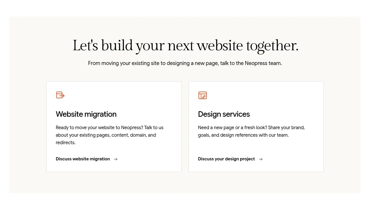 Build or migrate services CTA
Neopress · Call to action
Build or migrate services CTA
Neopress · Call to action
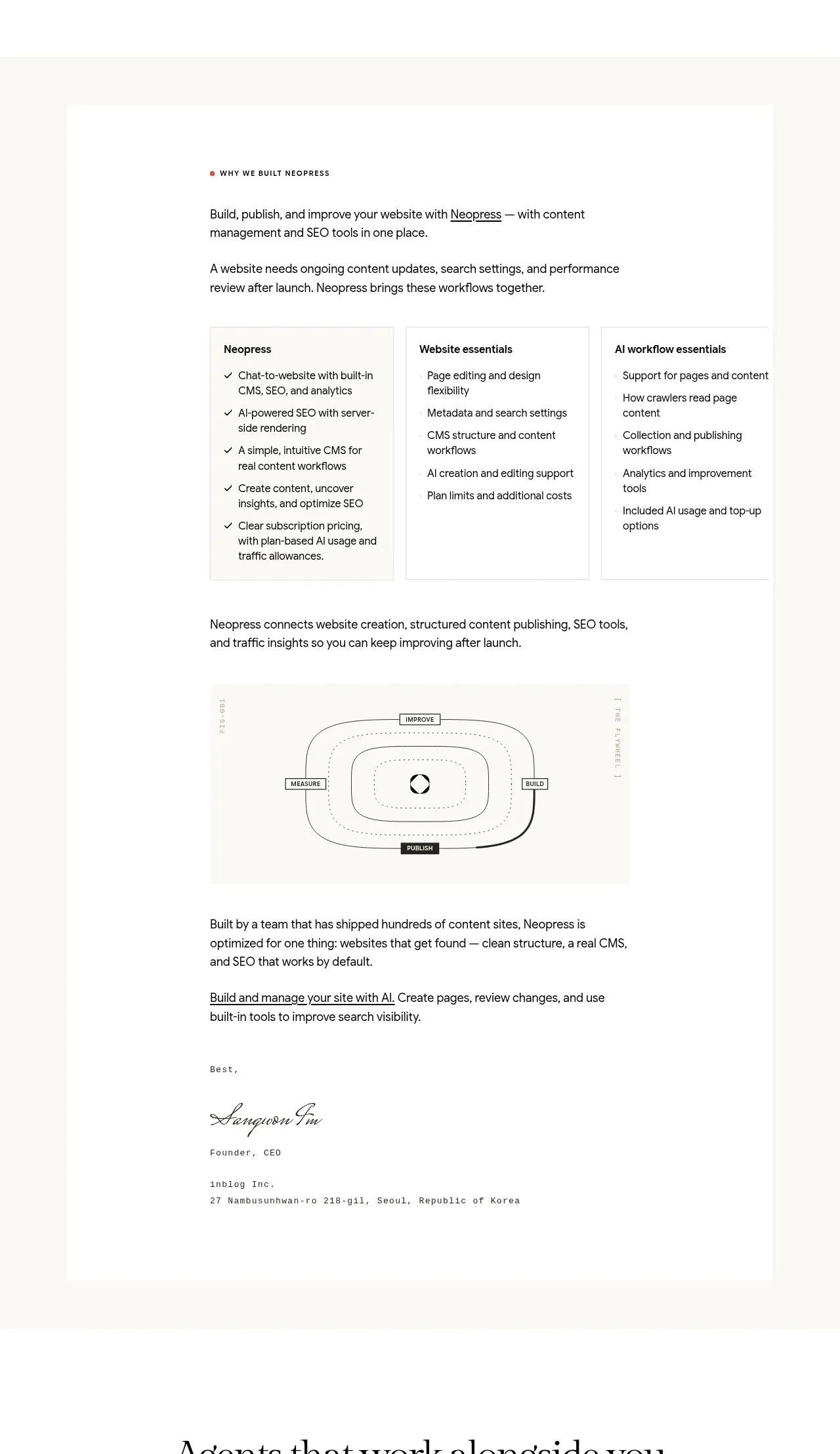 Product philosophy and workflow card
Neopress · Card
Product philosophy and workflow card
Neopress · Card
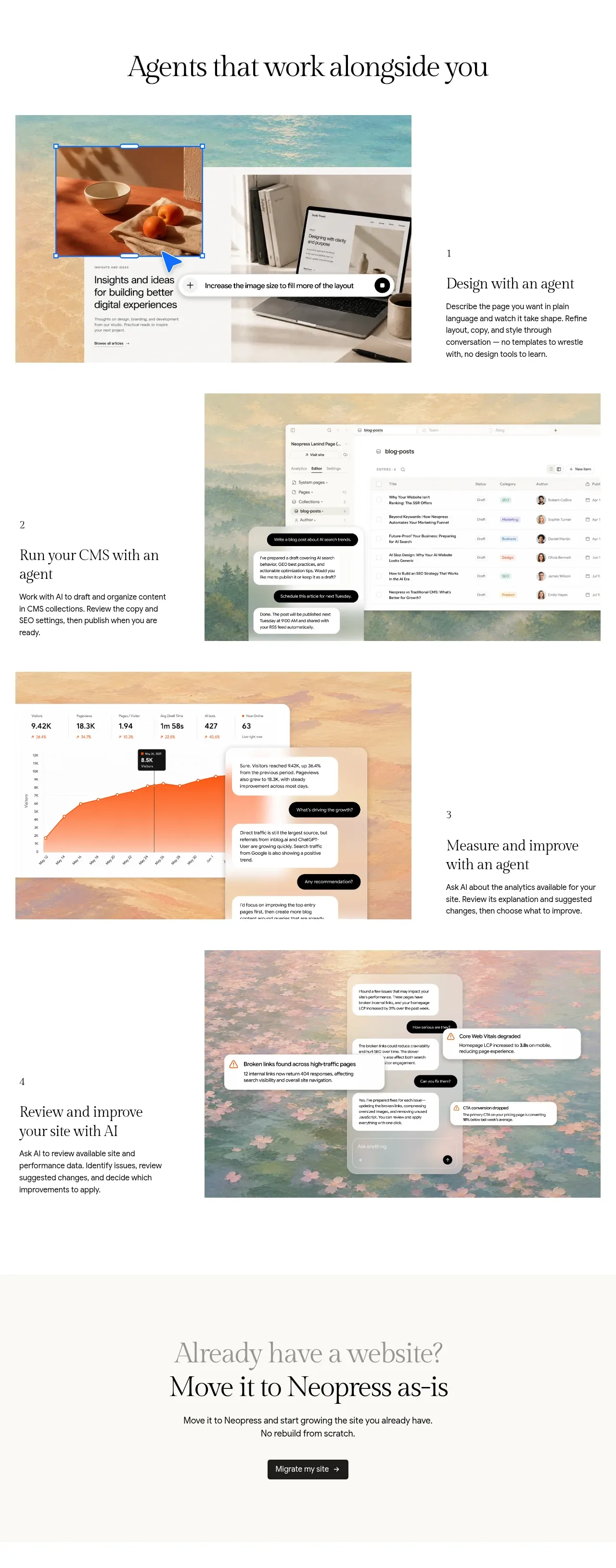 Agent workflow capabilities
Neopress · Feature grid
Agent workflow capabilities
Neopress · Feature grid
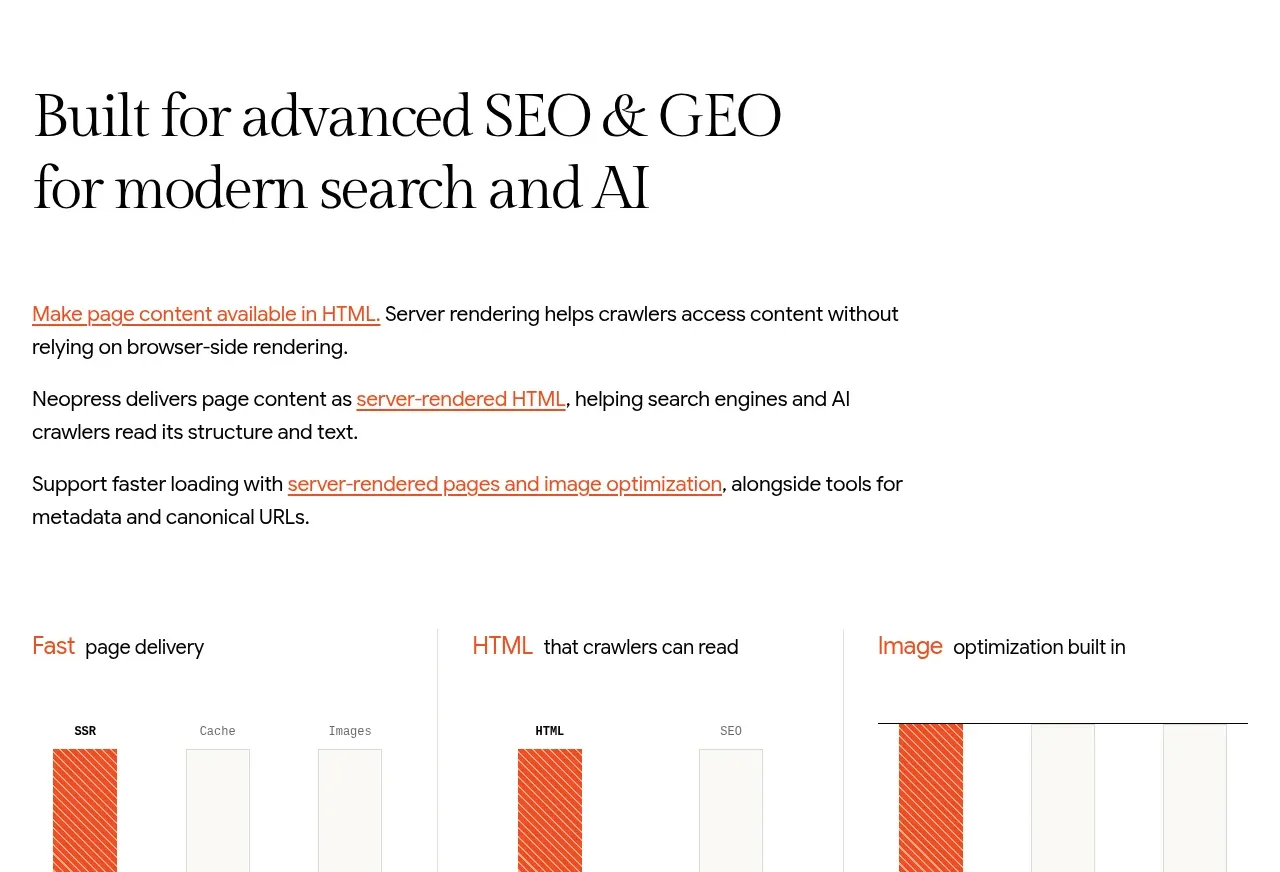 Website migration CTA
Neopress · Call to action
Website migration CTA
Neopress · Call to action
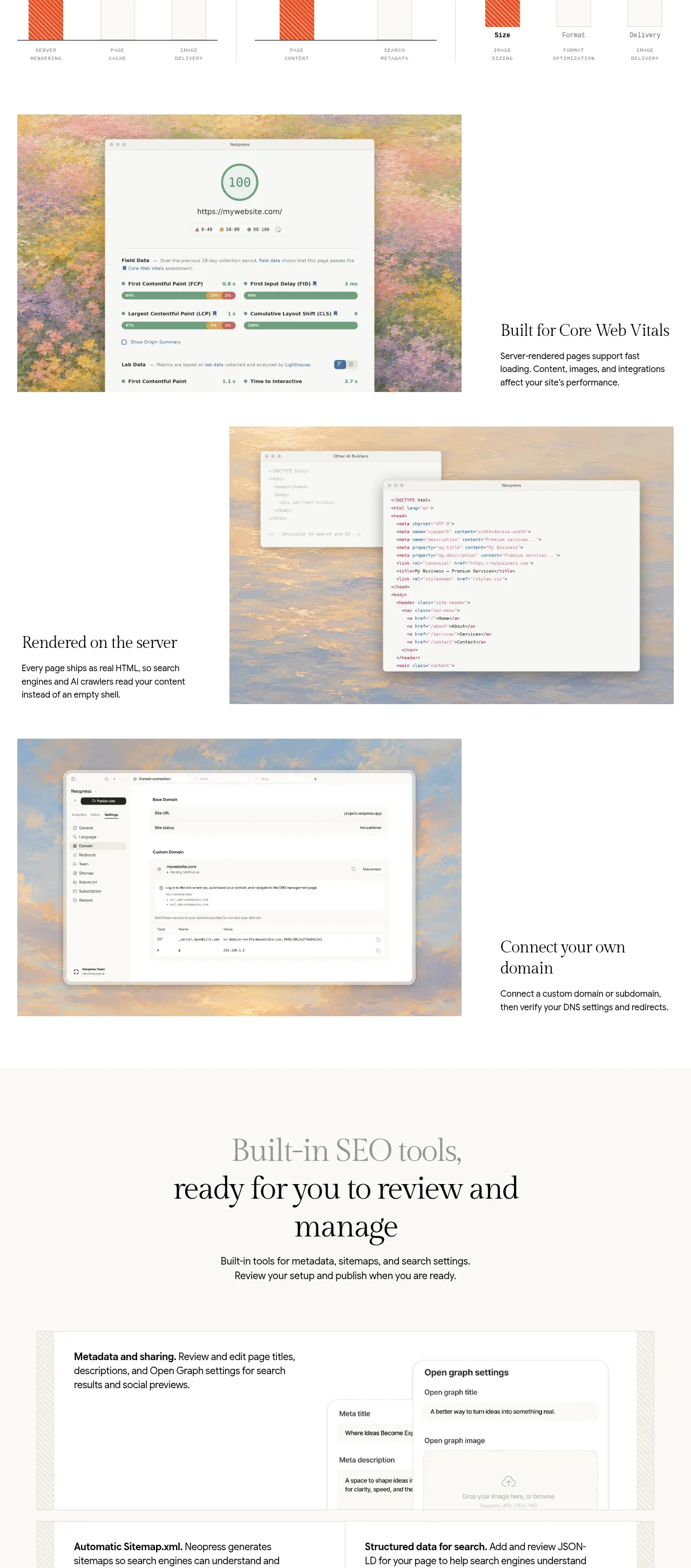 SEO and GEO foundations
Neopress · Feature grid
SEO and GEO foundations
Neopress · Feature grid
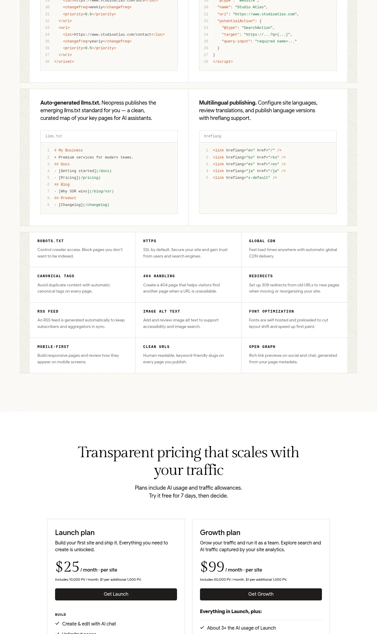 Built-in SEO tools
Neopress · Feature grid
Built-in SEO tools
Neopress · Feature grid
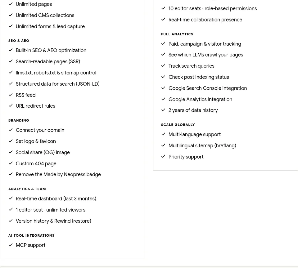 Traffic-scaled pricing
Neopress · Pricing table
Traffic-scaled pricing
Neopress · Pricing table