kage
kage
plane.so

Design analysis
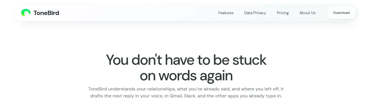
A slim white navigation bar anchors the brand on the left, centers product links, and places account and primary conversion actions on the right.
Prompt preview
## Reference images

Study these alongside the description below: hierarchy, rhythm, spacing, colour. Build for the product you are asked about, using this design language.

- Component: https://kage-design-assets.t3.tigrisfiles.io/components/plane-agents/6cd7606f-e6b6-4968-a1a7-76c61b9969ac-1790143340-0.webp
- Full page it was cut from: https://kage-design-assets.t3.tigrisfiles.io/screenshots/plane-agents/6cd7606f-e6b6-4968-a1a7-76c61b9969ac-1790143303447-full.webp
- Component on Kage: https://kage.design/component/plane-agents-navigation

## Before you start
Ask what the user's product, audience, and brand are, then apply the principles below to that product rather than copying the reference.

Build a slim, responsive SaaS navigation bar with a left-aligned wordmark area, a centered or flex-spaced set of product links, and right-aligned secondary and primary actions. Use a white background, approximately #ffffff, subtle bottom border #eeeeee, dark text around #171717, and a compact 40–56px height. Keep the content within a centered max-width container with generous horizontal padding. Use small, highly legible sans-serif typography; make the primary action a black filled pill or softly rounded button with white text, while secondary links remain unboxed. Collapse links into a menu on narrow screens and preserve the primary action when possible.

Never: use logos, product names, copy, illustrations, or imagery from the reference.