kage
kage

Design analysis
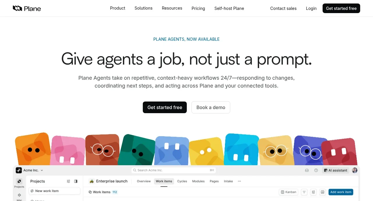
A type-led white hero (tiny teal caps eyebrow, very large tightly tracked headline, two pill CTAs) hands off to a strip of colorful squircle mascot tiles that introduces the multicolor palette before any UI appears. Below, the page alternates white and black bands: a grayscale logo bar, a two-column feature pairing an agent-creation form mockup with a four-step underlined list, a four-card template carousel keyed to hue-tinted gradient washes, a black bento grid of five dark UI cards, and a light control section with a screenshot set on photography — closing on a black CTA with scattered mascots and a dense dark footer. Hierarchy is carried almost entirely by size, weight and hairline borders; colour is rationed to accent eyebrows, chips and mascot hues.
Prompt preview
## Reference images

Study these alongside the description below: hierarchy, rhythm, spacing, colour. Build for the product you are asked about, using this design language.

- Full page: https://kage-design-assets.t3.tigrisfiles.io/screenshots/plane-agents/6cd7606f-e6b6-4968-a1a7-76c61b9969ac-1790143303447-full.webp
- Above the fold: https://kage-design-assets.t3.tigrisfiles.io/screenshots/plane-agents/6cd7606f-e6b6-4968-a1a7-76c61b9969ac-1790143298686.webp
- Design on Kage: https://kage.design/designs/plane-agents-landing-page

## Before you start
Ask the user what product they are building, who it is for, and what brand assets they already have (name, logo, brand colours, typefaces). Wait for the answers. Everything below is a design language to apply to *their* product — never reproduce the reference product, its mascots, copy or screenshots.

## Page structure
1. **Top nav** — wordmark left; 5 text links centred; right cluster of a text link ("Contact sales"), a quiet "Login" link and one solid dark pill CTA. Hairline bottom border, white background.
2. **Hero** — centred stack: a small caps eyebrow in the accent colour, one very large headline line, a two-sentence grey subcopy block (~60ch), then two buttons (solid dark pill + outlined pill). Nothing else.
3. **Mascot strip** — a full-width row of 9–10 colourful rounded tiles, each a simple character with basic face marks, sitting between the hero copy and the product shot like a decorative divider.
4. **Product screenshot** — a large, rounded-corner, hairline-bordered capture of the actual app (a kanban board with sidebar), annotated with 5–6 small coloured status pills ("Drafting release notes", "Due date crossed"…) that show where the product acts on the work.
5. **Social proof bar** — a short two-line grey statement on the left, a row of small grayscale customer logos to its right, generous vertical padding.
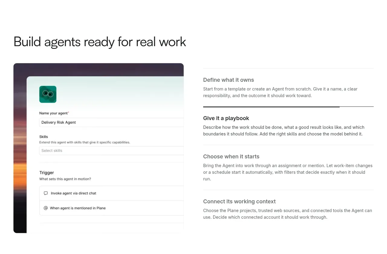
6. **Build/config section** — two columns. Left: a UI card mockup (a form with fields like name, skills, trigger) layered over a photographic gradient. Right: a four-item text list ("Define what it owns" → "Connect its context"), one line each, with a short rule underlining the active item; thin separators between items.
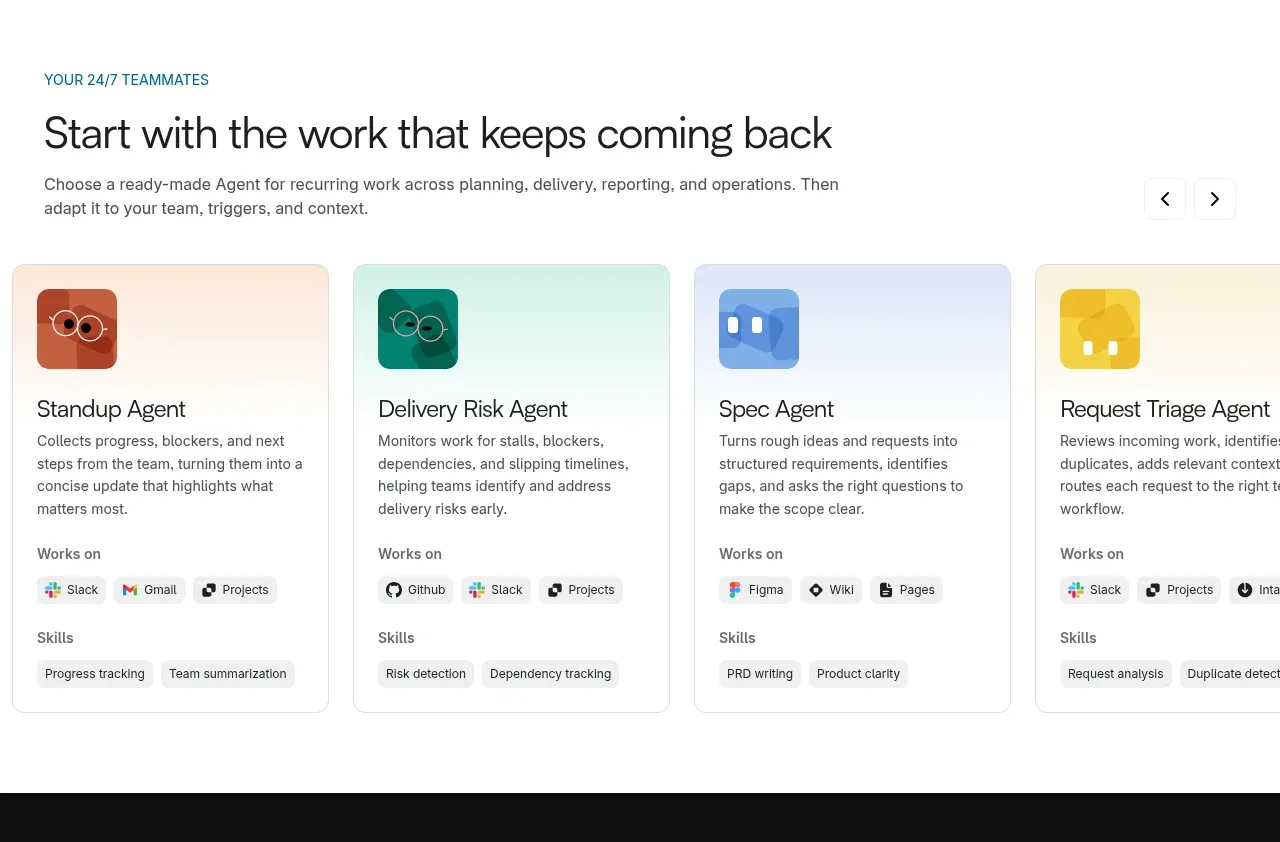
7. **Template carousel** — eyebrow ("YOUR 24/7 TEAMMATES") in accent caps + heading + one-line subcopy, with prev/next arrows top-right. Four cards, each with: a soft gradient header in its own hue (orange, green, blue, yellow), a rounded mascot-icon chip, a name, a 2–3 line description, then two labelled chip rows ("Works on", "Skills") of small icon+label chips. The 4th card bleeds off-canvas to signal scrollability.
8. **Dark bento band** — full-bleed near-black section: centred heading + one-line subcopy + two buttons (white pill + dark ghost pill), then a 2×large top row and 3 smaller bottom row of cards. Each card: small white heading, one-line grey copy, and a dark-mode UI mockup (assignee picker, mention menu, trigger toggles, integration diagram, cron scheduler) partially cropped by the card edge.
9. **Control & visibility section** — back to white: accent eyebrow, heading ("Set the boundaries. Follow every run."), subcopy, two buttons. Below: a very large screenshot composition on a photographic sky/water background showing a settings surface (access modal, scope panel, credit-usage stats). Under it, three equal text columns with bold mini-headings and 2-line grey copy.
10. **Closing CTA** — black full-bleed band: two-line centred heading, two buttons, colourful mascot tiles scattered along the edges at slight rotations.
11. **Footer** — same black: logo and 4 circular compliance badges top-right, then 7 dense link columns (Product, Features, Pricing, Industries, Learn, Use cases/Compare, Company), a bottom bar with two OS download buttons left and five social icon buttons right.

## Design language
- **Hierarchy without decoration**: build it from type scale and weight only — ~11–12px letter-spaced caps eyebrow in one accent colour, ~56–64px hero headline with tight tracking (-0.02em), ~36–40px section headings, 15–16px grey body, 13px UI labels. No gradients behind headings, no icon bullets.
- **Colour system**: white base `#FFFFFF`; near-black ink and primary buttons `#111113`; grey text `#52525B`; hairline borders `#E4E4E7`. One restrained accent (teal `#0FA3A8` here — swap in the user's brand accent) reserved for eyebrows and small highlights. Dark bands are `#0A0A0B` with cards at `#1B1B1E` and muted grey text `#A1A1AA`. Per-card personality comes from hue tinting: soft radial/linear gradient washes of orange `#F97316`, green `#10B981`, blue `#3B82F6`, yellow `#EAB308` at low opacity behind neutral content.
- **Accent characters, neutral chrome**: the only saturated, playful elements are the mascot tiles and card icon chips; every real UI element stays grey/black. Keep this split strict — playful brand layer on top of a dead-serious product layer.
- **Rhythm down the page**: alternate white and black full-bleed bands (light → light → light → black → light → black) so long feature storytelling never feels flat. Airy centred hero (~120px vertical padding) → medium two-column features (~96px) → tighter card grids → densest at the footer.
- **Cards and chips**: radius 12–16px on cards and screenshots, fully rounded (pill) buttons and chips, hairline borders instead of shadows; shadows only on floating mockup panels. Chips are 12–13px text with a 14px icon, bordered, on white or dark-tinted fills.
- **Screenshots as evidence**: real product UI is shown large and nearly uncropped, always in a rounded bordered frame; annotate with 1–3 word coloured pills rather than arrows or callout lines.
- **Interaction**: minimal and functional — carousel arrows, underline-to-activate step lists, hover states that deepen borders. No scroll-jacking, no parallax.

## Never
- No Plane logo, wordmark, mascot characters, product names, or any copy from the reference page.
- No screenshots or UI content lifted from the reference; build mockups from the user's own product concept.
- No stock photography, illustration sets or icon packs copied from the reference — the mascot idea must be redrawn in the user's own brand style or replaced with an equivalent brand device.
- Never present the result as Plane or imply affiliation with it.
Components from this page
All components
 Global navigation
Plane Agents · Navigation
Global navigation
Plane Agents · Navigation
 Agents hero with product preview
Plane Agents · Hero
Agents hero with product preview
Plane Agents · Hero
 Customer logo strip
Plane Agents · Logo cloud
Customer logo strip
Plane Agents · Logo cloud
 Agent setup workflow
Plane Agents · Feature grid
Agent setup workflow
Plane Agents · Feature grid
 Ready-made agent cards
Plane Agents · Feature grid
Ready-made agent cards
Plane Agents · Feature grid
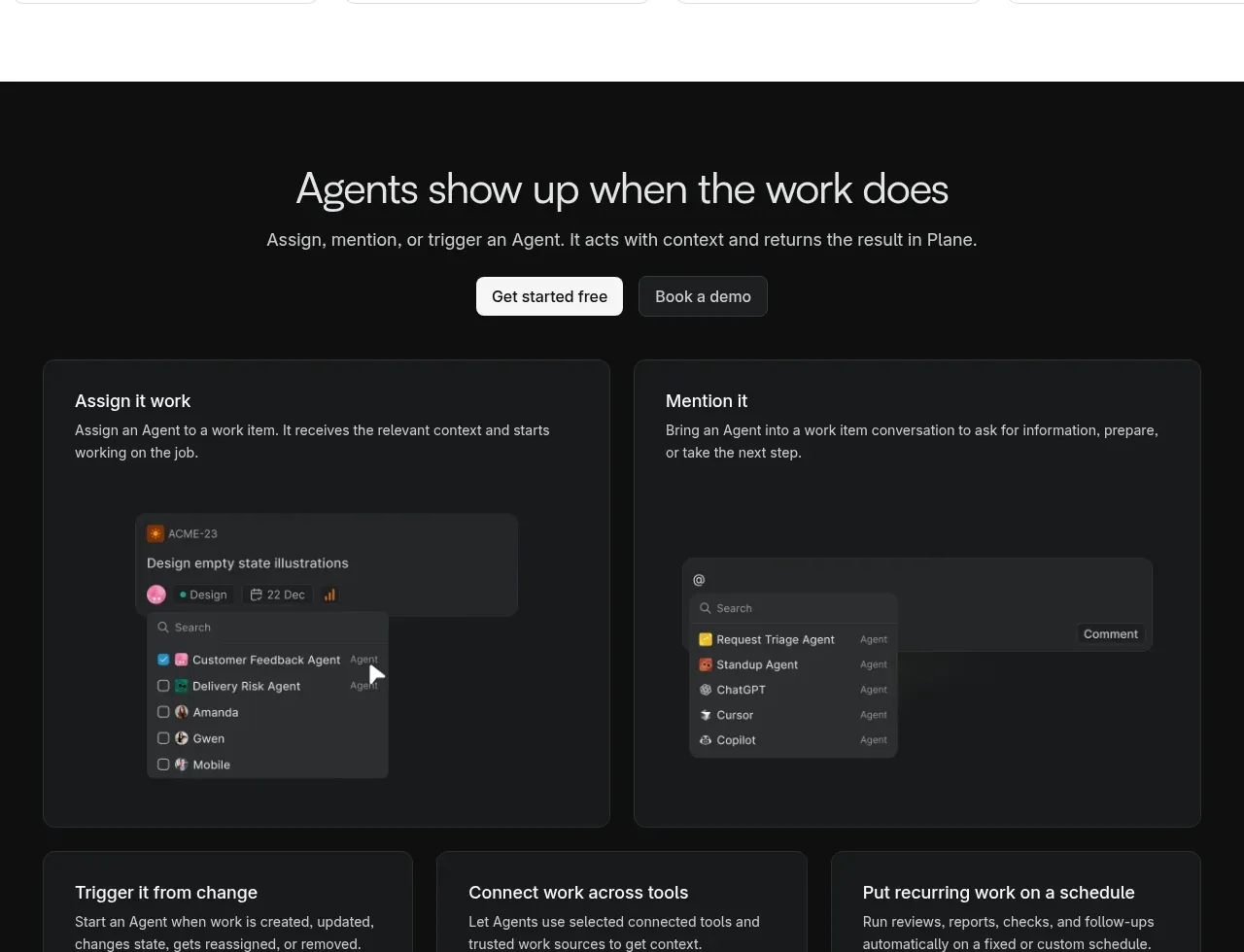 Dark agent activation section
Plane Agents · Call to action
Dark agent activation section
Plane Agents · Call to action
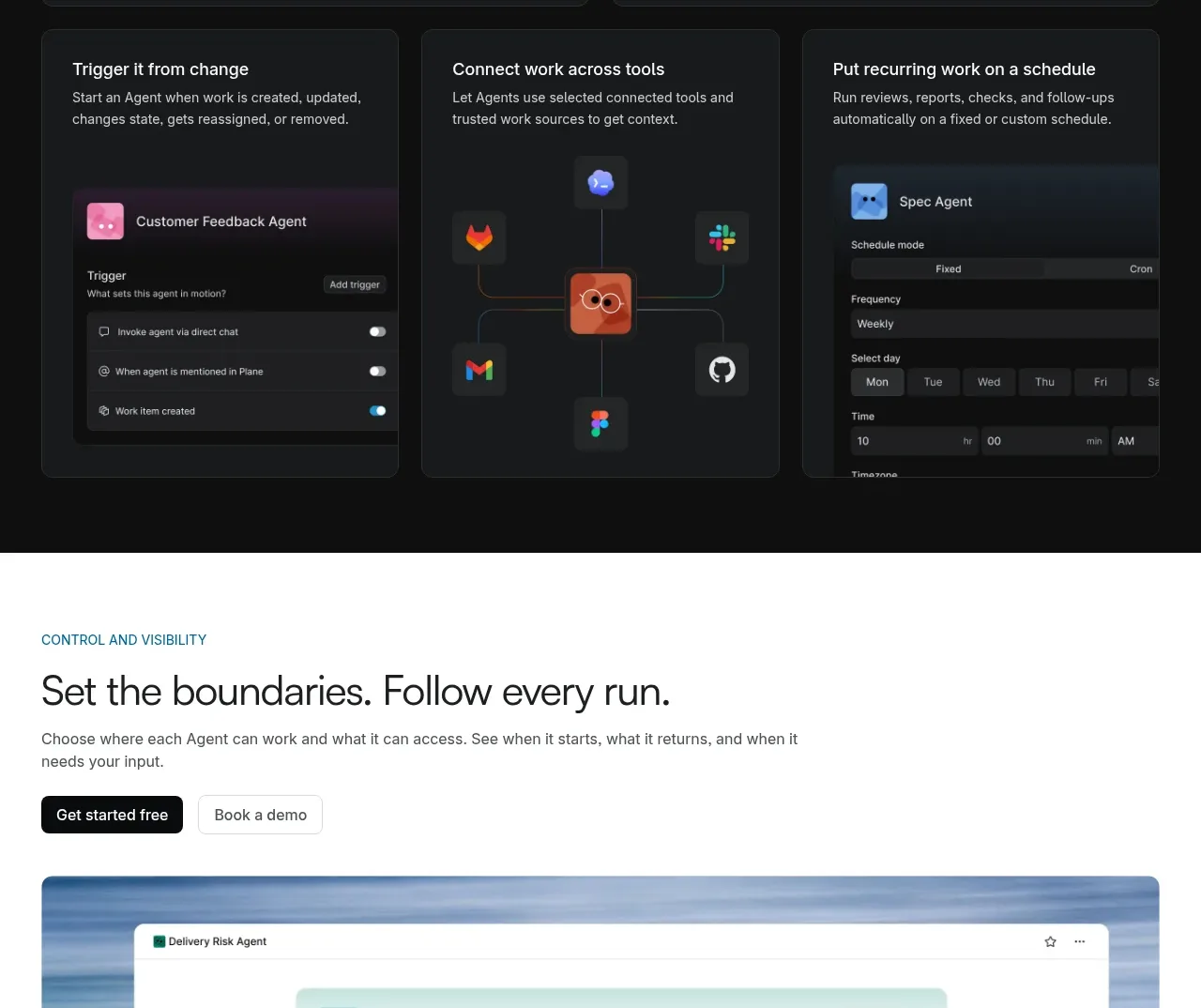 Controls and visibility
Plane Agents · Feature grid
Controls and visibility
Plane Agents · Feature grid
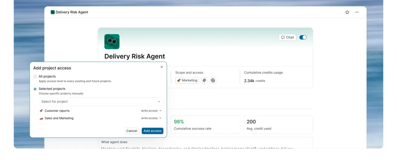 Final conversion banner
Plane Agents · Call to action
Final conversion banner
Plane Agents · Call to action
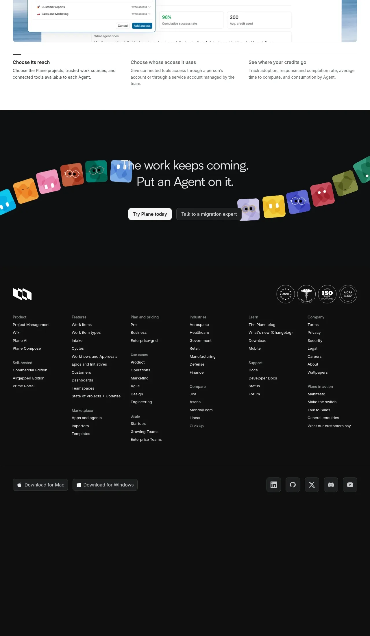 Multi-column site footer
Plane Agents · Footer
Multi-column site footer
Plane Agents · Footer