kage
kage
postsider.com

Design analysis
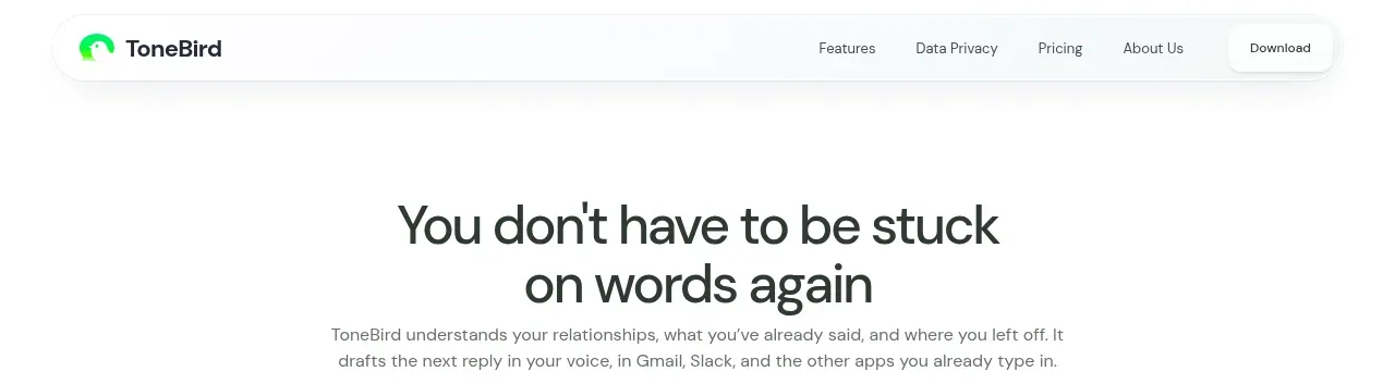
A compact white header establishes the product mark, centered documentation links, and two contrasting account actions without competing with the hero.
Prompt preview
## Reference images

Study these alongside the description below: hierarchy, rhythm, spacing, colour. Build for the product you are asked about, using this design language.

- Component: https://kage-design-assets.t3.tigrisfiles.io/components/postsider/9db522ee-ab56-4492-bd61-aeca6aa2f318-1790057106-0.webp
- Full page it was cut from: https://kage-design-assets.t3.tigrisfiles.io/screenshots/postsider/9db522ee-ab56-4492-bd61-aeca6aa2f318-1790056967277-full.webp
- Component on Kage: https://kage.design/component/postsider-navigation

## Before you start
Ask what the user's product is, who it serves, and what its brand voice and colors are. Apply the following principles to that product rather than reproducing the reference.

Build a minimal SaaS navigation bar. Use a full-width white surface, a thin accent rule at the top, and a constrained inner row with the brand lockup at left, four low-emphasis text links near the center, and a small login link plus dark pill CTA at right. Keep the row approximately 52px tall, with generous horizontal padding and vertically centered controls. Use a clean grotesk sans-serif, 11–13px navigation text, semibold brand text, and a black #090909 primary button with white text. Use subtle hover color changes, a compact mobile menu, and an accessible focus ring. Avoid heavy borders; use whitespace and alignment to create hierarchy.

Never: use logos, product names, copy, illustrations, or imagery from the reference.