kage
kage

Design analysis
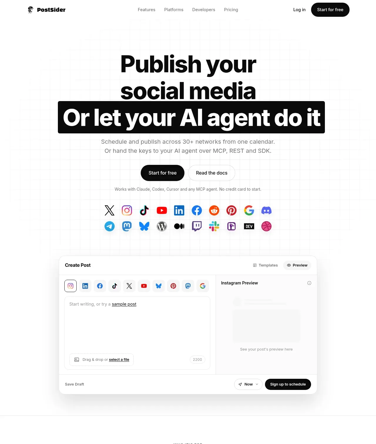
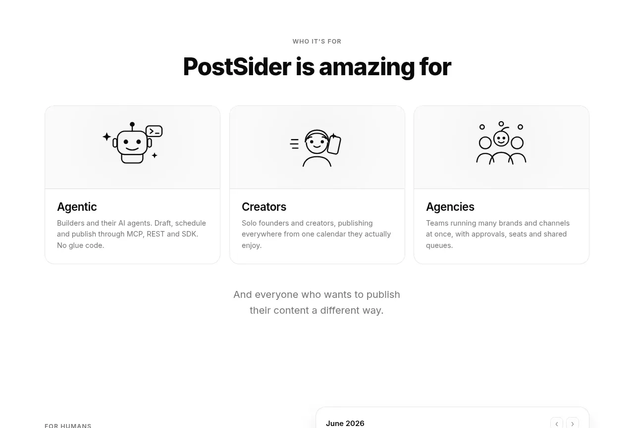
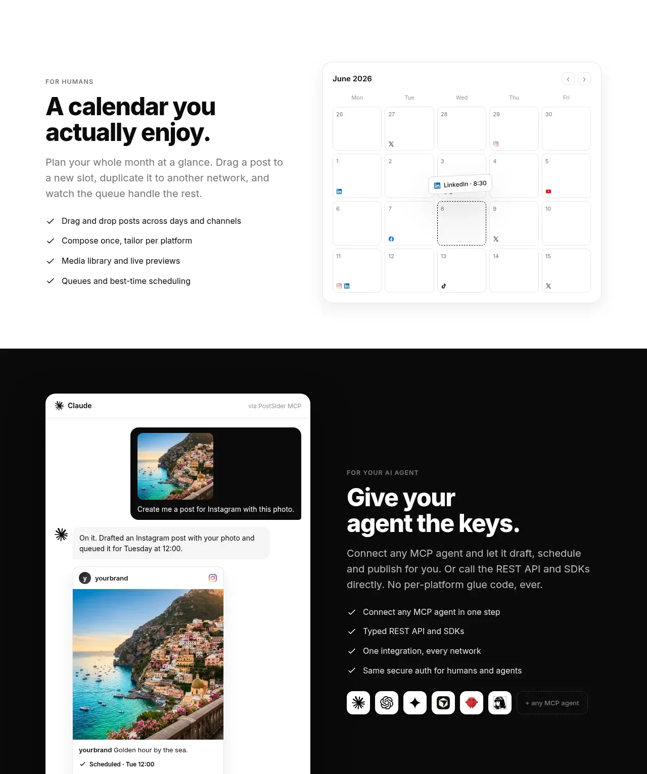
A long monochrome landing page where hierarchy is carried entirely by type weight, surface shifts and grayscale depth — the only saturated colour comes from third-party social network icons. The hero sets a huge tight-tracking grotesque headline with a white-on-black highlighted line, then drops into a realistic composer UI mock. Down the page the rhythm keeps changing: three line-illustrated persona cards, a text-plus-calendar split, a full-bleed black band telling the agent story with a chat mock, a five-stat strip, a bento feature grid, numbered steps, a dense icon wall, a security split with a 2×2 mini-card grid, four pricing columns where the popular plan is inverted to black, an FAQ accordion paired with a left-aligned heading, a personal founder note, six free-tool cards, three grayscale blog teasers and a final CTA panel with a manga-style illustration.
Prompt preview
## Reference images

Study these alongside the description below: hierarchy, rhythm, spacing, colour. Build for the product you are asked about, using this design language.

- Full page: https://kage-design-assets.t3.tigrisfiles.io/screenshots/postsider/9db522ee-ab56-4492-bd61-aeca6aa2f318-1790056967277-full.webp
- Above the fold: https://kage-design-assets.t3.tigrisfiles.io/screenshots/postsider/9db522ee-ab56-4492-bd61-aeca6aa2f318-1790056963900.webp
- Design on Kage: https://kage.design/designs/postsider-landing-page

# Design language brief

## Before you start
Ask the user what they are building, who it is for, and what brand assets they already have (product name, logo, colours, typeface). Wait for the answers. Everything below is applied to *their* product and brand — this brief describes a design language, not a page to clone.

## Page structure
Build a single long marketing page in this order:

1. **Navbar** — slim top bar: wordmark left, 4–5 text links centre, "Log in" text link and one black pill CTA right.
2. **Hero** — centred. Two-line display headline where the second line sits inside a black highlighted block (white text on black, full-bleed-ish padding). One short two-line subcopy paragraph in grey, then two CTAs: solid black pill + thin-outlined secondary pill. A one-line reassurance in small grey type below.
3. **Network logo strip** — two compact rows of small colourful third-party icons, centred, introducing the integrations.
4. **Hero product mock** — one large floating app screenshot (a composer/editor card) with a thin border, rounded corners and a soft shadow; a main panel plus a secondary preview panel inside it. This grounds the promise in a real UI.
5. **Persona section** — small uppercase eyebrow, centred heading, then three equal cards each with a small line-drawn spot illustration, bold card title and two-line grey description. Close with a short centred "and everyone else" line.
6. **"For humans" split** — eyebrow + big left-aligned heading and copy on the left with a tick list; a realistic calendar UI mock on the right showing a month grid with small event chips.
7. **Dark agent band (full-bleed black)** — left: a chat/AI-assistant mock card showing a conversation that ends in a scheduled post; right: eyebrow, heading, grey copy, white-on-black tick list, and a row of small circular agent logos. This is the page's one full-bleed inversion.
8. **Stats strip** — light grey full-width band, five columns, each a large bold figure plus two small grey caption lines.
9. **Feature bento** — centred eyebrow + heading + subcopy, then a bento grid: one wide card containing an inline UI mock (a week strip with time chips), two stacked cards beside it, then a row of three smaller icon cards below.
10. **How it works** — centred heading, then three equal columns with oversized "01 / 02 / 03" numerals, bold titles and short grey copy.
11. **Platforms wall** — centred heading + subcopy, then a dense centred grid of 25–30 colourful network icons with a "+ more" tail.
12. **Security split** — eyebrow + heading + copy left; right side a 2×2 grid of small bordered cards, each a bold mini-title and one grey line.
13. **Pricing** — centred eyebrow + heading + one-line subcopy, then four pricing columns: name, one-line audience, large price with /mo, pill CTA, and a long tick list. The "most popular" plan is a black card with white text, slightly taller, with a small badge on its top edge. Footnote line below.
14. **Switching/comparison section** — eyebrow + big heading + two-line copy, then three bordered cards each with a bold title, grey line and "Read the breakdown →" link.
15. **FAQ** — heading on the left, accordion on the right: ~10 rows, one grey line each, thin divider rules, "+" icons.
16. **Founder note** — eyebrow, big heading "One person. No support maze."-style statement, small circular avatar, first-person paragraph, and three inline text links.
17. **Free tools** — eyebrow + centred heading + subcopy, six small bordered cards in a 3×2 grid (title + one grey line each), one "browse all →" link.
18. **Blog teasers** — eyebrow + centred heading, three cards with a grayscale thumbnail, category label, date and title, plus a "read more →" link.
19. **Final CTA panel** — large rounded light-grey panel: big left-aligned headline, two-line copy, black pill CTA and a small-print line; a black-and-white illustration filling the right side.
20. **Footer** — wordmark + tagline + social icons left; four link columns (Product / Developers / Company / Legal); thin bottom bar with © line and small legal links.

## Design language
- **Palette**: near-total monochrome. Background `#ffffff`, text `#111111`, secondary text `#6b7280`, hairline borders `#e5e5e5`, light surfaces `#f5f5f5`, black surfaces `#0a0a0a`. Reserve colour exclusively for third-party logos/icons; never introduce a brand accent colour for buttons or headings.
- **Hierarchy by weight, not colour**: eyebrows are 11–12px uppercase with wide tracking in grey; section headings 40–48px bold; hero 64–80px extra-bold with tight leading (−2% tracking). Body 16–18px in grey at ~1.6 line-height. One type family throughout; contrast comes from weight and size only.
- **The highlighted line**: use exactly one display device — a line of white text on a black block — in the hero. Echo it only in the pricing "popular" card and the dark band so inversion always signals importance.
- **Rhythm down the page**: alternate centred statement sections with left-aligned split sections; alternate white surfaces, light-grey surfaces and one full-bleed black band so no two adjacent sections share the same layout. Section padding is generous (~110–130px vertical); card grids are tight (~16–24px gaps) for a dense-but-airy feel.
- **Cards**: white or `#f7f7f7` surfaces, 1px `#e5e5e5` borders, 12–16px radius, no shadows — except the hero product mock, which may carry one soft wide shadow to float.
- **Buttons**: pills (999px radius). Primary = solid black with white text; secondary = white with 1px grey border. Never gradient or coloured buttons.
- **Ticks and steps**: checklists use small ✓ marks in black; step numerals are oversized light-black figures ("01") above the title, not inside badges.
- **UI mocks**: build product mockups in HTML/CSS, not images — 13–14px UI text, realistic micro-copy, small coloured status chips, inside a bordered rounded card so they read as real software.
- **Illustration**: black line-art spot illustrations on white, and optionally one black-and-white illustration in the final CTA. Keep them monochrome so they never compete with the logo wall.
- **Motion**: minimal — subtle hover lift/border-darken on cards, underline on text links, gentle fade-up on section entry. Nothing bouncy.

## Never
- Do not use the reference product's name, wordmark, copy, tagline, FAQ wording or pricing numbers.
- Do not reuse its line-drawn robot/person illustrations or the manga-style character.
- Do not present the result as PostSider or imply affiliation with the social networks whose icons appear; only show integration logos the user's product actually supports.
Components from this page
All components
 Minimal product navigation
PostSider · Navigation
Minimal product navigation
PostSider · Navigation
 AI-assisted publishing hero
PostSider · Hero
AI-assisted publishing hero
PostSider · Hero
 Audience fit cards
PostSider · Feature grid
Audience fit cards
PostSider · Feature grid
 Calendar and unified workspace
PostSider · Feature grid
Calendar and unified workspace
PostSider · Feature grid
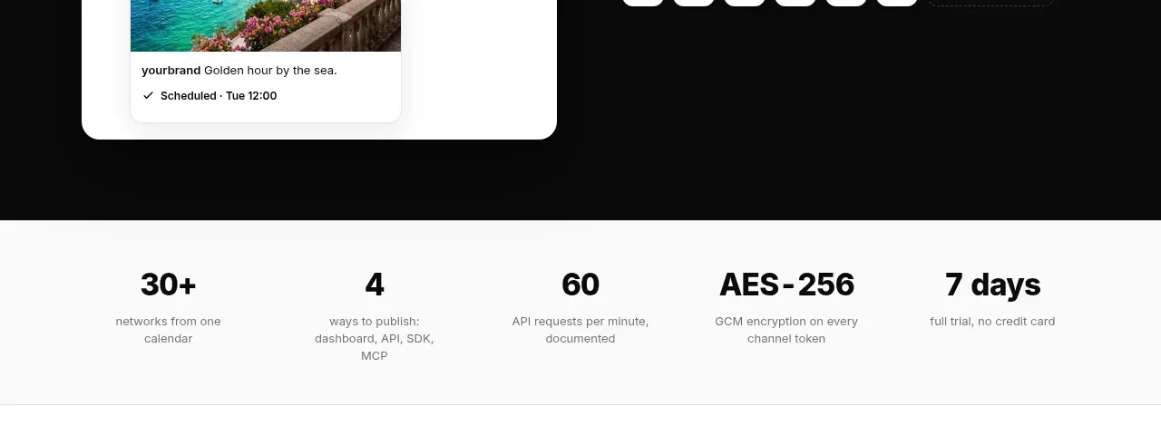 Proof points strip
PostSider · Stats
Proof points strip
PostSider · Stats
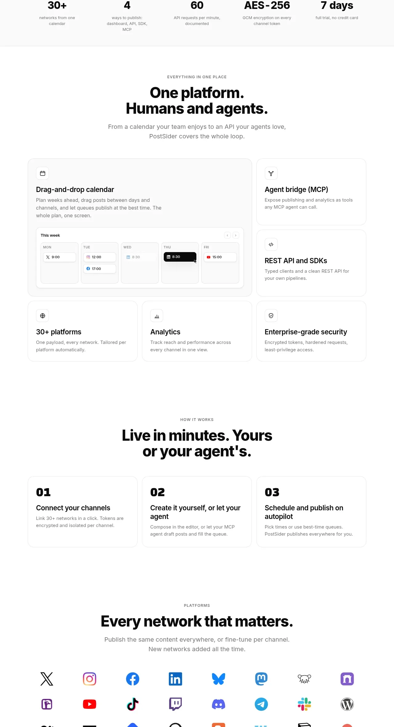 Platform capabilities and workflow
PostSider · Feature grid
Platform capabilities and workflow
PostSider · Feature grid
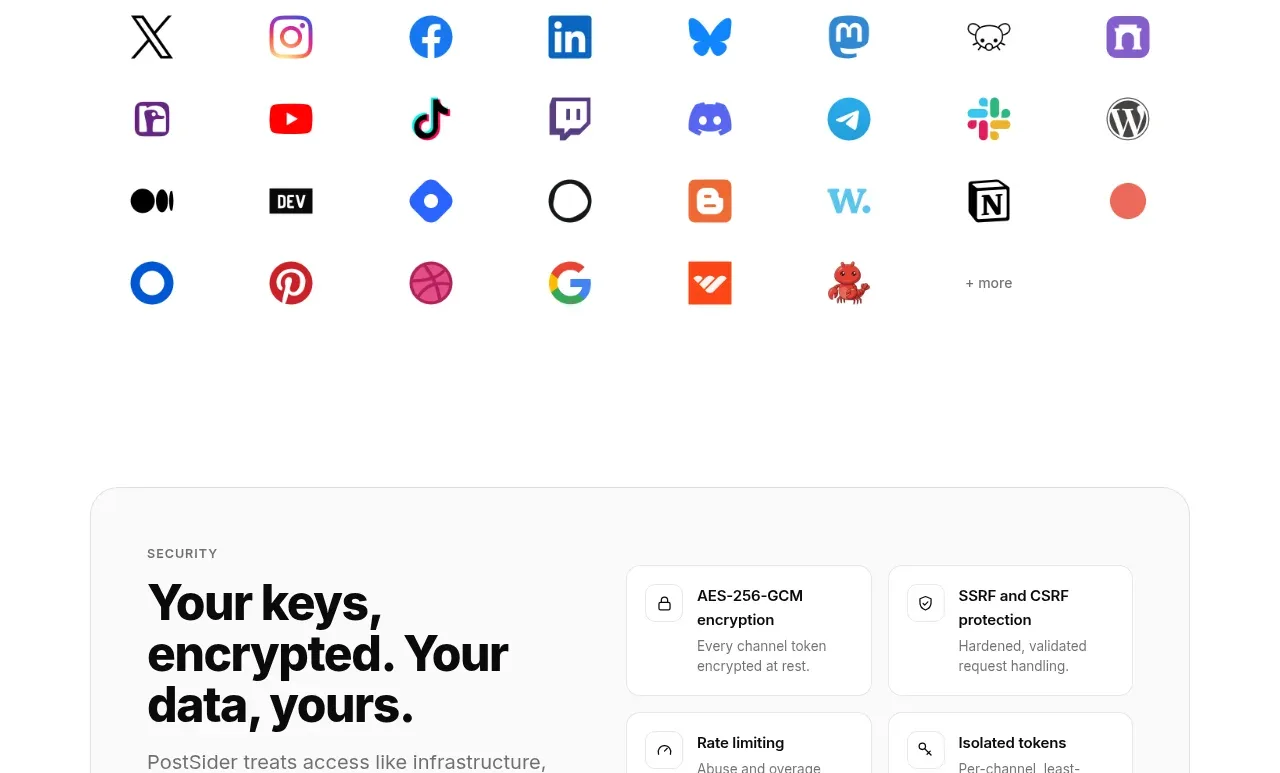 Supported platforms grid
PostSider · Logo cloud
Supported platforms grid
PostSider · Logo cloud
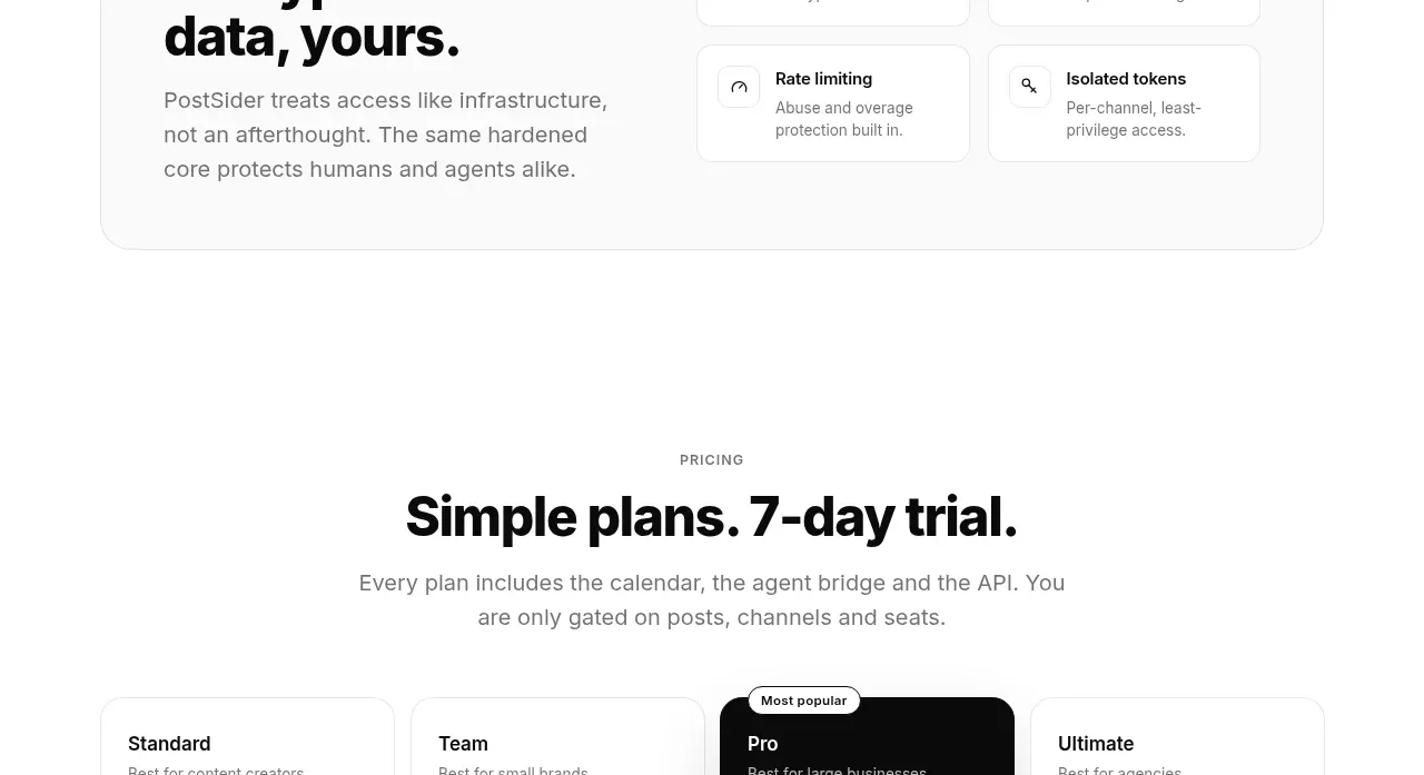 Security promise card
PostSider · Card
Security promise card
PostSider · Card
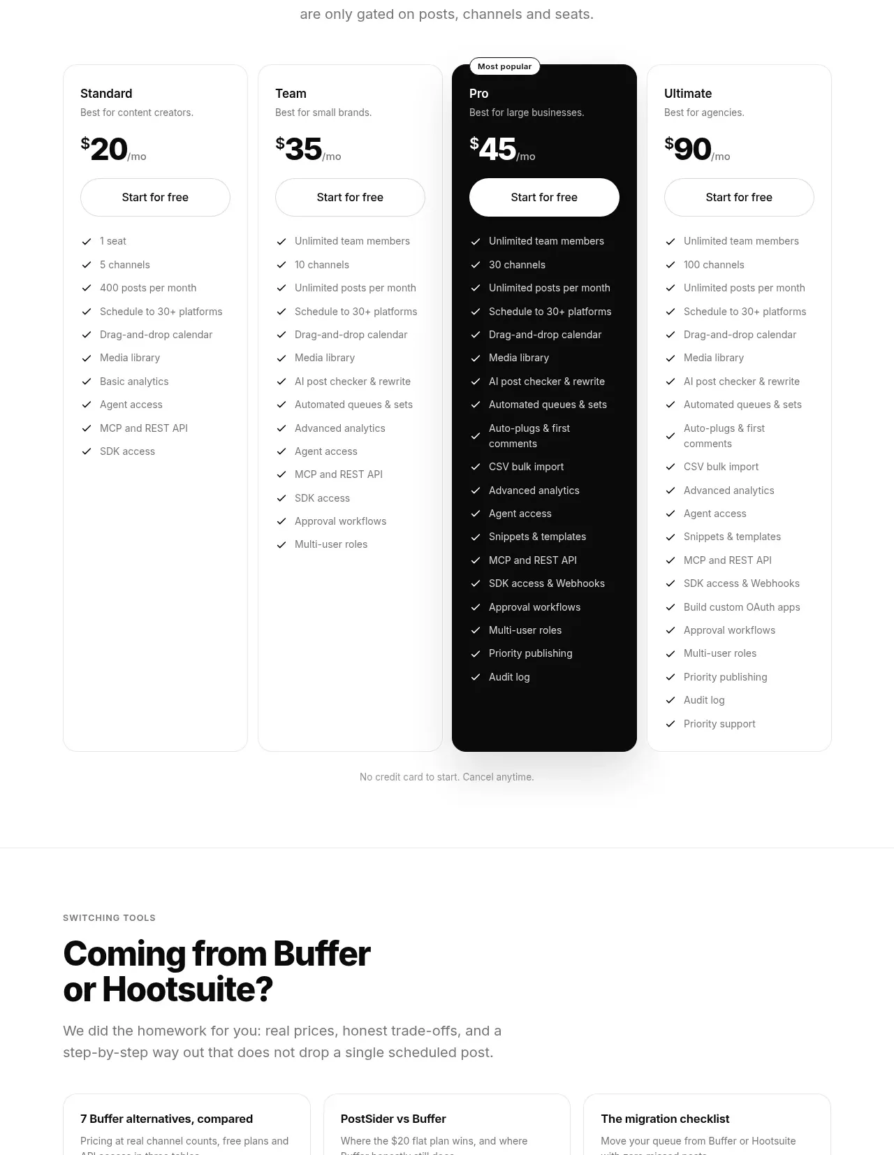 Four-tier pricing comparison
PostSider · Pricing table
Four-tier pricing comparison
PostSider · Pricing table
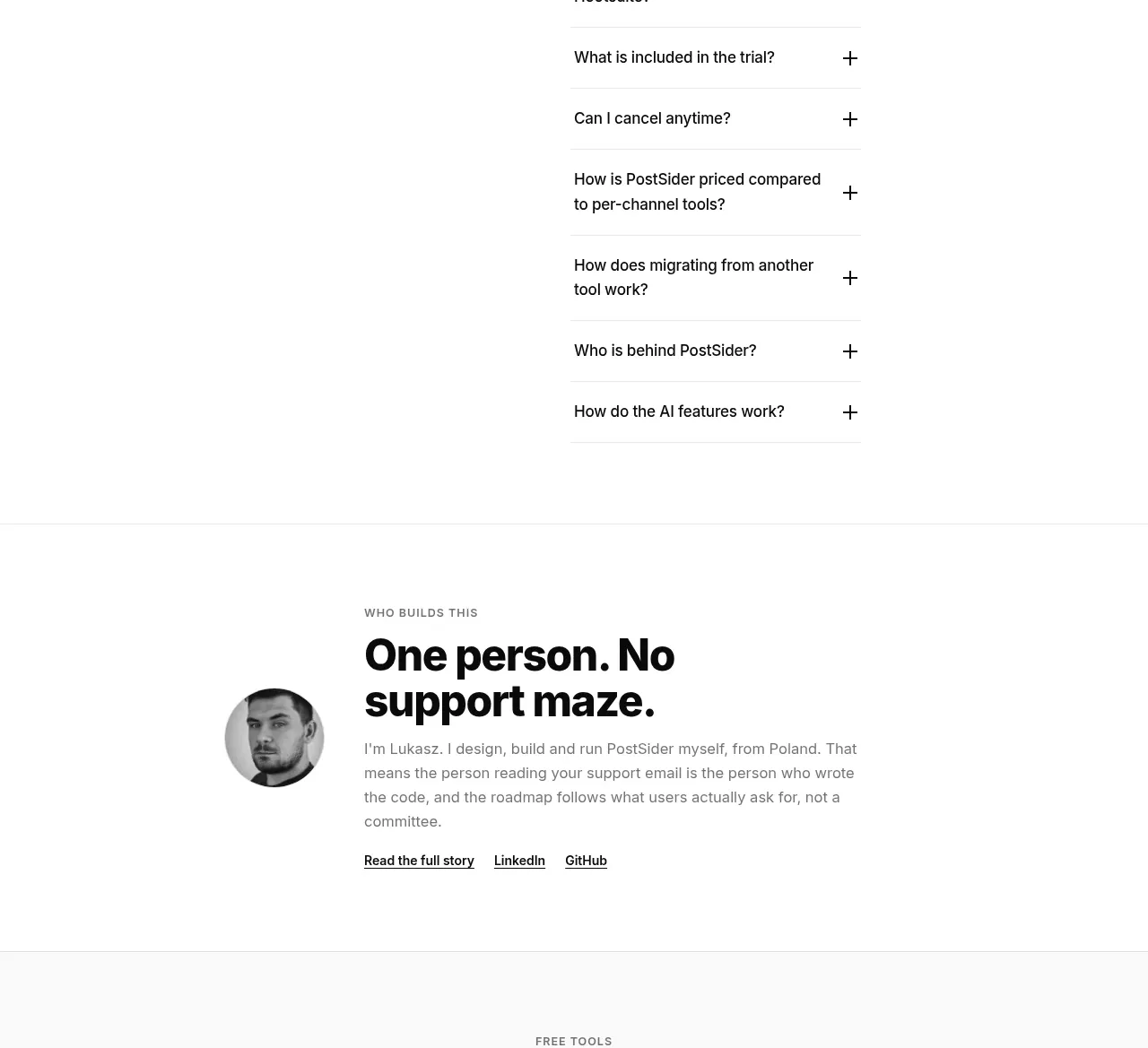 FAQ accordion
PostSider · FAQ
FAQ accordion
PostSider · FAQ
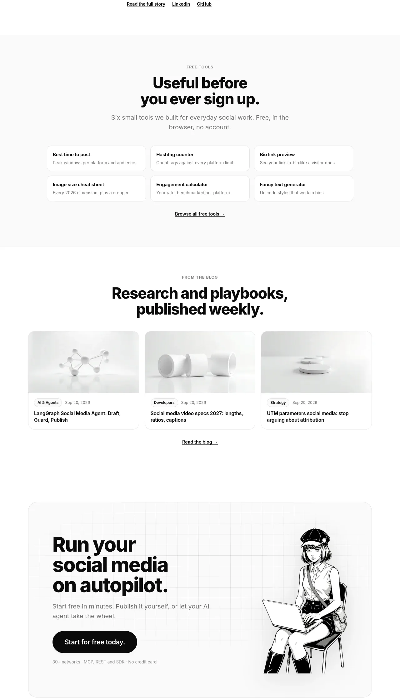 Resources and editorial cards
PostSider · Gallery
Resources and editorial cards
PostSider · Gallery
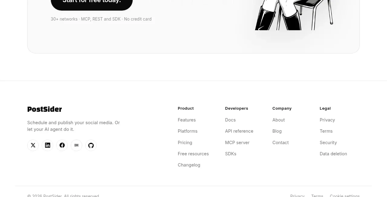 Final conversion panel
PostSider · Call to action
Final conversion panel
PostSider · Call to action