 kage
kage
resurf.so

Design analysis
A slim, airy navigation bar keeps secondary links centered and makes the primary download action easy to spot at the far right.
Prompt preview
## Reference images

Study these alongside the description below: hierarchy, rhythm, spacing, colour. Build for the product you are asked about, using this design language.

- Component: https://kage-design-assets.t3.tigrisfiles.io/components/resurf/ff64fde5-ed9d-4c90-b5a1-3641329afaa7-1789365706-0.webp
- Full page it was cut from: https://kage-design-assets.t3.tigrisfiles.io/screenshots/resurf/ff64fde5-ed9d-4c90-b5a1-3641329afaa7-1789365667481-full.webp
- Component on Kage: https://kage.design/component/resurf-navigation

## Before you start
Ask what the user's product is, who it serves, and what its brand personality and primary conversion action should be. Apply the principles below to that product rather than reproducing the reference.

Build a slim desktop navigation bar for a calm, premium software landing page. Use a centered row of low-emphasis text links, generous horizontal spacing, and one compact filled button aligned to the right for the primary action. Keep the brand mark small and anchored at the left. Use a warm near-white background (`#fafafa`), charcoal text (`#202020`), muted secondary text (`#767676`), and a subtle bottom edge only if needed. Use a restrained sans-serif at 12–14px, medium weight for the button, 8px radius, and 16–24px horizontal padding. Keep the bar around 40–56px tall and make it sticky only if that helps the product. On mobile, collapse links into a menu while preserving the primary action.

### Never
- Never use logos, product names, copy, illustrations, or imagery from the reference.
- Never overcrowd the header with navigation items.
- Never make the secondary links compete visually with the primary action.
More components

 Minimal utility navigation
kinetics.colorion.co · Navigation
Minimal utility navigation
kinetics.colorion.co · Navigation

 Global navigation bar
SHIUI · Navigation
Global navigation bar
SHIUI · Navigation

 Announcement bar and navigation
Neopress · Navigation
Announcement bar and navigation
Neopress · Navigation

 Floating site navigation
Epilude Notetaker · Navigation
Floating site navigation
Epilude Notetaker · Navigation
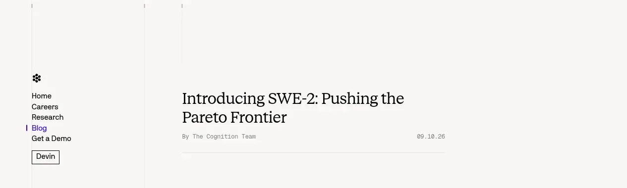
 Minimal article navigation
Cognition's SWE-2 · Navigation
Minimal article navigation
Cognition's SWE-2 · Navigation

 Announcement bar and primary navigation
DockFix 5.0 · Navigation
Announcement bar and primary navigation
DockFix 5.0 · Navigation