kage
kage
Design analysis
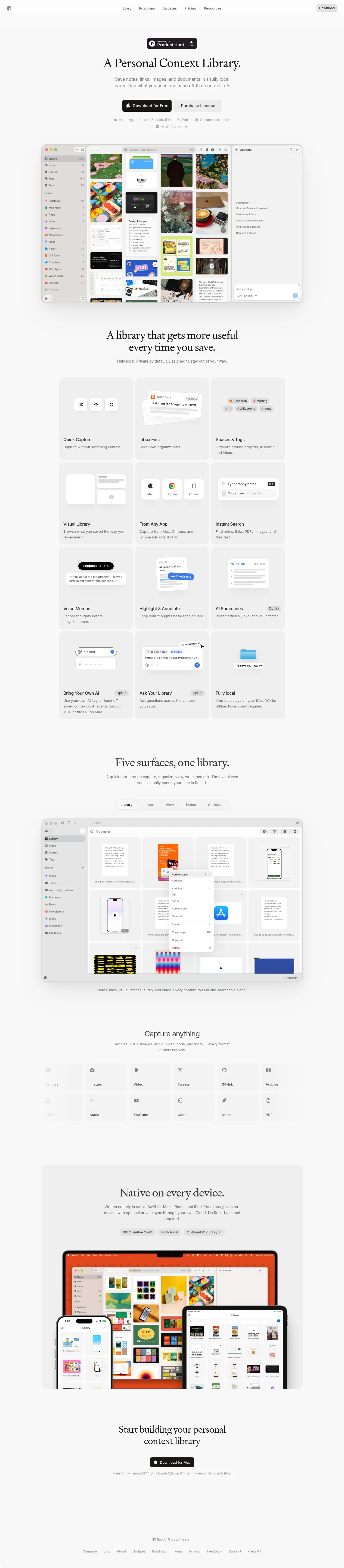
An editorial-minimal landing page where hierarchy comes almost entirely from type: oversized serif display headlines sit above tiny gray sans-serif body copy on a warm off-white canvas, while all UI chrome (nav, buttons, cards, footer) stays monochrome so the only colour arrives inside the product screenshots. The page builds rhythm by alternating centred headline blocks with large framed visuals: hero → full-width Mac window screenshot → a 3×4 bento of feature tiles, each with a miniature white UI mockup and a one-line description → a tabbed product tour with a segmented control → an icon grid of supported formats → an overlapping desktop/phone/tablet collage → a centred CTA and a whisper-quiet footer. Pill buttons, 16px tile radii, flat tonal fills instead of borders, and small 'Opt-in' meta badges keep everything calm and native-Mac feeling.
Prompt preview
## Reference images

Study these alongside the description below: hierarchy, rhythm, spacing, colour. Build for the product you are asked about, using this design language.

- Full page: https://kage-design-assets.t3.tigrisfiles.io/screenshots/resurf/ff64fde5-ed9d-4c90-b5a1-3641329afaa7-1789365667481-full.webp
- Above the fold: https://kage-design-assets.t3.tigrisfiles.io/screenshots/resurf/ff64fde5-ed9d-4c90-b5a1-3641329afaa7-1789365665919.webp
- Design on Kage: https://kage.design/designs/resurf-landing-page

## Before you start
Ask the user what they are building, who it is for, and what brand assets they already have (product name, brand colours, typefaces, logo files). Wait for the answers before writing any code. Everything below is a design language to apply to *their* product — never to the reference site.

## Page structure
1. **Top nav** — slim bar: small circular logo far left, a centred cluster of 4–5 plain text links, and a dark pill CTA button far right. No borders; the bar blends into the background.
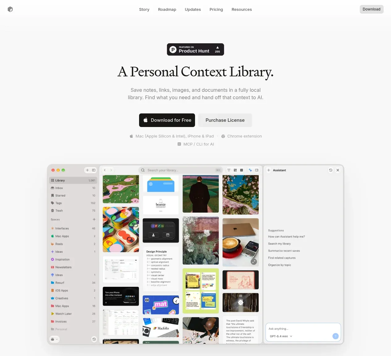
2. **Hero** — centred column: a small black social-proof badge pill at top, then a serif display headline, then a 2-line muted subtext, then two pill buttons side by side (solid black primary + tonal secondary), then a single quiet line of platform availability with tiny inline icons.
3. **Hero screenshot** — a full-width app screenshot framed as a rounded Mac window (traffic lights, sidebar, content grid, side panel), floating on the background with a soft wide shadow. This is the hero's payoff.
4. **Feature intro** — centred serif headline with a one-line subtext; no visual, just a breath before the grid.
5. **Feature bento** — 3-column × 4-row grid (2 columns on tablet, 1 on mobile) of light tonal tiles. Each tile: a miniature abstract UI mockup (key caps, tag chips, search bar, waveform pill, chat bubble, folder icon) floating in the upper half, then a small semibold title and a one-line gray description. Mark AI-related tiles with a small muted "Opt-in" pill.
6. **Product tour** — centred serif headline + subtext, then a segmented tab control (5 tabs, white active pill on a light track), then a large framed screenshot that changes with the active tab, and a one-line caption beneath.
7. **Formats grid** — centred headline + subtext, then a grid of small square tonal tiles, each a thin-line icon plus one label for a supported content format.
8. **Cross-device section** — centred serif headline, 2-line subtext, three small stat/claim pills in a row, then an overlapping device collage (large desktop behind, phone and tablet in front at the bottom corners), cropped by the section's bottom edge.
9. **Final CTA** — centred serif headline over a solid black pill CTA and a one-line system-requirements footnote in gray.
10. **Footer** — centred tiny logo + copyright line, then one row of small gray text links.

## Design language
- **Hierarchy by type, not colour.** Serif display headlines at ~56–72px with tight tracking carry all emphasis; everything else is a small system sans (13–15px). Body copy is mid-gray and short — never more than two lines.
- **Warm monochrome canvas.** Background ≈ `#F5F4F1`, tiles/cards ≈ `#ECEBE8` (one step darker, flat fill, no borders), text near-black ≈ `#1A1A18`, muted gray ≈ `#8A8880`, primary CTA solid black `#111111` with white text. All chrome is monochrome; colour appears only inside screenshots, device mockups, or the user's brand assets.
- **Rhythm down the page.** Every section is a centred single column (~1040–1120px max width) with generous 120–160px vertical padding, alternating headline-block → visual. Density peaks in the bento grid and formats grid, then relaxes at the final CTA and footer.
- **Cards and windows.** Tiles use 16–20px radius with flat tonal fills instead of borders; framed app screenshots use ~12px window radius, hairline chrome, and soft wide shadows (`0 20px 60px rgba(0,0,0,0.08)`) so they appear to float.
- **Buttons and badges.** Everything is a full pill (radius 999). Primary = black/white text; secondary = one shade darker than the background. Meta badges ("Opt-in", stat pills) are 11–13px, muted fills, medium weight.
- **Illustration style.** Feature-tile mockups are tiny abstract UI fragments — white surfaces, 4–8px radii, thin-line monochrome icons, fake text as light gray bars — never real logos or real copy.
- **Tabs and grids.** Segmented controls use a light track with a white active pill; icon/format grids use equal square tiles with consistent 12–16px gaps.
- **Motion.** Restrained: 150–200ms ease transitions, tiles lift or darken slightly on hover, no parallax or heavy scroll effects.

## Never
- Do not use the reference's product name, tagline, copy, logo, Product Hunt badge, or any of its screenshots' content (sidebar labels, saved-image masonry, chat text).
- Do not reproduce its illustrations, icon set, or real third-party app icons; build abstract placeholders and the user's own screenshots instead.
- Never present the result as the reference product — it is the user's product wearing this design language.
Components from this page
All components
 Minimal product navigation
Resurf · Navigation
Minimal product navigation
Resurf · Navigation
 Product introduction with interface preview
Resurf · Hero
Product introduction with interface preview
Resurf · Hero
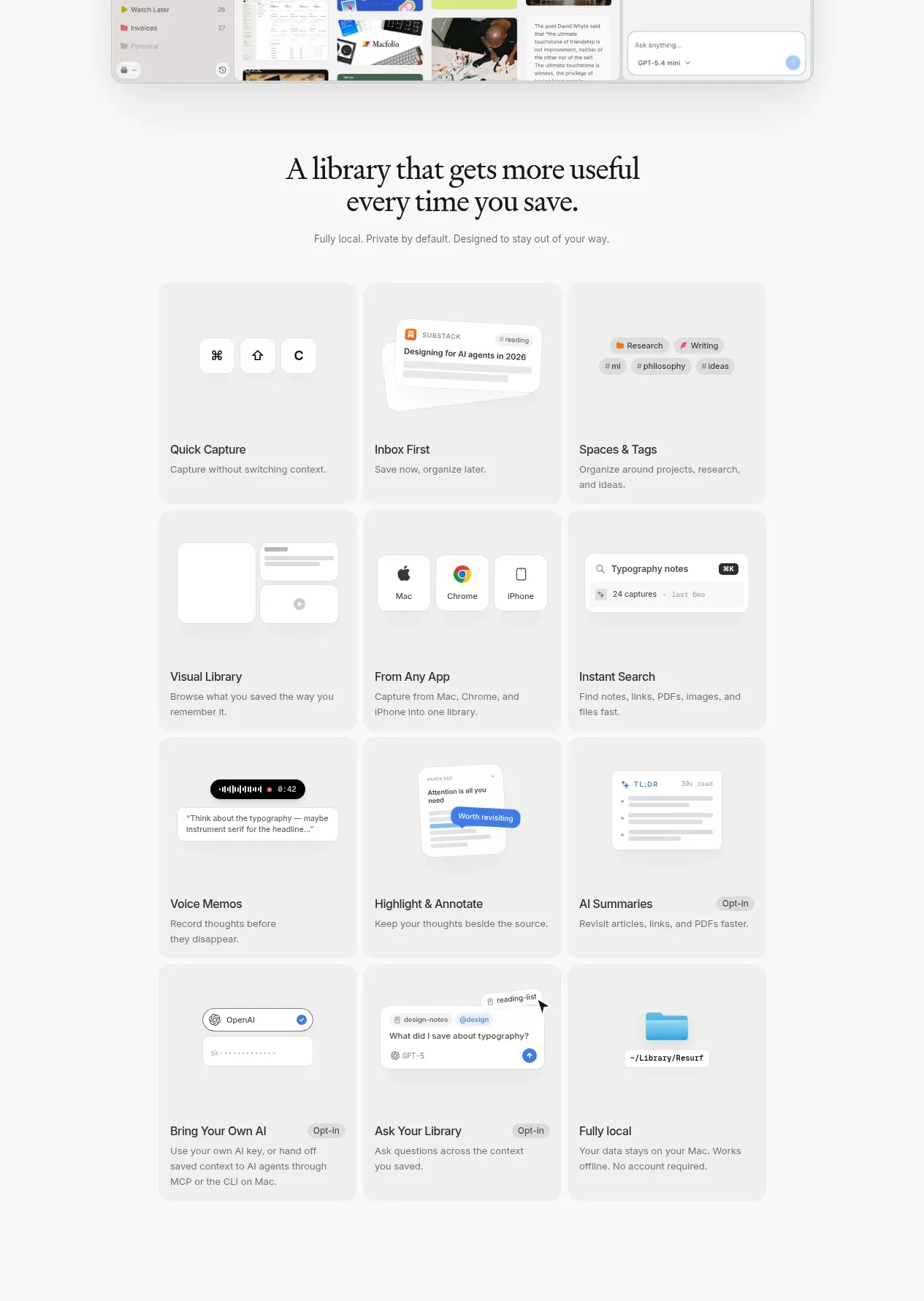 Core capabilities grid
Resurf · Feature grid
Core capabilities grid
Resurf · Feature grid
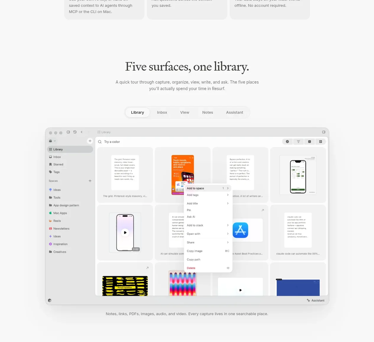 Product surfaces walkthrough
Resurf · Tabs & steps
Product surfaces walkthrough
Resurf · Tabs & steps
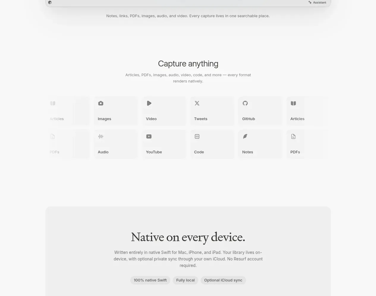 Capture format matrix
Resurf · Feature grid
Capture format matrix
Resurf · Feature grid
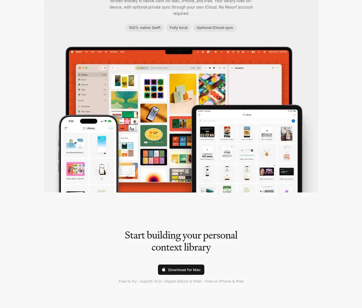 Cross-device platform panel
Resurf · Card
Cross-device platform panel
Resurf · Card
 Download conversion prompt
Resurf · Call to action
Download conversion prompt
Resurf · Call to action
 Utility footer
Resurf · Footer
Utility footer
Resurf · Footer