 kage
kage
shi-ui.vercel.app

Design analysis
A restrained, thin editorial header establishes the monochrome system, brand mark, catalogue links, and a few compact utility actions without competing with the content.
Prompt preview
## Reference images

Study these alongside the description below: hierarchy, rhythm, spacing, colour. Build for the product you are asked about, using this design language.

- Component: https://kage-design-assets.t3.tigrisfiles.io/components/shiui/3111a107-5e9b-4487-9176-525a4b4c448a-1789365763-0.webp
- Full page it was cut from: https://kage-design-assets.t3.tigrisfiles.io/screenshots/shiui/3111a107-5e9b-4487-9176-525a4b4c448a-1789365716423-full.webp
- Component on Kage: https://kage.design/component/shiui-navigation

## Before you start
Ask what the user's product and brand are, then apply the principles below to their context rather than reproducing this reference.

Build a thin global navigation for a design-system or product catalogue. Use a warm off-white background, hairline gray borders, a small brand lockup at left, compact uppercase navigation links, and right-aligned utility buttons. Keep the header around 56–64px tall, use a narrow sans-serif at 9–11px with generous letter spacing, and make the active/action button dark charcoal with a subtle squared radius. Align everything to the same centered content grid used by the page. Add clear hover/focus states and a responsive collapse for narrow screens.

Never: use logos, product names, copy, illustrations or imagery from the reference.
More components

 Minimal utility navigation
kinetics.colorion.co · Navigation
Minimal utility navigation
kinetics.colorion.co · Navigation

 Announcement bar and navigation
Neopress · Navigation
Announcement bar and navigation
Neopress · Navigation

 Floating site navigation
Epilude Notetaker · Navigation
Floating site navigation
Epilude Notetaker · Navigation
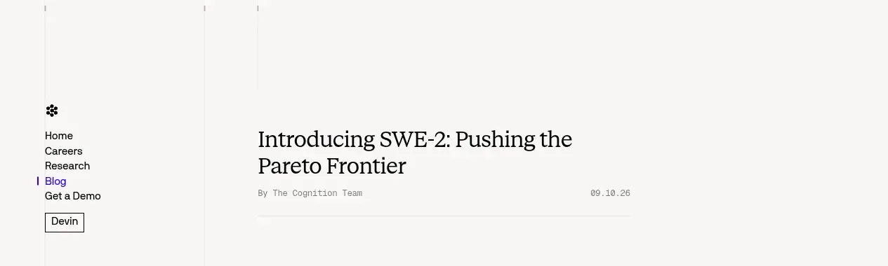
 Minimal article navigation
Cognition's SWE-2 · Navigation
Minimal article navigation
Cognition's SWE-2 · Navigation

 Minimal product navigation
Resurf · Navigation
Minimal product navigation
Resurf · Navigation

 Announcement bar and primary navigation
DockFix 5.0 · Navigation
Announcement bar and primary navigation
DockFix 5.0 · Navigation