 kage
kage
shi-ui.vercel.app

Design analysis
A long-form component catalogue uses an off-white paper ground, hairline gray rules, condensed uppercase metadata, and a restrained vermilion accent to evoke a printed Japanese editorial system. The page moves from a framed hero and token swatches into increasingly dense two-column specimen grids: buttons and tags, forms, navigation, feedback, data, overlays, cards, marks, and charts, with each specimen boxed, labeled, and annotated for reuse.
Prompt preview
## Reference images

Study these alongside the description below: hierarchy, rhythm, spacing, colour. Build for the product you are asked about, using this design language.

- Full page: https://kage-design-assets.t3.tigrisfiles.io/screenshots/shiui/3111a107-5e9b-4487-9176-525a4b4c448a-1789365716423-full.webp
- Above the fold: https://kage-design-assets.t3.tigrisfiles.io/screenshots/shiui/3111a107-5e9b-4487-9176-525a4b4c448a-1789365713368.webp
- Design on Kage: https://kage.design/designs/shiui-navigation

## Before you start
Ask the user what they are building, who it is for, and which brand assets they already have (name, colours, typography, logo or other type). Wait for their answers before designing. Apply the reference's visual system to their product rather than copying the reference product.

## Page structure
1. **Utility strip and masthead** — Start with a very thin top strip containing a small external badge area, then a compact horizontal header with a vermilion circular mark, tiny wordmark area, uppercase navigation links, and right-aligned utility buttons.
2. **Framed hero and visual sample** — Use a wide, two-column hero inside a ruled container. The left panel has a small eyebrow, oversized editorial serif headline split across three short lines, concise explanatory copy, two compact actions, and three numerical stats; the right panel is a narrow vertical paper specimen with Japanese-style vertical metadata and one large vermilion circle.
3. **Token introduction** — Add a full-width divider and a short numbered section bar introducing the colour tokens. Show three equal token cards for paper, sumi black, and the accent vermilion, each with a large swatch, token name, hex value, and one-line usage note.
4. **Catalogue header** — Introduce the component library with a small red section index, an editorial title such as a numbered element count, and a right-aligned miniature note. Keep the header separated by long horizontal rules.
5. **Buttons and actions** — Present a two-column grid of many equal-height specimen cards. Each card has a tiny identifier and component name in its top rail, copy/import controls at the right, the component centered in a generous demo area, and a small “use” annotation along the bottom. Vary primary vermilion buttons, black buttons, outlined buttons, text links, loading states, checkout bars, and icon-like controls.
6. **Seals, tags and eyebrows** — Continue the same two-column card grid with stamps, badges, labels, circular seals, catalogue eyebrows, price stamps, and small announcement treatments. Mix paper, black, and vermilion treatments while preserving the same card chrome.
7. **Forms and inputs** — Show a denser sequence of input specimens: single-line fields, textareas, selects, checkboxes, radio buttons, toggles, sliders, search, password, upload/drop zone, date fields, quantity controls, email validation, address progress, alerts, and pagination. Keep labels and helper text small and use thin rectangular controls with minimal rounding.
8. **Navigation** — Demonstrate tabs, filter bars, pagination, stepped progress, menus, accordions, breadcrumbs, carousels, vertical captions, and section headers. Keep each pattern isolated in a labeled card and use red only for the active or selected state.
9. **Feedback and state** — Add cards for toasts, notices, shipping banners, progress bars, circular loading, skeleton blocks, empty states, tooltips, ratings, confirmation controls, and view counters. Let black and red feedback blocks interrupt the otherwise pale rhythm.
10. **Data and walls** — Include compact tables, metric panels, quote blocks, profile rows, timelines, FAQ accordions, stock tables, code/token blocks, trend lines, sliders, and event tickets. This section should feel more information-dense while retaining the same component framing.
11. **Overlays** — Show modal and drawer triggers, cart summaries, select menus, tooltip notes, profile cards, unsaved-change dialogs, filter results, command palette, cookie consent, and close controls. Use dark panels sparingly to make overlay layers legible against the paper background.
12. **Cards and promotional patterns** — Present notice cards, flat link cards, pricing cards, testimonial blocks, newsletter signup, coupon strips, poster-like promotional panels, material rows, and copy controls. Give these cards slightly more compositional emphasis but keep their borders and labels consistent.
13. **Marks and motion** — Show the brand-neutral mark system: round seals, line or wave motifs, stamp-like lockups, ticker strips, palette chips, and simple motion/interaction indicators. Keep them as compact specimens rather than a separate marketing section.
14. **Charts and diagrams** — End with larger chart cards in a two-column layout: horizontal comparison bars, a red-accent line chart, a donut or ring chart, and a square-grid heatmap. Use restrained axes and labels, black structure, pale fills, and vermilion highlights.

## Design language
- Build hierarchy through editorial contrast: oversized high-contrast serif display type for the hero, compact grotesk or monospace uppercase metadata for labels, and small readable sans-serif notes for usage guidance.
- Use a warm paper background around `#e9e8e2` or `#eeede7`, near-black sumi surfaces around `#252522`, pale gray rules around `#aaa9a1`, and a single vermilion accent around `#e94b2f`.
- Treat the page as a printed catalogue: broad outer margins, a centered content column, long horizontal rules, numbered section markers, and repeated specimen cards. Change rhythm by moving from spacious hero panels to tight repeated grids, then to denser data and overlay examples, finishing with larger chart compositions.
- Use thin 1px borders almost everywhere. Prefer square or nearly square corners, roughly `0–2px` radius; avoid floating cards, gradients, and soft shadows. Dark blocks should be flat and opaque.
- Keep component cards consistent: a narrow metadata header, a large open demonstration area, and a low annotation footer. Make the copy/import controls quiet, small, and secondary.
- Pair a literary serif display face with a utilitarian condensed sans or monospace for codes, labels, dimensions, and section indexes. Use tight tracking and uppercase microcopy; keep the main headline large with compact line-height.
- Reserve vermilion for primary actions, selected tabs, warning emphasis, small rules, data points, and one high-impact shape at a time. Most surfaces should remain paper, gray, or sumi so the accent stays rare.
- Make interactions feel like physical print controls: crisp state changes, simple borders, short underlines, and immediate colour swaps. Use restrained transitions such as `120–180ms` opacity, border, or background changes; avoid bouncing, glass effects, and elaborate motion.
- Ensure the dense catalogue remains scannable with strong alignment, repeated two-column geometry, stable card heights, and small explanatory “use” notes. On narrow screens, collapse to one column while retaining the section rails and metadata hierarchy.

## Never
- Do not use any SHIUI, Hinomaru, reference-product, or source-site logos, wordmarks, product names, or copy.
- Do not reproduce the reference's exact Japanese marks, artwork, illustrations, icon set, sample labels, or component text.
- Do not present the result as SHIUI or imply affiliation with the reference.
- Do not replace the paper catalogue language with gradients, glossy glass panels, rounded SaaS cards, photography, or decorative imagery.
Components from this page
All components
 Global navigation bar
SHIUI · Navigation
Global navigation bar
SHIUI · Navigation
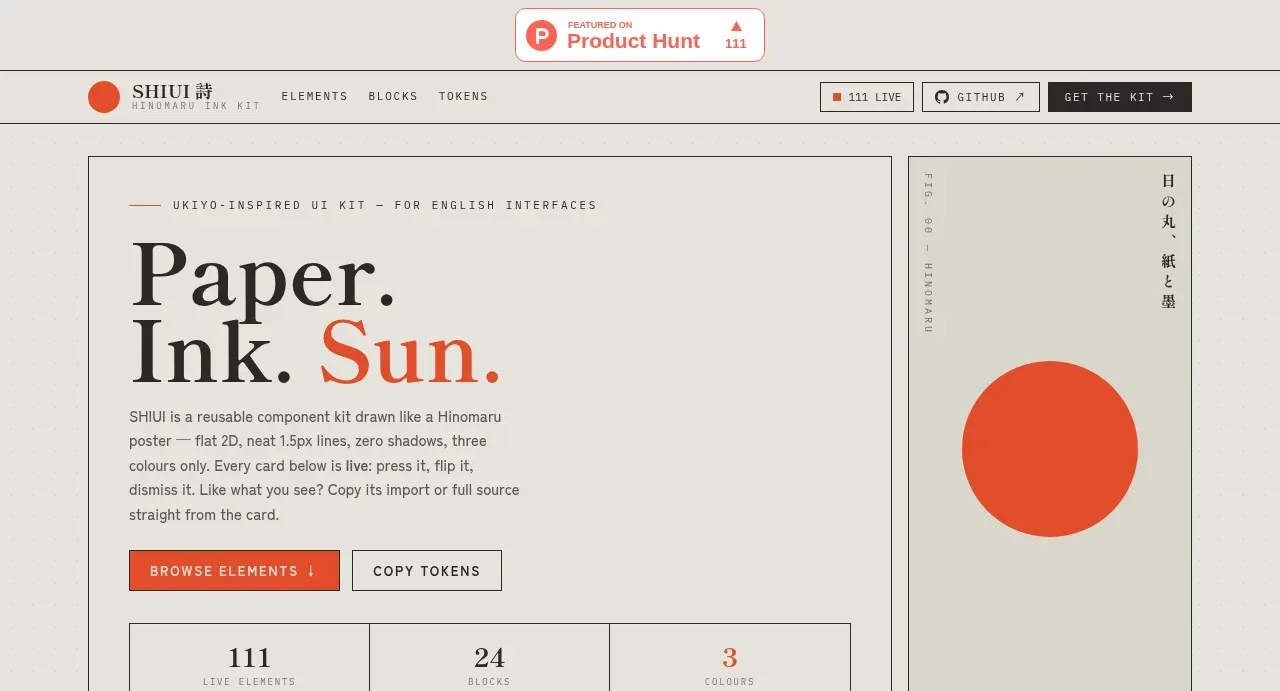 Editorial introduction hero
SHIUI · Hero
Editorial introduction hero
SHIUI · Hero
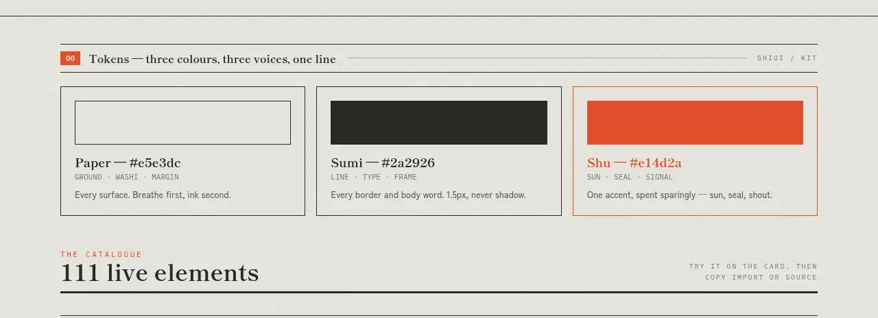 Colour and element catalogue
SHIUI · Feature grid
Colour and element catalogue
SHIUI · Feature grid
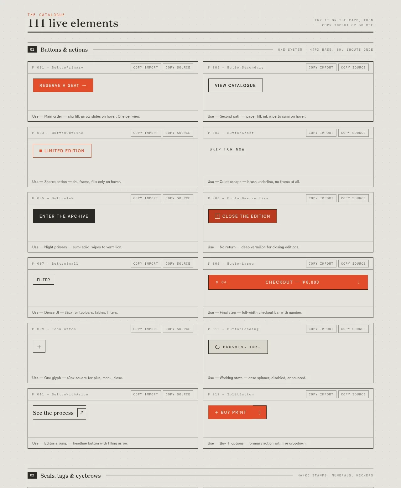 Buttons and actions inventory
SHIUI · Feature grid
Buttons and actions inventory
SHIUI · Feature grid
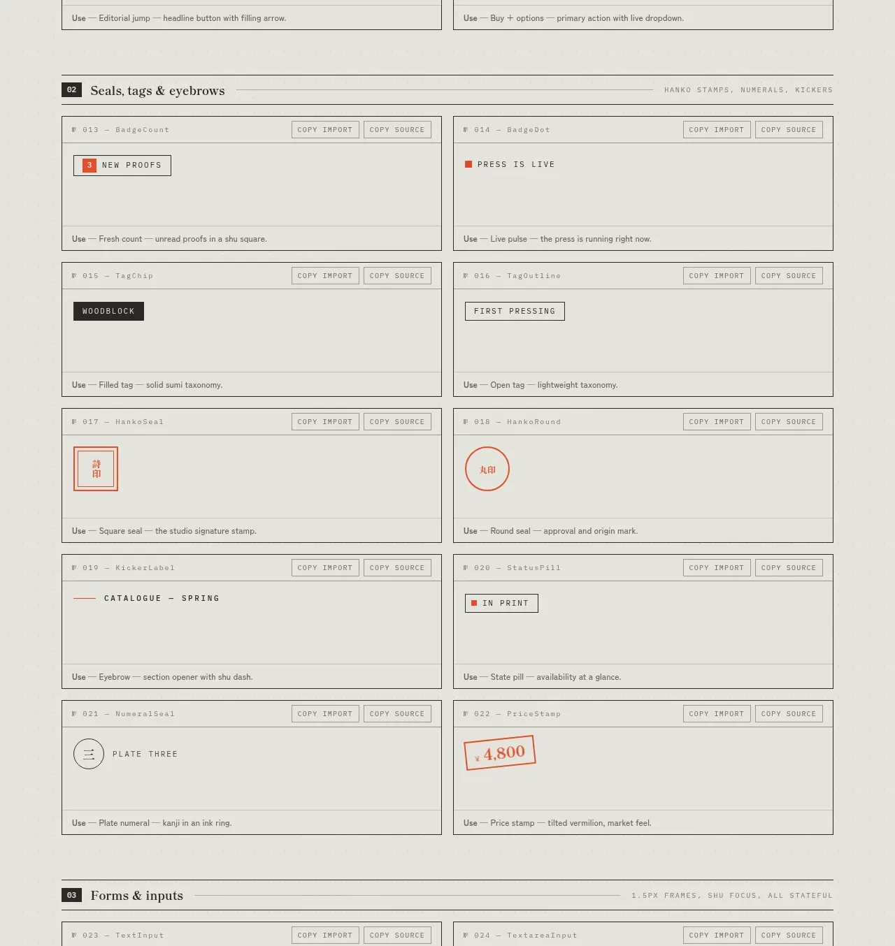 Seals, tags and eyebrows inventory
SHIUI · Feature grid
Seals, tags and eyebrows inventory
SHIUI · Feature grid
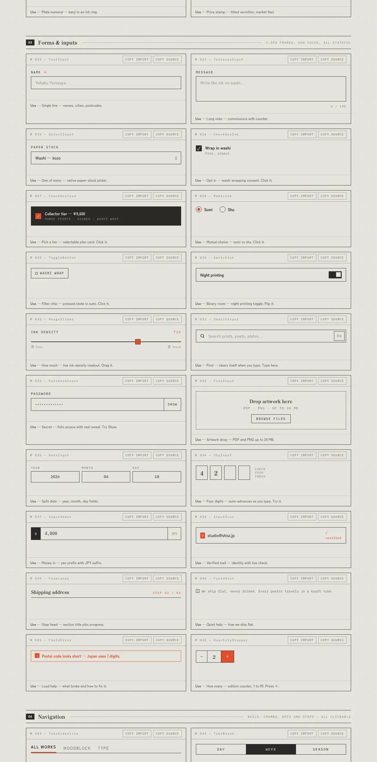 Forms and inputs inventory
SHIUI · Feature grid
Forms and inputs inventory
SHIUI · Feature grid
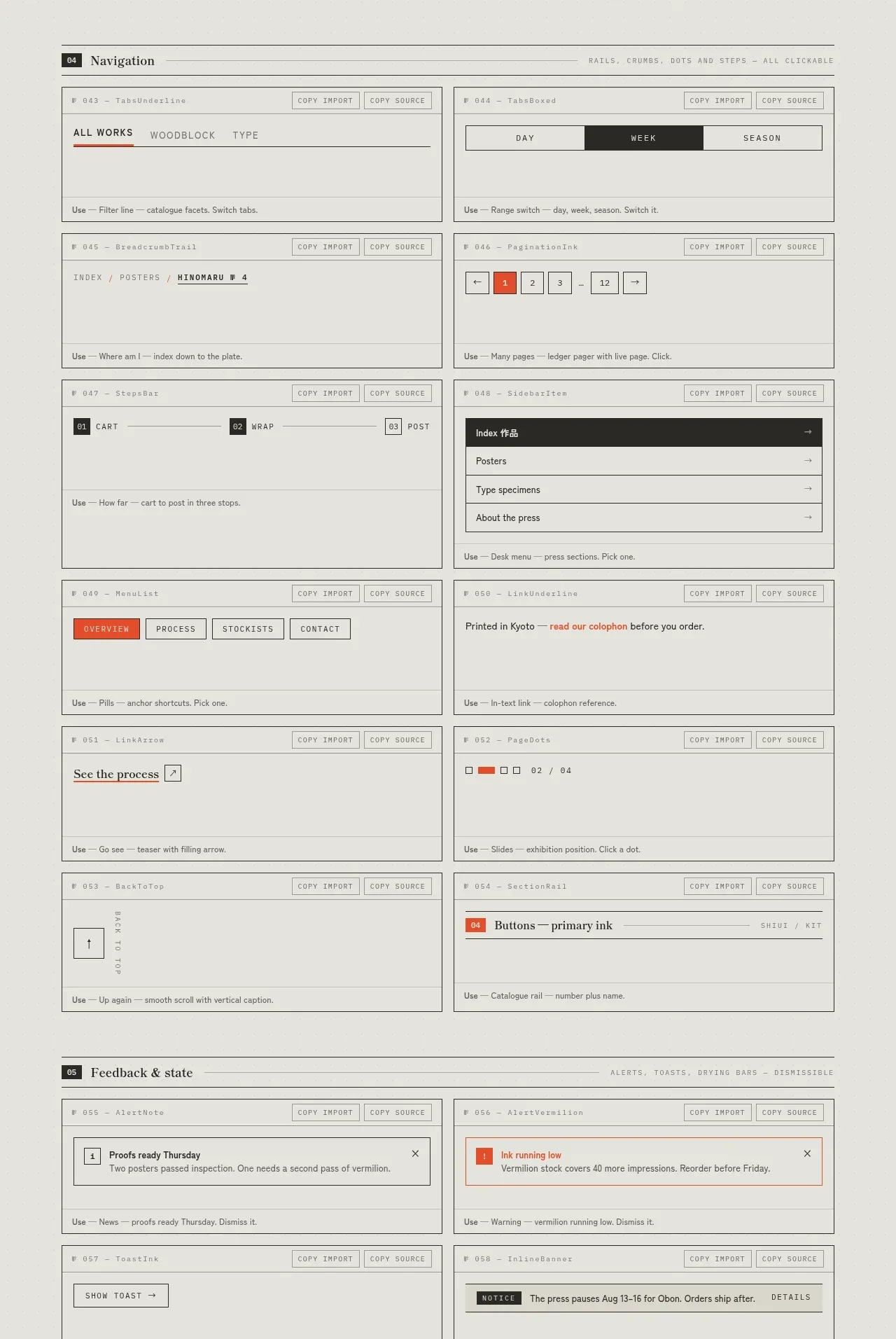 Navigation patterns inventory
SHIUI · Feature grid
Navigation patterns inventory
SHIUI · Feature grid
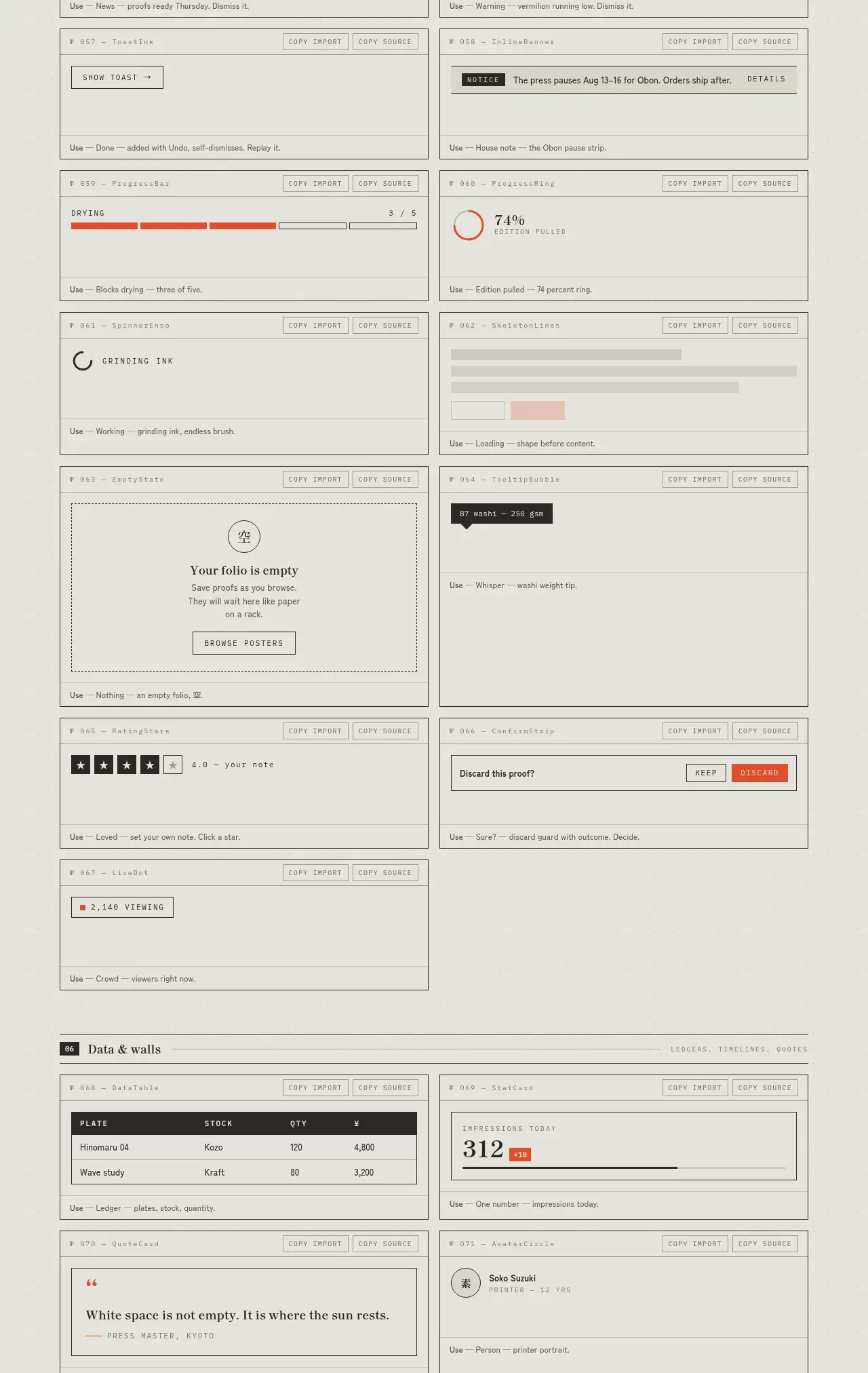 Feedback and state inventory
SHIUI · Feature grid
Feedback and state inventory
SHIUI · Feature grid
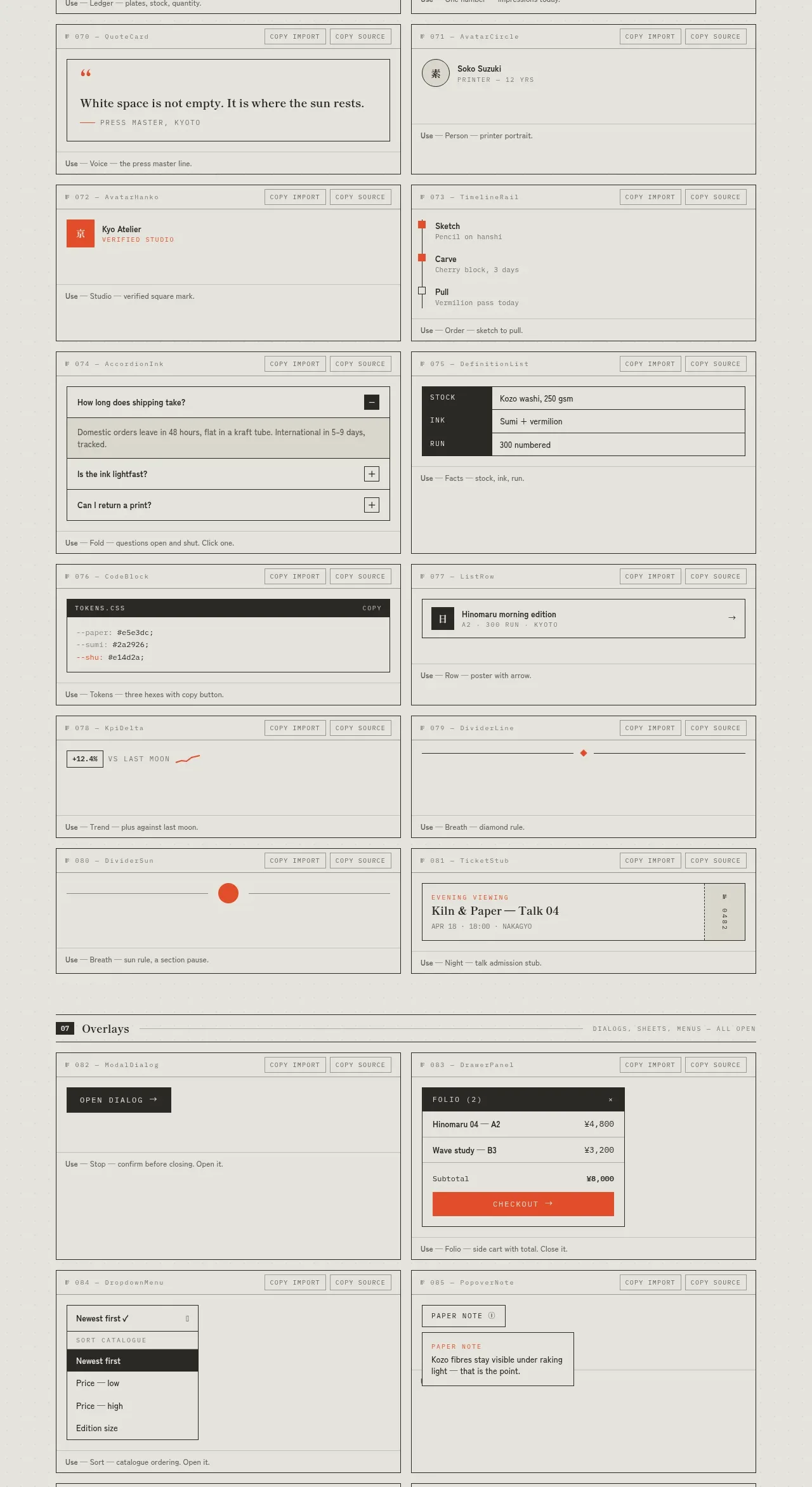 Data and content blocks inventory
SHIUI · Feature grid
Data and content blocks inventory
SHIUI · Feature grid
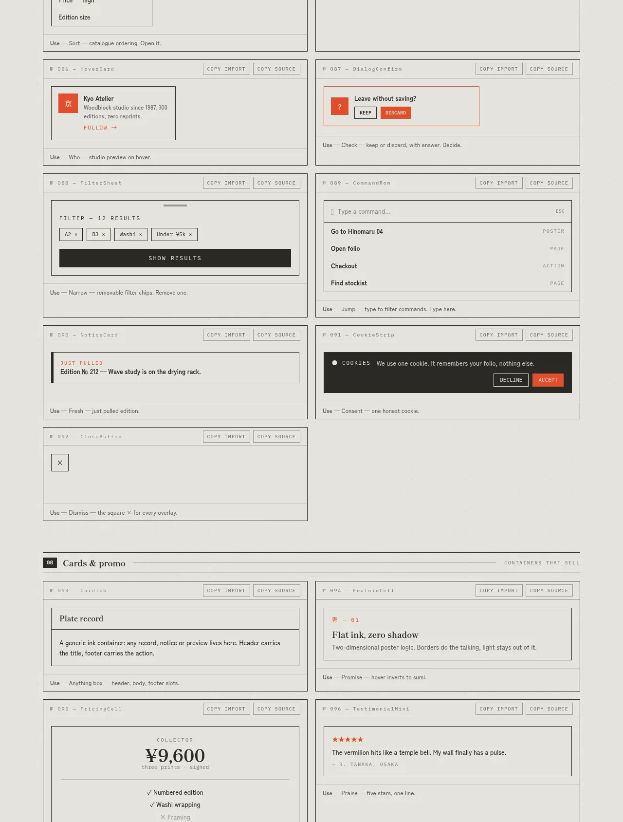 Overlays and promotional patterns
SHIUI · Feature grid
Overlays and promotional patterns
SHIUI · Feature grid
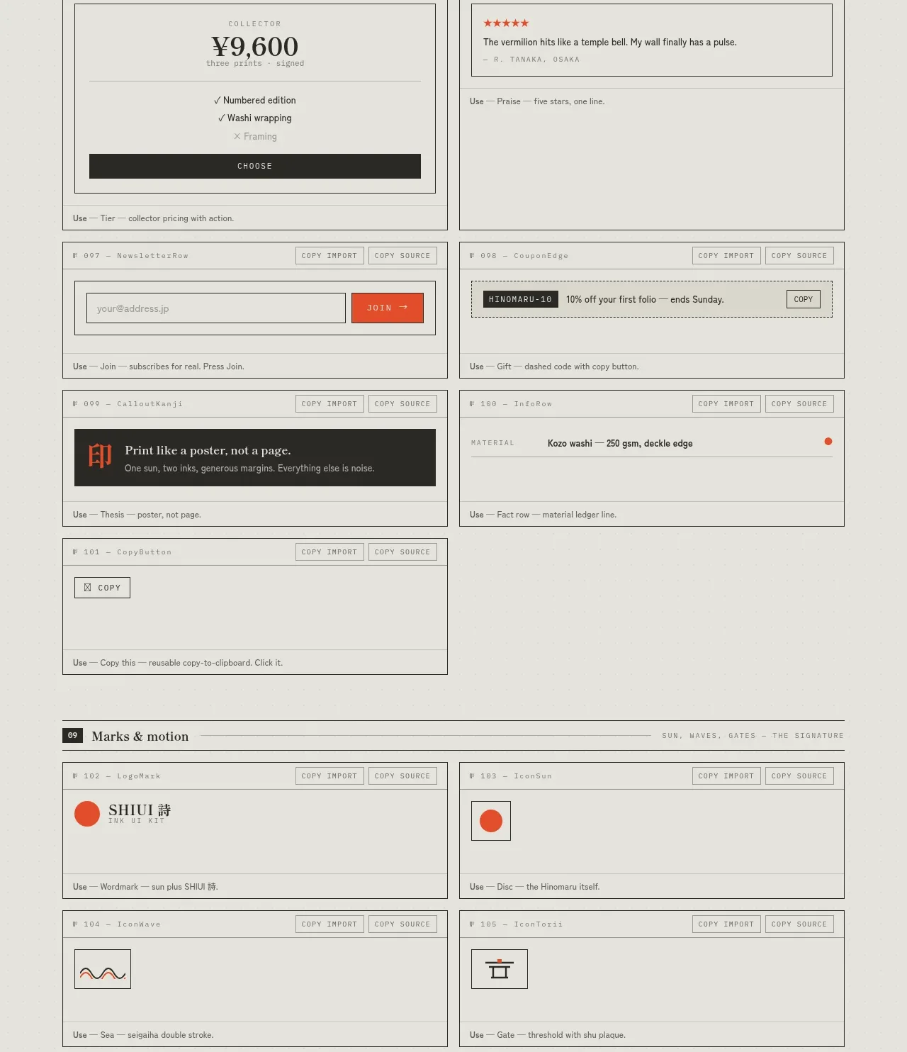 Cards and promotional blocks
SHIUI · Feature grid
Cards and promotional blocks
SHIUI · Feature grid
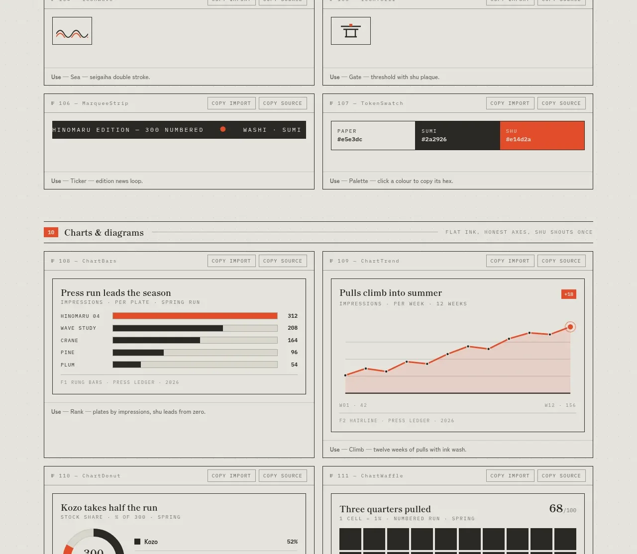 Marks and motion inventory
SHIUI · Feature grid
Marks and motion inventory
SHIUI · Feature grid


