kage
kage
simhadigital.com

Design analysis
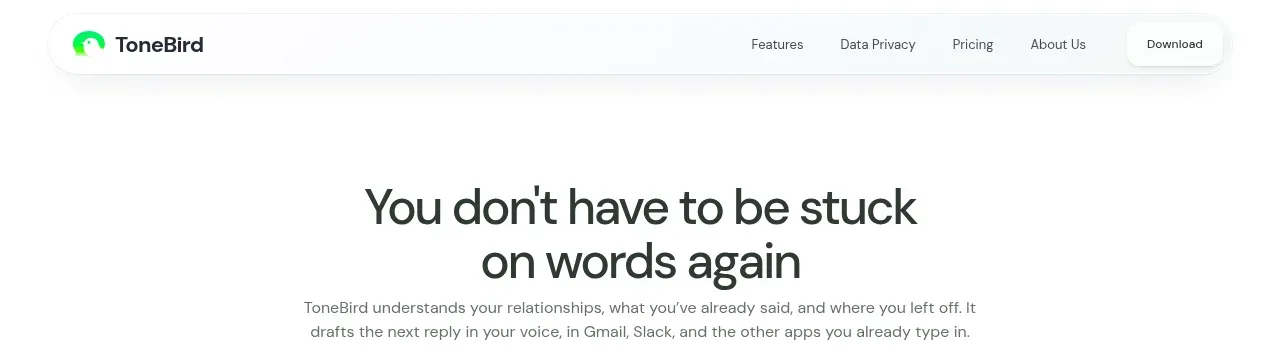
A compact white navigation bar establishes the brand at left, keeps a small set of product links centered, and gives the orange primary action strong contrast on the right.
Prompt preview
## Reference images

Study these alongside the description below: hierarchy, rhythm, spacing, colour. Build for the product you are asked about, using this design language.

- Component: https://kage-design-assets.t3.tigrisfiles.io/components/simha-digital/94ffd0b7-28d3-4d9a-b697-c16514e9c8c4-1790057072-0.webp
- Full page it was cut from: https://kage-design-assets.t3.tigrisfiles.io/screenshots/simha-digital/94ffd0b7-28d3-4d9a-b697-c16514e9c8c4-1790056948469-full.webp
- Component on Kage: https://kage.design/component/simha-digital-navigation

## Before you start
Ask what the user's product is, who it serves, and what its brand personality and primary action should be. Apply the following principles to that product rather than reproducing the reference.

Build a slim desktop-first SaaS navigation bar. Use a full-width warm-white background, a thin bottom divider, a compact brand lockup on the left, a short row of text links near the center/right, a small language selector and sign-in link, and one rounded orange primary button at the far right. Keep everything vertically centered in a 68px row with generous horizontal page padding. Use a clean grotesk sans-serif: small muted utility text around 12px, medium-weight links, and a compact wordmark with a tiny uppercase descriptor. Use approximate colors #F8F9F6, #202522, #747A72, and accent #F46B43. Buttons should have a 7–9px radius, subtle hover darkening, and an arrow or directional cue. Collapse links into a mobile menu.

Never use the reference's logo, product name, copy, illustrations, or imagery.