 kage
kage
simhadigital.com
Design analysis
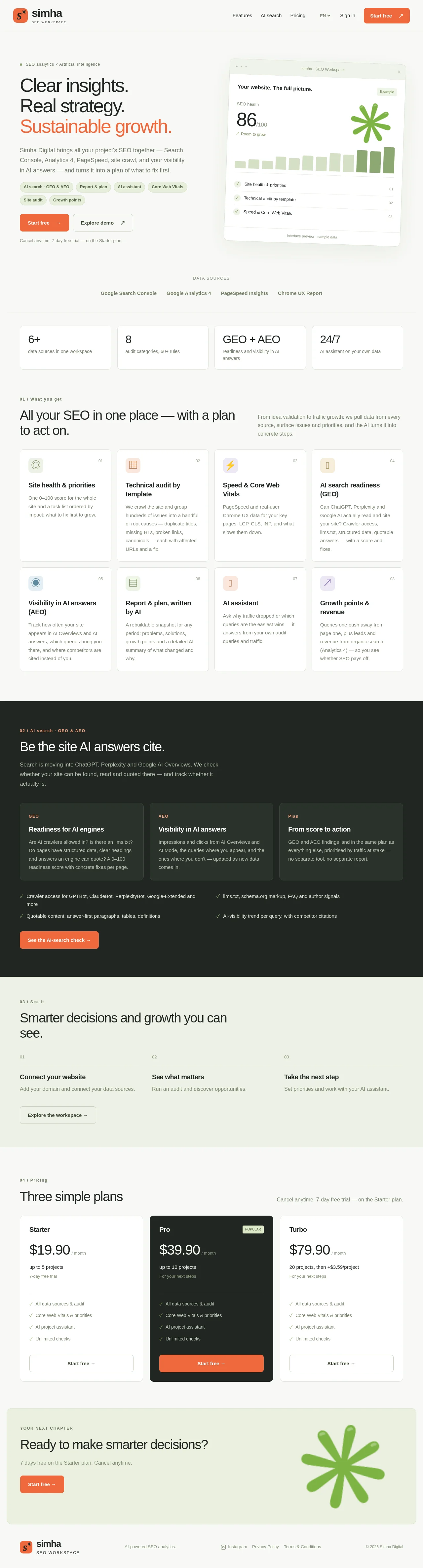
A calm, editorial SaaS landing page on a warm cream background with an orange accent and a playful green asterisk mark. Numbered section eyebrows (01–04) give the page a documentation-like rhythm: hero with dashboard mockup, stat row, 8-card feature grid, a full-bleed dark inverted section for the AI-search story, a three-step strip, dark-highlighted pricing tiers, and a soft CTA band. Hierarchy is carried almost entirely by type scale and spacing rather than decoration; the single dark section creates the page's strongest rhythm break.
Prompt preview
## Reference images

Study these alongside the description below: hierarchy, rhythm, spacing, colour. Build for the product you are asked about, using this design language.

- Full page: https://kage-design-assets.t3.tigrisfiles.io/screenshots/simha-digital/94ffd0b7-28d3-4d9a-b697-c16514e9c8c4-1790056948469-full.webp
- Above the fold: https://kage-design-assets.t3.tigrisfiles.io/screenshots/simha-digital/94ffd0b7-28d3-4d9a-b697-c16514e9c8c4-1790056946924.webp
- Design on Kage: https://kage.design/designs/simha-digital-landing-page

## Before you start
Ask the user what they are building, who it is for, and what brand assets they have (name, logo, colours, type). Wait for answers. Apply the design language below to *their* product, never reproduce this reference's name, copy, asterisk mark or illustrations.

## Page structure
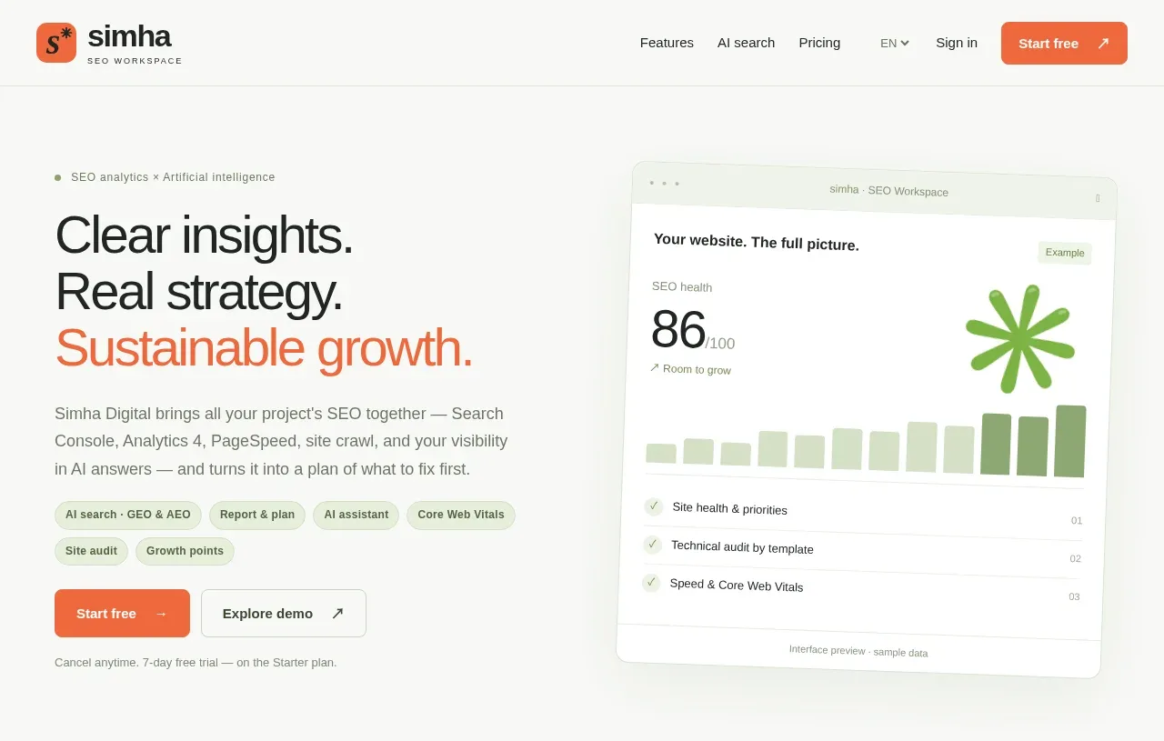
- Sticky top bar: logo mark + wordmark left, nav links + language selector + Sign in, one solid accent "Start free" pill button.
- Hero: two columns. Left: small eyebrow label with dot ("SEO analytics × Artificial intelligence"), large 3-line headline with the third line in accent colour, a paragraph, a row of small pill chips (feature tags), primary + secondary buttons, tiny reassurance line. Right: a slightly tilted browser-window mockup card showing an app preview (big score, bar chart, checklist rows) with a caption footer.
- Data sources strip: centred small uppercase label and four plain text logos.
- Stat row: four thin-bordered cards each with a large figure/short phrase and a one-line caption.
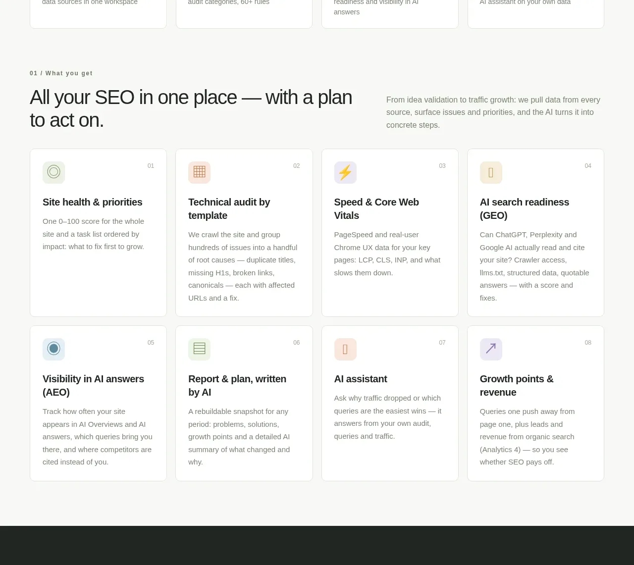
- Section 01 "What you get": section heading left + short intro paragraph right, then a 4×2 grid of bordered feature cards, each with a pastel icon chip, numbered corner label, title, and short body text.
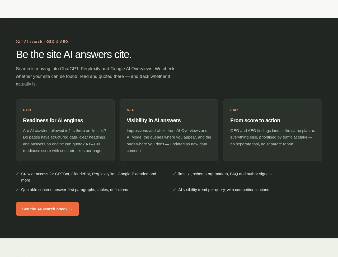
- Section 02 (dark, full-bleed): numbered eyebrow, large heading, short paragraph, three dark sub-cards with accent labels, a two-column checklist of proof points, one accent CTA button.
- Section 03: numbered eyebrow, heading, then a three-column numbered steps row (01/02/03, title + one line each) with a ghost button below.
- Section 04 Pricing: heading + trial note right; three pricing cards where the middle tier is a dark card with a "popular" badge; each card shows name, big price /month, project limits, four checkmark features, and a button (accent on the dark card).
- CTA band: soft tinted rounded panel with small uppercase eyebrow, heading, one line, accent button, and a large decorative botanical shape on the right.
- Footer: logo, tagline, legal/social links, copyright.

## Design language
- Warm cream/off-white page background (~#F3F3EC), white cards, near-black ink (#1A1A17), single warm-orange accent (~#F05023/#E8541F) reserved for CTAs, highlighted headline line, and labels; a green accent (~#7FB63F) used sparingly for the decorative mark.
- Build hierarchy with type scale: very large tight-tracked headlines (~56–72px), small ~13px body, tiny uppercase eyebrows with a leading number ("01 / Pricing") to sequence the page.
- Rhythm: mostly airy, generous vertical padding; one full-bleed near-black section (~#2B2E26) mid-page as the strongest visual break; pricing reintroduces the dark as a highlighted card instead of a section.
- Cards: 1px hairline grey borders, small radius (~10px), no or minimal shadows; flat, quiet surfaces.
- Numbered labels (01, 02…) on cards and steps add editorial, documentation-like structure.
- Accent labels in tiny uppercase inside dark cards; checkmarks as simple list rows for proof/pricing.
- Buttons: rounded-full solid accent pills with arrow glyphs; secondary buttons are bordered pills; ghost text-button for tertiary steps.
- Mockup: present product UI in a floating window card with subtle rotation and a caption footer; keep the preview abstract (score + bars + rows).
- Motion minimal; generous whitespace; no gradients or photos.

## Never
Never reuse the "simha" name, asterisk logo, botanical/green star shape, headline copy, pill chip labels, stat figures, pricing numbers, or any copy from the reference. Do not present the result as Simha Digital.
Components from this page
All components
 Minimal SEO workspace navigation
Simha Digital · Navigation
Minimal SEO workspace navigation
Simha Digital · Navigation
 Insight-led SEO workspace hero
Simha Digital · Hero
Insight-led SEO workspace hero
Simha Digital · Hero
 Connected data sources
Simha Digital · Logo cloud
Connected data sources
Simha Digital · Logo cloud
 Proof-point metric cards
Simha Digital · Stats
Proof-point metric cards
Simha Digital · Stats
 All-in-one SEO capability grid
Simha Digital · Feature grid
All-in-one SEO capability grid
Simha Digital · Feature grid
 AI search and visibility framework
Simha Digital · Feature grid
AI search and visibility framework
Simha Digital · Feature grid
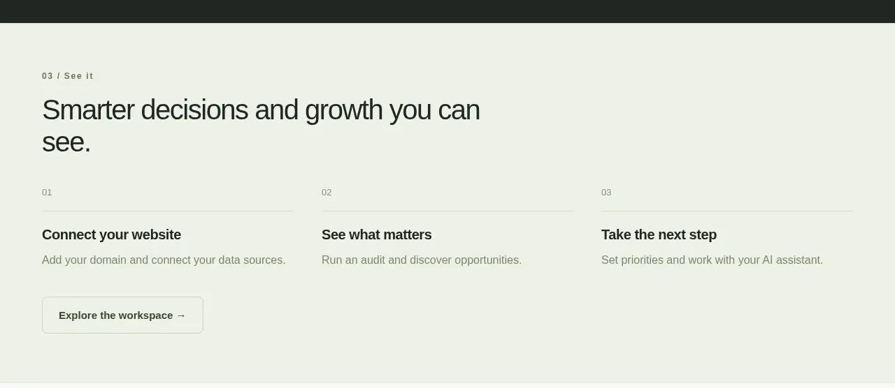 Three-step path to action
Simha Digital · Call to action
Three-step path to action
Simha Digital · Call to action
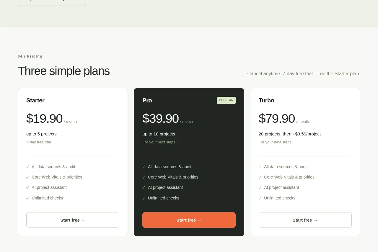 Three-tier SaaS pricing table
Simha Digital · Pricing table
Three-tier SaaS pricing table
Simha Digital · Pricing table
 Next-chapter conversion banner
Simha Digital · Call to action
Next-chapter conversion banner
Simha Digital · Call to action
 Compact brand and utility footer
Simha Digital · Footer
Compact brand and utility footer
Simha Digital · Footer
Related designs
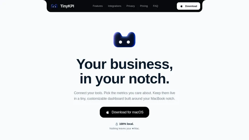

 TinyKPI
Landing page · Analytics & data
TinyKPI
Landing page · Analytics & data


 Basedash in Español Français & Português
Landing page · Analytics & data
Basedash in Español Français & Português
Landing page · Analytics & data


 AI Observability by OpenObserve
Landing page · Analytics & data
AI Observability by OpenObserve
Landing page · Analytics & data


 AdScope
Landing page · Analytics & data
AdScope
Landing page · Analytics & data


 fplxi.com
Landing page · Analytics & data
fplxi.com
Landing page · Analytics & data


 posthog.com
Landing page · Analytics & data
posthog.com
Landing page · Analytics & data