kage
kage
spaceui.one

Design analysis
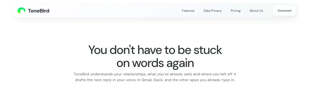
A compact floating navigation bar anchors the page with a brand mark, centered product links, and small search and utility controls. Its restrained white surface and subtle border keep attention on the hero.
Prompt preview
## Reference images

Study these alongside the description below: hierarchy, rhythm, spacing, colour. Build for the product you are asked about, using this design language.

- Component: https://kage-design-assets.t3.tigrisfiles.io/components/spaceui-one/175f9577-62b1-4f69-9b00-6ff53f853c35-1790162351-0.webp
- Full page it was cut from: https://kage-design-assets.t3.tigrisfiles.io/screenshots/spaceui-one/175f9577-62b1-4f69-9b00-6ff53f853c35-1790162331209-full.webp
- Component on Kage: https://kage.design/component/spaceui-one-navigation

## Before you start
Ask what the user's product is, who it serves, and what brand direction they want. Apply the principles below to that product rather than reproducing the reference.

Build a compact desktop-first navigation bar for a modern developer/design product. Use a centered max-width container, a small brand mark at left, primary links grouped in the middle, and search plus utility actions at right. Keep the bar around 48–56px tall with generous horizontal padding, a white or near-white surface (`#ffffff` / `#fafafa`), a 1px border (`#eeeeee`), and a 12–16px radius. Use a clean sans-serif: 13px regular navigation labels, slightly darker hover states, and a compact search field with a muted icon and keyboard-shortcut hint. Align everything vertically on one baseline and provide clear keyboard focus states. On mobile, collapse links into a menu button while preserving the brand and primary action.

Never: use logos, product names, copy, illustrations, or imagery from the reference.