kage
kage
Design analysis
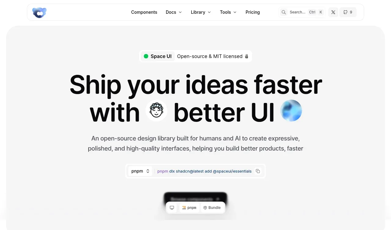
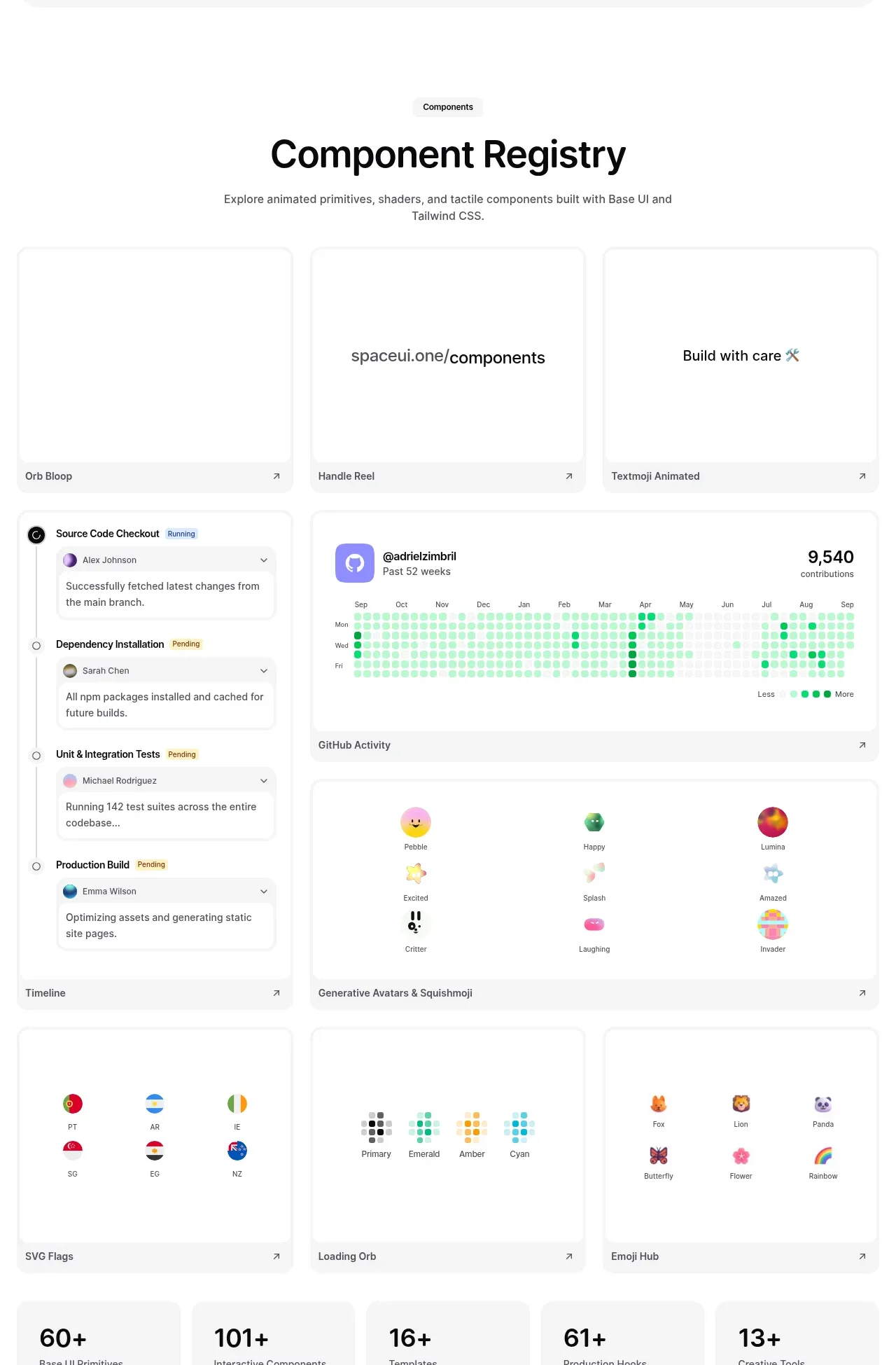
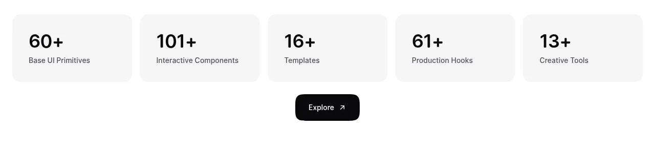
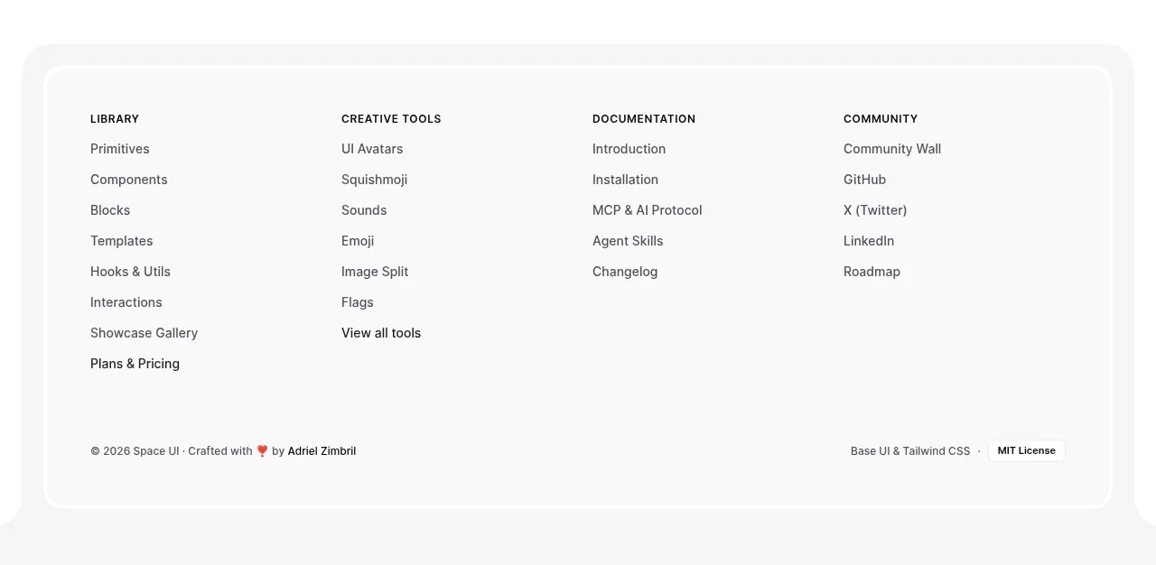
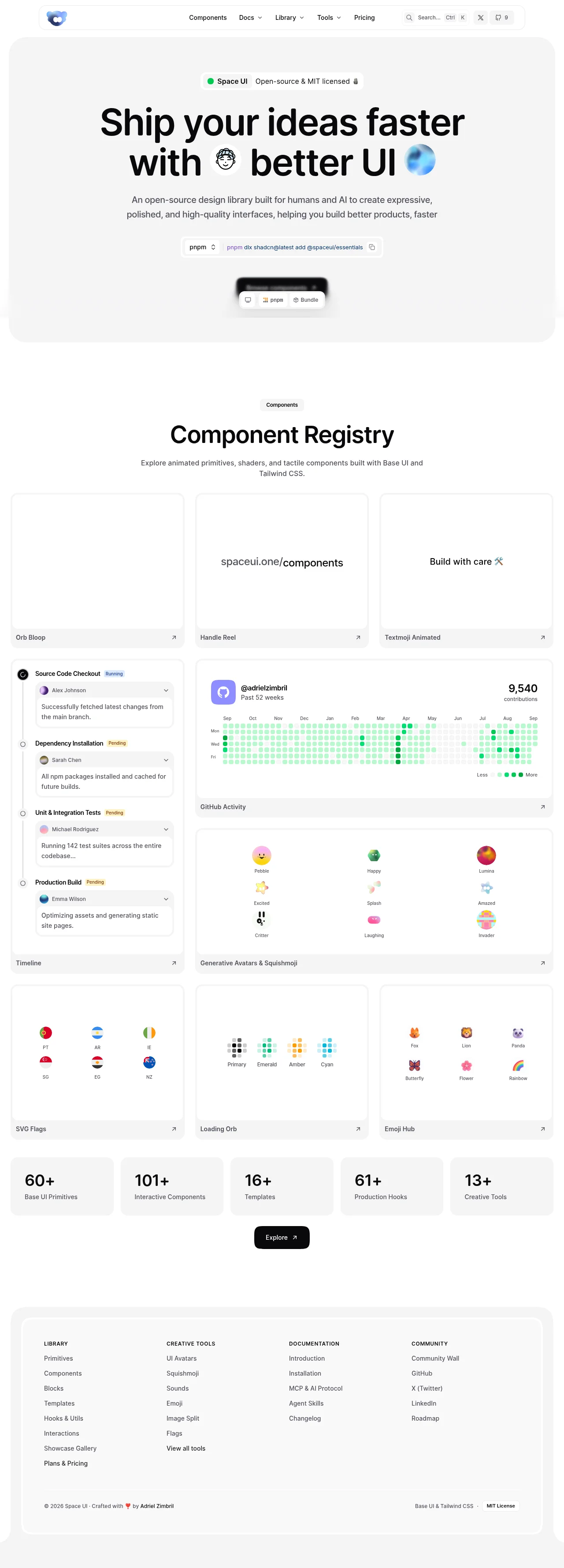
A near-monochrome zinc chrome (off-white page, gray inset panels, 1px hairline cards) wraps a set of colourful live component demos, so all the colour is earned by the product itself: a green contribution heatmap, rainbow avatars, flags and spinners. Hierarchy is driven by scale jumps — an ~80px heavy display headline with inline emoji chips, a 40px section heading, then small uppercase pill labels — while rhythm shifts from an airy hero, through a dense bento gallery where every card is a working demo with a labelled footer bar, to a scannable five-card stats band and a single black pill CTA. The footer returns to the framed gray-panel treatment of the hero, closing the page symmetrically with four dense link columns and a hairline-separated legal row.
Prompt preview
## Reference images

Study these alongside the description below: hierarchy, rhythm, spacing, colour. Build for the product you are asked about, using this design language.

- Full page: https://kage-design-assets.t3.tigrisfiles.io/screenshots/spaceui-one/175f9577-62b1-4f69-9b00-6ff53f853c35-1790162331209-full.webp
- Above the fold: https://kage-design-assets.t3.tigrisfiles.io/screenshots/spaceui-one/175f9577-62b1-4f69-9b00-6ff53f853c35-1790162322738.webp
- Design on Kage: https://kage.design/designs/spaceui-one-landing-page

## Before you start
Ask the user what they are building, who it is for, and what brand assets they already have (product name, logo, colours, typefaces). Wait for their answers before writing any code. Apply everything below to *their* product and brand — never reproduce the reference site's name, logo, copy or component demos.

## Page structure
1. **Floating pill navbar** — fixed near the top, a rounded-full white bar with hairline border and soft shadow: logo left; centre links, some with dropdown carets; right side a compact search field showing a ⌘/Ctrl+K hint, an external source-control icon, and a small pill with a count badge.
2. **Hero panel** — a full-width rounded-3xl light-gray panel inset from the viewport edges. Inside, all centred: a pill badge (coloured status dot + short label + license note), a two-line display headline with small inline emoji/image chips embedded in the text, a two-line muted subtitle, then a package-manager command bar — a small select for the package manager, a monospace install command, and a copy button. Below the command bar sits a blurred dark product screenshot with a small floating pill toolbar (icon row + one label), teasing the actual components.
3. **Section intro** — back on the plain page background: a small pill label, a large centred section heading, and a centred two-line subtitle naming the tech stack.
4. **Bento component gallery** — a 3-column grid of white preview cards. Each card has a live animated demo filling most of its height and a footer bar inside the card with the component name (left) and a ↗ arrow (right). First row: three equal cards. Second row: one narrow tall card beside a wide column stacking two cards (a wide data-visualisation demo, then a grid of small generated avatars/mascots with tiny caption labels). Third row: three equal cards again. Let the demos carry all colour.
5. **Stats band** — five equal light-gray cards in one row, each with a very large number (e.g. "60+") over a small muted label.
6. **CTA** — one centred black pill button with a short label and ↗ arrow.
7. **Footer** — inside another rounded-3xl gray panel mirroring the hero: four columns of links, each headed by a small uppercase label; bottom row separated by a hairline with copyright + credit on the left and stack/license notes on the right.

## Design language
- **Monochrome frame, colourful content.** Build all chrome from a zinc/neutral scale: page background #fafafa, inset panels #f4f4f5, cards #ffffff, borders #e4e4e7, headings #09090b, body text #52525b, muted labels #a1a1aa. Reserve saturated colour exclusively for product demos and one status green (#22c55e with #dcfce7 tint for pills/intensity scales).
- **Framed rhythm.** The viewport-edge inset + large radius (~24–32px) gray panels mark the page's opening and closing; the middle sections sit on the plain background so the card grid feels denser and livelier.
- **Type pairing and scale.** One heavy geometric/grotesque sans throughout, paired with a monospace for commands and data. Display headline ~clamp(56px, 8vw, 96px), weight 600–700, tracking ≈ -0.03em, near-black. Section headings ~40px. Body 15–16px line-height ~1.6. Pill labels 11px uppercase, letter-spacing 0.08em. Stats numbers ~48px bold. Mono ~13px inside command bars and captions.
- **Cards.** 1px solid border, radius ~16px, no or minimal shadow; generous internal padding; the demo area is the hero of each card, with a slim footer bar (name + ↗) giving it the feel of a browsable registry item.
- **Pills everywhere.** Badges, buttons, nav, search field, package-manager selector and count badges are all fully rounded with soft fills; the single black pill is the only high-contrast CTA on the page.
- **Density curve.** Airy hero (large type, one command bar) → dense bento grid with working demos → flat scannable stats row → single CTA beat → high-link-density footer columns. Each change of density is signalled by a change of surface (panel vs plain vs cards).
- **Motion.** Demos animate continuously (orbs, spinners, counters, text effects) while the frame stays still; hover states lift cards slightly or brighten borders; ↗ arrows signal navigation. Keep transitions short (~150–200ms) and ease-out.
- **Micro-captioning.** Every demo item gets a tiny muted caption beneath or beside it, so the gallery reads like a catalogue rather than decoration.

## Never
- Do not use the reference site's name, logo, wordmark, rocket/blob mark, or its exact headline, badge or footer copy.
- Do not recreate its specific component demos (its timeline, its contribution heatmap, its avatar/emoji/flag sets) — build equivalent demos from the user's own product domain.
- Do not use its photography, emoji art sets, icon set or contributor names.
- Never present the result as the reference product; it is a design language applied to the user's brand.