kage
kage
subscrr.app

Design analysis
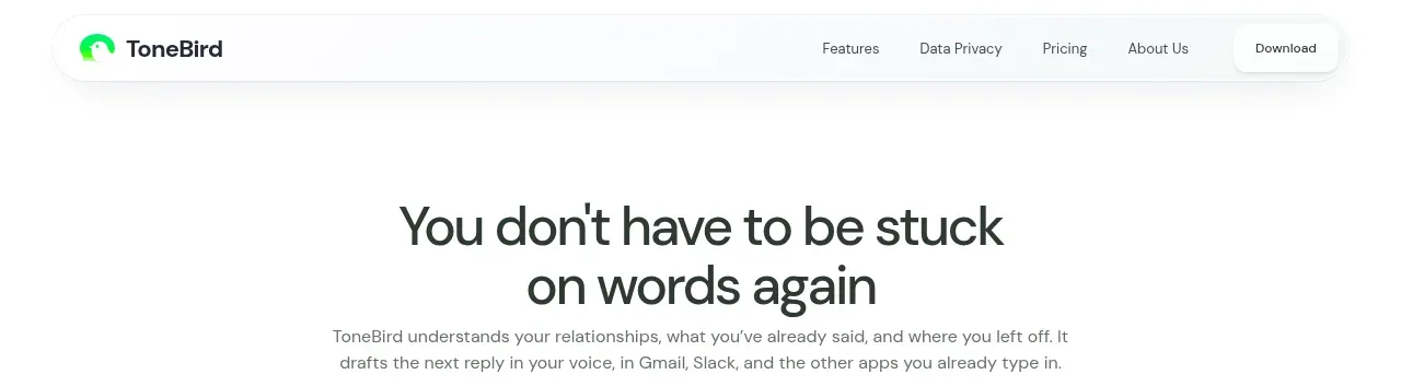
A restrained cream navigation bar pairs a compact app mark and wordmark with small anchor links and one high-contrast download button.
Prompt preview
## Reference images

Study these alongside the description below: hierarchy, rhythm, spacing, colour. Build for the product you are asked about, using this design language.

- Component: https://kage-design-assets.t3.tigrisfiles.io/components/subscrr/31e8b1bf-7154-4569-a65b-7b8da9be3511-1790316323-0.webp
- Full page it was cut from: https://kage-design-assets.t3.tigrisfiles.io/screenshots/subscrr/31e8b1bf-7154-4569-a65b-7b8da9be3511-1790316149312-full.webp
- Component on Kage: https://kage.design/component/subscrr-navigation

## Before you start
Ask what the user's product is, who it serves, and what brand personality and primary action they want. Build the navigation for that product rather than reproducing the reference.

Create a slim desktop-first navigation bar with a warm off-white background, a small product mark and wordmark aligned on the left, understated text links in the middle/right, and one saturated primary CTA at the far right. Use a max-width content row with generous horizontal padding and vertically center every item. Use a clean grotesk typeface, 11–13px utility links, medium-weight wordmark, and a pill CTA with approximately `#ff3218` background and white text. Keep the border nearly invisible (`#e9e9e3`) and use a 999px radius on the CTA. On hover, links should darken and the CTA should slightly lift or deepen in colour. On small screens, collapse links into a compact menu while retaining the CTA.

Never: use logos, product names, copy, illustrations, or imagery from the reference.