kage
kage
subscrr.app

Design analysis
A warm off-white landing page uses oversized black grotesk headlines, tiny blue section labels, and vivid red-orange accents to make a personal-finance product feel editorial rather than spreadsheet-like. The page moves from a split hero and oversized phone mockup into cinematic video, alternating image/text feature blocks, centered device showcase sections, pricing and FAQ utility zones, then a dark conversion footer; generous whitespace keeps the dense lower content legible.
Prompt preview
## Reference images

Study these alongside the description below: hierarchy, rhythm, spacing, colour. Build for the product you are asked about, using this design language.

- Full page: https://kage-design-assets.t3.tigrisfiles.io/screenshots/subscrr/31e8b1bf-7154-4569-a65b-7b8da9be3511-1790316149312-full.webp
- Above the fold: https://kage-design-assets.t3.tigrisfiles.io/screenshots/subscrr/31e8b1bf-7154-4569-a65b-7b8da9be3511-1790316146070.webp
- Design on Kage: https://kage.design/designs/subscrr-landing-page

## Before you start
Ask the user what they are building, who it is for, and what brand assets they already have (name, colours, type). Wait for their answers before designing. Apply everything below to that product, not to the reference.

## Page structure
- **Sticky top navigation:** Place a compact logo area at left, a small horizontal set of anchor links in the centre/right, and a vivid red rounded “Get the app” style CTA at the far right; keep the bar shallow and nearly white.
- **Hero:** Use a two-column layout on a warm off-white background. Put a very large multiline headline, short muted supporting copy, and two pill CTAs on the left; show a tall rounded smartphone/product visual on the right, extending well below the text block.
- **Cinematic media panel:** Follow the hero with a wide, strongly rounded video/image panel spanning most of the content width. Let the image carry saturated orange, red, blue, and black tones, with only a tiny control indicator.
- **Overview section:** Add a small blue uppercase eyebrow, then a large left-aligned headline. Under it, use a two-column feature row with a rounded warm-toned product/lifestyle image on the left and concise explanatory copy plus three checked benefits on the right.
- **Breakdown card:** Introduce a wide white rounded card with generous padding. Place a stacked multiline heading on the left, emphasizing the final line in red, supporting text below, and a rounded image tile aligned right.
- **Reminders section:** Center the eyebrow, large headline, and brief paragraph. Place one wide, rounded, saturated image beneath the copy with a notification UI overlay integrated into the composition.
- **Setup section:** Return to a two-column split: explanatory text and numbered pill-like steps on the left, a tall rounded screenshot/image on the right. Keep the section spacious and offset it from the previous centered block.
- **Feature carousel/card rail:** Show a large white rounded feature card with heading, body copy, a small text link, and a phone screenshot positioned toward the right. Allow a sliver of the next card to appear at the edge and add small red pagination markers below.
- **Premium widgets section:** Center a small eyebrow, very large headline, and muted description. Follow with a wide rounded red-orange media panel containing a partially visible phone/device mockup.
- **Apple Watch section:** Center the heading and description, then place two equal rounded image tiles side by side: one lifestyle close-up and one product-in-use image with a watch visible.
- **Editorial statement:** Add a wide text block with a large bold paragraph. Use black text with selected words or phrases in vivid red-orange to create a strong editorial emphasis.
- **Privacy section:** Use a narrower left-aligned text block with a large heading, several lines explaining the privacy model, and a row of small white pill badges beneath it.
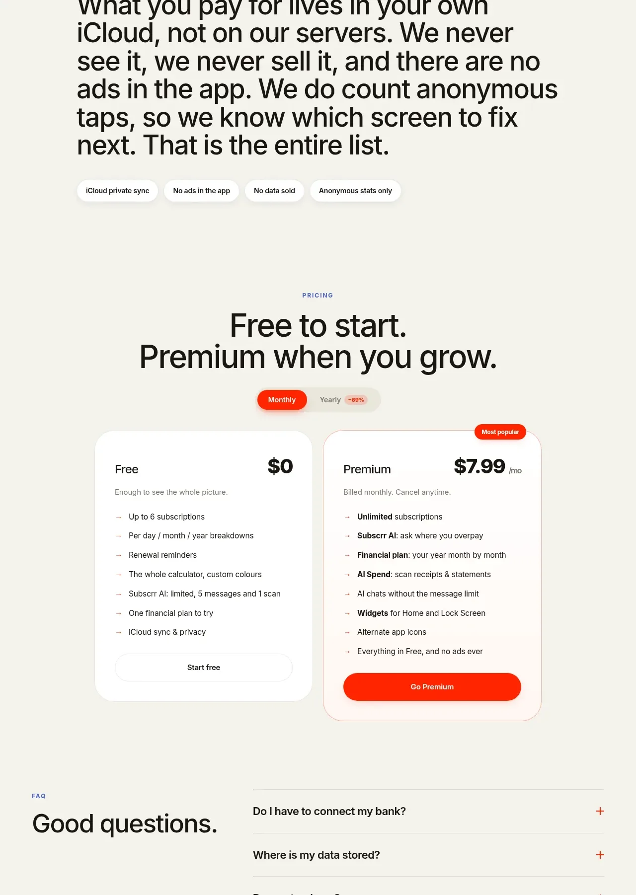
- **Pricing:** Center the pricing eyebrow and headline. Add a compact monthly/yearly toggle, then two side-by-side rounded pricing cards: a plain white free card and a lightly accented premium card with a “Most popular” badge, bold price, feature list, and contrasting CTA.
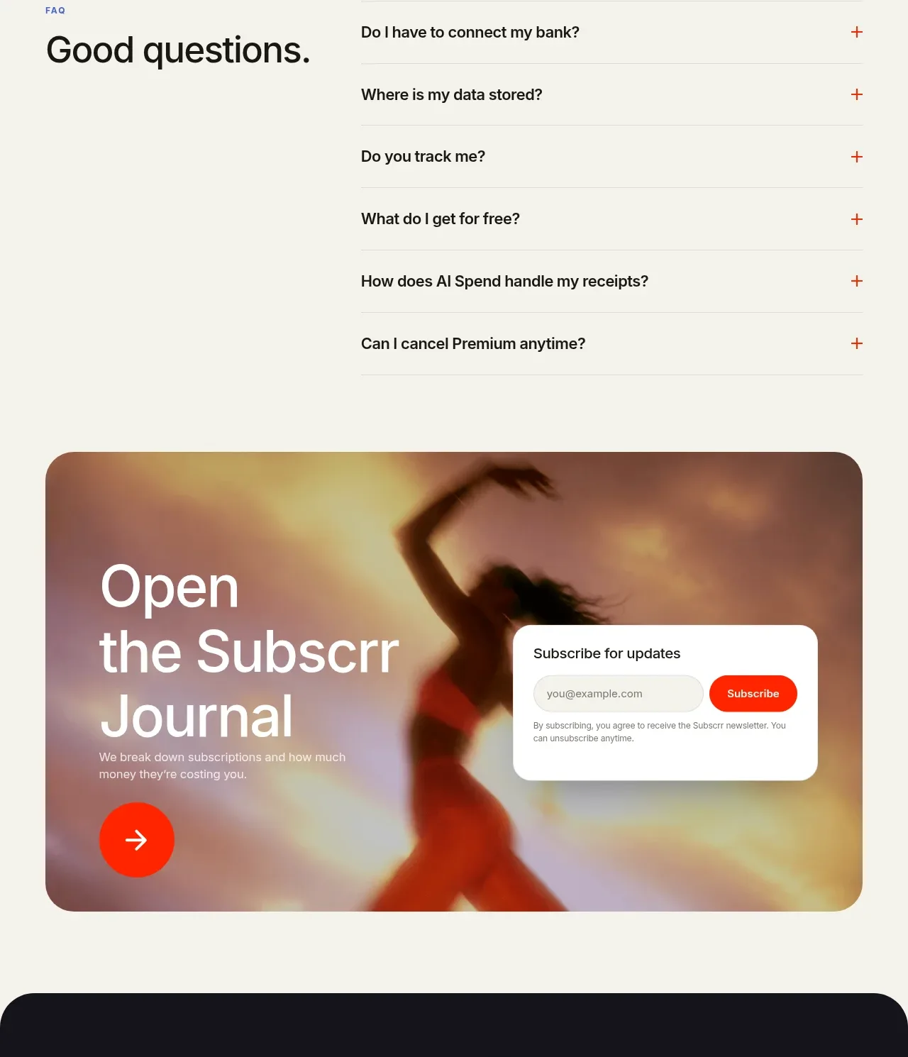
- **FAQ:** Use a two-column layout with a large “Good questions” heading on the left and a vertical accordion list on the right. Separate questions with thin gray rules and place small red plus signs at the far right.
- **Journal/newsletter banner:** Add a wide rounded lifestyle image banner with large white editorial heading on the left, a circular red arrow button, and a white newsletter signup panel on the right.
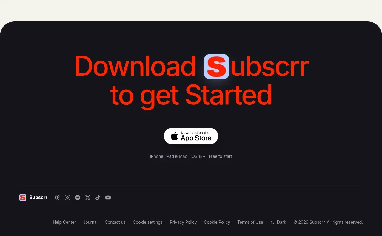
- **Dark download CTA:** Switch to a near-black full-width rounded-top section. Center a large red-orange download headline with an accent treatment on the product initial, an App Store badge, and a tiny compatibility line.
- **Footer:** Keep the footer dark and restrained. Place a small brand mark and social icons on the left, a thin divider across the width, then compact utility links and copyright/theme information along the bottom.

## Design language
- Build hierarchy through extreme type contrast: use a heavy grotesk display face for headlines, roughly 56–80px on desktop hero/section titles, 36–56px for major blocks, and 13–16px for body copy; keep navigation, labels, and metadata around 10–12px.
- Use an editorial rhythm that alternates between expansive centered sections and compact two-column feature rows. Increase visual density around setup, carousel, pricing, and FAQ, then release tension again with the journal banner and dark CTA.
- Start with a warm ivory background around `#F4F4EC` or `#F3F3EB`, near-black text around `#111114`, and a high-energy red-orange accent around `#FF3218` / `#FF3B1F`. Use muted blue-violet around `#4D5E9D` only for tiny eyebrows and labels.
- Pair oversized black type with short gray supporting text around `#777771`. Keep body measures narrow, approximately 360–520px, so long sections remain easy to scan.
- Treat images, videos, and cards as large rounded rectangles, generally 24–32px radius. Use white cards against ivory with almost no shadow; rely on background contrast, thin gray borders, and generous padding instead of elevation.
- Make CTAs pill-shaped, saturated red for primary actions, white or transparent for secondary actions, with compact bold labels. Pricing and FAQ controls should feel tactile but remain visually quiet.
- Use cinematic photography and product mockups as colour fields: warm orange/red imagery can dominate media panels while the surrounding interface stays neutral. Avoid decorative illustrations when a real product/lifestyle composition can carry the section.
- Keep motion subtle: use smooth anchor scrolling, gentle image/device entrance transitions, carousel pagination, and accordion expansion. Do not add loud parallax or constant animation; the page’s rhythm should come from section changes and media.
- On smaller screens, stack every split layout, preserve the order of text before media, reduce display type fluidly, keep card radii and padding consistent, and allow horizontal feature rails to scroll without making the whole page overflow.

## Never
- Do not copy the reference product’s logos, wordmarks, product name, copy, illustrations, photography, screenshots, icon set, or exact app-store presentation.
- Never present the result as Subscrr or imply an affiliation with it.
- Replace every visual, label, CTA, and example with content and brand assets supplied by the user’s product.
Components from this page
All components
 Minimal product navigation
Subscrr · Navigation
Minimal product navigation
Subscrr · Navigation
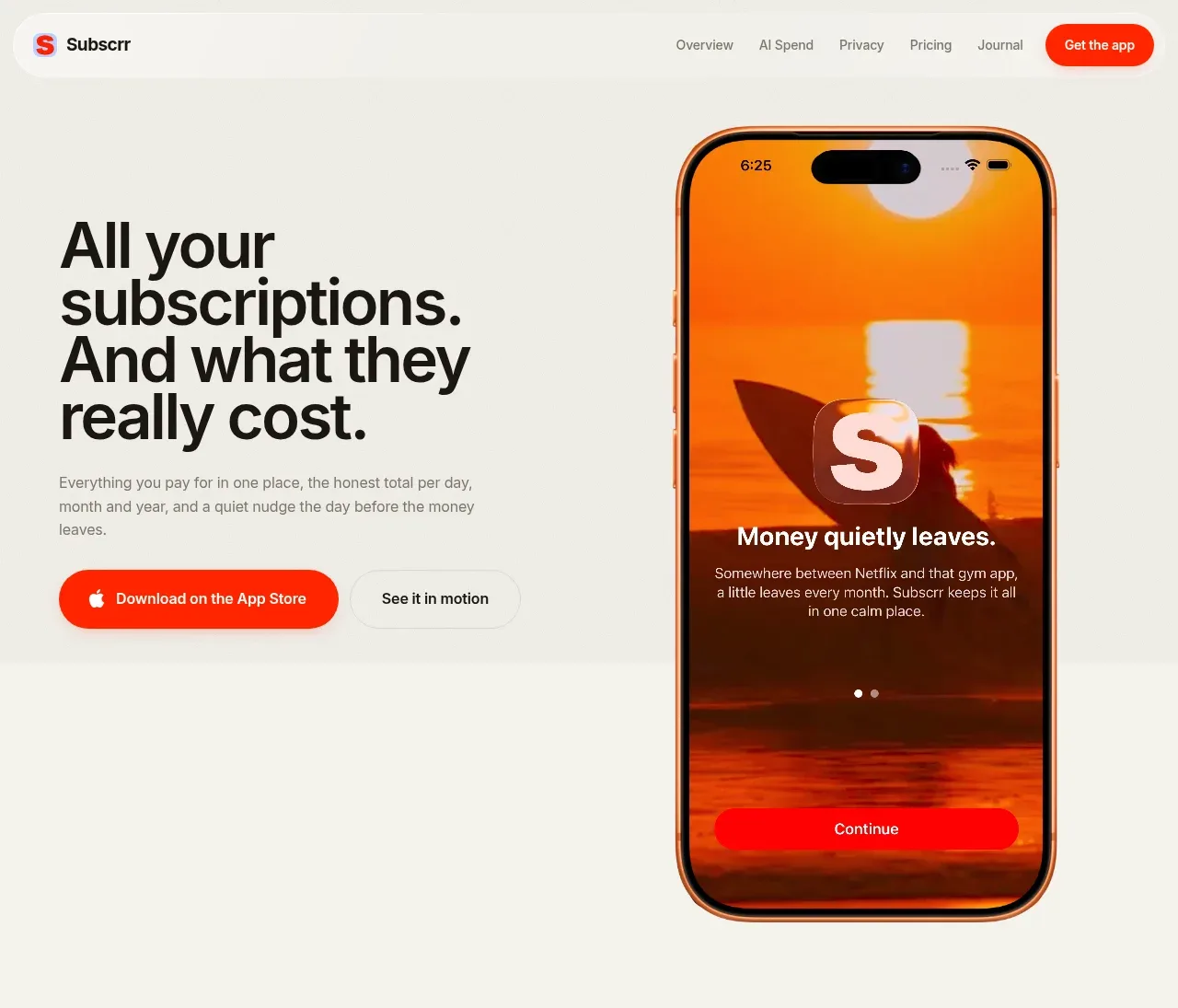 Subscription value proposition hero
Subscrr · Hero
Subscription value proposition hero
Subscrr · Hero
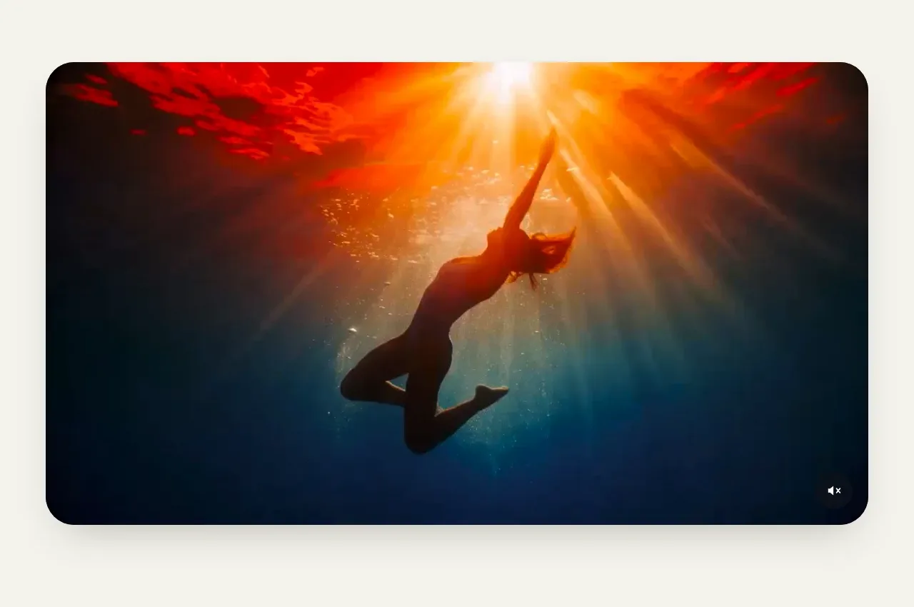 Immersive product video panel
Subscrr · Gallery
Immersive product video panel
Subscrr · Gallery
 Spend visibility and daily-cost breakdown
Subscrr · Feature grid
Spend visibility and daily-cost breakdown
Subscrr · Feature grid
 Reminders and simple setup flow
Subscrr · Feature grid
Reminders and simple setup flow
Subscrr · Feature grid
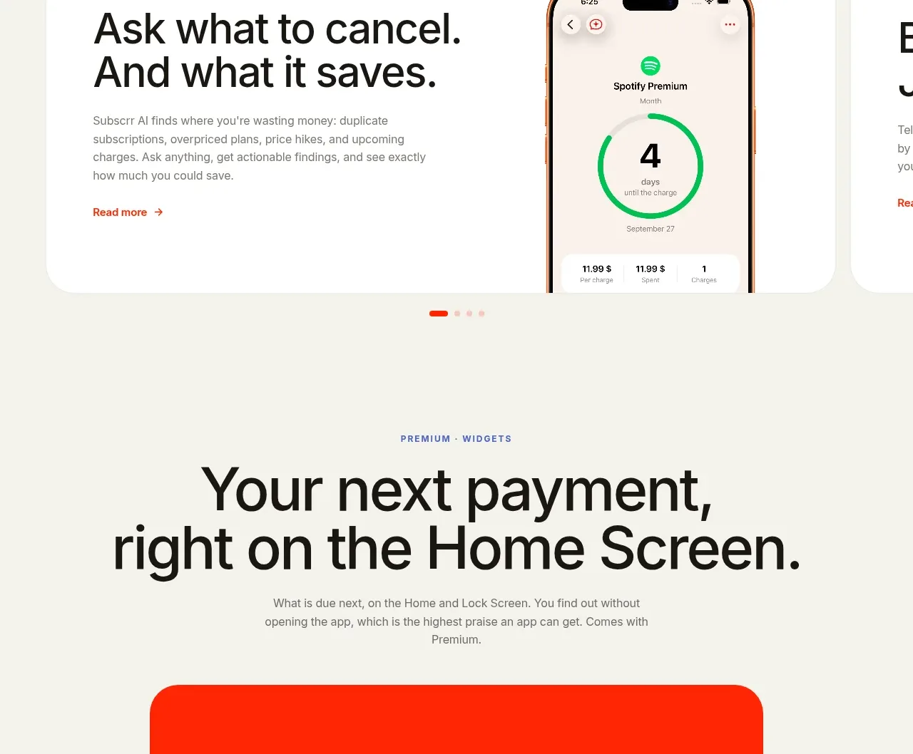 AI assistant feature cards
Subscrr · Card
AI assistant feature cards
Subscrr · Card
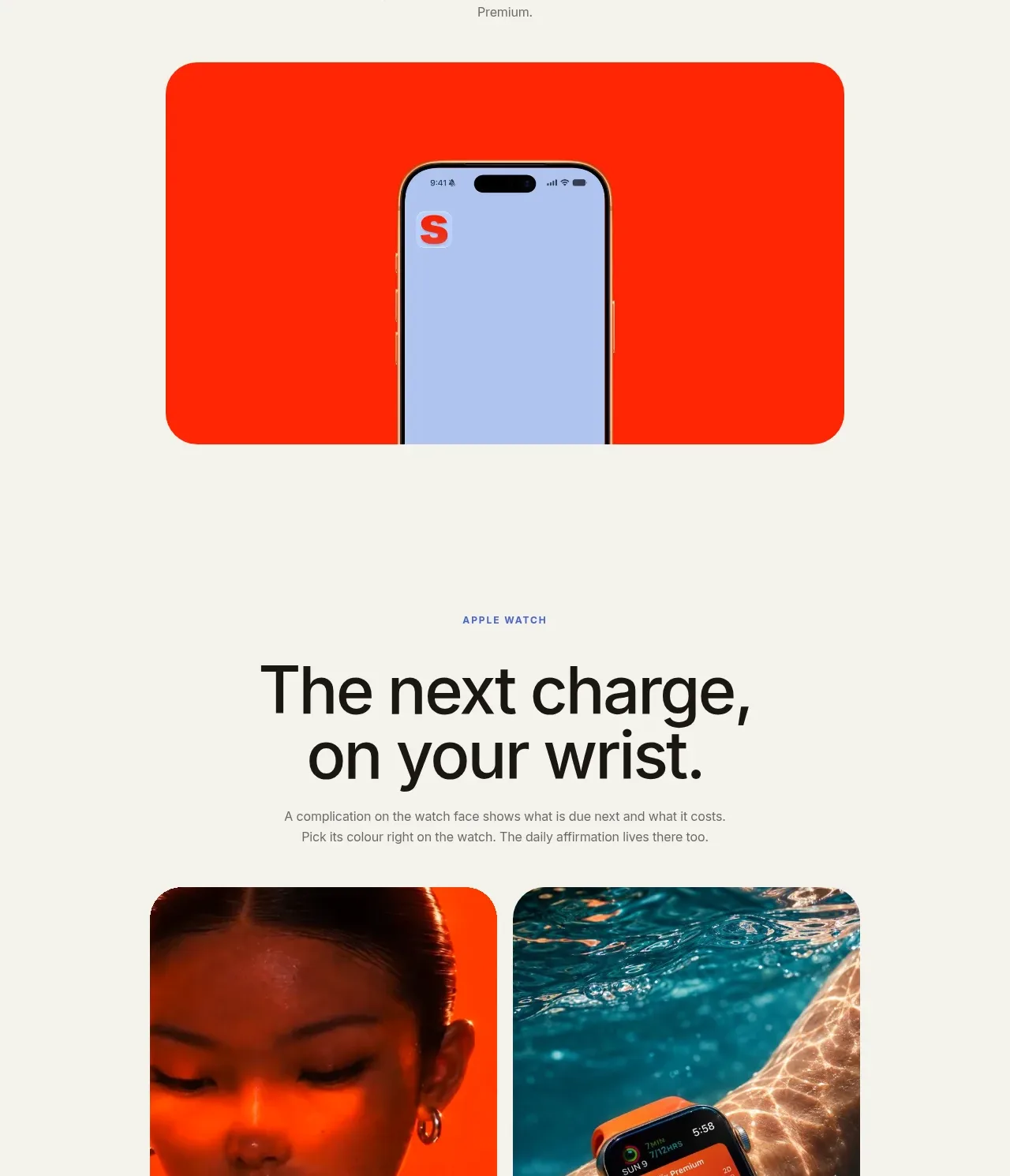 Home-screen widget promotion
Subscrr · Hero
Home-screen widget promotion
Subscrr · Hero
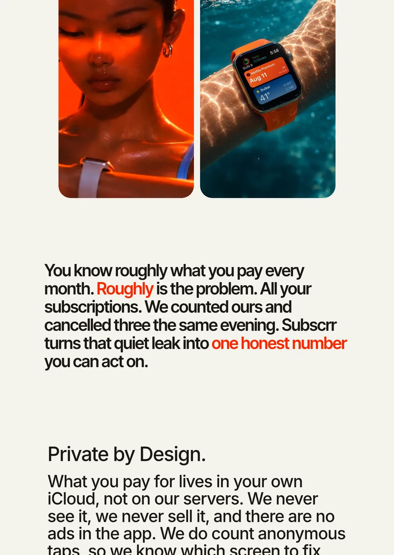 Wearable companion showcase
Subscrr · Gallery
Wearable companion showcase
Subscrr · Gallery
 Editorial trust and privacy message
Subscrr · Card
Editorial trust and privacy message
Subscrr · Card
 Free and premium pricing comparison
Subscrr · Pricing table
Free and premium pricing comparison
Subscrr · Pricing table
 Frequently asked questions
Subscrr · FAQ
Frequently asked questions
Subscrr · FAQ