kage
kage
thestory.run

Design analysis
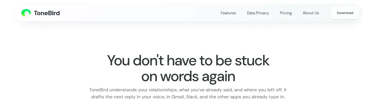
A restrained header keeps the brand at left and a compact set of product links plus one emphasized action at right. Its light background and fine top accent let the page’s editorial typography remain dominant.
Prompt preview
## Reference images

Study these alongside the description below: hierarchy, rhythm, spacing, colour. Build for the product you are asked about, using this design language.

- Component: https://kage-design-assets.t3.tigrisfiles.io/components/thestory-run/30e08e83-50b8-4774-b650-1d7663d8d1f5-1790143352-0.webp
- Full page it was cut from: https://kage-design-assets.t3.tigrisfiles.io/screenshots/thestory-run/30e08e83-50b8-4774-b650-1d7663d8d1f5-1790143267493-full.webp
- Component on Kage: https://kage.design/component/thestory-run-navigation

## Before you start
Ask what the user's product is, who it serves, and what their brand voice and primary action are. Apply the following principles to that product rather than reproducing the reference.

Build a minimal, full-width desktop navigation. Use a small brand wordmark at the left, optional compact status text beside it, and a right-aligned row of 4–5 text links with one dark green filled CTA. Keep the content in a centered max-width container with generous horizontal padding. Use an off-white background, a very thin coral-red top rule (approximately `#ed5575`), dark charcoal text (`#24251f`), and a deep green CTA (`#075b3f`). Typography should be quiet and small for navigation, with the CTA slightly bolder. Use subtle hover underlines or colour shifts; keep the header visually light and avoid a heavy shadow.

Never use logos, product names, copy, illustrations, or imagery from the reference.