kage
kage
thestory.run

Design analysis
A long editorial landing page built like an essay: large dark-green serif headlines alternate with small sans-serif body copy, and neon-yellow highlighter marks and hand-drawn doodle illustrations give it a notebook personality. Product screenshots sit in soft rounded cards on tinted sage/olive panels, and a sticky-note yellow card acts as the coach's voice. The rhythm alternates between narrative manifesto sections, a three-step interactive demo, bento-style feature cards, a testimonial row, a two-tier pricing pair, an accordion FAQ, and a team/company section ending in a simple CTA and footer. The highlighter-yellow accent (used for links, emphasis and UI chips) against forest green and off-white is the unifying device.
Prompt preview
## Reference images

Study these alongside the description below: hierarchy, rhythm, spacing, colour. Build for the product you are asked about, using this design language.

- Full page: https://kage-design-assets.t3.tigrisfiles.io/screenshots/thestory-run/30e08e83-50b8-4774-b650-1d7663d8d1f5-1790143267493-full.webp
- Above the fold: https://kage-design-assets.t3.tigrisfiles.io/screenshots/thestory-run/30e08e83-50b8-4774-b650-1d7663d8d1f5-1790143263146.webp
- Design on Kage: https://kage.design/designs/thestory-run-landing-page

## Before you start
Ask the user what product they are building, who it is for, and what brand assets they already have (name, colours, fonts). Wait for the answers before writing any code; everything below is applied to their product, not the reference.

## Page structure
Build a single long-scroll landing page with these sections, in order:
1. **Top nav**: wordmark on the left with a small "beta" badge, right-aligned text links plus one bold CTA link. No buttons with heavy borders.
2. **Hero**: centred, two-line large serif headline; short centred paragraph with a key phrase highlighted in yellow; two side-by-side CTAs (primary filled dark button + a secondary badge/badge-like link); a script-font credibility line underneath.
3. **Hero product shot**: a full app screenshot in a rounded card with a subtle tinted background frame, followed by a one-line caption with an underlined link.
4. **Problem section**: centred serif heading plus a pull-quote; then a three-column spread around a central hand-drawn doodle illustration, each column a small bold label + short paragraph.
5. **Manifesto interlude**: three large centred serif statements stacked, ending in a script-font line highlighted in yellow, then an underlined "read the manifesto" link with a tiny footnote.
6. **Contrast section**: centred serif heading + subcopy, then a two-column comparison with small uppercase labels, one doodle illustration per column, and a quote + attribution under each.
7. **Product demo**: a numbered three-step vertical walkthrough (sticky mini index on the left, prose on the right) where each step pairs a paragraph with a screenshot card on a tinted sage panel. Each screenshot is annotated with small labelled chips/notes.
8. **Bento features**: a serif heading + subcopy, then a grid of feature cards mixing filled dark-green, cream, yellow and peach cards with mini UI mockups inside; end with an underlined "see everything" link.
9. **Testimonials**: a serif heading and a single row of small white quote cards with large quotation marks.
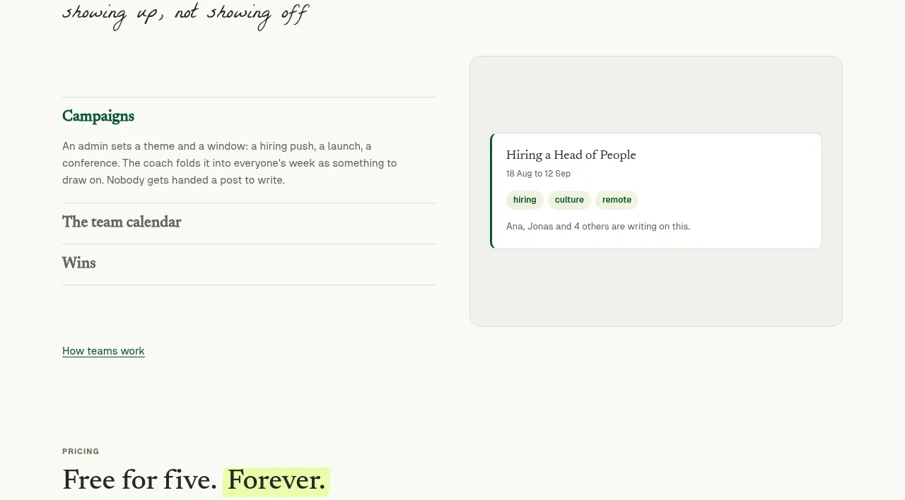
10. **Team section**: eyebrow label, serif heading, prose paragraphs with bold inline emphasis and a script-font tagline; below it a two-column accordion list (titles only) beside a screenshot card.
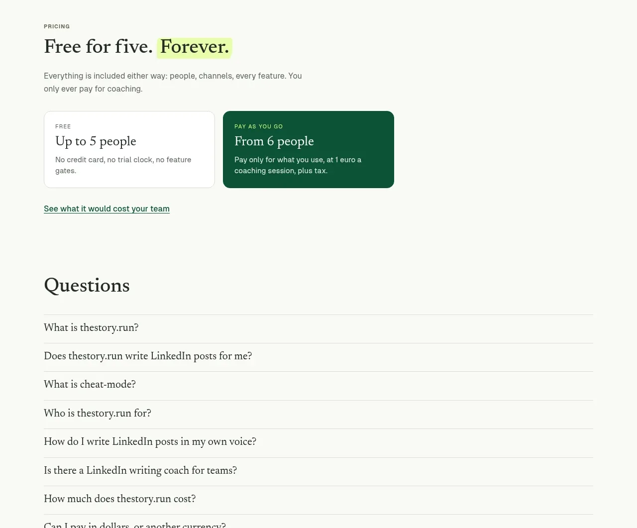
11. **Pricing**: serif heading with a yellow-highlighted word, short subcopy, then two pricing cards side by side — one light, one filled dark green — followed by an underlined helper link.
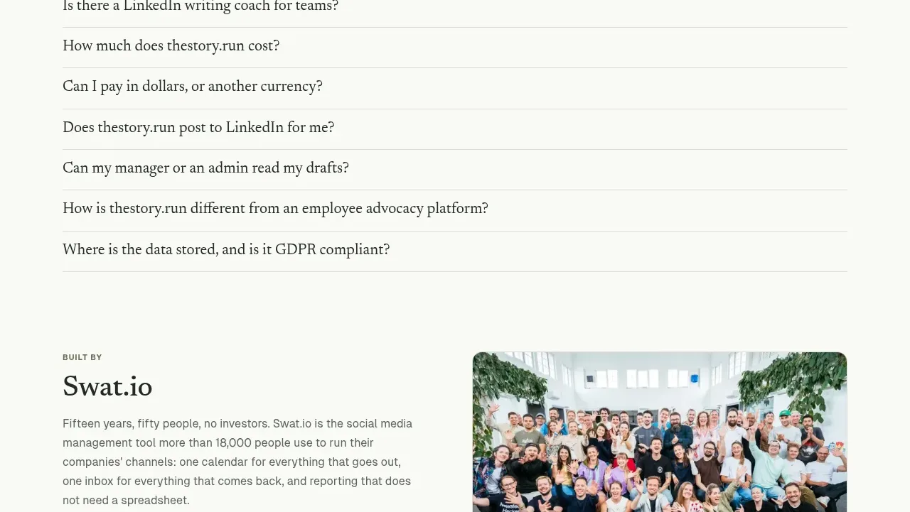
12. **FAQ**: serif "Questions" heading and a simple stacked accordion list with underlined questions and hairline dividers.
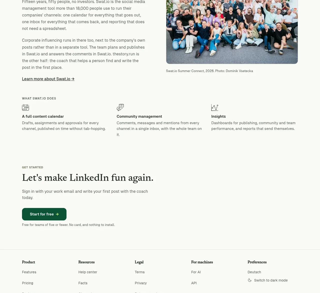
13. **Company/about**: a "Built by" block with prose, a photo with a small credit caption, then a three-column icon-and-text feature list.
14. **Final CTA**: serif headline, one line of copy, one dark button, one reassurance line.
15. **Footer**: multi-column link groups, copyright line, and small badges on the right.

## Design language
- Hierarchy comes from type, not decoration: headlines in a classic serif (e.g. a Georgia/Playfair-like face) at very large sizes, tight line-height; body in a neutral sans at ~15–16px with generous line-height.
- Signature accent: a neon highlighter yellow (#e8fb6a–#d9f24f range) used as inline text highlight, link underlines, sticky-note cards and small UI chips. Secondary accent is deep forest green (#1e4620–#2f5d31) for headlines, filled buttons and one filled pricing card.
- Backgrounds are warm off-white/cream (#faf9f4); screenshot panels use muted sage/olive tints (#dfe3d2-ish) and occasional peach (#fbe6d4) for variety in the bento grid.
- Cards: rounded corners (~12–16px), no or very soft shadows; separation comes from background tint contrast rather than borders.
- Illustrations are hand-drawn, single-weight line doodles — never stock photos or 3D renders. Script/handwriting font reserved for short personality lines ("stay curious…") only.
- Small uppercase eyebrow labels introduce sections; captions and footnotes are tiny (~11–12px) and muted.
- Rhythm: alternate dense screenshot sections with airy all-type manifesto breaks so the scroll breathes; centre-align narrative sections, left-align demo and feature sections.
- Buttons: small, dark-green filled, medium radius, with arrow glyphs; secondary actions are underlined text links, not bordered buttons.
- Motion: keep it quiet — simple accordion opens, hover underlines, no parallax or heavy animation.

## Never
Never copy the reference's brand name, wordmark, taglines, testimonial quotes, manifesto copy, illustrations or photos. Never present the result as that product or reuse its exact highlight colour pairing without adapting it to the user's brand.
Components from this page
All components
 Minimal product navigation
thestory.run · Navigation
Minimal product navigation
thestory.run · Navigation
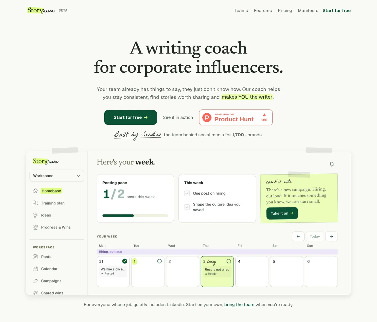 Editorial writing-coach hero
thestory.run · Hero
Editorial writing-coach hero
thestory.run · Hero
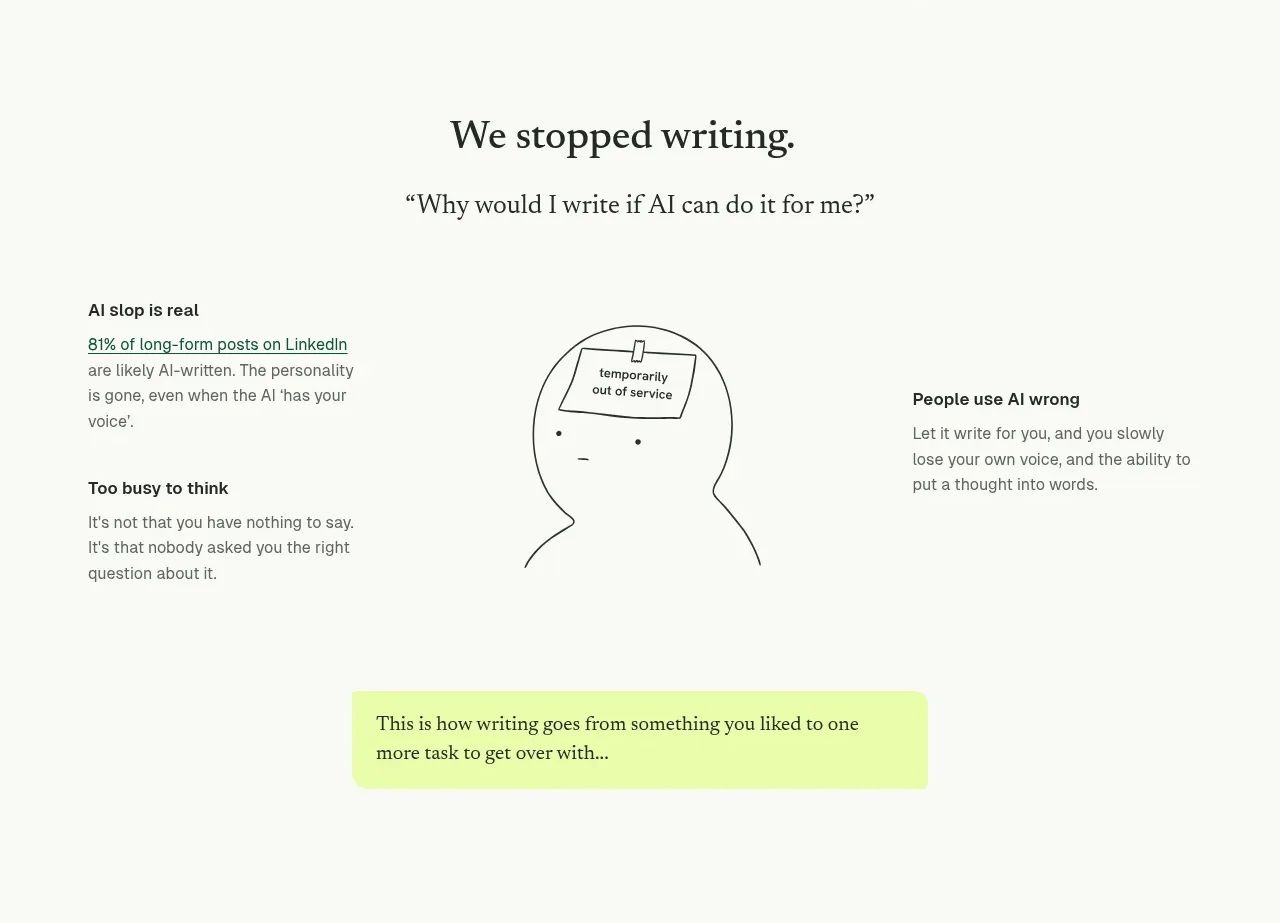 The problem with AI writing
thestory.run · Feature grid
The problem with AI writing
thestory.run · Feature grid
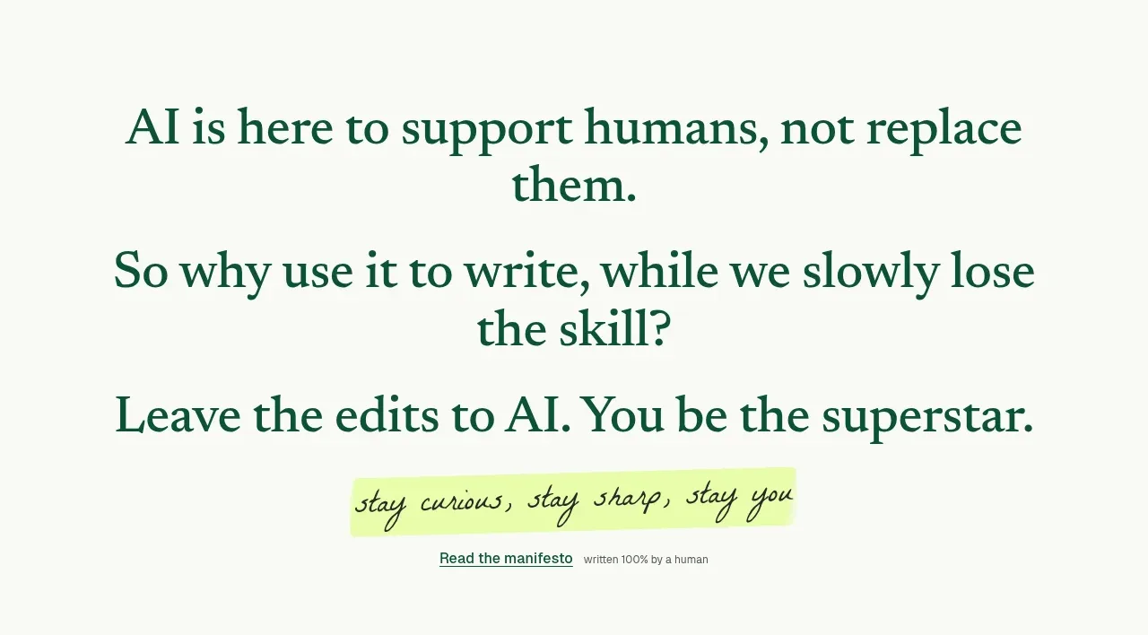 Human-first manifesto
thestory.run · Call to action
Human-first manifesto
thestory.run · Call to action
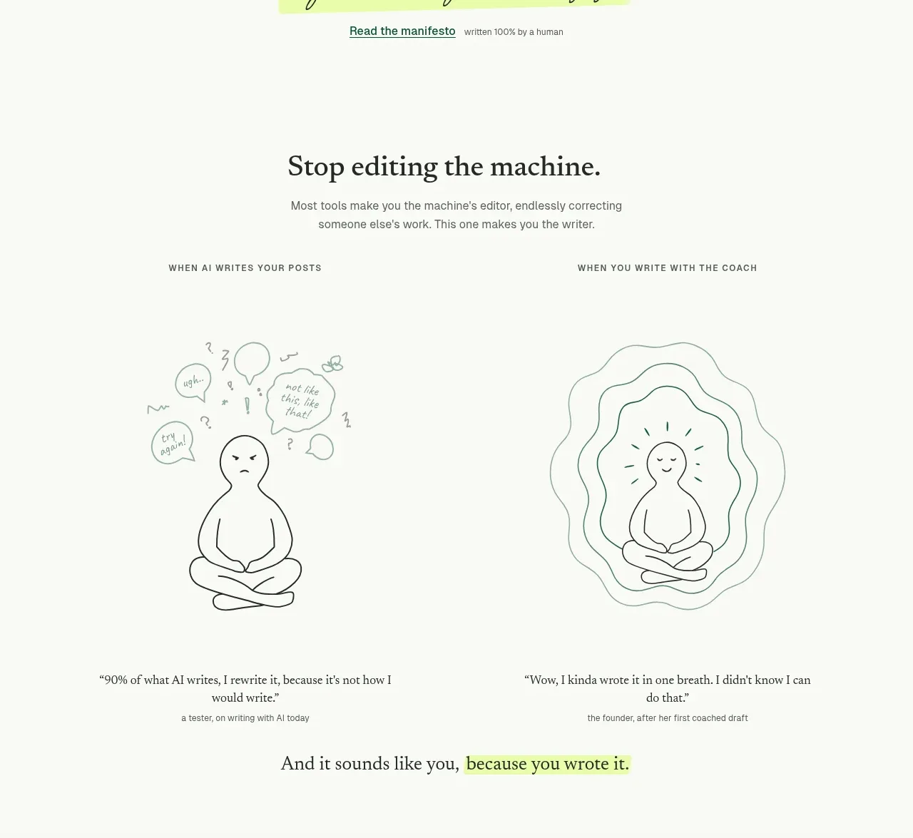 Before-and-after writing comparison
thestory.run · Feature grid
Before-and-after writing comparison
thestory.run · Feature grid
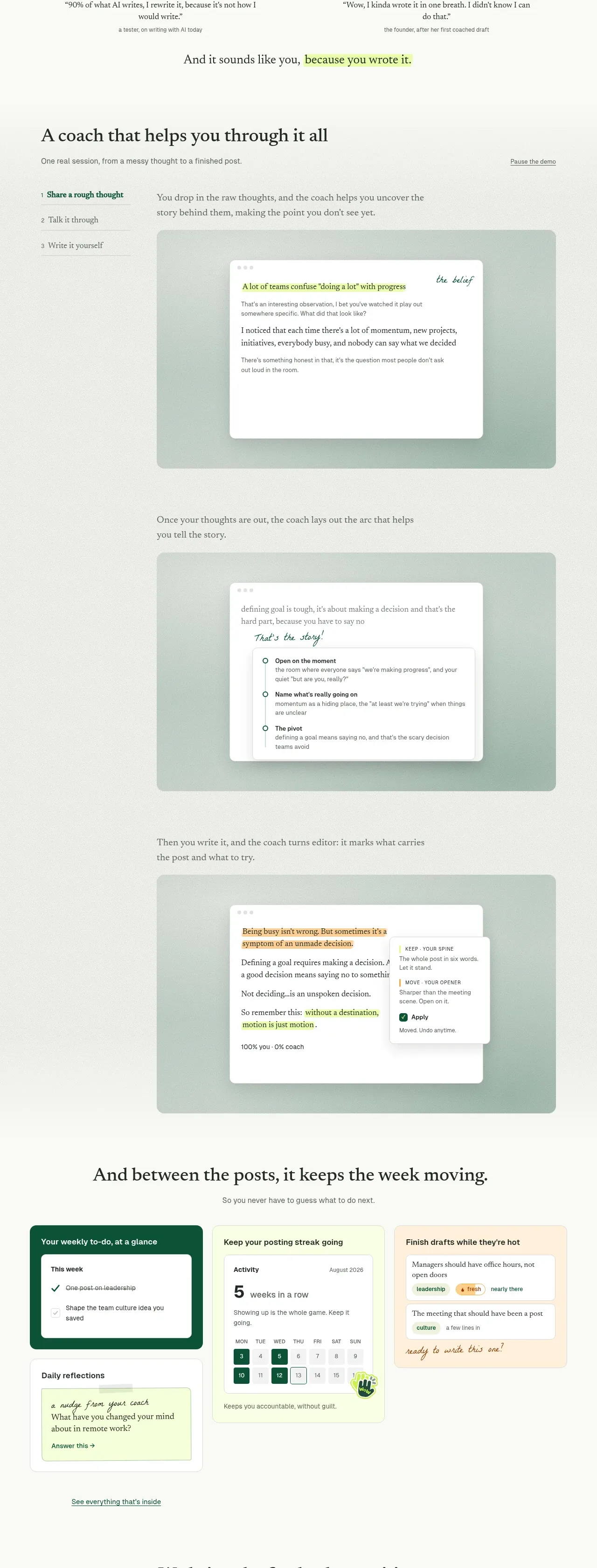 Guided coaching workflow
thestory.run · Feature grid
Guided coaching workflow
thestory.run · Feature grid
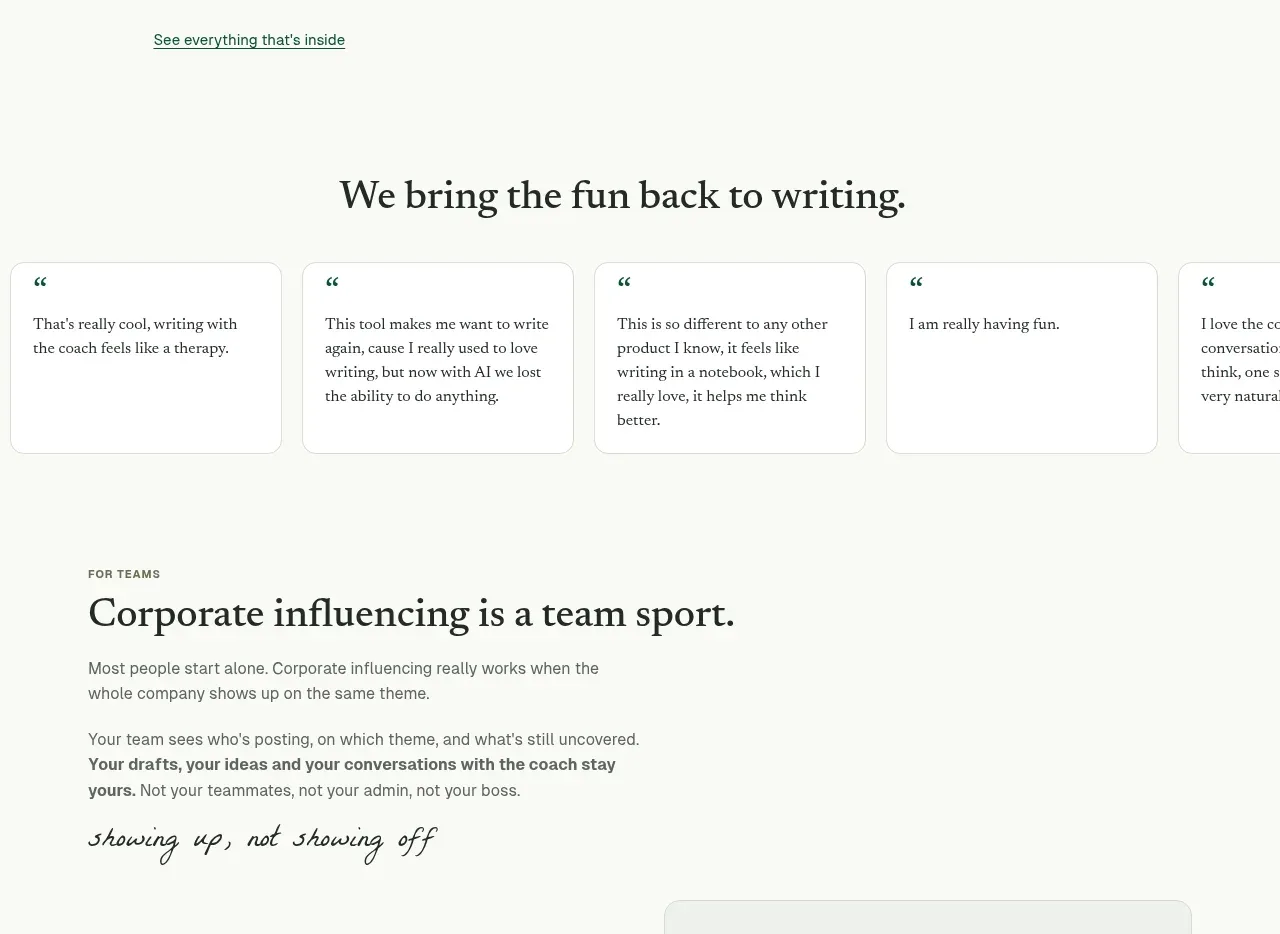 Weekly momentum tools
thestory.run · Feature grid
Weekly momentum tools
thestory.run · Feature grid
 Customer quote strip
thestory.run · Testimonials
Customer quote strip
thestory.run · Testimonials
 Team collaboration story
thestory.run · Feature grid
Team collaboration story
thestory.run · Feature grid
 Simple usage-based pricing
thestory.run · Pricing table
Simple usage-based pricing
thestory.run · Pricing table
 Questions and answers
thestory.run · FAQ
Questions and answers
thestory.run · FAQ
 Company proof, final signup, and footer
thestory.run · Footer
Company proof, final signup, and footer
thestory.run · Footer