kage
kage
xem.email

Design analysis
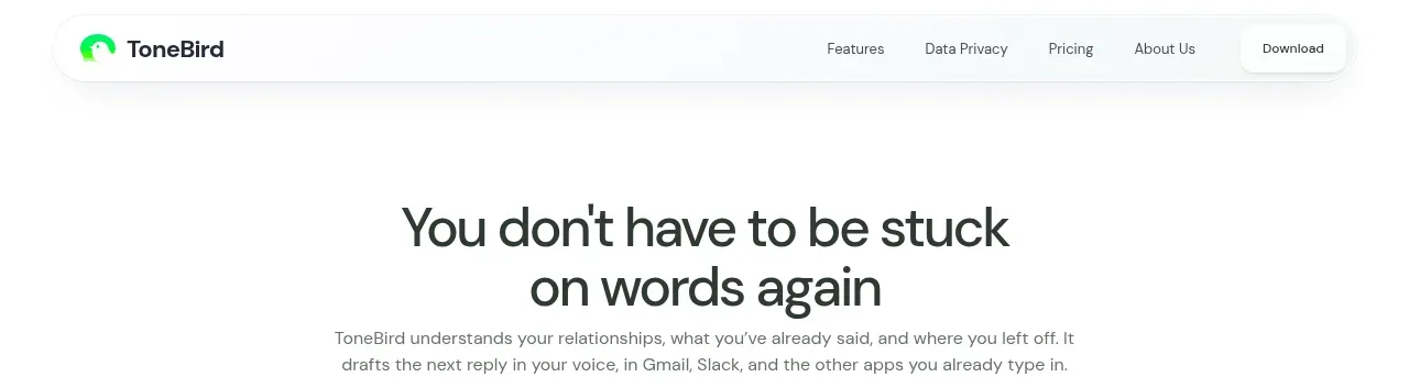
A compact cream navigation bar keeps the product identity, primary destinations, login, and a single purple conversion action visible without competing with the hero.
Prompt preview
## Reference images

Study these alongside the description below: hierarchy, rhythm, spacing, colour. Build for the product you are asked about, using this design language.

- Component: https://kage-design-assets.t3.tigrisfiles.io/components/xem/cfdda217-53f8-4a81-998a-9d07a076ba78-1790143670-0.webp
- Full page it was cut from: https://kage-design-assets.t3.tigrisfiles.io/screenshots/xem/cfdda217-53f8-4a81-998a-9d07a076ba78-1790143376275-full.webp
- Component on Kage: https://kage.design/component/xem-navigation

## Before you start
Ask what the user's product is, who it is for, and what their brand personality and primary conversion goal are. Apply the principles below to that product rather than copying the reference.

Build a compact SaaS navigation bar with a warm off-white background and generous horizontal breathing room. Use a small brand mark and wordmark at left, a restrained row of text links in the center, and a low-emphasis login link plus one filled primary button at right. Keep the navigation in a centered max-width container, align everything vertically, and make it collapse into a simple menu on small screens. Use dark forest text around #17261f, a purple primary button around #5b35c9, subtle #ebe9df borders, 12–14px sans-serif labels, and a 6–8px button radius. The header should feel quiet and editorial, with no heavy shadow; add a sticky state only if useful.

Never use the reference's logo, product name, copy, illustrations, or imagery.