kage
kage

Design analysis
A long editorial landing page that mixes a warm cream base with full-bleed colour blocks — deep green product section, lavender workspace sections, lilac template gallery, dark testimonials — alternating light and dark rhythm down the page. The type system is the star: a large serif where the second line of every headline drops into italic ("Every email, / a little more human."), paired with small uppercase eyebrow labels in letter-spaced sans. Product screenshots sit in rounded pastel cards with generous padding, and real UI mockups (template editor, analytics dashboard with stacked bar charts and a heat-map calendar) do the persuading rather than stock imagery. Whimsical hand-drawn illustration accents and an envelope motif reinforce the "human email" positioning. Density shifts deliberately: airy narrative sections, then dense data previews, then dark closing blocks for trust (testimonial, open-source CTA) and a straightforward FAQ.
Prompt preview
## Reference images

Study these alongside the description below: hierarchy, rhythm, spacing, colour. Build for the product you are asked about, using this design language.

- Full page: https://kage-design-assets.t3.tigrisfiles.io/screenshots/xem/cfdda217-53f8-4a81-998a-9d07a076ba78-1790143376275-full.webp
- Above the fold: https://kage-design-assets.t3.tigrisfiles.io/screenshots/xem/cfdda217-53f8-4a81-998a-9d07a076ba78-1790143371915.webp
- Design on Kage: https://kage.design/designs/xem-landing-page

# Before you start
Ask the user what they are building, who it is for, and what brand assets (name, colours, type, logo) they already have. Wait for the answers. Everything below is applied to their product, not to the reference site.

# Page structure
1. **Sticky nav**: left wordmark, centred text links (product areas, templates, analytics, AI, sending, journal, FAQs), right "Log in" text link plus a solid accent pill button.
2. **Hero**: small uppercase eyebrow badge ("Proudly open source"-style), huge two-line serif headline where line two is italic, short centred sub-paragraph, primary pill CTA + secondary "take a tour" text link with arrow.
3. **Hero collage**: a scattered, slightly rotated collage of envelope / newsletter-card mockups with a circular "scroll" sticker — immediately shows the product's artefacts.
4. **Dark green product block**: full-bleed deep-green section with feature pills across the top, centred serif headline + italic second line, and a horizontal tab switcher (Design / Send / Automate / Understand) driving a large product screenshot in a rounded panel; a footnote line below.
5. **Lavender section — workspace**: left-aligned serif headline with italic second line plus body copy and link, right side a chat-style UI mockup card. Two-column narrative + screenshot.
6. **Cream onboarding section**: "A preview of your first steps" — a checklist card on the left with numbered steps (one expanded), a mockup panel on the right; below, two side-by-side info cards (bring-your-own SMTP, managed sending) each with eyebrow, heading, copy and arrow link, then a small pill CTA bar.
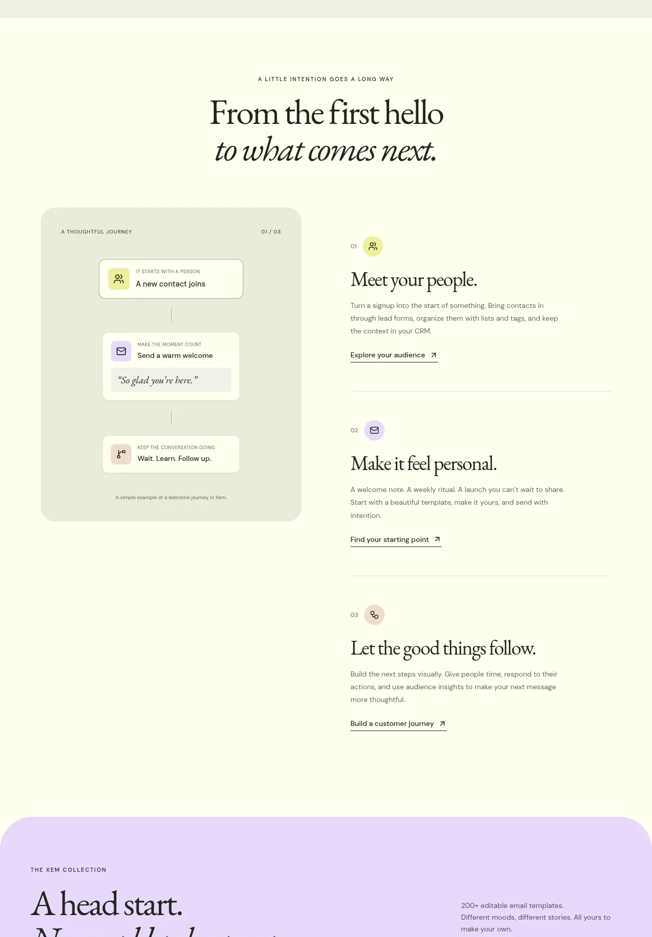
7. **Narrative section**: eyebrow, big serif headline with italic line two, then a numbered journey (01/02/03) with small sticky-note style cards on the left and text blocks with arrow links on the right.
8. **Lilac template gallery**: headline + copy, then a horizontally scrolling row of email-template preview cards (image top, category eyebrow, title, arrow), with carousel arrows.
9. **Analytics preview**: large rounded dashboard mockup — KPI stat row, stacked bar chart, line chart, donut chart, top-tables table, and a heat-map calendar grid — framed by a short serif headline above.
10. **Editor section**: dark-green panel with copy + a bright newsletter mockup ("big idea?" prompt box), followed by two smaller contrast cards (light "people not just a list", dark "fits into your world" with integration icon grid).
11. **Trust strip**: a single-line row "Your relationships. Your rules." with three checkmark items.
12. **MCP/AI section**: two-column card with heading, copy, and a chat-prompt example card with action chips.
13. **Feature tabs section**: heading, pill tabs, large screenshot panel, then two small bordered info cards with arrow links.
14. **Dark testimonial block**: near-black section, left small avatar + name list, right large pull-quote testimonial with attribution and small partner badges.
15. **Journal / blog cards**: three article cards (eyebrow date, title, excerpt) on the cream background.
16. **Open-source closing**: big serif headline, bullet list of contribution links, prominent GitHub-style CTA button.
17. **FAQ**: centred heading ("Good questions."), a dark green panel with expandable question rows and an answer panel beside it.
18. **Footer**: minimal dark or cream strip with links.

# Design language
- **Headline pattern**: every major section headline is a large serif (~64–88px, tight leading) where the second line flips to italic — build this two-line/italic rhythm consistently; it is the page's signature.
- **Eyebrow labels**: tiny uppercase, letter-spaced sans (~11–12px) above each section to set context before the big type.
- **Section colour rhythm**: alternate cream/off-white (#faf7ef-ish) base with full-bleed coloured blocks — deep green (#1e3a2f), lavender (#e6e0f5), lilac (#cfc4ec), near-black (#161418). Light→dark→light keeps a long page readable.
- **Type pairing**: one high-contrast editorial serif for headings + a clean geometric sans for UI, body, buttons and labels. Body ~16px, comfortable measure, muted grey-green rather than pure black.
- **Product screenshots**: always inside large rounded-corner (~16–24px) panels with 1px borders and very soft shadows, sitting on pastel card backgrounds; never full-bleed raw screenshots.
- **Colour as function**: one saturated accent (violet/purple #6d5bd0) reserved for primary CTAs and small highlights; greens carry the brand blocks; pastels carry sections. Avoid gradient decoration.
- **Illustration**: sparse hand-drawn / doodle accents (envelopes, scribbles, stickers) used as personality markers only — no stock photography.
- **Data mockups**: dashboards shown with believable numbers, varied chart types (stacked bars, line, donut, heat-map) in brand hues at reduced saturation.
- **Buttons**: solid accent pill for primary, quiet text + arrow (↗) links for secondary; consistent pill radius throughout.
- **Density**: airy headline sections (~120–160px padding), dense only inside UI mockups and the FAQ; dark closing sections slow the pace before the end.
- **Motion**: subtle — hover arrows nudge, cards lift slightly; no heavy animation.

# Never
- Never reuse the Xem name, wordmark, logo, headline copy, testimonial quotes, journal titles, template artwork or icon set.
- Never present the output as the reference product; apply this design language to the user's own brand, colours and copy.
- Do not copy the collage imagery or illustration characters — create original, empty generic mockups.
Components from this page
All components
 Minimal product navigation
Xem · Navigation
Minimal product navigation
Xem · Navigation
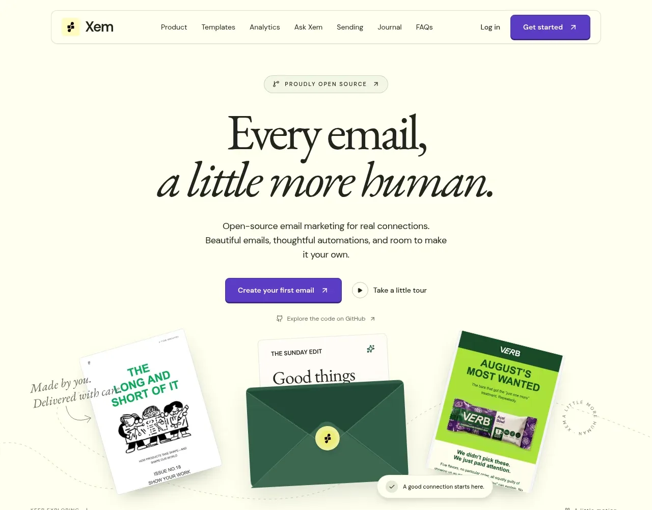 Editorial email marketing hero
Xem · Hero
Editorial email marketing hero
Xem · Hero
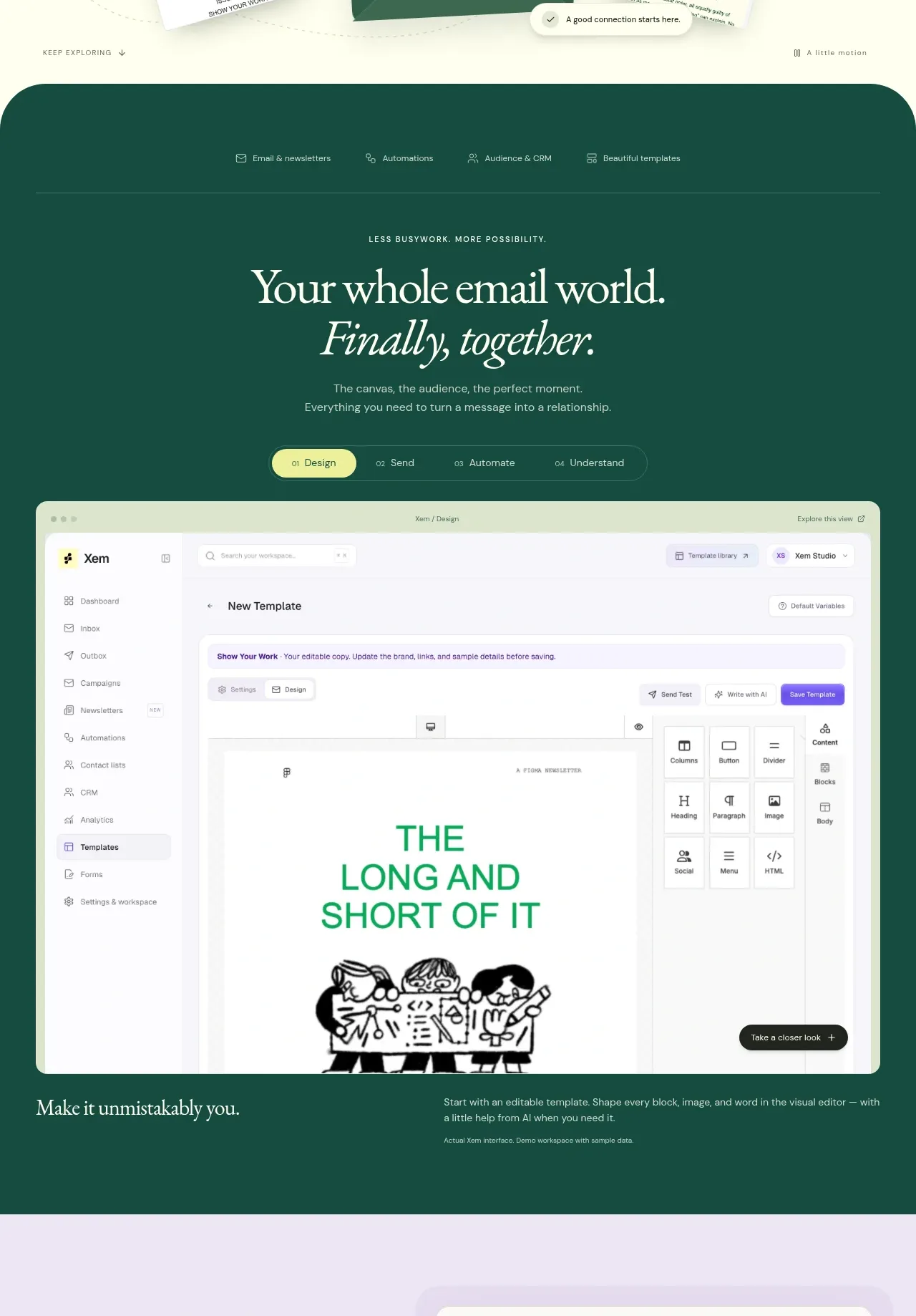 Unified workspace product story
Xem · Feature grid
Unified workspace product story
Xem · Feature grid
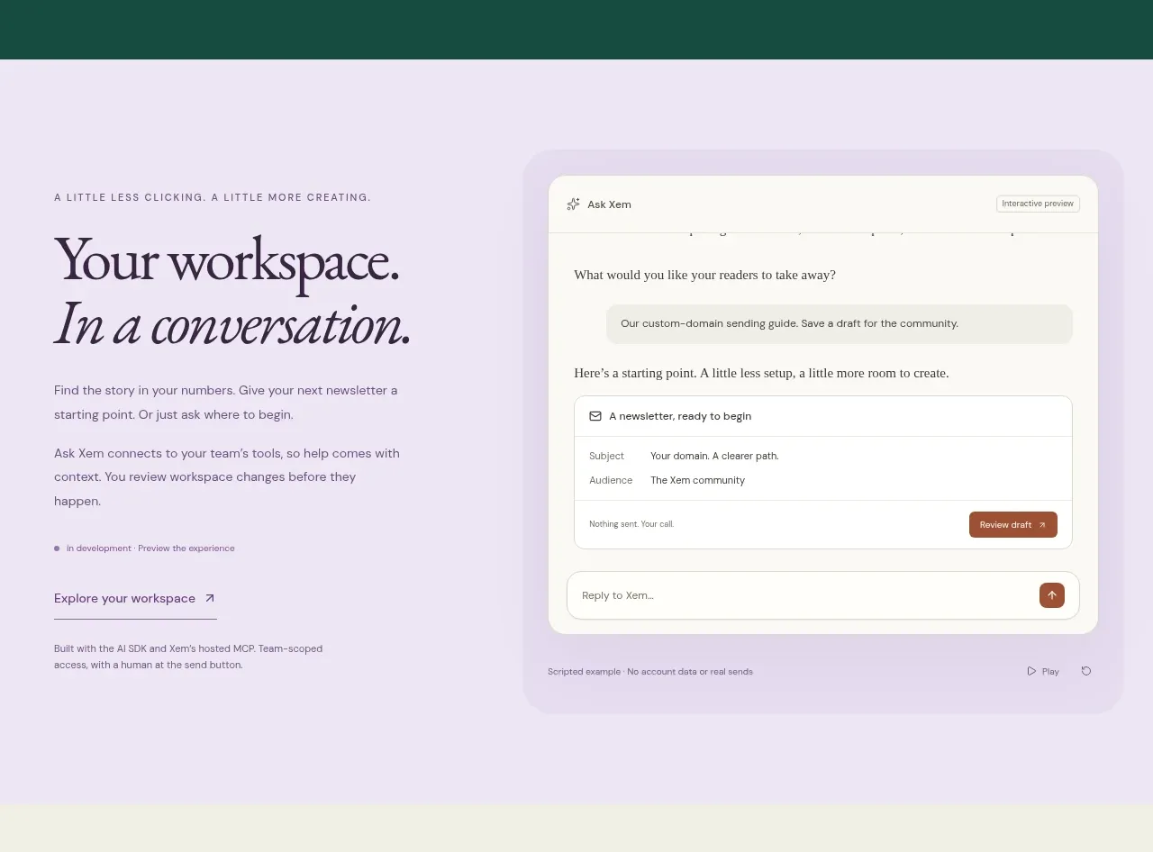 Conversational workspace feature
Xem · Feature grid
Conversational workspace feature
Xem · Feature grid
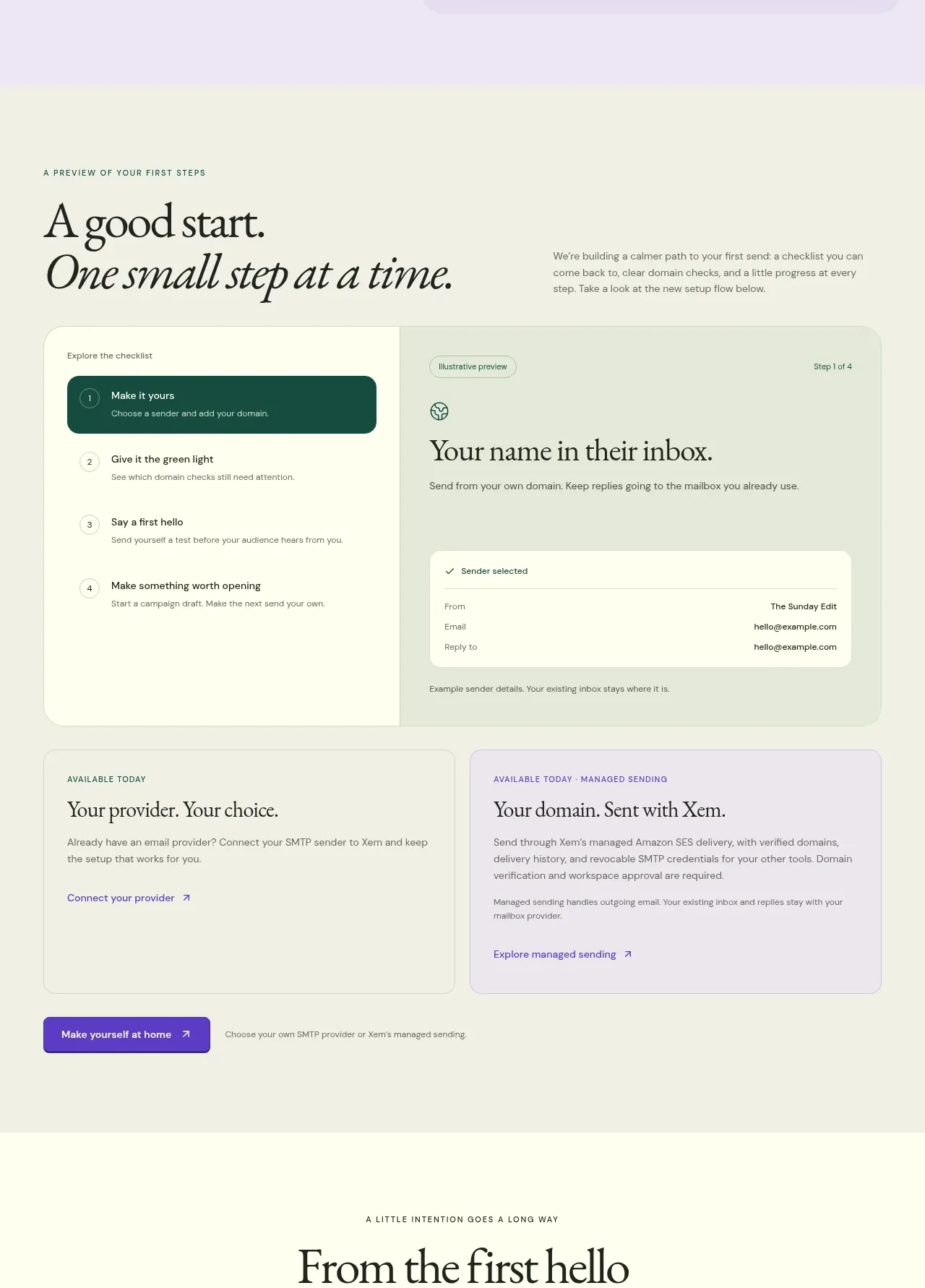 Guided onboarding checklist
Xem · Feature grid
Guided onboarding checklist
Xem · Feature grid
 Relationship-building journey
Xem · Feature grid
Relationship-building journey
Xem · Feature grid
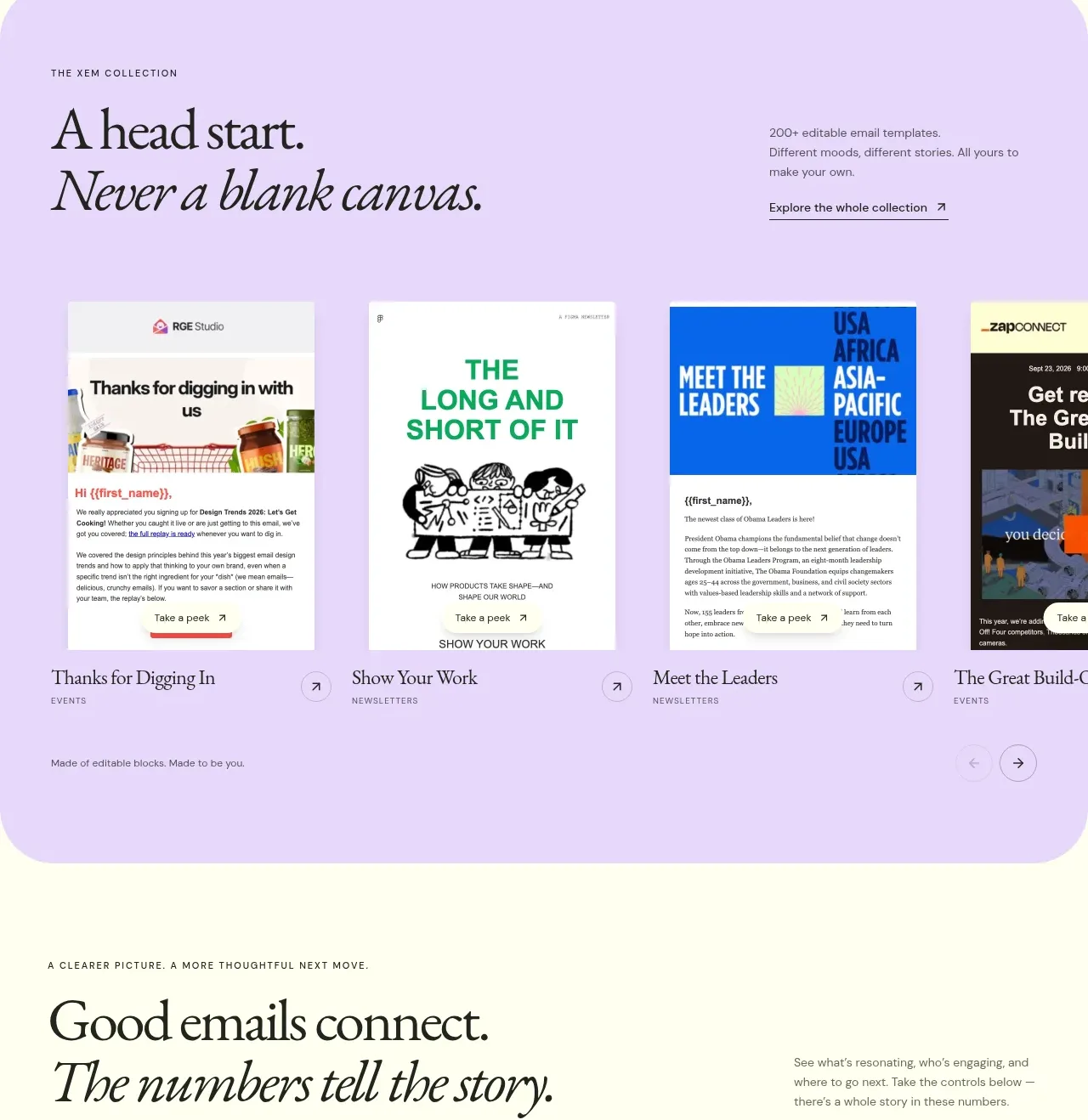 Template collection gallery
Xem · Gallery
Template collection gallery
Xem · Gallery
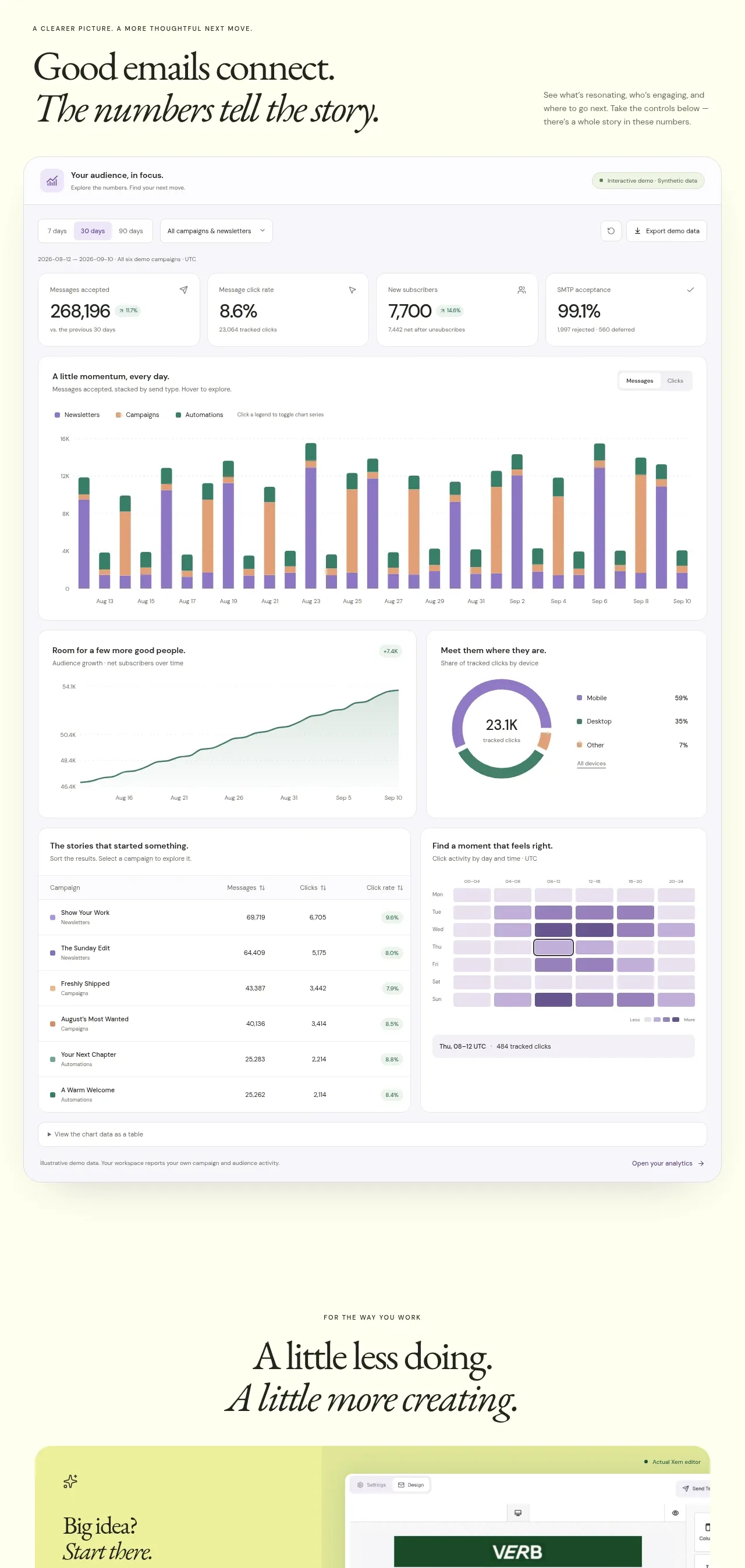 Analytics dashboard proof
Xem · Chart
Analytics dashboard proof
Xem · Chart
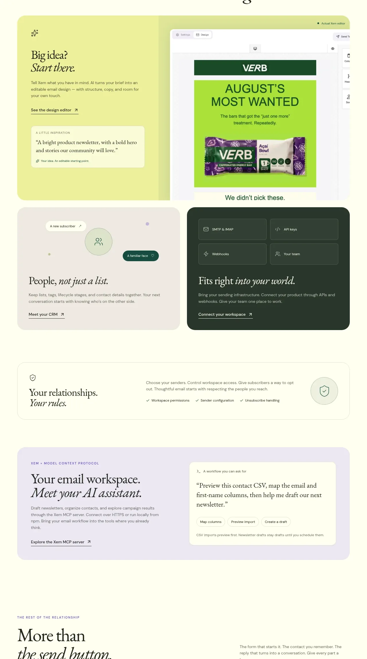 Creative workflow toolkit
Xem · Feature grid
Creative workflow toolkit
Xem · Feature grid
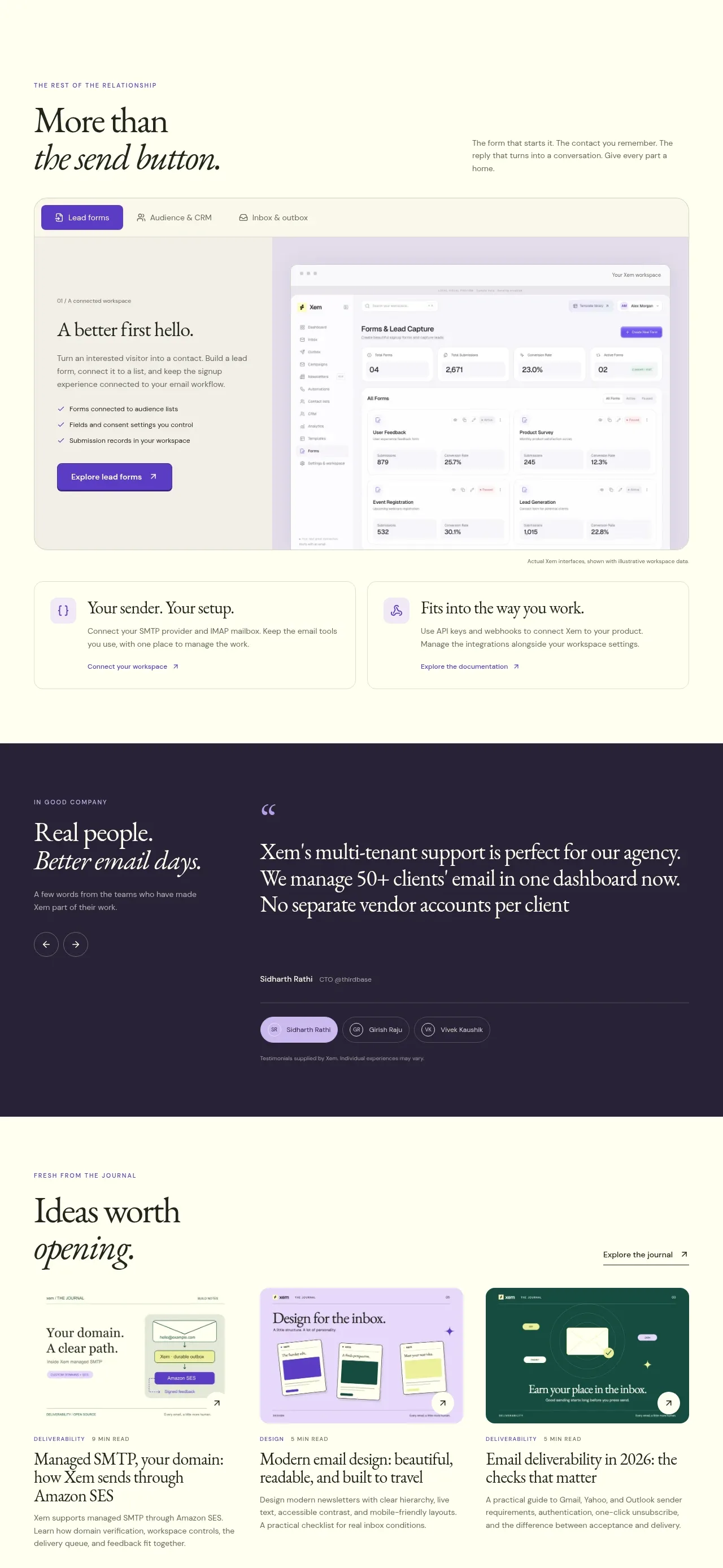 Forms and sending workflow
Xem · Form
Forms and sending workflow
Xem · Form
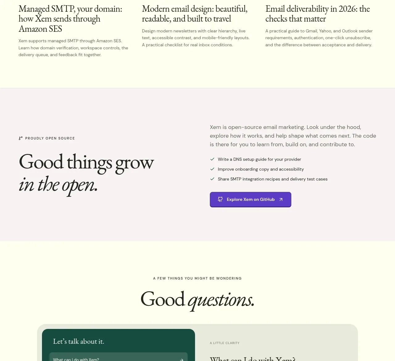 Customer proof testimonial
Xem · Testimonials
Customer proof testimonial
Xem · Testimonials
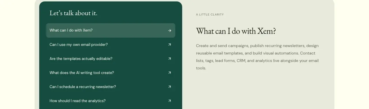 Journal and open-source closing content
Xem · Feature grid
Journal and open-source closing content
Xem · Feature grid