kage
kage
harmony.io
Design analysis
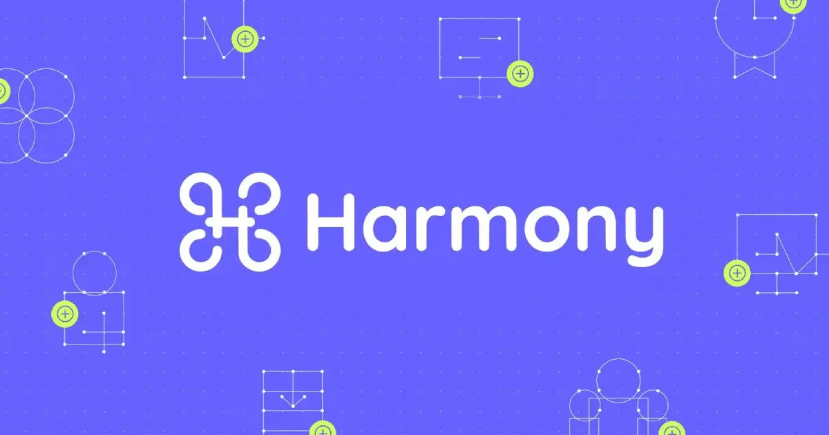
A 1200×630 link-preview card built around a single centered white lockup: a curly looped mark followed by a heavy rounded sans wordmark set at roughly 55% of canvas width, sitting just above vertical center. The flat violet field carries a faint dot-grid texture, and eight thin white wireframe doodle icons (four-circle clover, monitor, medal, person, browser window, group) are pinned around the periphery, each tagged with a small lime plus badge that hints at resolution/add actions. Hierarchy comes almost entirely from scale and placement — one large focal lockup, small sparse line art at the edges — with only three colours doing all the work, which keeps the card legible at thumbnail size.
Prompt preview
## Reference images

Study these alongside the description below: hierarchy, rhythm, spacing, colour. Build for the product you are asked about, using this design language.

- Screenshot: https://kage-design-assets.t3.tigrisfiles.io/screenshots/harmony/b5df596c-5fd9-41b5-bc71-e23ea6ae1fd7-1790575268333.webp
- Design on Kage: https://kage.design/designs/harmony-og-image

## Before you start
Ask the user what product the card is for, who it is for, what the card should communicate, and what brand assets they already have (name, logo/mark, colours, typeface). Wait for the answers before designing. Everything below is a composition system to apply to *their* brand with placeholder branding and copy — not a recreation of the reference card.

## Page structure
Produce a single static social card image at exactly **1200×630** (standard OG ratio). Recommended: an HTML/CSS file sized 1200×630 (fixed dimensions, no scroll) rendered to PNG with Playwright/Puppeteer, or a standalone SVG exported to PNG. Compose it in three layers, bottom to top:

1. **Background field** — one flat, saturated brand colour covering the whole canvas, with a subtle dot-grid texture (small dots in a slightly lighter/darker tint of the same colour, ~24–32px spacing). No gradients, no photography.
2. **Peripheral icon constellation** — 7–9 thin line-art icons pinned around the edges and corners, leaving a clear horizontal band across the middle. Icons should be simple wireframe doodles on the product's theme (tools, screens, people, documents, charts), each with one small circular accent badge containing a plus or check glyph, overlapping the icon's corner. Vary icon subjects so no two adjacent ones repeat; keep them inside a ~40–60px safe margin.
3. **Central lockup** — the brand mark and wordmark side by side as one horizontal group, optically centred (slightly above true vertical centre, around 46–50% height). The lockup should span roughly 55–60% of the canvas width.

## Design language
- **One focal point, everything else subordinate.** Hierarchy comes from scale contrast alone: the lockup is huge, the edge icons are small and thin. Do not add headlines, taglines or URLs unless the user asks — if they do, keep them small and place them below the lockup without pushing it off-centre.
- **Palette: exactly three colours.** Flat violet background ≈ `#7B5CF5`, white `#FFFFFF` for all line art and the wordmark, one lime/chartreuse accent ≈ `#C6E94F` used only for the small circular badges. Substitute the user's brand colours but keep the same roles: one saturated field colour, one neutral for art, one tiny high-energy accent at <5% of canvas area.
- **Type.** Use a heavy, rounded geometric sans for the wordmark (e.g. a Nunito/Baloo-class face) at a size where cap-height reads clearly at 200px-wide thumbnail render. Mark and wordmark share the same colour and baseline; gap between them ≈ half the wordmark's x-height.
- **Icon style.** Uniform 2px white strokes, no fills, wireframe/doodle construction with small filled dot nodes at line endpoints and junctions. Icon boxes ~90–140px. Badges ~36–44px circles, solid accent fill, dark or white glyph, always overlapping an icon corner rather than floating free.
- **Balance without symmetry.** Distribute icons so visual weight feels even around the centre — cluster 2–3 per edge, vary their sizes and rotations slightly — but never centre-symmetric rows; the periphery should feel hand-placed.
- **Texture, not decoration.** The dot grid is the only background ornament; keep it low contrast so white strokes stay dominant.
- **Flat everything.** No shadows, bevels, borders or gradients; contrast between the field colour and white art is the entire depth model.

## Never
- Do not reproduce the reference brand: no looped/ornamental H-style mark, no "Harmony" name, no copy from the reference.
- Do not clone the exact icon set (four-circle clover, medal, monitor doodles); invent new icons in the same wireframe style that fit the user's product.
- Do not present the result as the reference product or reuse its wordmark, logo, colours-as-brand (use the user's own brand colours), or any illustration from the card.