kage
kage
intellagents.io
Design analysis
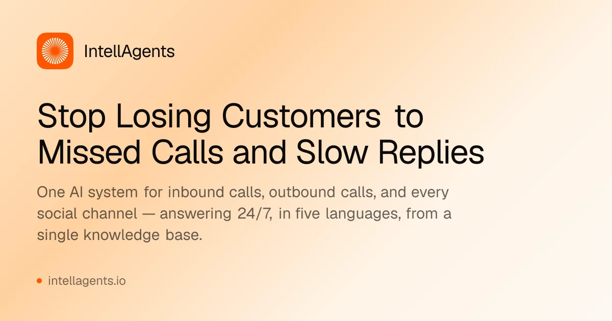
A single-weight, all-type social card on a 1200×630 canvas: a soft peach-to-cream gradient fills the frame, and every element — rounded-square orange app icon with a white radial starburst, wordmark, two-line bold headline, supporting paragraph, and a dotted domain footer — stacks in one left-aligned column that occupies roughly the left two-thirds, leaving warm empty gradient as the only imagery. Hierarchy is carried purely by scale and colour contrast: near-black 72px-class headline, warm-gray subhead, then muted footer. The absence of screenshots or illustrations keeps it legible at feed size and lets the orange brand accent do all the colour work.
Prompt preview
## Reference images

Study these alongside the description below: hierarchy, rhythm, spacing, colour. Build for the product you are asked about, using this design language.

- Screenshot: https://kage-design-assets.t3.tigrisfiles.io/screenshots/intellagents-io/5151e790-3e5c-43fa-aa77-073a6aff5595-1790316160128.webp
- Design on Kage: https://kage.design/designs/intellagents-og-image

## Before you start
Ask the user what they are building, who it is for, and what brand assets they already have (product name, logo/icon file or description, brand colours, typeface). Wait for the answers, then apply everything below to *their* product with placeholder branding and copy if assets are missing. The reference is a composition study only — do not reproduce its content.

## Goal
Produce a **1200×630 Open Graph / social share card image** (deliverable: an SVG file, or a single HTML/CSS page sized exactly 1200×630 that can be screenshotted to PNG — e.g. with Playwright or `wkhtmltoimage`). No interactivity, no animation; it is a static image.

## Page structure
Work as one fixed 1200×630 artboard with ~80px outer padding and a single left-aligned column occupying the left ~65% of the width:

1. **Background**: full-bleed soft diagonal gradient — warm peach/apricot (≈#F4A96A–#F7C592) saturating the top-left and left edge, easing to pale cream (≈#FCEBD9 → #FDF4EB) toward the centre-right. No texture, no noise, no shapes.
2. **Brand lockup (top-left, ~y=80)**: a rounded-square app icon (≈72×72px, corner radius ≈22px) in the brand accent colour containing a simple white radial/starburst mark, with the product wordmark set to its right at ≈32px, medium weight, near-black. Vertically centre the two.
3. **Headline (~y=210)**: the value proposition in two lines, bold, ≈68–72px, tight line-height ≈1.05, near-black, left-aligned. Keep it to 8–12 words so it wraps naturally to two lines.
4. **Subhead (~y=390)**: a 1–3 line supporting sentence at ≈28–30px, line-height ≈1.5, in a warm mid-grey that reads as slightly sun-faded against the peach background. Constrain it to ~60% of the canvas width.
5. **Footer (~y=540)**: a small dot (≈10px) in the brand accent colour followed by the domain (or key benefit phrase) at ≈22px in the same warm grey as the subhead.

## Design language
- **Type-only composition**: no screenshots, illustrations or photography — the gradient background *is* the imagery. Hierarchy comes exclusively from scale steps (72 → 30 → 22px) and colour contrast, so text must stay large enough to read in a 400px-wide feed preview.
- **One-column, left-weighted rhythm**: every element aligns to the same left edge (~80px inset); the right third of the canvas stays empty to balance the dense left column and give the eye somewhere to rest.
- **Warm, low-contrast palette**: one vivid accent (orange ≈#F4681F) used only for the icon and the footer dot; near-black ≈#141414 for the headline and wordmark; warm grey ≈#8F7E6E for secondary text; background gradient between ≈#F4A96A and ≈#FDF4EB. If the user's brand is not warm, transpose the same logic: one saturated accent on a tinted, desaturated version of that accent.
- **Type pairing**: a single geometric/humanist sans family throughout; differentiate roles by weight (bold headline, regular/medium wordmark and subhead) rather than by changing typeface. If the user has a brand font, use it at these sizes; otherwise use Inter, Manrope or Geist.
- **Shape and radius**: the only hard shape is the icon's rounded square (~30% corner radius). Everything else is typographic and square-edged to the canvas — no cards, no borders, no shadows, no dividers.
- **Spacing**: generous vertical gaps (≈90–110px between lockup, headline, subhead and footer) with the whole composition optically centred slightly above vertical middle.
- **Static output**: render at exactly 1200×630; verify no element overflows and that the headline wraps to at most two lines.

## Never
- Do not use the IntellAgents name, wordmark, starburst icon, domain, tagline or its headline copy anywhere in the output.
- Do not clone its exact peach gradient if the user's brand points elsewhere — rebuild the palette from their assets.
- Never present the card as IntellAgents' card; it is a new card in the same compositional language for the user's product.