kage
kage
jurniti.com
Design analysis
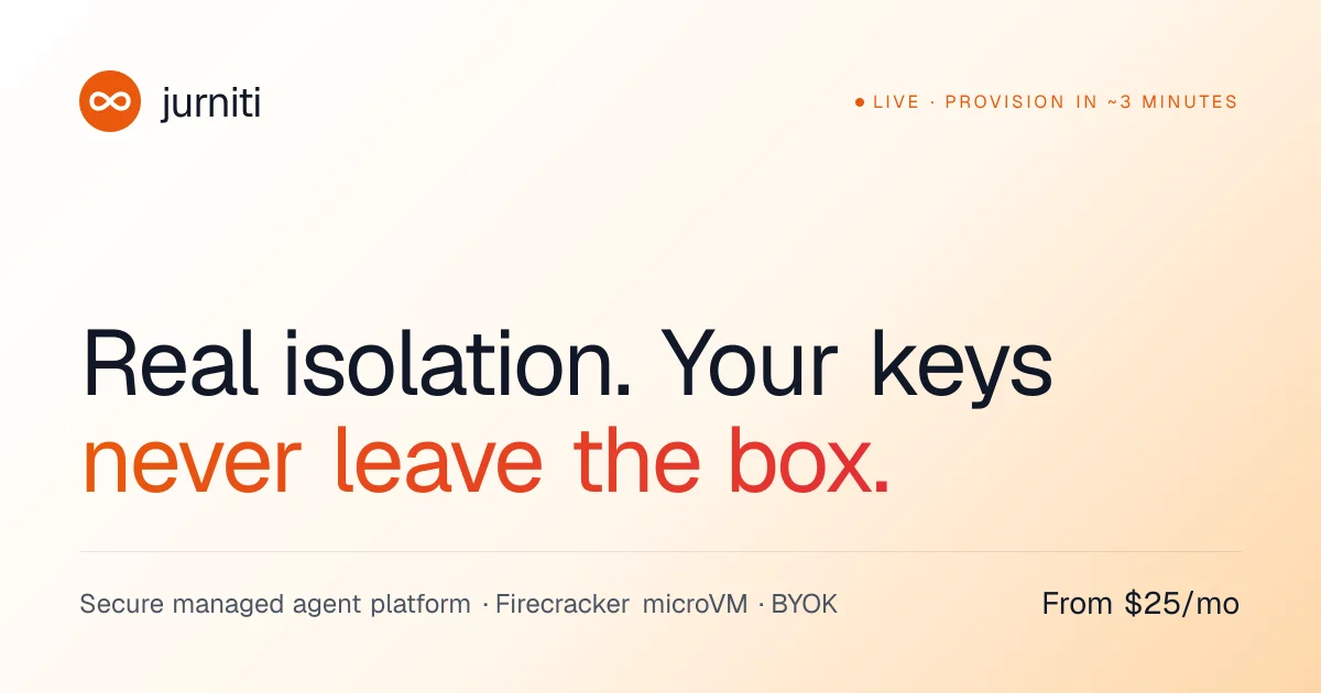
A 1200×630 share card on a warm cream-to-peach gradient, structured as three stacked zones on one left-aligned axis: a logo/wordmark row with a small uppercase status label on the right, an oversized two-line headline whose second line shifts from orange to red, and a hairline-ruled footer pairing metadata with a right-aligned price. The design is entirely flat — hierarchy comes from type scale, the single warm accent colour and a large band of empty space between header and headline, with no imagery or illustration at all.
Prompt preview
## Reference images

Study these alongside the description below: hierarchy, rhythm, spacing, colour. Build for the product you are asked about, using this design language.

- Screenshot: https://kage-design-assets.t3.tigrisfiles.io/screenshots/jurniti/cc994a6e-8b13-4ef0-904d-be237d62d649-1789538540518.webp
- Design on Kage: https://kage.design/designs/jurniti-og-image

# 1200×630 OG social card — warm minimal share card

Produce a social share card at exactly **1200×630 px**, built as HTML/CSS rendered to PNG (e.g. a fixed-size page screenshotted with Playwright/Puppeteer) or as a standalone SVG. Use the user's own branding throughout — this is a compositional template, not a copy of the reference.

## Before you start
Ask the user:
- What product or page is the card for, and what single message should it land in two seconds?
- Who is it for (developers, buyers, general audience)?
- What brand assets exist: name, logo mark, wordmark, brand colours, typeface?

Wait for the answers. Every choice below (colours, type, copy, logo) is applied to *their* brand; only the layout and visual grammar come from this template.

## Page structure
One canvas, three horizontal zones stacked top to bottom, everything sharing a left margin of ~72px:

1. **Header row** (top ~15% of the canvas): logo mark (small filled circle/rounded icon) plus lowercase wordmark on the left; on the far right a one-line micro-label in uppercase with a leading accent dot — a status or proof point ("LIVE", "AVAILABLE NOW", "SHIPS IN ~3 MINUTES" style), letter-spaced, in the accent colour.
2. **Hero zone** (middle ~55%): the focal element. A two-line headline, left-aligned, sentence case, each line ending in punctuation. Line 1 in near-black ink; line 2 in an accent gradient. Roughly 84–92px, medium weight, tight tracking. Leave a generous empty band (~18% of canvas height) between the header row and the headline — the emptiness is part of the design.
3. **Footer row** (bottom ~15%): a single 1px hairline rule spanning the content width, then one baseline of text: left side, a short metadata phrase with interpunct (`·`) separators naming 2–3 concrete attributes of the product; right side, exactly one dark, self-contained fact — a price ("From $X/mo") or equivalent key stat.

## Design language
- **Canvas colour:** warm off-white base (≈ `#FBF6EE`) with a soft, subtle radial warm tint toward the right/bottom edge (≈ `#F7E3C4`). Very low contrast, no noise, no texture, no vignette beyond that glow.
- **One accent only:** pick a single warm accent from the user's brand (reference uses orange ≈ `#F1660C` for the logo dot and label, with the gradient running ≈ `#F97316` → `#E23A2E` left-to-right on headline line 2). The accent appears in exactly three places: logo mark, status label, gradient line. Nothing else is coloured.
- **Ink and mute:** headline line 1 and the footer stat in near-black with a slight cool cast (≈ `#1A1F2E`); metadata phrase in muted warm gray (≈ `#6B6F76`); hairline rule in a pale warm tone (≈ `#E5D8C4`).
- **Type:** one modern grotesque family throughout. Headline ~86px / weight 500 / tracking −2% / line-height ~1.1. Micro-label ~21px, uppercase, tracking +8%. Footer text ~27px, regular weight. Wordmark ~34px, lowercase, medium.
- **Flatness:** no shadows, no cards, no borders, no rounded containers anywhere. The only line on the canvas is the footer hairline rule.
- **Alignment discipline:** one left axis for logo, headline and metadata; the micro-label (top right) and the stat (bottom right) are the only right-aligned elements, framing the canvas diagonally.
- **No imagery:** no photos, illustrations, screenshots, mockups or decorative shapes. The card is typography + gradient + hairline. That restraint is what makes it read at small sizes in feeds.

## Never
- Never use the reference's name "jurniti", its infinity logo, its copy ("Real isolation. Your keys never leave the box.", "Firecracker microVM", "BYOK", "~3 minutes"), or its exact colour values — substitute the user's brand.
- Never add imagery, icon sets, patterns or extra sections; if the user asks for more content, cut copy instead of adding zones.
- Never present the result as the reference product or reuse its wordmark.