kage
kage
framerusercontent.com
Design analysis
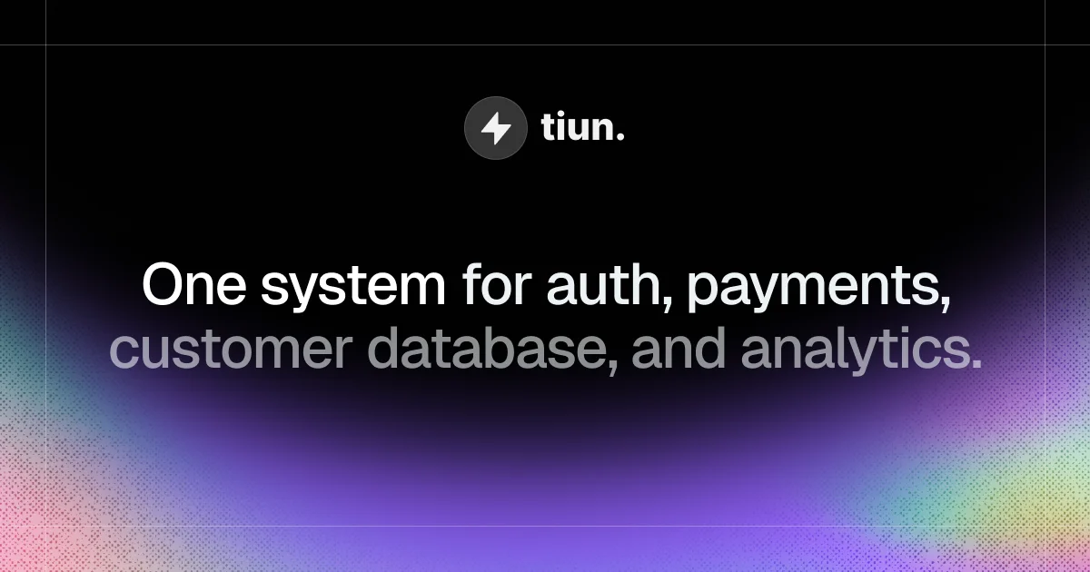
A 1200×630 social card built almost entirely from atmosphere and type: a near-black canvas where the bottom third dissolves into a violet radial glow with fine grain that frays into iridescent pink/green dither in the two bottom corners. Hierarchy is a simple centered stack — a small circular badge plus bold lowercase wordmark up top, then a two-line display headline where line one is white and line two drops to gray, creating emphasis through tint alone rather than size or weight. Faint hairline frame marks at the left and top edges suggest a designed canvas, and roughly 60% of the card is empty black negative space, keeping it legible at thumbnail size.
Prompt preview
## Reference images

Study these alongside the description below: hierarchy, rhythm, spacing, colour. Build for the product you are asked about, using this design language.

- Screenshot: https://kage-design-assets.t3.tigrisfiles.io/screenshots/tiun/18cca79d-bc2e-492e-9a74-898b940458da-1789538669975.webp
- Design on Kage: https://kage.design/designs/tiun-og-image

## Before you start
Ask the user what they are building, who it is for, and which brand assets they already have (name, wordmark, logo mark or glyph, brand colours, typeface). Wait for the answers before designing. Everything below is applied to their product — the reference only teaches composition and atmosphere.

## Deliverable
Produce one 1200×630 social card (Open Graph / large link-preview image). Build it as a single self-contained HTML file with a fixed 1200×630 canvas rendered to PNG via headless screenshot, or as an equivalent standalone SVG. Use placeholder branding and copy unless the user supplied real assets.

## Page structure
Zones of the canvas, top to bottom:
1. Edge marks: a 1px vertical hairline near the left edge and a 1px horizontal hairline near the top at ~5–6% white opacity — framing a "designed canvas" without boxing it in.
2. Top zone (~12–20% from top): centered brand lockup — a small dark circular badge containing one simple white glyph, followed by the wordmark in bold sans.
3. Middle zone (~35–55%): the two-line headline, centered on the same axis, the largest element on the canvas.
4. Bottom third: a single large violet radial glow rising from the bottom edge, overlaid with fine grain; the grain turns iridescent (pink/green/yellow dither) only in the bottom-left and bottom-right corners.
No nav, no buttons, no product UI — the card is lockup + headline + atmosphere. Keep all text inside a central ~1080×500 safe area so link previews can crop edges.

## Design language
- Dark-first canvas: near-black `#08080a` base with roughly 60% empty black negative space, so type and glow read instantly at thumbnail size.
- One glow, one accent zone: all colour comes from a single blurred radial gradient (violet `#7c3aed` core softening toward `#a78bfa`, fading into black) anchored to the bottom centre. Never scatter multiple glows or accents.
- Grain over gradient: layer a monochrome noise texture (~8–12% opacity) over the whole card so gradients don't band; let that same noise become colourful dithered fringe in the two bottom corners (pink `#f2a7c3`, green `#8fe3b0`, yellow `#e8e39a`), as if holographic foil bleeds in from the edges.
- Type is the brand: one neo-grotesque/geometric sans in bold, tight tracking (about -0.02em). Headline ~72–80px with ~1.1 line-height; wordmark ~36–40px; keep the size jump large so hierarchy survives at 200px-wide previews.
- Emphasis by tint, not weight: render headline line one in white `#f4f4f5` and line two in gray `#8a8a91` — same size, same weight; the colour drop alone signals "primary / supporting".
- Centered, symmetric composition: everything sits on one vertical axis; no asymmetric grids.
- Flatness: no borders, shadows or cards anywhere; the only solid element is the small badge circle (`#2a2a2e` fill, white glyph).
- Static image: no motion; design for legibility — high contrast between type and background everywhere type sits.

## Never
- No tiun name, lightning-bolt mark, or its headline copy — use the user's brand and a placeholder headline about their product.
- No product screenshots, UI mockups, illustrations or stock photography; this language is type + glow + grain only.
- Don't present the result as tiun or mention the reference product in the output.