 kage
kage
payflip.xyz
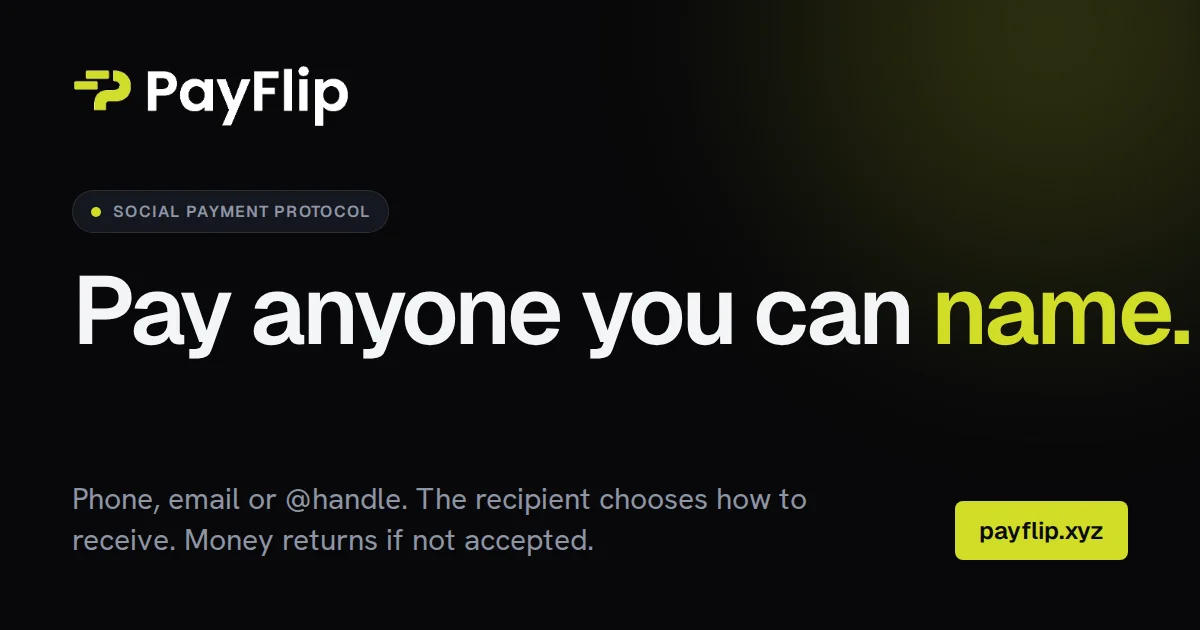
Design analysis
A dark OG card that funnels everything down a single left rail: wordmark and a letterspaced category pill up top, a one-line two-tone headline as the focal point, then muted supporting copy and an accent-filled domain chip pinned to the bottom edge. The chartreuse accent is rationed to exactly three spots — pill dot, the final headline word, and the payflip.xyz chip — so the eye travels top → middle → bottom-right in one read. A faint lime radial glow in the top-right keeps the flat black canvas from feeling empty without adding any real texture.
Prompt preview
## Reference images

Study these alongside the description below: hierarchy, rhythm, spacing, colour. Build for the product you are asked about, using this design language.

- Screenshot: https://kage-design-assets.t3.tigrisfiles.io/screenshots/payflip/e1aa445e-d730-40ff-a919-70cdf8a6e181-1789538647052.webp
- Design on Kage: https://kage.design/designs/payflip-og-image

# 1200×630 social card (Open Graph image)

## Before you start
Ask the user what product the card is for, who will see it when the link is shared (X, Slack, LinkedIn, iMessage), and which brand assets already exist: brand name, accent colour, typeface, domain. Wait for the answers before designing. Everything below is applied to *their* brand, not to any reference.

## Page structure
Build one static canvas, exactly 1200×630 px — either as an HTML/CSS document of that fixed size rendered to PNG (e.g. with a headless-browser screenshot step), or as a single SVG. Top to bottom:

1. **Background** — near-black canvas with one soft radial glow of the accent colour bleeding in from the top-right corner; everything else is flat.
2. **Wordmark lockup (top-left)** — small logo glyph plus brand name in bold white, sized to stay legible when the card renders at ~400px wide in a feed.
3. **Category pill** — a dark rounded pill just below the lockup: tiny accent dot + uppercase, widely letterspaced micro-label naming the product category.
4. **Headline (vertical middle)** — one oversized headline on a single line, breaking over at most two lines if needed. All words in white except the final word plus its period, which flip to the accent colour. This is the focal point and should dominate the canvas.
5. **Footer row (bottom edge)** — a short two-line supporting sentence in muted grey on the left, and a domain chip (accent-filled rounded rectangle with dark bold text) on the right, baseline-aligned with the copy.

## Design language
- **Grid:** ~72px padding on all sides; every element hugs one left rail except the domain chip, which anchors the bottom-right. Generous dead space between the four zones — do not fill it.
- **Hierarchy in four steps:** headline ≫ wordmark/chip ≫ pill label ≫ supporting copy. Exactly one focal element (the headline); everything else is supporting.
- **Colour:** near-black base `#0A0B09`; white `#FAFAF7` for wordmark and headline; muted warm grey `#B7BCB0` for supporting copy; a single accent (substitute the user's brand accent, e.g. chartreuse `#C8F327`) used exactly three times — pill dot, headline accent word, domain chip — so the eye travels top → middle → bottom-right.
- **Glow:** one radial-gradient of the accent at ~6–8% opacity centred off-canvas in the top-right quadrant. No other texture, pattern or imagery.
- **Type:** one bold geometric grotesk throughout. Headline ~112px with -0.02em tracking; wordmark ~52–56px; pill label 18–20px uppercase with +0.2em letterspacing; supporting copy ~32px/1.4. The scale jump between the tiny caps pill and the giant headline does most of the compositional work.
- **Radius and elevation:** fully-rounded pill, 10–12px radius on the chip, no shadows anywhere — separation comes from colour and value contrast, not depth.
- **Static by nature:** no motion, hover states or interaction. Test legibility at thumbnail size: the accent word and the domain chip must still read clearly.

## Never
- No reference product names, wordmarks, logos, taglines, copy or domain from any example — use the user's placeholder branding and their own headline in their voice.
- Do not recreate a specific existing brand's exact palette if the user has their own brand colours; treat the reference palette only as a fallback example.
- No stock photography, illustrations or icon sets; the card is typography, one glow, and two accent components. Never present the result as another product's card.


