kage
kage
sendinvo.com
Design analysis
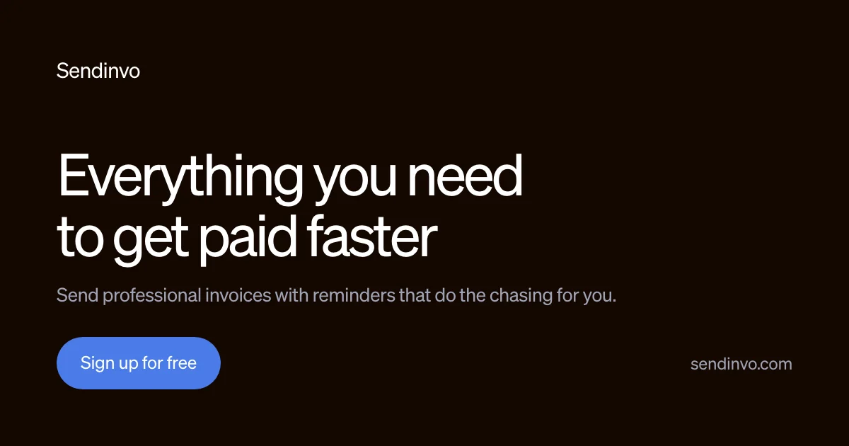
A text-only OG card on a near-black canvas with a faint warm cast (~#131211). Hierarchy is built entirely through type scale: a small wordmark top-left, then a long empty band before a two-line white headline (~90px, tight leading) that is the sole focal point, decompressed by one gray subline. The composition closes on its corners — a soft-blue pill CTA bottom-left and the domain in gray bottom-right — leaving roughly two-thirds of the canvas as negative space.
Prompt preview
## Reference images

Study these alongside the description below: hierarchy, rhythm, spacing, colour. Build for the product you are asked about, using this design language.

- Screenshot: https://kage-design-assets.t3.tigrisfiles.io/screenshots/sendinvo-com/0d145083-a0f5-443a-a1e6-b233449d5e64-1789890376025.webp
- Design on Kage: https://kage.design/designs/sendinvo-og-image

## Before you start
Ask the user what they are building, who it is for, and what brand assets they already have (product name, domain, brand colours, typeface). Wait for the answers. Everything below is applied to *their* product and branding — this composition is the template, not the content. Do not use "Sendinvo" or any reference copy.

## Page structure
Produce a **1200×630 social share card** (Open Graph image). Build it as HTML/CSS sized exactly 1200×630 and render to PNG, or as an SVG with `viewBox="0 0 1200 630"`. No photography, illustration, product UI or gradients — the entire card is typography on a flat field.

Top to bottom, left-aligned on a single column with ~88px side margins:

1. **Canvas**: flat near-black with a faint warm tint (≈ `#131211`). Nothing else decorative.
2. **Wordmark (top-left, ~64px from top)**: product name only, small (~30px), white, medium weight, letter-spaced normally. It is a quiet label, not a logo lockup.
3. **Headline block (starts ~200px down)**: the value proposition in two lines, white, ~90px, line-height ~1.05, tracking ≈ -0.02em. This is the loudest element on the card — roughly 3–4× everything else.
4. **Subline**: one sentence of supporting copy directly beneath, gray (≈ `#8a8683`), ~26px, normal weight, max ~70 characters.
5. **Bottom-left anchor (~90px from bottom)**: a single CTA as a fully-rounded pill, soft blue fill (≈ `#5577e8`), white ~24px label, generous padding (~36px × 22px).
6. **Bottom-right anchor**: the domain, gray (≈ `#8a8683`), ~24px, baseline-aligned with the CTA pill.

## Design language
- **One accent rule**: exactly one coloured element (the CTA). Everything else is white-on-dark or gray-on-dark, so the accent reads instantly at feed size.
- **Scale carries hierarchy**: no icons, dividers or weight changes — hierarchy is size (~90px headline vs ~30px wordmark) plus a two-step colour ramp (white ≈ `#f5f4f2` → gray ≈ `#8a8683`).
- **Corner anchoring**: content hangs from the top-left wordmark and closes in the bottom two corners (CTA left, domain right), leaving a large breathing band between wordmark and headline.
- **Single family, neo-grotesque**: one neutral sans-serif (e.g. Inter or the brand's grotesque) in regular-to-medium weights; no serif contrast, no all-caps.
- **Negative space as structure**: at least 60% of the canvas stays empty; text blocks are left-aligned and never centred.
- **Shape discipline**: the only soft shape is the full-radius pill; the card itself has sharp corners.
- **Contrast for thumbnails**: keep all type ≥24px and pure white/gray on dark so it survives at 200×105px preview size.

## Never
- No reference branding: never use "Sendinvo", "sendinvo.com", or the headline "Everything you need to get paid faster" — write placeholder copy for the user's product.
- No logos, icons, illustrations, photography or screenshots from the reference.
- No gradients, glows, patterns or decorative shapes; no centred text; no more than one accent colour.