kage
kage
Design analysis
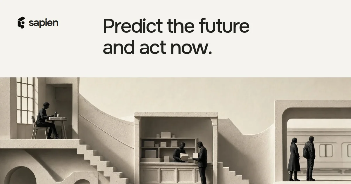
A 1200×630 social card split by a hard horizontal line into two zones: a flat warm-cream top band carrying the identity and message, and a full-bleed sepia diorama below. Hierarchy is driven purely by scale and placement — a small lowercase wordmark sits at top-left while the two-line serif headline ('Predict the future and act now.') starts at roughly the golden-section point and runs at ~90px, dominating the empty cream field. The bottom half is a monochrome miniature-world render — figures at a window table, a shop counter, a train platform — whose cream palette matches the top band so the two halves read as one composition; it is deliberately cropped at the bottom edge to imply a larger scene. No gradients, badges, buttons or borders: the card works on flat colour, generous negative space and tonal contrast between charcoal figures and beige architecture.
Prompt preview
## Reference images

Study these alongside the description below: hierarchy, rhythm, spacing, colour. Build for the product you are asked about, using this design language.

- Screenshot: https://kage-design-assets.t3.tigrisfiles.io/screenshots/sapien/c51c4536-d581-48e7-83ee-f78e6d348ed0-1791093699500.webp
- Design on Kage: https://kage.design/designs/sapien-og-image

## Before you start
Ask the user what they are building, who it is for, and what brand assets they already have (product name, logo/wordmark, brand colours, typefaces), then wait for the answers. Everything below is applied to their brand, not to the reference. The deliverable is a single 1200×630 social card image (OG/Twitter preview) built as HTML/CSS rendered to PNG at exactly 1200×630, or as an SVG of the same dimensions — pick whichever fits the user's tooling.

## Canvas structure (1200×630, top to bottom)
1. **Identity strip (y ≈ 40–130)**: the wordmark (icon + lowercase name) alone at the top-left, inset ~64px from the left and ~48px from the top, height ~36px. Nothing else on that row.
2. **Headline zone (y ≈ 60–220)**: a two-line headline in the same upper band, left edge at ~30% of canvas width (≈360px) — the wordmark and headline sit on one visual line but the headline owns the space. Size ~90–100px, line-height ~1.15, dark near-black on the cream background. Keep it to 5–7 words total; end with a period for a declarative tone.
3. **Hard horizontal split (y ≈ 280)**: the cream band ends in a straight edge — no gradient, no shadow, no border.
4. **Imagery band (y ≈ 280–630, full width)**: one full-bleed illustration/render filling the remaining ~350px, cropped by the bottom edge of the card. It should read as a miniature scene or diorama containing 3 small vignettes left-to-right (e.g. a person at a window, an exchange at a counter, two people waiting at a platform), separated by architectural masses. For the user's product, build an equivalent metaphor: a miniature world that stages what their product does. Use an illustrated CSS/SVG composition (flat geometric shapes suggesting rooms, stairs, arches, small silhouetted figures) since we cannot reuse the reference imagery.
5. **Footer clearance**: nothing in the bottom ~0–40px; let the scene bleed off the edge.

## Design language
- **Split composition**: two horizontal zones ~45% text / ~55% imagery, meeting on one hard line. All text lives above the line; all imagery below it; never overlap them.
- **Palette**: warm cream field ≈ #EAE6DC; headline and figures in near-black charcoal ≈ #1E1D1A; illustration tones stay inside the same family — creams ≈ #F2EFE7, beiges ≈ #D9D3C4, taupe shadows ≈ #C9C2B2 — with charcoal reserved for people and key details. One accent maximum, only if the user's brand demands it.
- **Type pairing**: a modern serif (Tiempos/Editorial-like, moderate stroke contrast) for the headline; a clean geometric sans for the lowercase wordmark. Scale does all the work: wordmark ~36px, headline ~95px, nothing in between. No subheads, no body copy, no captions.
- **Hierarchy by placement**: identity is small and corner-anchored; the message is huge and starts at the golden-section left edge rather than flush-left, so the empty cream field at top-left keeps the card breathing.
- **Imagery treatment**: monochrome, quiet, architectural; figures are small relative to the built environment; forms are simple boxes, arches, staircases; depth comes from tone steps, not outlines or shadows.
- **Motion/interaction**: none — it is a static raster/vector asset. Render at 2× for crispness if producing PNG.

## Never
No logos, wordmarks, product names, taglines, copy, illustrations, renders or icon sets from the reference; never present the result as Sapien. Use the user's own branding and placeholder copy. Do not add buttons, URL pills, gradients, drop shadows, rounded card frames or emoji to the canvas.