 kage
kage
tinykpi.app
Design analysis
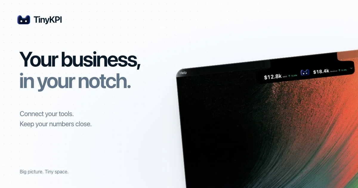
A 1200×630 social card split roughly 55/45 between a quiet text column and a laptop photograph that bleeds off the right and bottom edges. The brand lockup sits small in the top-left while a two-line display headline carries the frame, shifting from near-black to slate grey on the second line so the word 'notch' lands as the punchline. The focal proof point is the black notch strip inside the device photo — white revenue figures with green up-arrows — which reads even at thumbnail size against the faintly dotted off-white canvas.
Prompt preview
## Reference images

Study these alongside the description below: hierarchy, rhythm, spacing, colour. Build for the product you are asked about, using this design language.

- Screenshot: https://kage-design-assets.t3.tigrisfiles.io/screenshots/tinykpi/0a180e1d-4bbb-4716-b030-f459ae798486-1789711371024.webp
- Design on Kage: https://kage.design/designs/tinykpi-og-image

## Before you start
Ask the user what product or company the social card is for, who the audience is, what headline and tagline copy they want, and what brand assets they already have (name, logo mark, colours, typeface). Also ask what the single most compelling visual proof point is — a product screenshot, a device mockup, or a key metric. Wait for the answers before designing. Everything below is applied to *their* product, not to any reference.

Produce a **1200×630 static social card image** (the Open Graph preview shown when the link is shared). Build it as a single HTML/CSS file rendered to PNG (e.g. via Puppeteer or `satori`/`resvg`), or as a standalone SVG. No animation, no interactivity — it must survive being scaled down to a ~200px-wide thumbnail in a chat app.

## Page structure
- **Canvas**: one 1200×630 frame, off-white background with a very faint dot-grid texture across the whole surface; 64px safe margin on all sides, nothing important in the outer 40px (link previews crop edges).
- **Brand lockup**: top-left corner, a small icon mark plus wordmark at roughly 28px — the smallest brand element on the card, present but not competing.
- **Headline block**: left column, starting about 25% down the canvas. Two lines of display type: line one in near-black, line two in a muted slate grey, with the key product word on line two. This is the dominant element.
- **Support copy**: directly under the headline, two short declarative lines (~24px, medium grey) explaining what the product does. No bullet points, no badges.
- **Footer tagline**: bottom-left, one short line at the smallest type size (~18px) in the lightest grey — a quiet sign-off that balances the lockup at the top.
- **Imagery zone**: right ~45% of the canvas, a laptop or display mockup rotated a few degrees and deliberately bleeding off the top, right and bottom edges, so the device feels larger than the frame. Inside its screen, render the product's most important UI detail (a compact metrics strip, widget, or status bar) as sharp dark chrome with light text — this is the focal proof point and the only place accent colours appear.

## Design language
- **Hierarchy in four steps**: wordmark ≈28px, headline ≈96px at weight 700–800 with tight tracking (−2% to −3%), support copy ≈24px at weight 500, footnote ≈18px. Exactly one headline, everything else clearly subordinate.
- **One accent mechanism per card**: use a colour shift on the headline's second line (near-black → slate grey) to spotlight the key word — do not add extra colours to the text column.
- **Colour**: off-white background `#F6F6F4` with dot grid `#E5E5E2`; primary text near-black `#16161A`; secondary slate `#6B7280`; footnote `#8A8A90`. Positive deltas in green `#22C55E`. Dark device chrome `#0B0B0E` with white UI text. Warm or vivid tones live *only inside the imagery*, never on the background or type.
- **Type**: one geometric grotesque family throughout; create contrast with weight and size, not with additional typefaces. Left-align everything in the text column on a single ragged-right edge.
- **Shape and depth**: large corner radius on the device (24–40px), rounded/pill treatment on any UI chrome inside the screen; no borders or shadows on the background — depth comes entirely from the angled photograph overlapping the flat canvas.
- **Composition rhythm**: top-left → headline → support → footnote forms a quiet vertical spine; the heavy dark device on the right counterweights it diagonally. Aim for roughly 55% text / 45% image.
- **Legibility check**: before exporting, verify the headline and the UI strip are readable at thumbnail size; export as PNG or JPG under ~500KB.

## Never
Do not reuse the reference product's logo, wordmark, headline copy, taglines, wallpaper imagery or icon shapes. Use the user's own branding and placeholder copy where assets are missing, and never present the finished card as belonging to any existing product.


