kage
framerusercontent.com
Design analysis
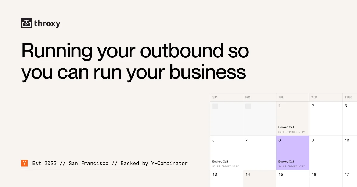
A high-contrast, corporate open graph card that establishes clear hierarchy and a modern, data-driven aesthetic. The layout follows a clear three-part grid: logo/brand on top left, dominant headline in the center-left, and an abstract UI element anchored to the right. The combination of minimalist typography and a vibrant lavender accent conveys a professional yet dynamic brand presence.
Prompt preview
## Reference images

Study these alongside the description below: hierarchy, rhythm, spacing, colour. Build for the product you are asked about, using this design language.

- Screenshot: https://kage-design-assets.t3.tigrisfiles.io/screenshots/throxy/c0e873d1-2b9c-459b-adc9-e925a3df8bbc-1793253813382.webp
- Design on Kage: https://kage.design/designs/throxy-og-image

## Before you start: Ask the user what their SaaS product is, who it is for, and any existing brand assets (name, preferred colors, font styles). Wait for the answers. This prompt is for their new brand.

## Design Goal: Create a 1200x630 Open Graph social card for a B2B SaaS tool. The final output should be an image or a high-fidelity HTML/CSS representation that can be saved as a PNG.

## Page structure: The card is divided into three main vertical zones. Top-Left: A small, clean brand mark and name. Center-Left: A large, attention-grabbing headline with multiple lines. Right side: An abstract data visualization block that serves as a visual representation of the product's function (e.g., a stylized pipeline or dashboard snippet). Bottom: Small, subtle status text at the base of the left column.

## Design language: The composition relies on extreme whitespace and high-contrast typography. The headline uses a bold, modern sans-serif font, dominating the visual weight of the left two-thirds. The primary color is a clean white background with sharp black/dark gray text. A vibrant purple/lavender is used sparingly as an accent within the abstract UI element on the right. The abstract UI block should feature numbered columns and colored blocks, implying a data-rich environment.

## Never: Do not use the name "throxy". Do not include real funding sources (e.g., "Y Combinator"). Do not use the exact phrasing "Running your outbound so you can run your business". Use placeholder brand names, generic industry terms, and placeholder text.