kage
dotverse.app
Design analysis
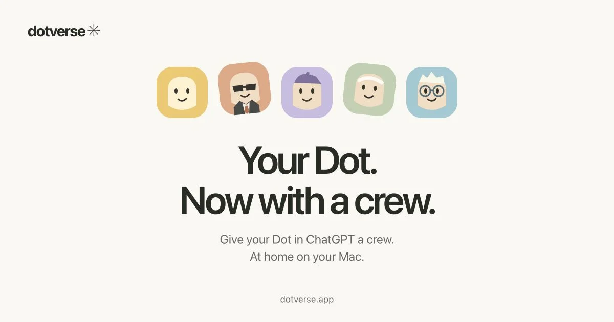
A 1200×630 social card on a warm cream canvas with a single vertical axis: wordmark top-left, a row of five pastel rounded-square avatar characters centred above a two-line heavyweight headline, a small grey subhead, and a quiet footer URL. The design works through restraint — one centred focal stack, generous negative space, and the only colour coming from the five avatar tiles, which makes the product's personality legible in a feed at thumbnail size.
Prompt preview
## Reference images

Study these alongside the description below: hierarchy, rhythm, spacing, colour. Build for the product you are asked about, using this design language.

- Screenshot: https://kage-design-assets.t3.tigrisfiles.io/screenshots/dotverse/7a4c504d-0060-44c9-873d-c74d045af4af-1793253624159.webp
- Design on Kage: https://kage.design/designs/dotverse-og-image

# Create a 1200×630 Open Graph social card

## Before you start
Ask the user what product this card is for, who it is for, and what brand assets they already have (name, wordmark style, colours, typeface, any mascot or avatar imagery). Wait for their answers. Everything below is a composition and design language to apply to *their* brand — do not recreate the reference product's name, characters, or copy.

## Output
Produce a single social share image at exactly 1200×630 (the standard OG ratio), rendered as HTML/CSS captured to PNG or as an SVG. Use placeholder branding and copy that the user can swap later.

## Page structure (canvas composition, top to bottom)
1. **Wordmark lockup, top-left**: small logo/wordmark (name + a simple geometric glyph) in the top-left corner, roughly 48–64px from the edges. This is the only corner-anchored element; everything else is centred.
2. **Hero imagery row**: a centred horizontal row of 5 rounded-square tiles (approx. 100–110px each, ~24–32px gap) sitting in the upper third of the canvas. Each tile holds a simple character or icon on a distinct pastel background. Vary tile colour per item so the row reads as a friendly "crew".
3. **Headline, centred**: a two-line display headline, each line ~90–110px in a bold geometric sans (e.g. Inter/GT Walsheim-class weight 700–800), near-black, tight leading (~1.05) and tight letter-spacing (-0.02em). This is the largest element and the visual anchor at the vertical centre.
4. **Subhead, centred**: two short lines of supporting copy, ~28–32px, medium grey, comfortable line height, directly under the headline.
5. **Footer URL**: the domain as a single small centred line (~24px, muted grey) near the bottom, acting as a quiet call-to-action.

## Design language
- **Canvas**: warm off-white/cream background (approx. #F5F1EA), not pure white — it softens the card in dark-mode feeds.
- **Single vertical axis**: everything except the top-left wordmark is centre-aligned on one axis. No columns, no sidebars — the composition survives heavy thumbnail cropping.
- **Colour restraint**: the canvas and text stay neutral (cream, near-black #1E1E1E, mid-grey #7A7A72); all colour is concentrated in the hero tile row. Use 4–5 soft pastels from the user's palette (e.g. #EFC65A, #E09A6E, #B7A6E3, #AFC49E, #9FC5DA) so the row reads as a set, not noise.
- **Type scale**: one display weight for the headline (~100px), one mid-grey supporting size (~30px), one muted footer size (~24px). Three sizes total — no extra hierarchy.
- **Shape language**: rounded squares (radius ~22–24% of tile size) with soft flat fills and no borders or drop shadows; simple flat character/icon shapes inside. Keep everything flat — no gradients, no glass.
- **Negative space**: keep at least 60–70px clear margin on all sides and generous air between the image row, headline, and subhead; density stays very low.
- **No interactivity**: it's a static image — express personality through character/illustration warmth, not motion.

## Never
- Do not use the reference product's name, wordmark, tagline, avatar characters, or domain.
- Do not present the result as the reference product; it is a template applying this composition to the user's own brand.
- Do not add stock photos, complex illustrations, gradients, or more than five hero tiles.