 kage
kage
busabase.com
Design analysis
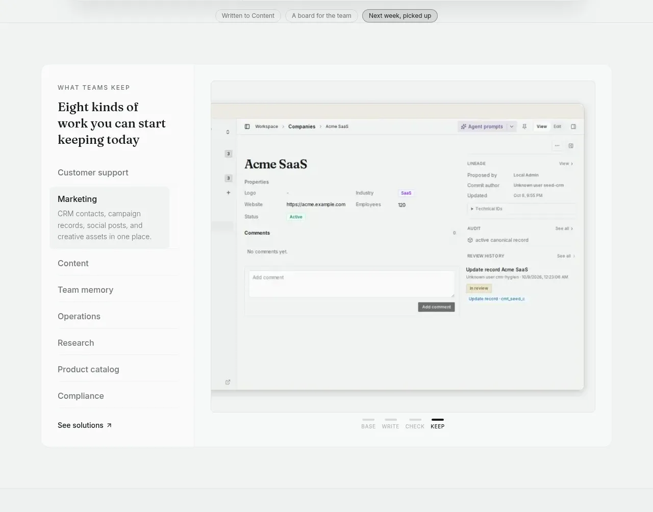
A split section pairs a vertical category list with a large product record preview. The active category is highlighted, making the broad product surface feel navigable while the screenshot demonstrates the selected use case.
Prompt preview
## Reference images

Study these alongside the description below: hierarchy, rhythm, spacing, colour. Build for the product you are asked about, using this design language.

- Component: https://kage-design-assets.t3.tigrisfiles.io/components/busabase/7d05ddcb-d0f9-4d81-8382-8bbb1120492e-1791612077-2.webp
- Full page it was cut from: https://kage-design-assets.t3.tigrisfiles.io/screenshots/busabase/7d05ddcb-d0f9-4d81-8382-8bbb1120492e-1791612035007-full.webp
- Component on Kage: https://kage.design/component/busabase-feature-grid

## Before you start
Ask what the user's product categories are, which use case should be active, and what kind of proof or interface preview is available. Apply the principles below to that product.

Build a feature showcase with a narrow left rail of category groups and a larger right-side application preview. Introduce the section with a small uppercase eyebrow and a serif heading in the left rail. Show one selected item inside a lightly tinted rounded card and keep remaining categories as simple text rows with a final text link. On the right, place a framed, realistic dashboard or record detail mockup with a top bar, metadata, content, and a slim audit/activity area. Use a two-column layout on desktop, roughly 25/75, with #f5f7f6 page background, #ffffff preview surfaces, #dce1de borders, 10px card radius, 24–40px internal padding, and muted #737a76 text. Make the category rail keyboard-accessible and let selecting an item swap the preview and active state; stack the rail above the preview on mobile.

Never: use logos, product names, copy, illustrations, or imagery from the reference.
More components

 Studios and output grid
Hypervibe · Feature grid
Studios and output grid
Hypervibe · Feature grid
 Continuity and memory grid
Hypervibe · Feature grid
Continuity and memory grid
Hypervibe · Feature grid
 Voice collaboration section
Hypervibe · Feature grid
Voice collaboration section
Hypervibe · Feature grid
 Core workspace feature section
Hypervibe · Feature grid
Core workspace feature section
Hypervibe · Feature grid
 Agent orchestration section
Hypervibe · Feature grid
Agent orchestration section
Hypervibe · Feature grid

 How it works: connected research tools
Lune · Feature grid
How it works: connected research tools
Lune · Feature grid