kage
kage

Design analysis
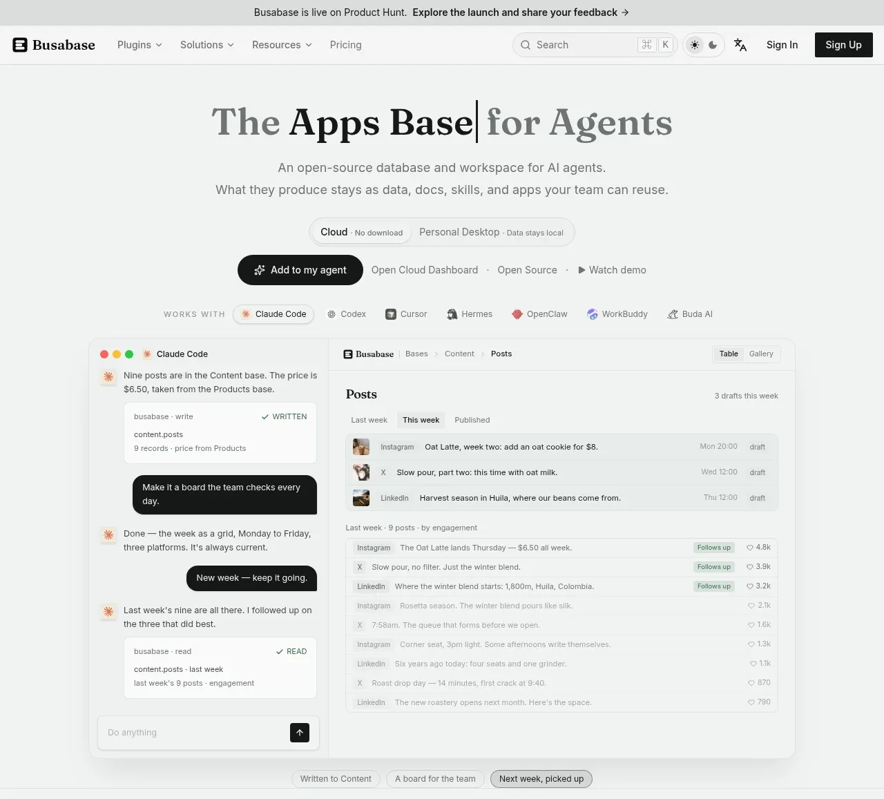
A monochrome, editorial landing page where a bookish serif display face sits on a warm off-white canvas and near-black ink does all the work colour normally would. The hero runs a typing-style headline over a dense two-pane mockup (agent chat with dark bubbles on the left, a data table with status and engagement chips on the right), then the rhythm alternates down the page: a split accordion-and-screenshot section, a full-width before/after comparison with chat windows versus one workspace, a 2×3 feature grid with embedded screenshots, a numbered three-step flow, three deployment cards, a three-tier pricing table with a highlighted plan, an accordion FAQ, and a framed final CTA. Small-caps letter-spaced kickers, 1px hairlines, black pill buttons and soft-framed screenshots carry the hierarchy with almost no accent colour beyond tiny status dots.
Prompt preview
## Reference images

Study these alongside the description below: hierarchy, rhythm, spacing, colour. Build for the product you are asked about, using this design language.

- Full page: https://kage-design-assets.t3.tigrisfiles.io/screenshots/busabase/7d05ddcb-d0f9-4d81-8382-8bbb1120492e-1791612035007-full.webp
- Above the fold: https://kage-design-assets.t3.tigrisfiles.io/screenshots/busabase/7d05ddcb-d0f9-4d81-8382-8bbb1120492e-1791612030591.webp
- Design on Kage: https://kage.design/designs/busabase-landing-page

# Editorial monochrome landing page for an AI-agent workspace

## Before you start
Ask the user what product they are building, who it is for, and what brand assets they already have (name, logo, colours, typefaces). Wait for their answers before writing any code. Everything below is a design language to apply to *their* product — do not rebuild this reference.

## Page structure
1. **Announcement banner** — full-width light strip above the nav with one short sentence and an arrow link (e.g. a launch or event note).
2. **Navbar** — wordmark left; 3–4 dropdown nav items (Plugins, Solutions, Resources) plus one direct link; right side: search field with ⌘K hint, theme toggle, language toggle, "Sign in" text link, solid black "Sign up" pill.
3. **Hero** — centred, narrow measure. Serif headline with a blinking typing-cursor (the headline types itself). Two-line sans subhead. A segmented pill toggle showing two deployment modes with tiny qualifiers ("no download" / "data stays local"). CTA row: one black pill button with a sparkle icon, then three quiet text links separated by dots (dashboard, open source, watch demo).
4. **"Works with" row** — small-caps label followed by 6–7 inline third-party logos the product integrates with, low-contrast so they read as credentials not features.
5. **Hero mockup** — a two-pane composite screenshot: left pane an agent chat (dark rounded bubbles for user prompts, light task cards with tool names and record counts above), right pane the actual product UI as a table with tabs, status chips ("draft", "follows up") and engagement numbers. Below it, three floating pill chips naming the outcomes the mockup demonstrates, one highlighted.
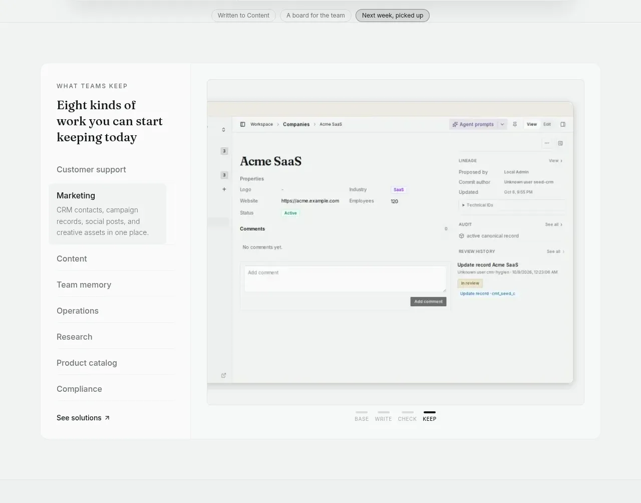
6. **Solutions split section** — left column: small-caps kicker, serif H2, then a vertical accordion of 7–8 use-case categories with one expanded showing a short paragraph, ending in an arrow link; right: a large framed app screenshot (a record-detail view with properties, comments and audit history). Under the screenshot, four tiny uppercase tabs (BASE / WRITE / CHECK / KEEP) with one active.
7. **Problem section** — centred kicker, serif H2 over two lines, two-sentence paragraph. Then a full-width before/after: left card "WITHOUT [PRODUCT]" showing scattered personal chat windows (person + tool name + one-line snippet), an arrow, right card "WITH [PRODUCT]" showing one tidy workspace list where each row credits who wrote it. Beneath, three small cards each pairing a ✗ problem line with a ✓ outcome line.
8. **Feature grid** — small-caps kicker listing categories separated by dots, serif H2, one-sentence subhead, then a 2×3 grid of bordered cards. Each card: tiny icon + label chip, serif card title, 2–3 sentence body, and a screenshot thumbnail anchored to the card bottom edge.
9. **How-it-works flow** — centred serif H2 over two lines, subhead, then three numbered panels (01/02/03) connected by arrows: connect your agents (integration chips + a dark chat bubble example), every write is on the record (logo, copy, screenshot), reuse it next time (2×2 grid of mini screenshots labelled Data/Knowledge/Apps/Skills).
10. **Deployment section** — kicker (open source · local-first), serif H2, subhead, three simple icon cards (on your machine / on your own server / in cloud) with 2–3 lines each, closing with a single security-review footnote link.
11. **Pricing** — centred serif H2 and one-line subhead; three plan cards: Free / Plus / Pro, the Pro card outlined darker with a black "Most popular" pill overlapping its top edge. Price set large in serif with "/seat/mo", billing note in small text, ✓-list of 5–7 features, full-width button per card (light for free, black for paid). "See full pricing →" link below.
12. **FAQ** — kicker + serif H2 ("Questions, answered"), then a single-column accordion of six questions with chevrons and hairline dividers.
13. **Final CTA** — a rounded framed container holding a code icon, serif H2 ("Give your agents a workspace worth building in"), one-sentence reassurance, the same segmented deployment toggle as the hero, and the black pill CTA with quiet text links beside it.
14. **Footer** — wordmark + one-line mission + support email on the left; four link columns (Product, Resources, Company, Legal); a bottom rule with copyright line and a small credit.

## Design language
- **Canvas and ink**: warm off-white page background (#FAF9F5), near-black ink (#141414), secondary text warm gray (#6F6B64), hairline borders (#E7E4DE), white cards (#FFFFFF) and one slightly deeper cream for tinted panels (#F2F0EA). Essentially monochrome; reserve colour for tiny semantic accents only (status dots, third-party logos, a green "active" chip).
- **Type pairing**: an editorial text serif (Newsreader, Source Serif 4 or similar) for every headline and card title — hero ~60–64px, section H2 ~38–44px over two lines, card titles ~22–26px, prices ~40px; a neutral sans (Inter or system) for body at 15–16px with generous line height; kickers in 11–12px uppercase with wide letter-spacing (~0.12em).
- **Hierarchy without colour**: build hierarchy through size contrast (huge serif vs small sans), weight, and whitespace; buttons are black pills with white text — the only heavy elements on the page — so they always dominate.
- **Borders, radius, shadow**: 1px hairlines everywhere; cards at 12–16px radius; screenshots sit inside white frames with a hairline border and a soft, low shadow; no glows, no gradients, no heavy drop shadows. Dark chat bubbles (near-black, ~12px radius) are the one deliberate contrast device used inside mockups.
- **Density rhythm**: alternate airy and dense blocks — centred headline blocks with lots of air, followed by dense, information-rich mockups and card grids; section boundaries are soft tints or hairlines, never hard colour bands. Keep the page long and narrative: hero → proof of use cases → problem framing → capability grid → mechanics → trust → pricing → FAQ → close.
- **Mockups are the storytelling**: use realistic product UI with legible labels, tab bars, status chips and realistic sample copy; frame screenshots consistently so multiple panes read as one system; add floating pill chips under the hero mockup to narrate what the viewer just saw.
- **Motion and interaction**: blinking typing cursor on the hero headline (and a typing effect if cheap to add); accordion expand/collapse on use cases and FAQ; subtle hover lift/border-darken on cards and pills; active-state underline on the small uppercase tabs. Keep everything under ~250ms and quiet.
- **Icons**: small 16–20px line icons, monochrome, inline with labels; integration logos as small muted marks in a row.

## Never
- Do not use the reference's name, wordmark, logo, tagline, copy, illustrations, screenshots or icon set — write original sample content for the user's product.
- Do not reuse the specific third-party agent/tool names and their logos from the works-with row; if the user has real integrations use theirs, otherwise use generic placeholders.
- Do not reuse the mockup demo content (chat scripts, table rows, record names) verbatim — invent equivalent realistic data for the user's domain.
- Never present the result as the reference product or imply any affiliation with it.
Components from this page
All components
 Announcement bar and primary navigation
Busabase · Navigation
Announcement bar and primary navigation
Busabase · Navigation
 Product hero with workspace preview
Busabase · Hero
Product hero with workspace preview
Busabase · Hero
 Work types and product capabilities
Busabase · Feature grid
Work types and product capabilities
Busabase · Feature grid
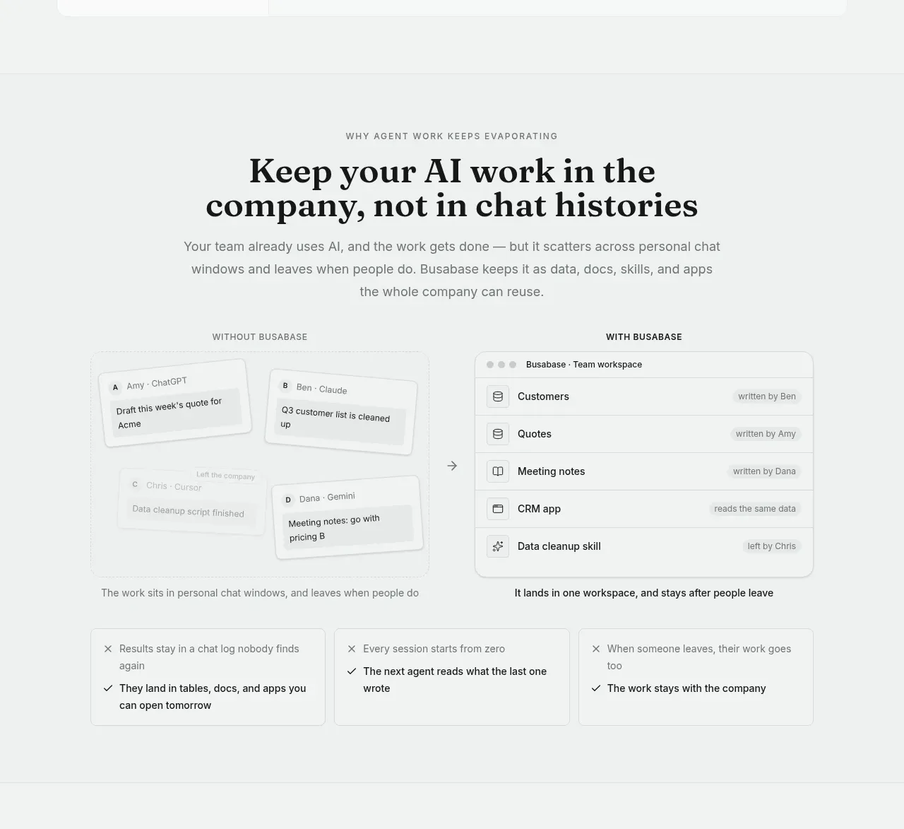 From scattered work to shared workspace
Busabase · Feature grid
From scattered work to shared workspace
Busabase · Feature grid
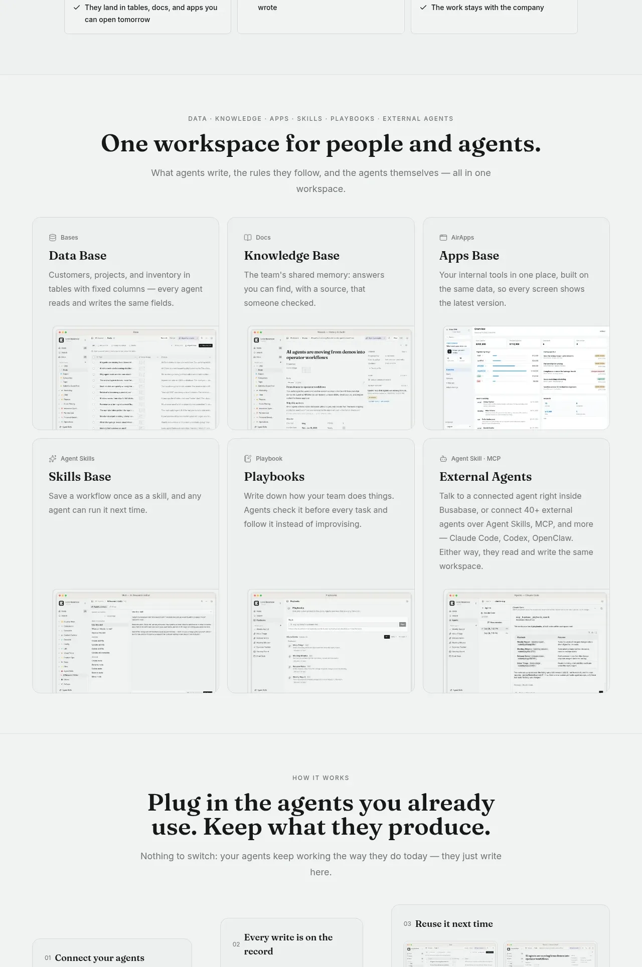 Unified workspace capabilities
Busabase · Feature grid
Unified workspace capabilities
Busabase · Feature grid
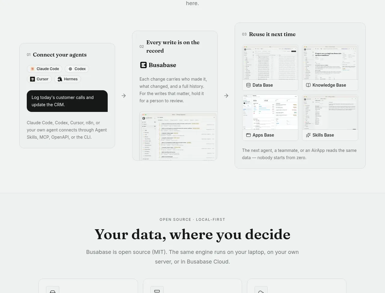 Agent integration workflow
Busabase · Feature grid
Agent integration workflow
Busabase · Feature grid
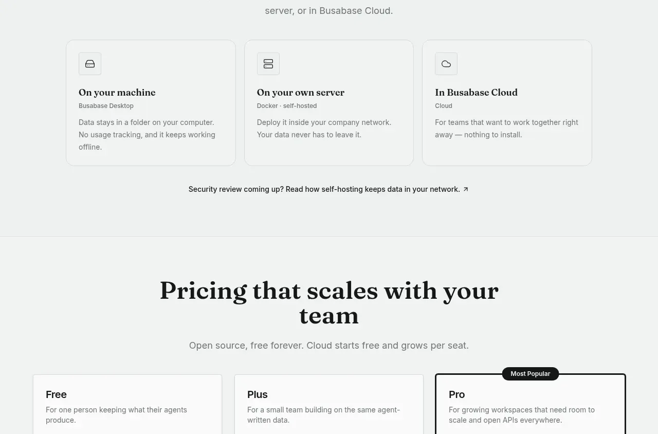 Deployment and data control options
Busabase · Feature grid
Deployment and data control options
Busabase · Feature grid
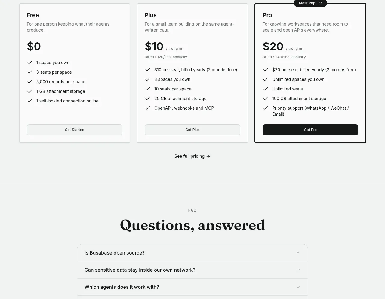 Three-tier pricing table
Busabase · Pricing table
Three-tier pricing table
Busabase · Pricing table
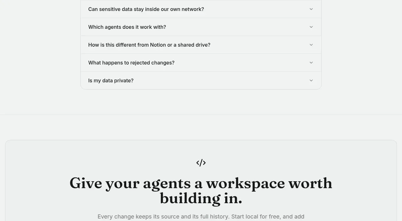 Frequently asked questions
Busabase · FAQ
Frequently asked questions
Busabase · FAQ
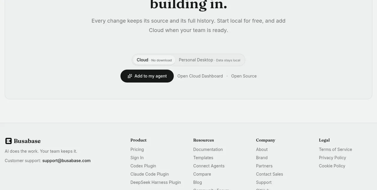 Final conversion call to action
Busabase · Call to action
Final conversion call to action
Busabase · Call to action
 Multi-column site footer
Busabase · Footer
Multi-column site footer
Busabase · Footer