 kage
kage
busabase.com
Design analysis
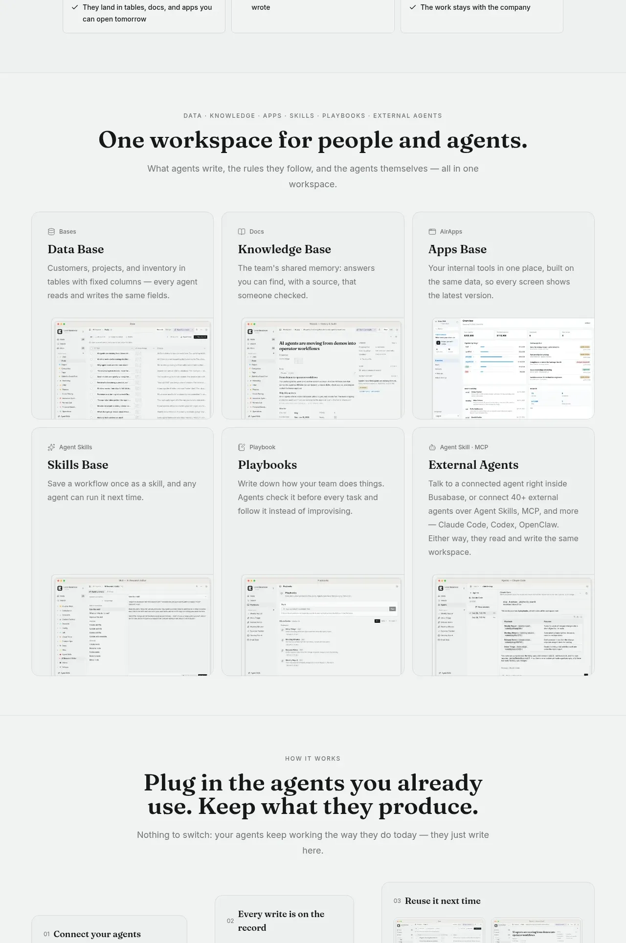
Six capability cards are arranged in a clean three-column grid, each combining a small category label, strong serif title, explanatory copy, and a product UI thumbnail. The repeated card structure makes a broad product story scannable.
Prompt preview
## Reference images

Study these alongside the description below: hierarchy, rhythm, spacing, colour. Build for the product you are asked about, using this design language.

- Component: https://kage-design-assets.t3.tigrisfiles.io/components/busabase/7d05ddcb-d0f9-4d81-8382-8bbb1120492e-1791612077-4.webp
- Full page it was cut from: https://kage-design-assets.t3.tigrisfiles.io/screenshots/busabase/7d05ddcb-d0f9-4d81-8382-8bbb1120492e-1791612035007-full.webp
- Component on Kage: https://kage.design/component/busabase-feature-grid-3

## Before you start
Ask what six core capabilities the user's product has and what interface evidence can represent each one. Ask for the product's brand type and colors, then apply the reusable system below.

Build a responsive six-card capability grid in two rows of three. Start with a centered eyebrow, serif section heading, and one-sentence description. Each card should have a consistent bordered shell, a tiny icon or category label, a serif title, two or three lines of body copy, and a bottom-aligned UI thumbnail or mini mockup. Keep all cards equal in width but allow content-driven height only if the grid remains visually aligned. Use #f4f6f5 as the section background, #ffffff or #f9faf9 cards, 1px #dce1de borders, 10px radius, minimal shadow, 24px padding, 16px titles, and 13–15px body copy. Use CSS grid with three columns on desktop, two on tablet, and one on mobile. Add a restrained border-color lift on hover; do not make the screenshots feel like marketing decoration.

Never: use logos, product names, copy, illustrations, or imagery from the reference.
More components

 Studios and output grid
Hypervibe · Feature grid
Studios and output grid
Hypervibe · Feature grid
 Continuity and memory grid
Hypervibe · Feature grid
Continuity and memory grid
Hypervibe · Feature grid
 Voice collaboration section
Hypervibe · Feature grid
Voice collaboration section
Hypervibe · Feature grid
 Core workspace feature section
Hypervibe · Feature grid
Core workspace feature section
Hypervibe · Feature grid
 Agent orchestration section
Hypervibe · Feature grid
Agent orchestration section
Hypervibe · Feature grid

 How it works: connected research tools
Lune · Feature grid
How it works: connected research tools
Lune · Feature grid