 kage
kage
busabase.com
Design analysis
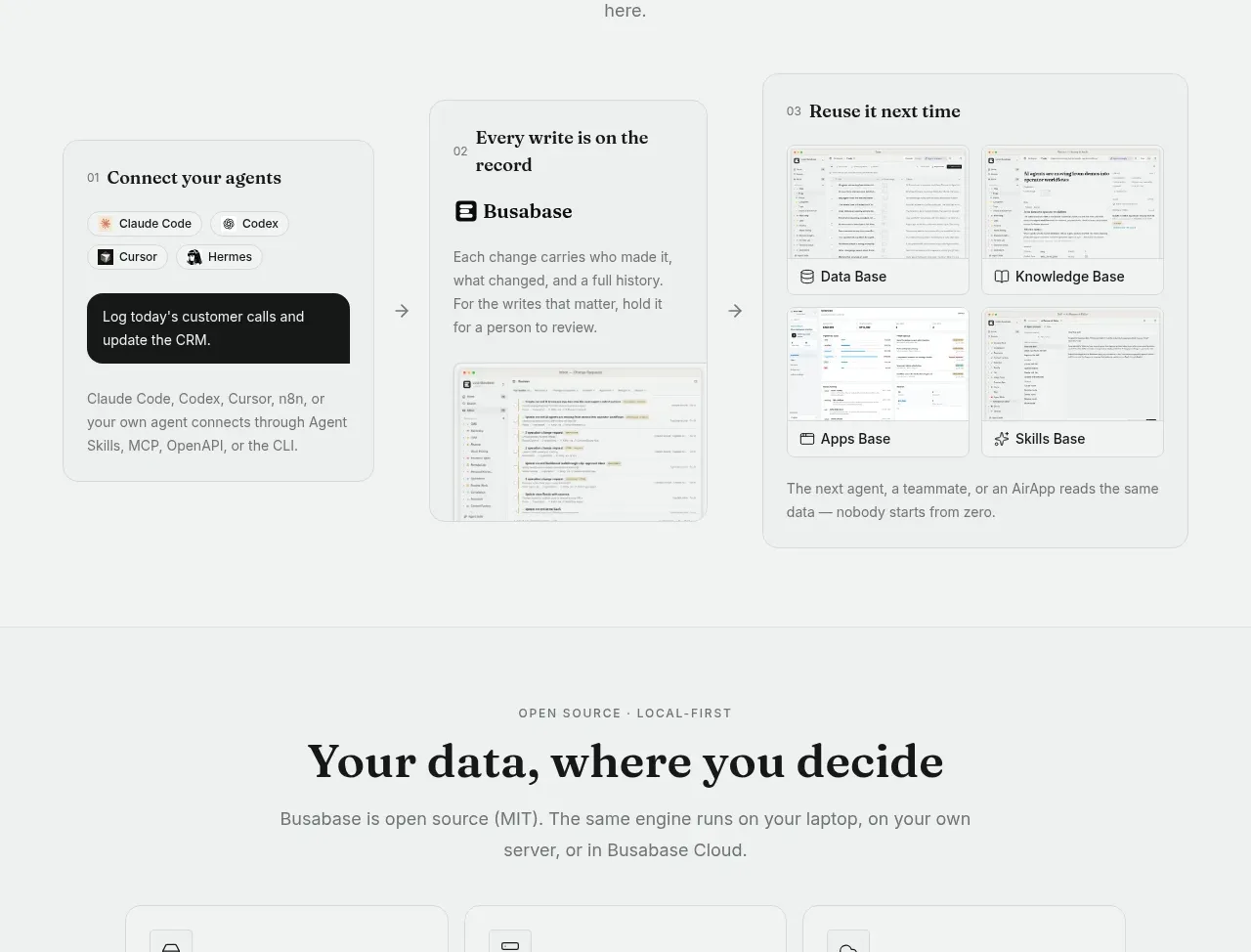
A three-step horizontal flow explains connection, recording, and reuse. Each step is a self-contained card with an arrow between stages and concrete interface evidence, turning an abstract workflow into a sequence.
Prompt preview
## Reference images

Study these alongside the description below: hierarchy, rhythm, spacing, colour. Build for the product you are asked about, using this design language.

- Component: https://kage-design-assets.t3.tigrisfiles.io/components/busabase/7d05ddcb-d0f9-4d81-8382-8bbb1120492e-1791612078-5.webp
- Full page it was cut from: https://kage-design-assets.t3.tigrisfiles.io/screenshots/busabase/7d05ddcb-d0f9-4d81-8382-8bbb1120492e-1791612035007-full.webp
- Component on Kage: https://kage.design/component/busabase-feature-grid-4

## Before you start
Ask which agents, tools, or inputs connect to the user's product and what three-step workflow users should understand. Apply these principles using the user's terminology and brand.

Create a three-step workflow section with a centered eyebrow, serif heading, and concise supporting copy. Lay out three cards horizontally with simple arrows between them: step one is about connecting existing tools, step two about recording or reviewing changes, and step three about reusing the resulting knowledge. Give every card a numbered kicker, concise title, short explanation, and an appropriately scaled UI snippet. Make the middle and final cards slightly larger only if that improves hierarchy; otherwise use equal cards. Use a pale #f3f5f4 background, #ffffff cards, #d9dedb borders, 10px radius, charcoal #171918, muted #737975, and 24–32px card padding. Animate arrows or card emphasis only subtly, and stack steps vertically with a clear connector on mobile.

Never: use logos, product names, copy, illustrations, or imagery from the reference.
More components

 Studios and output grid
Hypervibe · Feature grid
Studios and output grid
Hypervibe · Feature grid
 Continuity and memory grid
Hypervibe · Feature grid
Continuity and memory grid
Hypervibe · Feature grid
 Voice collaboration section
Hypervibe · Feature grid
Voice collaboration section
Hypervibe · Feature grid
 Core workspace feature section
Hypervibe · Feature grid
Core workspace feature section
Hypervibe · Feature grid
 Agent orchestration section
Hypervibe · Feature grid
Agent orchestration section
Hypervibe · Feature grid

 How it works: connected research tools
Lune · Feature grid
How it works: connected research tools
Lune · Feature grid