 kage
kage
busabase.com
Design analysis
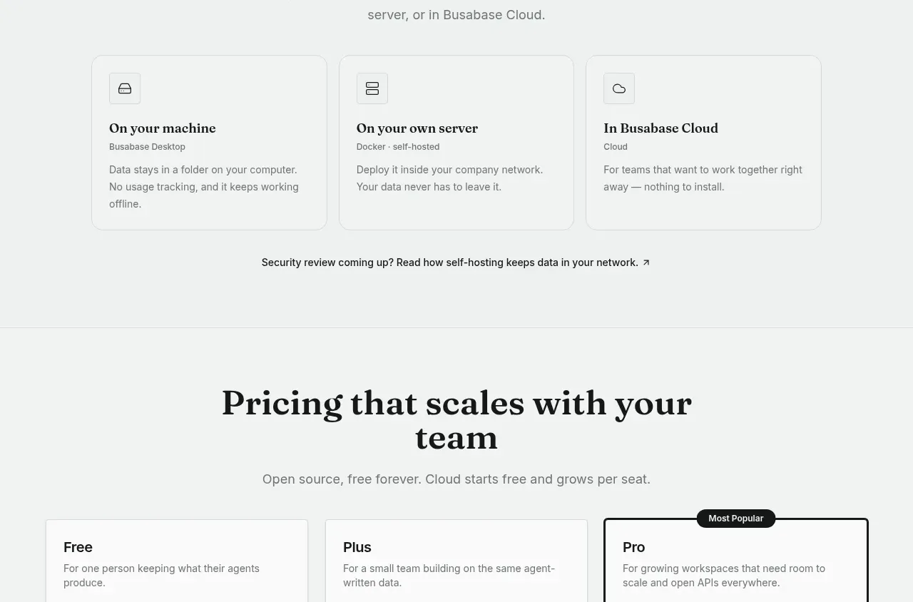
A concise trust-oriented section presents three deployment choices as equal cards, followed by a small security-review link. The copy emphasizes control without introducing visual complexity.
Prompt preview
## Reference images

Study these alongside the description below: hierarchy, rhythm, spacing, colour. Build for the product you are asked about, using this design language.

- Component: https://kage-design-assets.t3.tigrisfiles.io/components/busabase/7d05ddcb-d0f9-4d81-8382-8bbb1120492e-1791612078-6.webp
- Full page it was cut from: https://kage-design-assets.t3.tigrisfiles.io/screenshots/busabase/7d05ddcb-d0f9-4d81-8382-8bbb1120492e-1791612035007-full.webp
- Component on Kage: https://kage.design/component/busabase-feature-grid-5

## Before you start
Ask what deployment, hosting, or privacy choices the user's product offers and which trust concern matters most to its audience. Apply the following layout to that product.

Build a trust and deployment section with an uppercase eyebrow, centered serif heading, and a short explanation. Below, show three equal cards for distinct hosting or data-location choices. Each card has a small monochrome icon in a square, a clear title, a short descriptor, and two or three lines of practical explanation. Add a centered text link beneath the cards for security or technical details. Use #f4f6f5 page background, white cards, #dce1de borders, 10px radius, 20–24px padding, near-black #191b1a headings, and #747a77 body text. Keep iconography simple and generic, and ensure the cards become a single-column stack on narrow screens. Link and focus states should be visible but quiet.

Never: use logos, product names, copy, illustrations, or imagery from the reference.
More components

 Studios and output grid
Hypervibe · Feature grid
Studios and output grid
Hypervibe · Feature grid
 Continuity and memory grid
Hypervibe · Feature grid
Continuity and memory grid
Hypervibe · Feature grid
 Voice collaboration section
Hypervibe · Feature grid
Voice collaboration section
Hypervibe · Feature grid
 Core workspace feature section
Hypervibe · Feature grid
Core workspace feature section
Hypervibe · Feature grid
 Agent orchestration section
Hypervibe · Feature grid
Agent orchestration section
Hypervibe · Feature grid

 How it works: connected research tools
Lune · Feature grid
How it works: connected research tools
Lune · Feature grid