 kage
kage
capacity.so
Design analysis
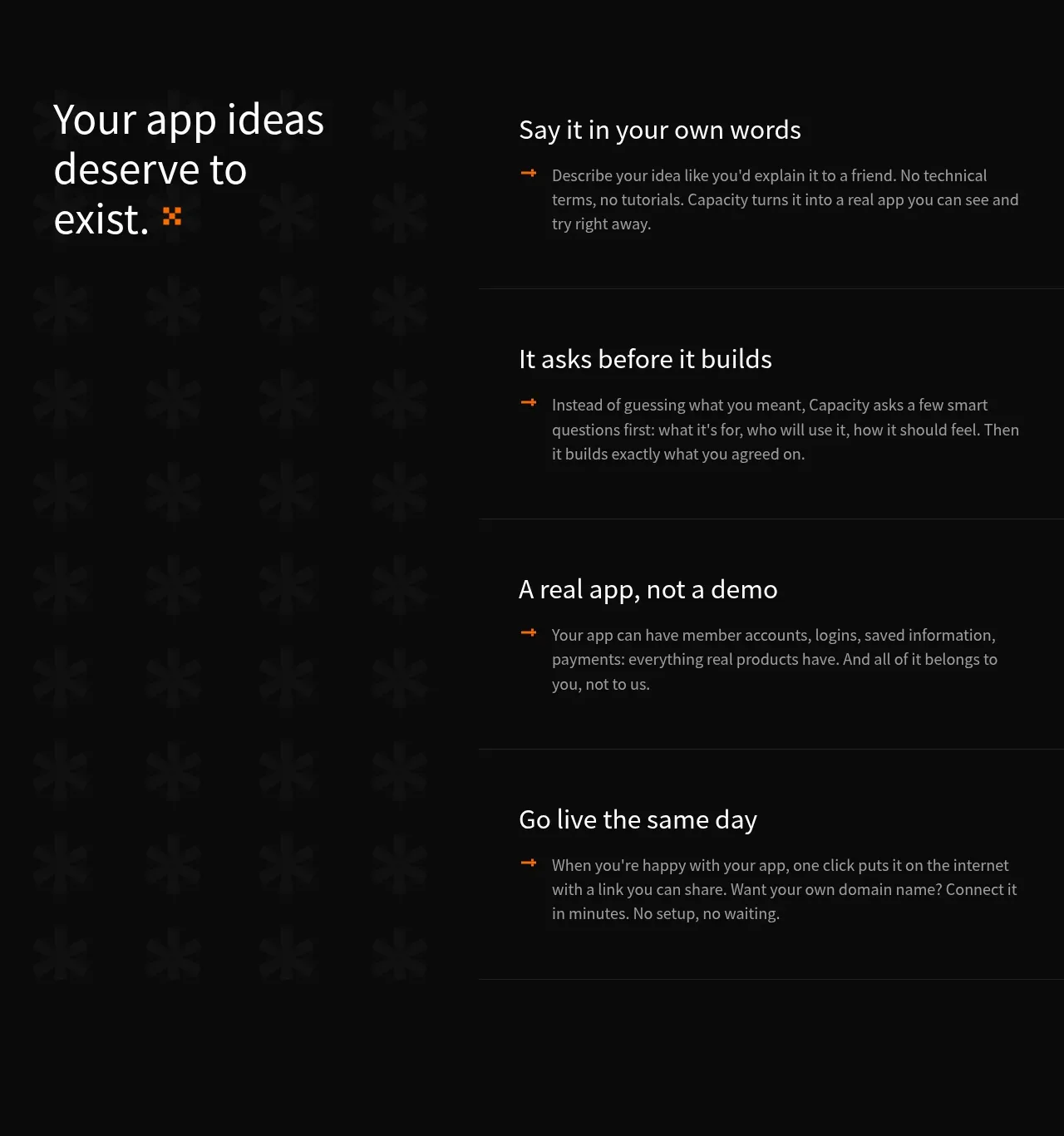
A split editorial layout anchors a large statement on the left while four horizontally separated explanatory steps occupy the right.
Prompt preview
## Reference images

Study these alongside the description below: hierarchy, rhythm, spacing, colour. Build for the product you are asked about, using this design language.

- Component: https://kage-design-assets.t3.tigrisfiles.io/components/capacity-so/08f2bf80-ea5b-4604-8f5e-193c94acfc56-1791551995-6.webp
- Full page it was cut from: https://kage-design-assets.t3.tigrisfiles.io/screenshots/capacity-so/08f2bf80-ea5b-4604-8f5e-193c94acfc56-1791551914192-full.webp
- Component on Kage: https://kage.design/component/capacity-feature-grid-2

## Before you start
Ask what the user's product process is, what sequence users should understand, and what tone the brand should convey. Then express that process with this layout logic.

Build a tall dark process section with a two-column layout: a sticky or visually anchored statement on the left and four stacked explanatory rows on the right. Each row needs a concise heading, a short paragraph, and a small accent arrow or marker; separate rows with subtle horizontal rules. Use a large 40–56px heading on the left, 20–24px step headings, 14–16px body copy, and ample vertical padding. Use a faint repeating texture only if it supports the user's brand, with near-black #080808, warm white text, gray body copy, and a single vivid accent such as #ff6a00. On mobile, place the statement above the steps. Allow rows to expand or animate subtly on hover/focus.

**Never:** use logos, product names, copy, illustrations, or imagery from the reference.
More components

 Studios and output grid
Hypervibe · Feature grid
Studios and output grid
Hypervibe · Feature grid
 Continuity and memory grid
Hypervibe · Feature grid
Continuity and memory grid
Hypervibe · Feature grid
 Voice collaboration section
Hypervibe · Feature grid
Voice collaboration section
Hypervibe · Feature grid
 Core workspace feature section
Hypervibe · Feature grid
Core workspace feature section
Hypervibe · Feature grid
 Agent orchestration section
Hypervibe · Feature grid
Agent orchestration section
Hypervibe · Feature grid

 How it works: connected research tools
Lune · Feature grid
How it works: connected research tools
Lune · Feature grid