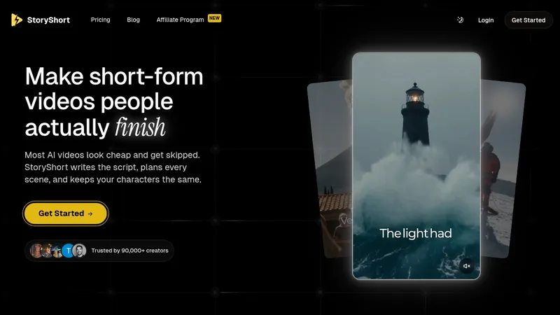
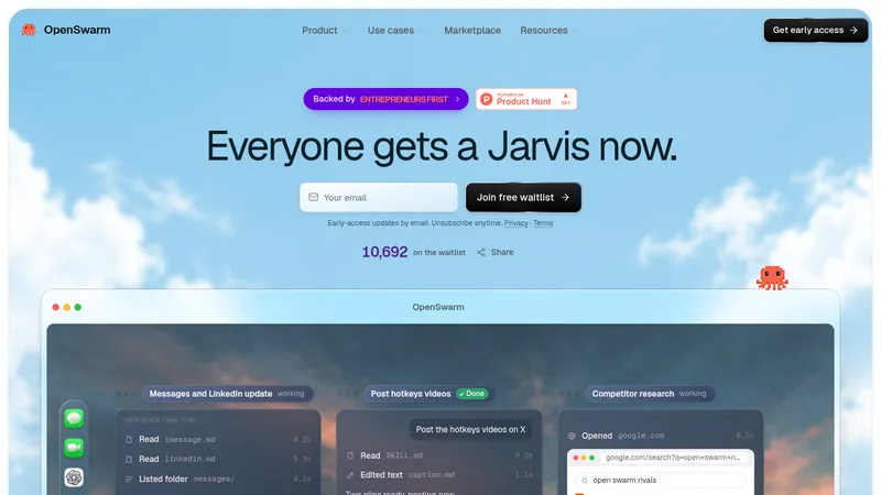
kage
kage
capacity.so

Design analysis
A long dark landing page for an AI knowledge platform that keeps one consistent near-black canvas from hero to footer, using warm orange glow accents at the top that fade into neutral darks below. The rhythm alternates between wide product mockups, compact feature grids and testimonial/social-proof bands, with generous vertical padding between sections. Hierarchy is driven by large light display type on dark grounds, small muted body text, and card outlines rather than heavy shadows, so the mockup screenshots and accent glows carry the visual weight.
Prompt preview
## Reference images

Study these alongside the description below: hierarchy, rhythm, spacing, colour. Build for the product you are asked about, using this design language.

- Full page: https://kage-design-assets.t3.tigrisfiles.io/screenshots/capacity-so/08f2bf80-ea5b-4604-8f5e-193c94acfc56-1791551914192-full.webp
- Above the fold: https://kage-design-assets.t3.tigrisfiles.io/screenshots/capacity-so/08f2bf80-ea5b-4604-8f5e-193c94acfc56-1791551901753.webp
- Design on Kage: https://kage.design/designs/capacity-landing-page

## Before you start
Ask the user what product they are building, who it is for (e.g. enterprise vs. consumer), and what brand assets they already have (name, logo, colours, typeface). Wait for the answers. Everything below is a design language to apply to their product, not the reference product's content.

## Page structure
1. **Sticky top nav** — slim bar on the dark ground with wordmark left, 4–5 short links centre/right, and one high-contrast CTA button (login + "Get started"). Subtle bottom border or slight blur when scrolled.
2. **Hero** — full-width dark section with a soft warm glow (radial gradient) behind the headline. Large two-line headline in light type, one line of muted subcopy, and a pair of CTAs (primary filled, secondary ghost). Optional small trust line (e.g. "no credit card").
3. **Product mockup band** — a large framed screenshot or UI mockup of the product sitting just under the hero, overlapping into the next section slightly, to anchor the abstract claim in a real interface.
4. **Logo strip** — a single quiet row of customer logos in monochrome gray, evenly spaced, no colour.
5. **Feature grid** — 2×2 or 3×2 grid of outlined cards, each with a small icon, bold title, two lines of muted body copy. Cards share identical padding and radius; no shadows, just thin borders.
6. **Alternating feature rows** — 2–3 sections that zig-zag: text column (heading + paragraph + short bullet list) beside a product mockup or an abstract UI fragment. Alternate the side of the mockup each row.
7. **Metrics or highlight band** — a row of 3–4 big numbers or stat cards on a slightly different dark surface, breaking the text rhythm.
8. **Testimonial / quote band** — one or two large quotes in light serif-ish or medium-weight type, attribution in small gray text.
9. **Final CTA section** — centred headline, subline, primary button, framed by a subtle glow so it echoes the hero.
10. **Footer** — multi-column link list (product, company, resources, legal) on the same dark ground, small muted type, wordmark and social icons in the last column. Deep padding, thin top divider.

## Design language
- **Canvas**: one continuous near-black background (≈ #0A0A0C to #111214). Sections separate by spacing and hairline dividers, not by colour-blocking, so the page reads as one surface.
- **Accent strategy**: pick one warm accent (the reference leans orange, ≈ #F97316 / #FF6B35 range) used only in glows, gradients behind the hero and final CTA, and key CTA states. Never in body text or borders.
- **Hierarchy**: display headline at ~56–72px with tight tracking and near-white colour (#F5F5F7); section headings at ~32–40px; body copy ~16px at 55–65% opacity of the foreground colour. Everything stepwise, no mixed scales within a section.
- **Type pairing**: a single neutral geometric sans for all UI and headings (e.g. Inter or similar); if the user has a display face, reserve it for hero and final CTA only.
- **Cards and surfaces**: thin 1px borders at ~#2A2A2E, radius 12–16px, flat fills or a 1–2% lighter surface tint. Shadows are avoided; depth comes from glow gradients and border contrast.
- **Glows**: use large, low-opacity radial gradients (accent at 10–15% opacity) behind hero and CTA only. Keep mid-page sections clean so the glow reads as a bookend.
- **Mockups**: product screenshots sit inside rounded frames with a faint border and slight gradient backdrop; never raw drop-shadowed rectangles.
- **Rhythm**: dense, compact sections alternate with tall breathing sections (120–160px vertical padding). Logo strip and stat band are deliberately shallow to change tempo.
- **Motion**: restrained — nav links and cards get subtle hover lift/border-lighten; buttons get colour shift; no large parallax or animated mascots.
- **Buttons**: primary is the accent colour with white text, radius ~8–10px, medium weight; secondary is a ghost outline with the same geometry.

## Never
- Do not use Capacity's name, wordmark, logo, copy, illustrations, screenshots or icon set anywhere in the output.
- Do not present the result as Capacity or claim affiliation with it.
- Do not copy its exact headline, testimonial text or logo strip — write new copy for the user's product in the same visual register.
Components from this page
All components
 Top navigation
capacity.so · Navigation
Top navigation
capacity.so · Navigation
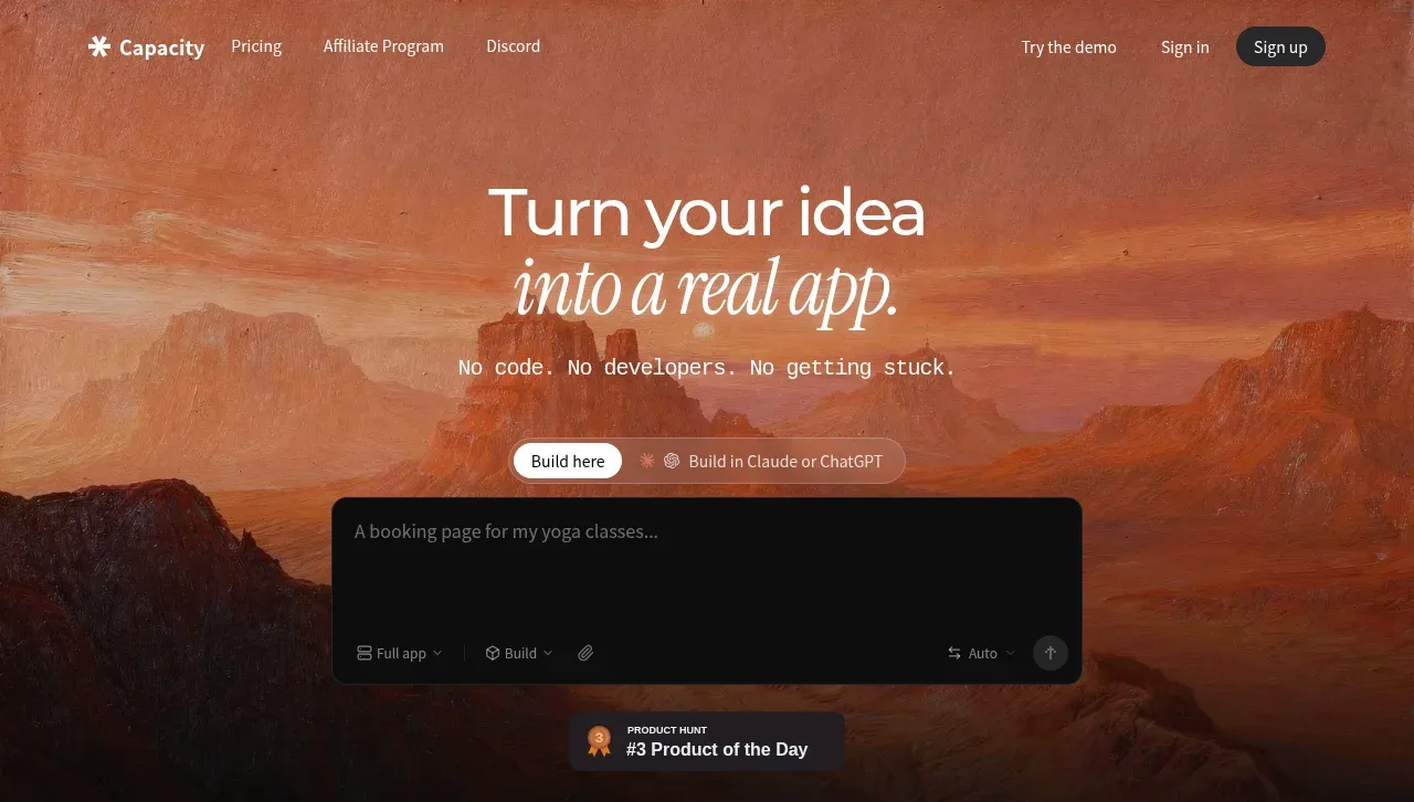 AI app builder hero
capacity.so · Hero
AI app builder hero
capacity.so · Hero
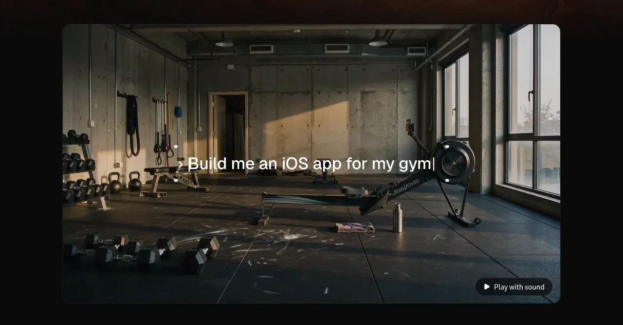 Product demonstration media
capacity.so · Gallery
Product demonstration media
capacity.so · Gallery
 Customer logo strip
capacity.so · Logo cloud
Customer logo strip
capacity.so · Logo cloud
 Build with existing AI tools
capacity.so · Feature grid
Build with existing AI tools
capacity.so · Feature grid
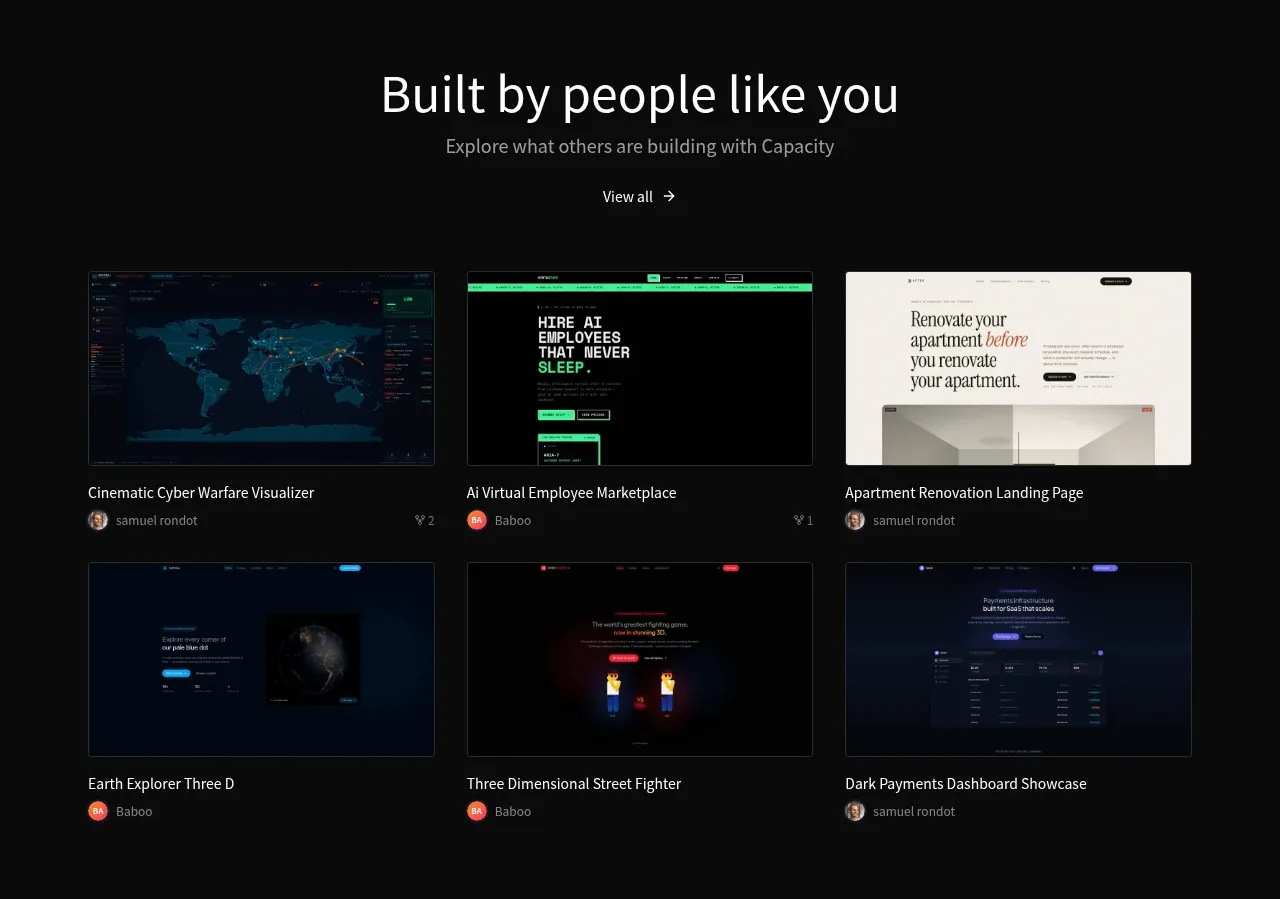 Community project gallery
capacity.so · Gallery
Community project gallery
capacity.so · Gallery
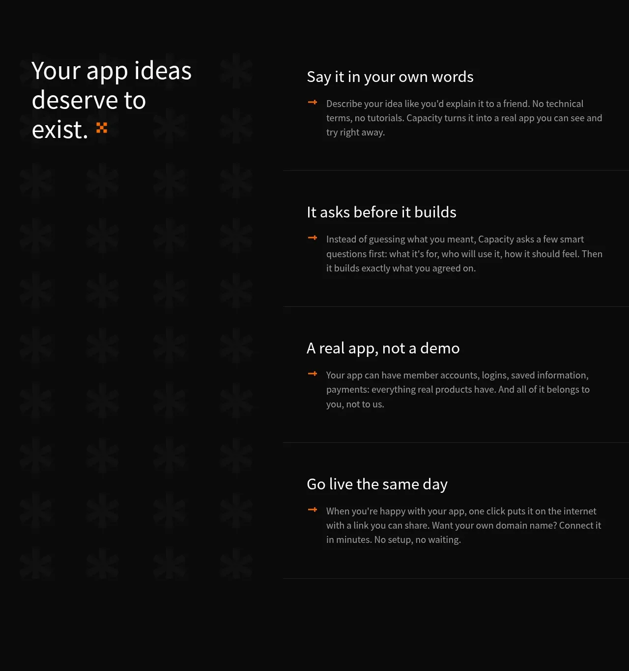 How the product works
capacity.so · Feature grid
How the product works
capacity.so · Feature grid
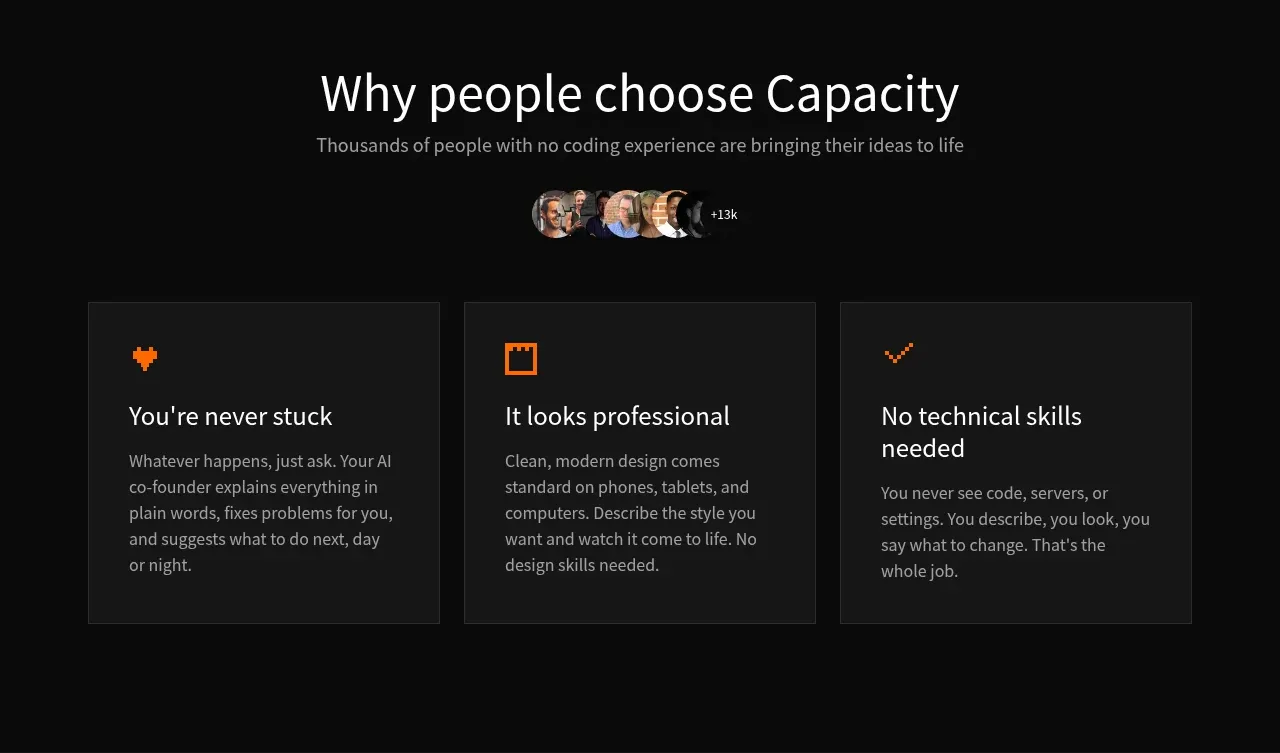 Reasons to choose the product
capacity.so · Feature grid
Reasons to choose the product
capacity.so · Feature grid
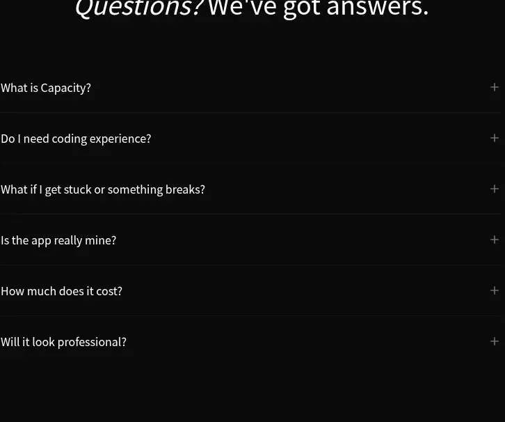 Frequently asked questions
capacity.so · FAQ
Frequently asked questions
capacity.so · FAQ
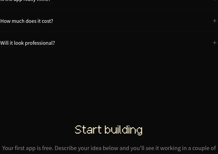 Start building prompt form
capacity.so · Form
Start building prompt form
capacity.so · Form
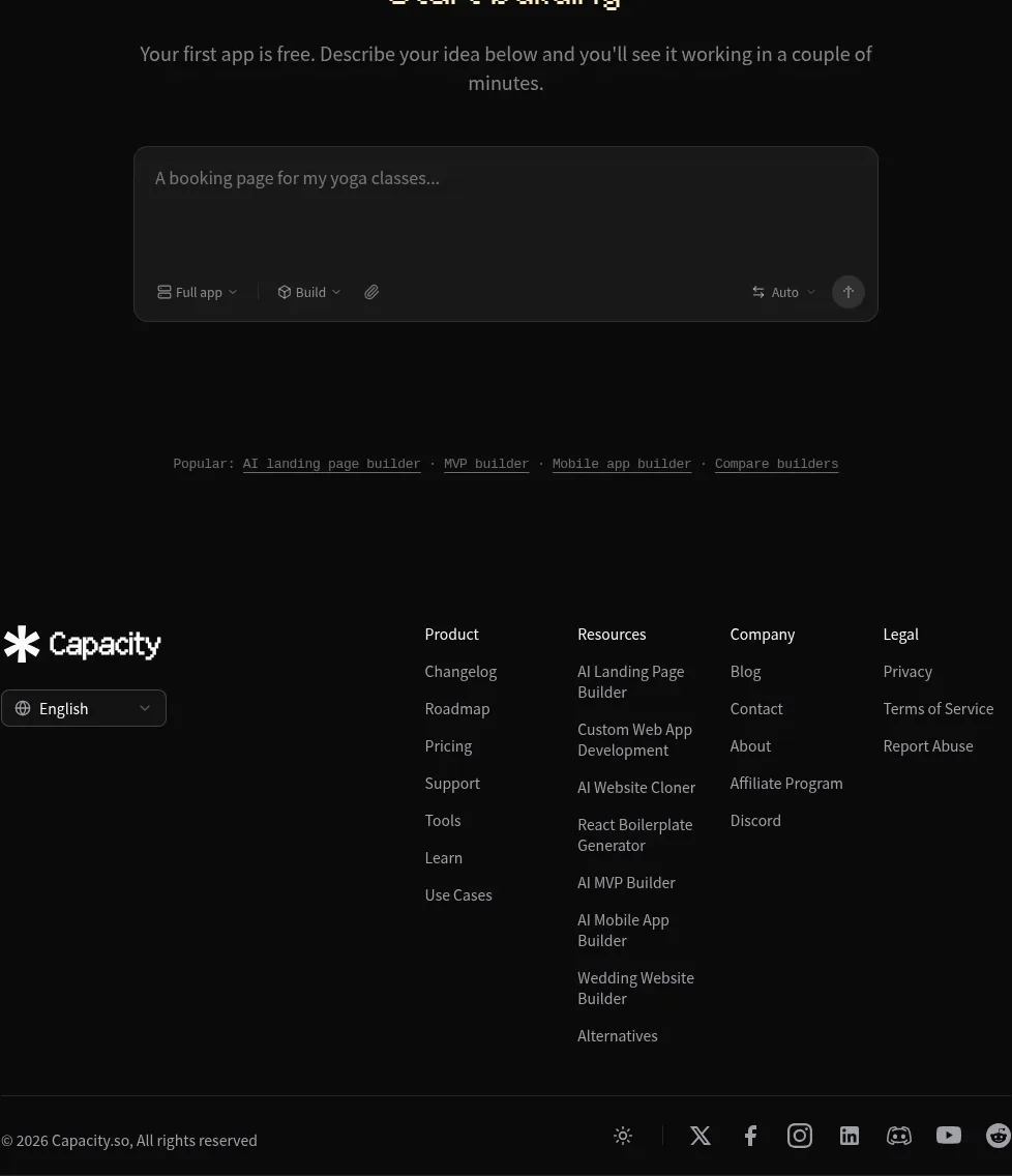 Site footer
capacity.so · Footer
Site footer
capacity.so · Footer