 kage
kage
capacity.so
Design analysis
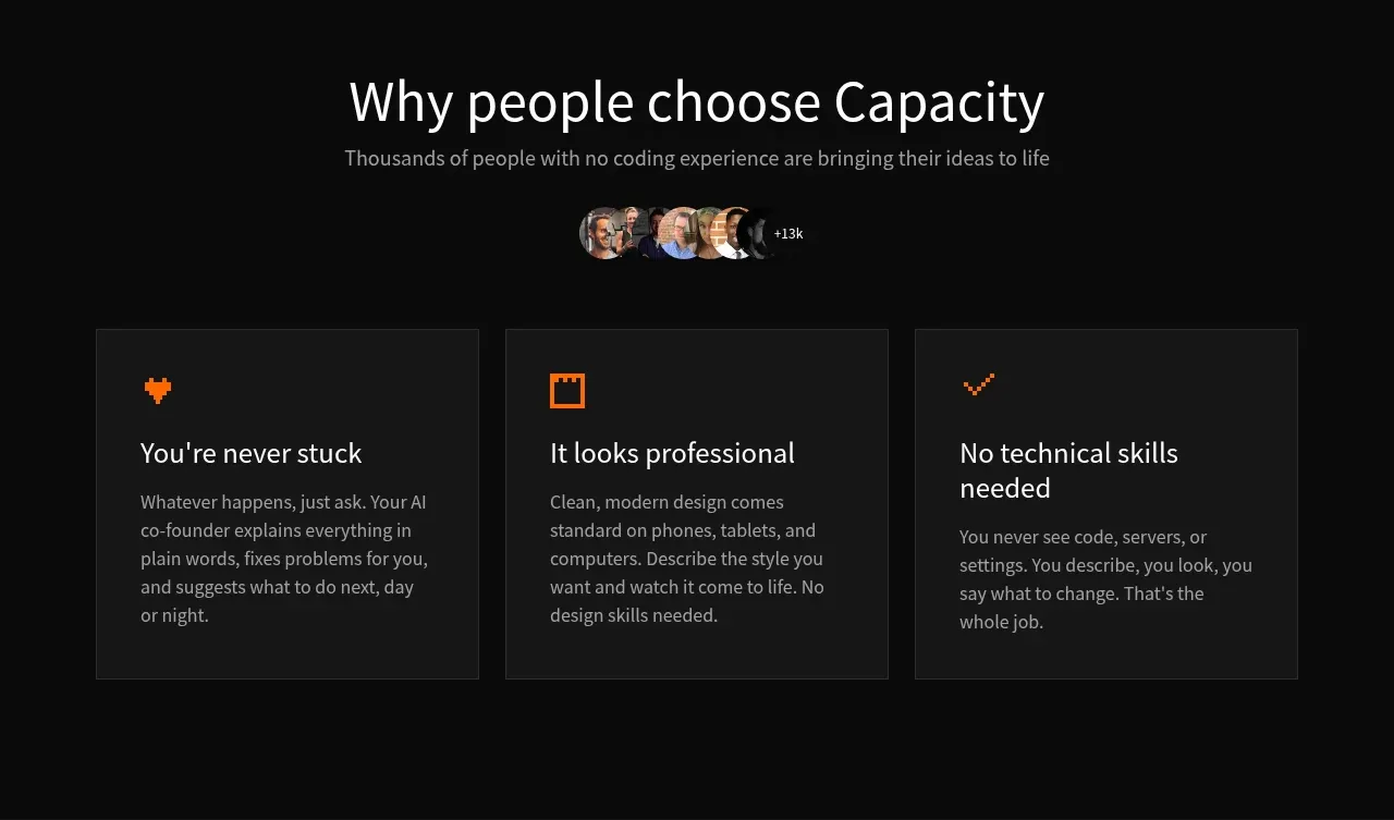
A concise social-proof section uses a centered heading, avatar cluster, and three equal benefit cards with icon, title, and explanation.
Prompt preview
## Reference images

Study these alongside the description below: hierarchy, rhythm, spacing, colour. Build for the product you are asked about, using this design language.

- Component: https://kage-design-assets.t3.tigrisfiles.io/components/capacity-so/08f2bf80-ea5b-4604-8f5e-193c94acfc56-1791551996-7.webp
- Full page it was cut from: https://kage-design-assets.t3.tigrisfiles.io/screenshots/capacity-so/08f2bf80-ea5b-4604-8f5e-193c94acfc56-1791551914192-full.webp
- Component on Kage: https://kage.design/component/capacity-feature-grid-3

## Before you start
Ask who the user's audience is, what proof is available, and which three benefits matter most. Then build an original benefit section with the same clarity.

Create a centered dark section with a large heading, one-line supporting statement, and a small overlapping avatar cluster with a numeric proof label. Below, place three equal cards in a responsive row. Each card uses a small accent icon, a direct benefit title, and two or three lines of supporting copy. Use charcoal cards such as #171717, subtle #ffffff12 borders, 8–12px radii, 24–28px padding, and orange or brand-colored icons. Keep card heights aligned and add a restrained hover border transition. Avoid exaggerated statistics unless the user can substantiate them.

**Never:** use logos, product names, copy, illustrations, or imagery from the reference.
More components

 Studios and output grid
Hypervibe · Feature grid
Studios and output grid
Hypervibe · Feature grid
 Continuity and memory grid
Hypervibe · Feature grid
Continuity and memory grid
Hypervibe · Feature grid
 Voice collaboration section
Hypervibe · Feature grid
Voice collaboration section
Hypervibe · Feature grid
 Core workspace feature section
Hypervibe · Feature grid
Core workspace feature section
Hypervibe · Feature grid
 Agent orchestration section
Hypervibe · Feature grid
Agent orchestration section
Hypervibe · Feature grid

 How it works: connected research tools
Lune · Feature grid
How it works: connected research tools
Lune · Feature grid