 kage
kage
heypi.xyz
Design analysis
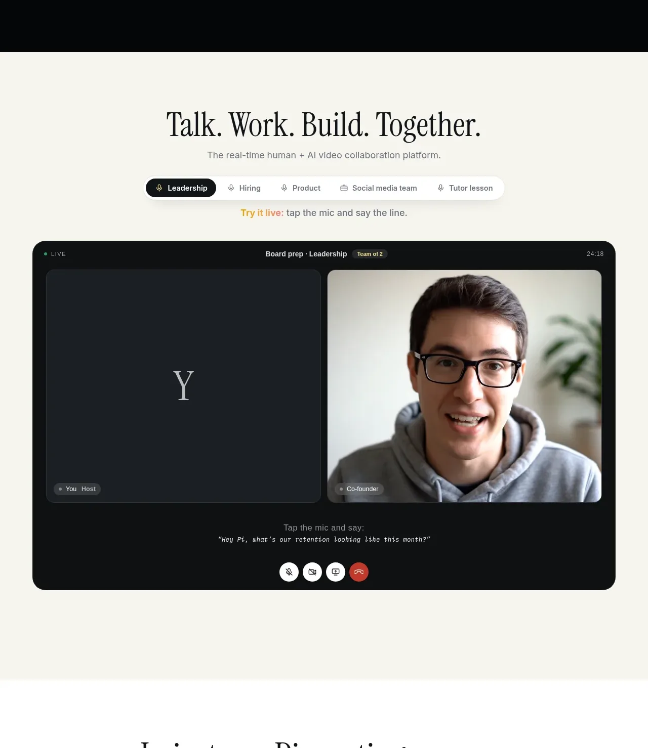
A warm section introduces the real-time collaboration concept, then demonstrates it through a large two-person meeting interface and selectable meeting contexts.
Prompt preview
## Reference images

Study these alongside the description below: hierarchy, rhythm, spacing, colour. Build for the product you are asked about, using this design language.

- Component: https://kage-design-assets.t3.tigrisfiles.io/components/heypi/9fccb756-63dd-4cec-9422-c066b077bc89-1791612276-2.webp
- Full page it was cut from: https://kage-design-assets.t3.tigrisfiles.io/screenshots/heypi/9fccb756-63dd-4cec-9422-c066b077bc89-1791612175185-full.webp
- Component on Kage: https://kage.design/component/heypi-feature-grid

## Before you start
Ask the user what collaborative workflow their product demonstrates and which user roles should appear. Apply the principles below to their product and brand.

Build a light, warm off-white showcase section with a centered editorial heading, concise subtitle, and a row of pill-shaped context tabs. The selected tab should be dark with light text while inactive tabs are pale and understated. Below, place a large rounded meeting-stage mockup with two equal video panes, a dark chrome header, speaker labels, a small live/status indicator, transcript or prompt text, and a centered row of circular call controls. Keep the mockup visually dominant and use realistic but product-neutral placeholder media. Suggested palette: #F4F3EB background, #111416 panel, #E7E5DC cards, #F7F5ED text, #D6C35B accent. Use 12–18px radii, soft shadows, clear focus states, and tab switching that updates the active context.

Never use logos, product names, copy, illustrations, or imagery from the reference.
More components

 Agent orchestration section
Hypervibe · Feature grid
Agent orchestration section
Hypervibe · Feature grid
 Continuity and memory grid
Hypervibe · Feature grid
Continuity and memory grid
Hypervibe · Feature grid
 Core workspace feature section
Hypervibe · Feature grid
Core workspace feature section
Hypervibe · Feature grid
 Voice collaboration section
Hypervibe · Feature grid
Voice collaboration section
Hypervibe · Feature grid
 Studios and output grid
Hypervibe · Feature grid
Studios and output grid
Hypervibe · Feature grid

 What it is: trusted knowledge features
Lune · Feature grid
What it is: trusted knowledge features
Lune · Feature grid