kage
kage
heypi.xyz
Design analysis
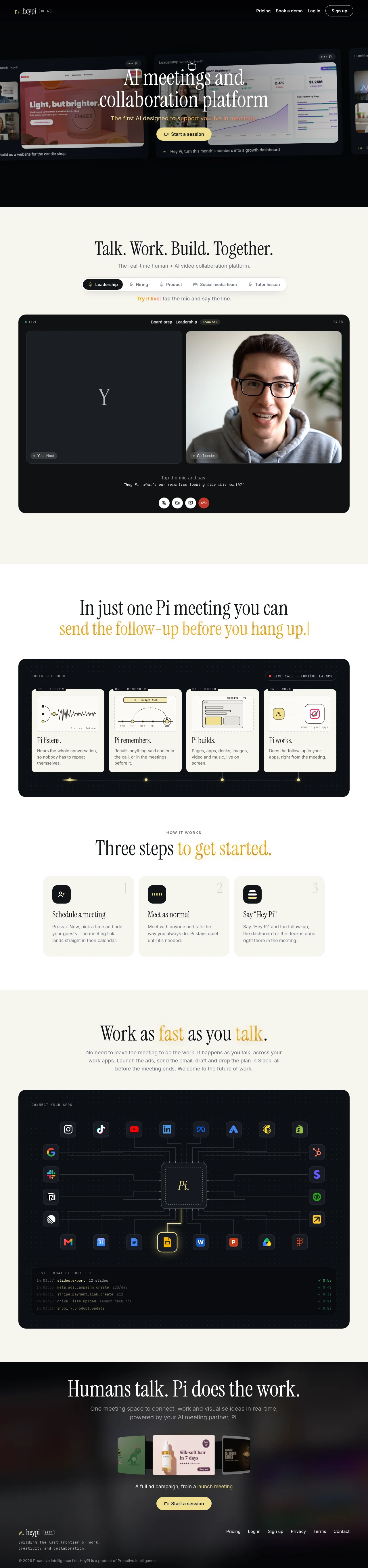
An editorial landing page that alternates warm near-black and cream bands, with each light section anchored by a large rounded dark panel that stages the product: a live-call UI with two video tiles, four numbered capability cards with hand-drawn line diagrams, and an integration circuit map closed by a terminal-style activity log. Hierarchy is carried by a high-contrast serif display face with selective gold emphasis words, while mono uppercase micro-labels (eyebrows, badges, timestamps) give everything a broadcast feel. A single gold accent is reserved for CTAs, live states and emphasis words, keeping the page calm and warm despite dense product UI.
Prompt preview
## Reference images

Study these alongside the description below: hierarchy, rhythm, spacing, colour. Build for the product you are asked about, using this design language.

- Full page: https://kage-design-assets.t3.tigrisfiles.io/screenshots/heypi/9fccb756-63dd-4cec-9422-c066b077bc89-1791612175185-full.webp
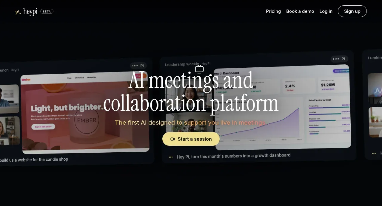
- Above the fold: https://kage-design-assets.t3.tigrisfiles.io/screenshots/heypi/9fccb756-63dd-4cec-9422-c066b077bc89-1791612173414.webp
- Design on Kage: https://kage.design/designs/heypi-landing-page

## Before you start
Ask the user what they are building, who it is for, and what brand assets they already have (name, colours, type). Wait for the answers before writing any code — everything below is applied to their product, not to the reference site.

## Page structure
1. **Top nav (dark):** slim bar on warm near-black; small wordmark plus a tiny mono BETA badge on the left; text links (pricing, demo, log in) and a white pill sign-up button on the right.
2. **Hero (dark):** full-bleed near-black band; centered serif display headline in white floating over a softly dimmed collage of product screenshots and meeting windows; a one-line gold subhead beneath; a single gold pill CTA with a small icon; tiny mono captions sit at the collage edges and read like spoken voice commands.
3. **Use-case section (cream):** centered serif headline plus a one-line sans subhead; a pill tab row of audience scenarios with the first tab active (dark fill, mic icon); a gold "try it live" instruction line; then a near-full-width dark rounded app mockup — window bar with a live badge, session title, participant pill and timer; two side-by-side video tiles (one dark tile showing a large initial letter, one real photograph); a mono caption prompting what to say into the mic; a row of circular call controls ending in a red hang-up button.
4. **Capability section (white):** serif headline whose second line is set in gold; a large dark rounded panel introduced by a mono uppercase eyebrow and a live-call status pill; inside, four cream cards in one row, each with a mono number+tag (01–04), a small 1px hand-drawn line diagram (waveform, timeline, wireframe, flow), a serif card title and a one-sentence body; a dotted timeline with gold nodes runs beneath the cards.
5. **How-it-works section (cream):** mono uppercase eyebrow; serif headline with the payoff phrase in gold; three wide cards, each with a dark rounded icon chip, a huge ghost numeral behind the content, a serif title and short body copy.
6. **Integrations section (cream):** serif headline with two gold emphasis words; short sans body paragraph; a large dark rounded panel with a mono eyebrow — a central square node carrying the product mark, thin circuit-style connector lines radiating to rows of colourful app tiles, one node highlighted in gold; beneath the map, a terminal strip of mono rows: timestamp, action name, payload, each ending with a green check and a duration.
7. **Closing section (dark):** serif headline, sans subhead, a short row of floating artefact cards showing the outputs the product generates; a caption whose key phrase is gold and underlined; a repeat of the gold pill CTA.
8. **Footer (dark):** wordmark + beta badge and a two-line mono tagline on the left; a horizontal link list on the right; a hairline-topped legal line with copyright at the very bottom.

## Design language
- **Band rhythm:** alternate dark → cream → white → cream → dark. Every light band resolves into one large rounded (~16–20px radius) dark panel that stages the product, so dense UI is always framed and the page breathes between bands.
- **Palette:** warm near-black `#0e0d0b`, cream `#f1ede4`, paper white `#faf8f2`, ink `#1b1a17`, gold accent `#d8a94e`, muted grey `#8a877f` for secondary text. Red appears only as live/destructive dots and the hang-up button. Use at most one gold element per visual cluster.
- **Type pairing:** a high-contrast serif (Lora / Source Serif class) for all display headlines, 56–88px with tight leading; a neutral sans for body copy at 15–17px; a monospace for eyebrows, badges, captions and logs at 11–13px, uppercase with wide tracking. Emphasis inside headlines is the same serif in gold, often italic.
- **Hierarchy recipe:** mono eyebrow → serif headline → sans body → single pill CTA. Card titles are serif at ~20px; everything label-like is mono.
- **Components:** fully pill-shaped buttons and tabs (primary = gold fill with dark text; secondary = white or outlined fill); badges are tiny mono pills with a coloured status dot; panels have 16–20px radius, no visible borders, at most a soft ambient shadow.
- **Diagrams:** capability cards use simple 1px ink-on-cream line drawings; the integration map uses thin light connector lines with small circular joints on dark; timelines use gold dots. Diagrams are small, schematic and consistent.
- **Density and spacing:** sections are tall (96–140px vertical padding); content max-width ~1100px; the dark product panels run wider (~1200px) and dominate their band.
- **Motion (restrained):** pulsing live dots, a blinking cursor in the terminal log, gentle float on hero collage cards. Nothing bouncy or parallax-heavy.
- **Photography:** one warm, real human photo inside the call mockup grounds the product in reality; everything else is UI, schematic diagrams or artefact cards — no lifestyle stock.

## Never
- No Pi wordmark, no "Hey Pi" wake-word phrasing, no HeyPi copy, scenario names, diagrams, app icon sets or photographs from the reference; never present the result as HeyPi or Proactive Intelligence.
- Write your own captions, eyebrow strings and scenario labels; borrow only the patterns.
Components from this page
All components
 Minimal dark navigation
HeyPi · Navigation
Minimal dark navigation
HeyPi · Navigation
 AI collaboration hero
HeyPi · Hero
AI collaboration hero
HeyPi · Hero
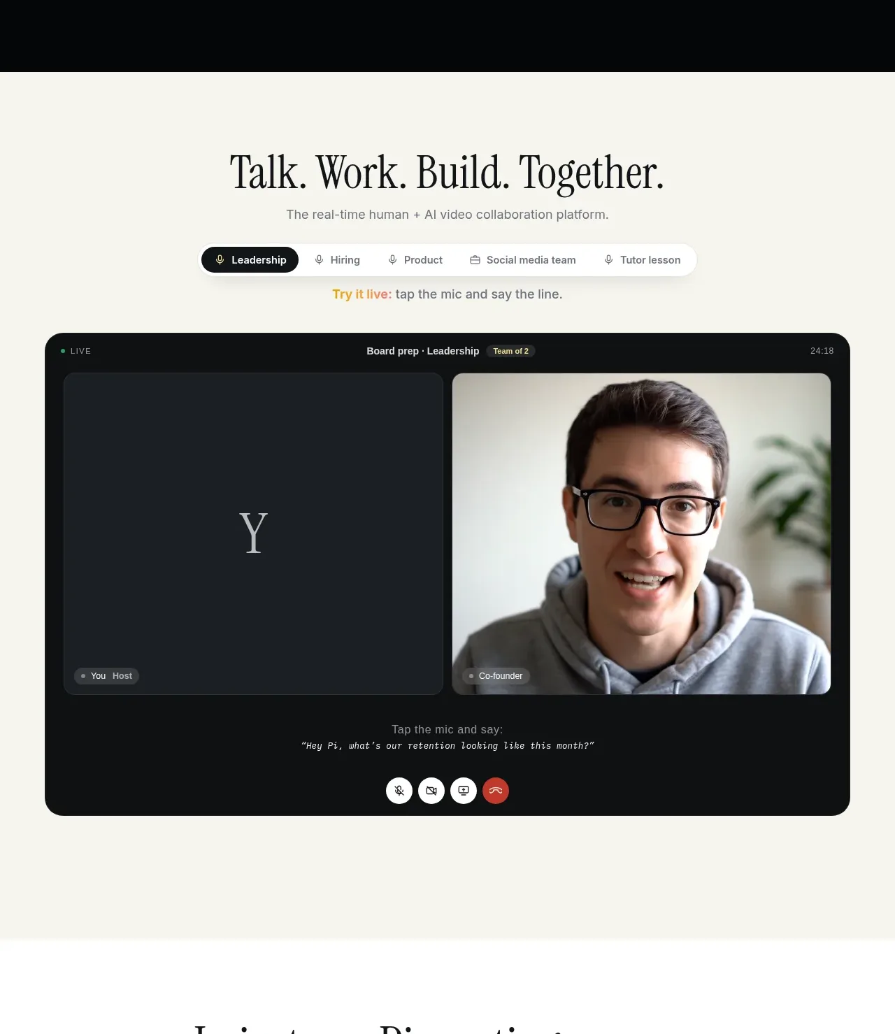 Live meeting showcase
HeyPi · Feature grid
Live meeting showcase
HeyPi · Feature grid
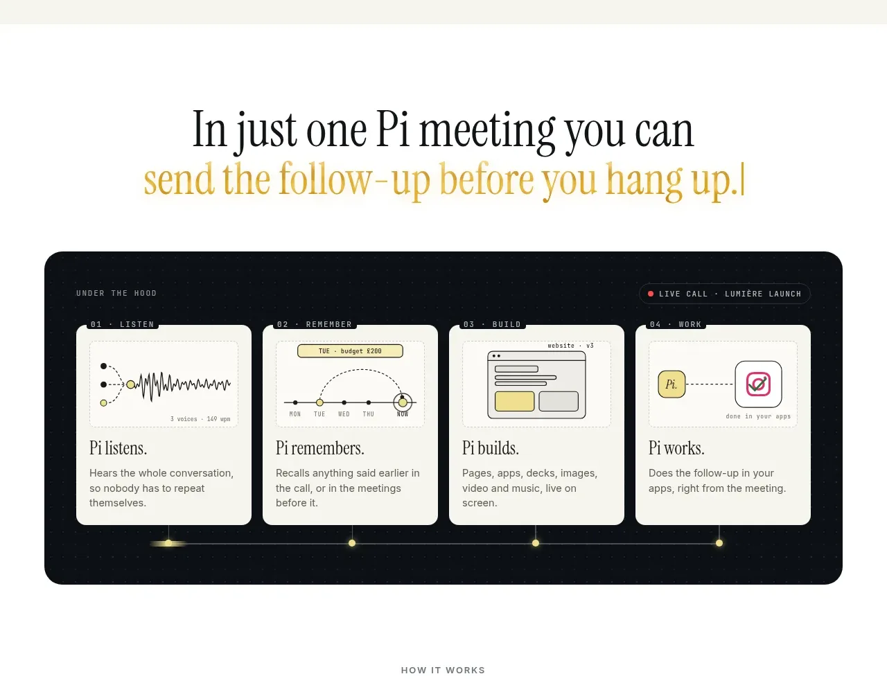 Meeting-to-output workflow
HeyPi · Feature grid
Meeting-to-output workflow
HeyPi · Feature grid
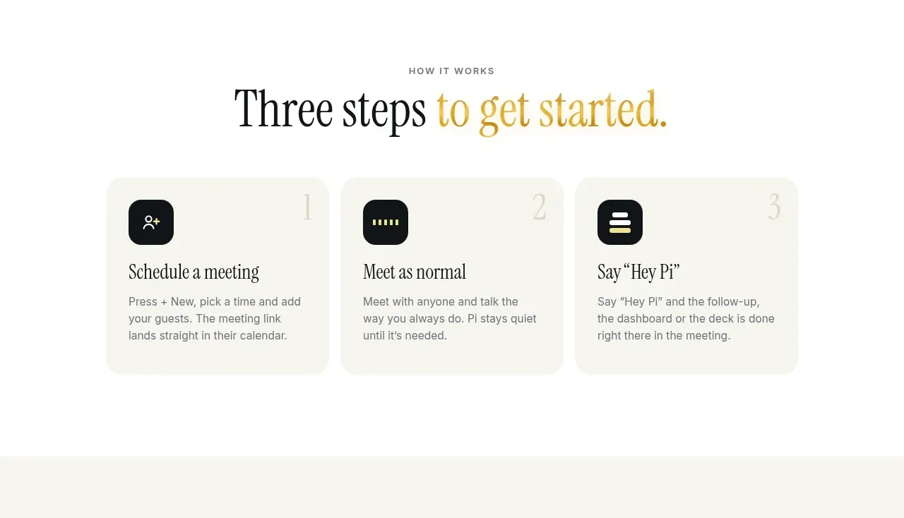 Three-step onboarding
HeyPi · Feature grid
Three-step onboarding
HeyPi · Feature grid
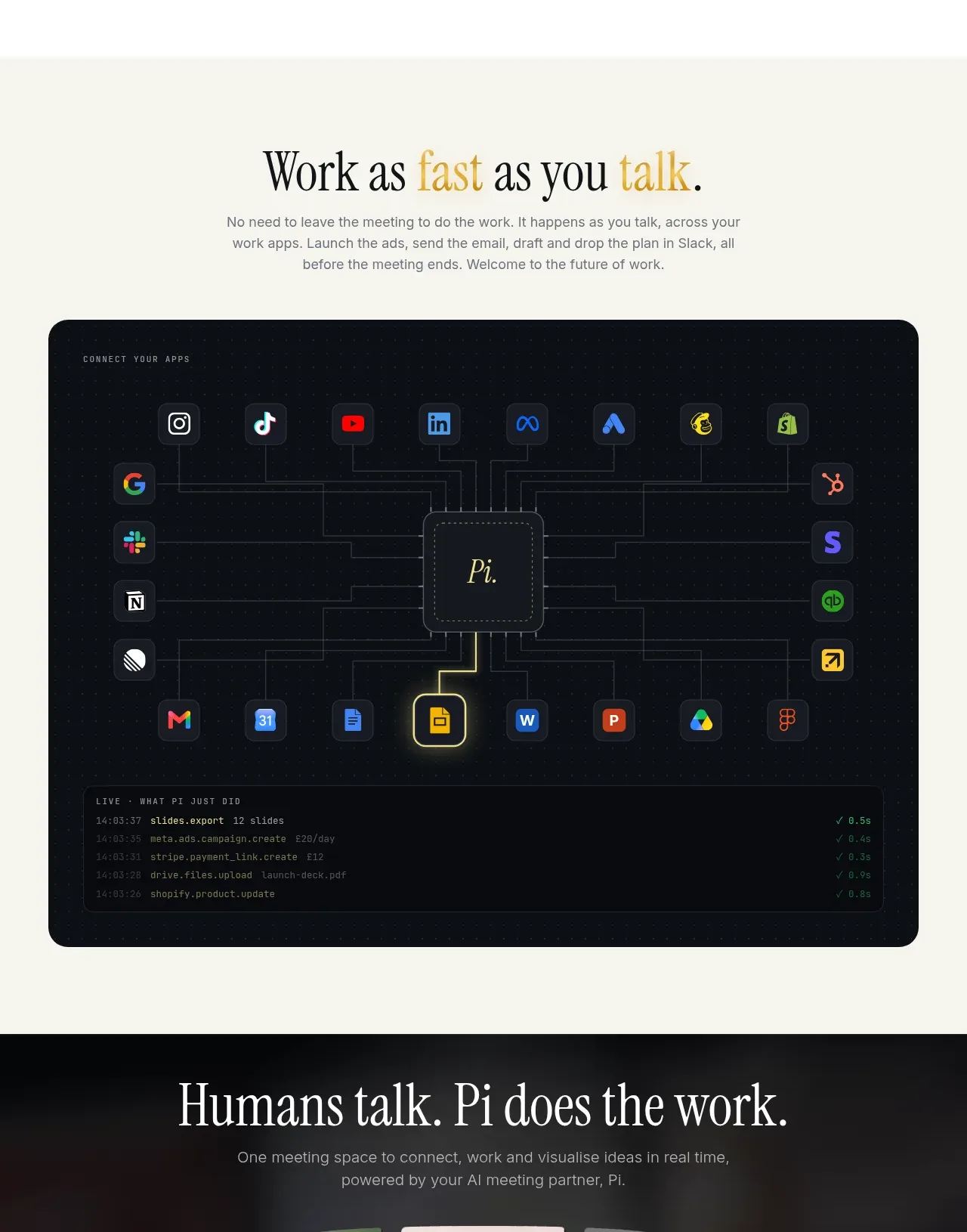 Connected app workspace
HeyPi · Feature grid
Connected app workspace
HeyPi · Feature grid
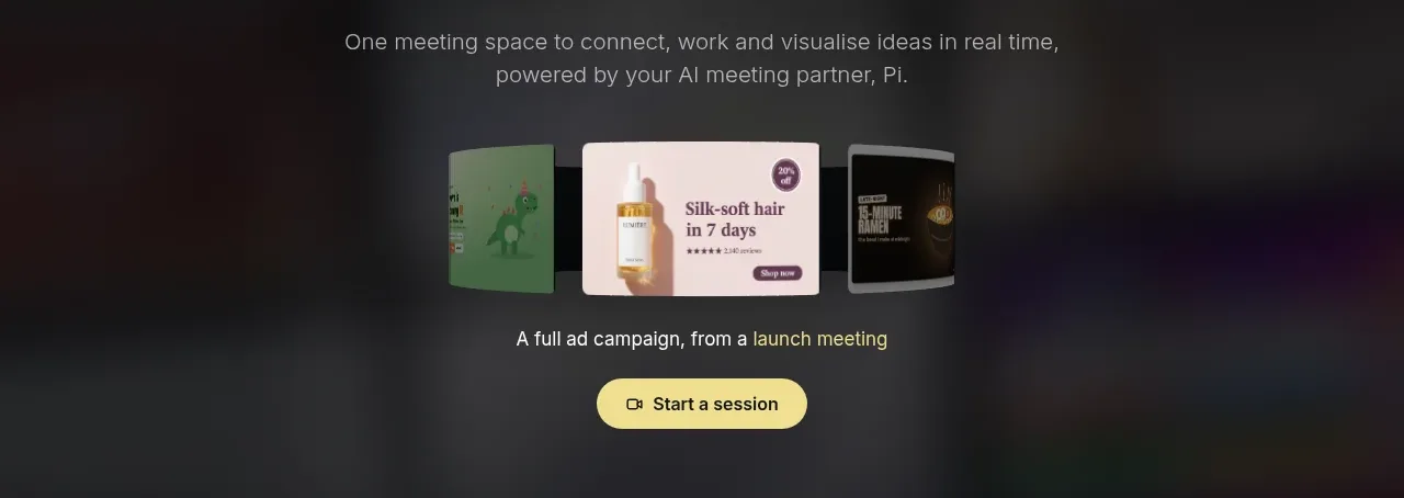 Closing product call to action
HeyPi · Call to action
Closing product call to action
HeyPi · Call to action
 Compact dark footer
HeyPi · Footer
Compact dark footer
HeyPi · Footer