 kage
kage
heypi.xyz
Design analysis
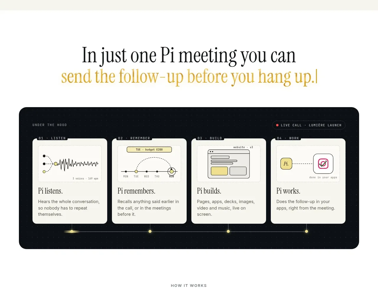
A short editorial statement leads into a dark, technical four-card sequence explaining how conversation becomes useful output.
Prompt preview
## Reference images

Study these alongside the description below: hierarchy, rhythm, spacing, colour. Build for the product you are asked about, using this design language.

- Component: https://kage-design-assets.t3.tigrisfiles.io/components/heypi/9fccb756-63dd-4cec-9422-c066b077bc89-1791612276-3.webp
- Full page it was cut from: https://kage-design-assets.t3.tigrisfiles.io/screenshots/heypi/9fccb756-63dd-4cec-9422-c066b077bc89-1791612175185-full.webp
- Component on Kage: https://kage.design/component/heypi-feature-grid-2

## Before you start
Ask the user what stages transform input into value in their product. Apply the structure to that workflow using their own terminology and brand.

Create a transition section with a centered two-line editorial statement, using a dark primary line and a highlighted warm accent line. Follow it with a wide dark rounded panel containing four evenly spaced cards connected by a fine horizontal timeline or progress rule. Each card should have a small step label, a compact abstract UI diagram, a short heading, and two lines of explanatory copy. Use a subtle dotted or technical background texture, ivory cards, dark text, and a pale-yellow accent for the connector. Suggested colours: #F7F6F0, #0D1215, #F0EEE5, #DCC968, #7D807C. Keep card heights aligned, spacing consistent, and make the sequence responsive by stacking cards vertically on mobile.

Never use logos, product names, copy, illustrations, or imagery from the reference.
More components

 Agent orchestration section
Hypervibe · Feature grid
Agent orchestration section
Hypervibe · Feature grid
 Continuity and memory grid
Hypervibe · Feature grid
Continuity and memory grid
Hypervibe · Feature grid
 Core workspace feature section
Hypervibe · Feature grid
Core workspace feature section
Hypervibe · Feature grid
 Voice collaboration section
Hypervibe · Feature grid
Voice collaboration section
Hypervibe · Feature grid
 Studios and output grid
Hypervibe · Feature grid
Studios and output grid
Hypervibe · Feature grid

 What it is: trusted knowledge features
Lune · Feature grid
What it is: trusted knowledge features
Lune · Feature grid