 kage
kage
heypi.xyz
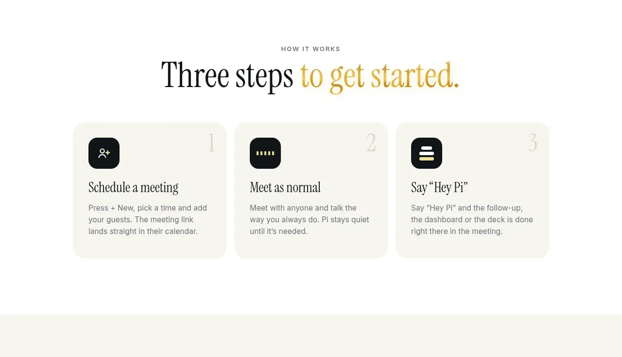
Design analysis
A clean how-it-works section reduces activation to three numbered cards with simple icons and concise explanations.
Prompt preview
## Reference images

Study these alongside the description below: hierarchy, rhythm, spacing, colour. Build for the product you are asked about, using this design language.

- Component: https://kage-design-assets.t3.tigrisfiles.io/components/heypi/9fccb756-63dd-4cec-9422-c066b077bc89-1791612277-4.webp
- Full page it was cut from: https://kage-design-assets.t3.tigrisfiles.io/screenshots/heypi/9fccb756-63dd-4cec-9422-c066b077bc89-1791612175185-full.webp
- Component on Kage: https://kage.design/component/heypi-feature-grid-3

## Before you start
Ask the user what the first three actions are for a new customer and what level of guidance they need. Adapt this simple onboarding pattern to their product.

Build a bright, spacious section with a small uppercase eyebrow, a centered serif heading, and a three-column row of equal cards. Each card should show a small dark rounded-square icon tile, a large faint step numeral, a clear action heading, and short supporting copy. Use a warm white background, pale neutral cards, almost-black text, and one restrained yellow accent. Suggested colours: #FBFAF5, #F0F0E8, #111416, #D4BE58, #777A76. Use 20–24px card radii, generous internal padding, subtle lift on hover, and stack the cards in order on mobile. Keep the copy scannable and the hierarchy obvious.

Never use logos, product names, copy, illustrations, or imagery from the reference.
More components

 Agent orchestration section
Hypervibe · Feature grid
Agent orchestration section
Hypervibe · Feature grid
 Continuity and memory grid
Hypervibe · Feature grid
Continuity and memory grid
Hypervibe · Feature grid
 Core workspace feature section
Hypervibe · Feature grid
Core workspace feature section
Hypervibe · Feature grid
 Voice collaboration section
Hypervibe · Feature grid
Voice collaboration section
Hypervibe · Feature grid
 Studios and output grid
Hypervibe · Feature grid
Studios and output grid
Hypervibe · Feature grid

 What it is: trusted knowledge features
Lune · Feature grid
What it is: trusted knowledge features
Lune · Feature grid